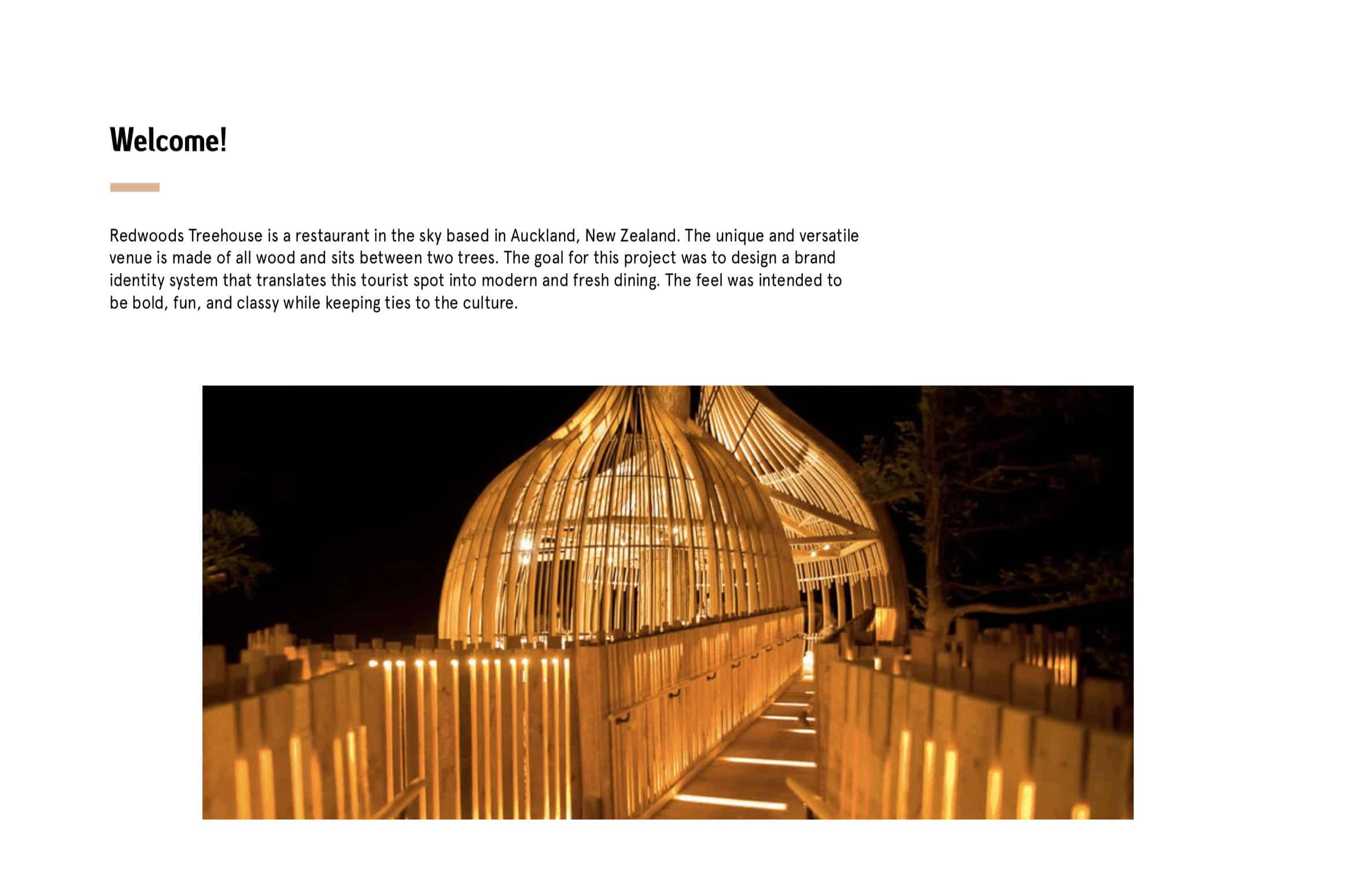
Redwoods Treehouse Rebrand

The goal of this project was to create a more modern and fresh feel to the restaurant. I wanted to translate the tourist spot into a contemporary and urban dining spot. While keeping ties to New Zealand and Maori culture, I added a fun and bold twist on the already existing restaurant.
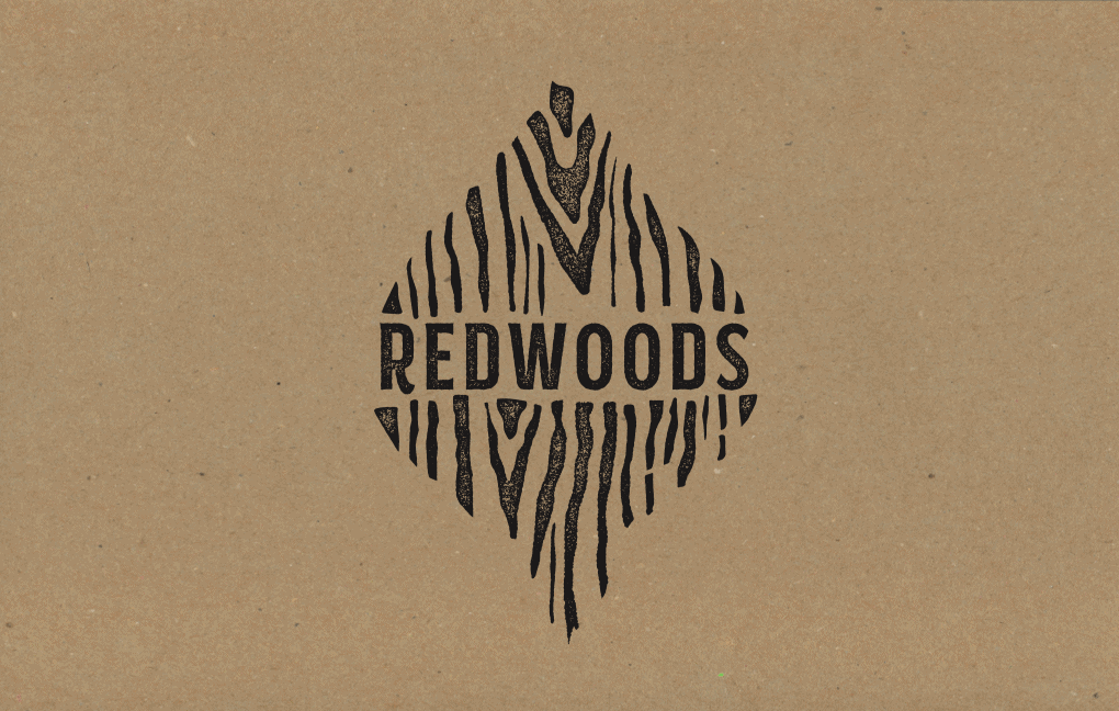
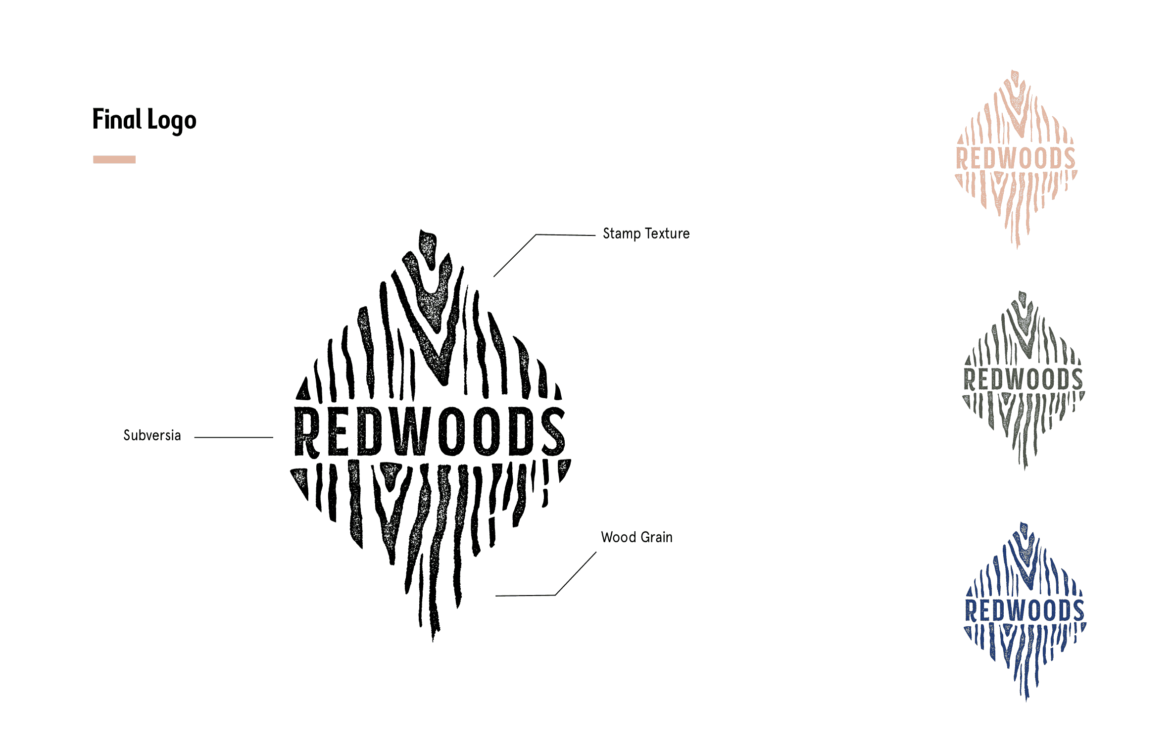
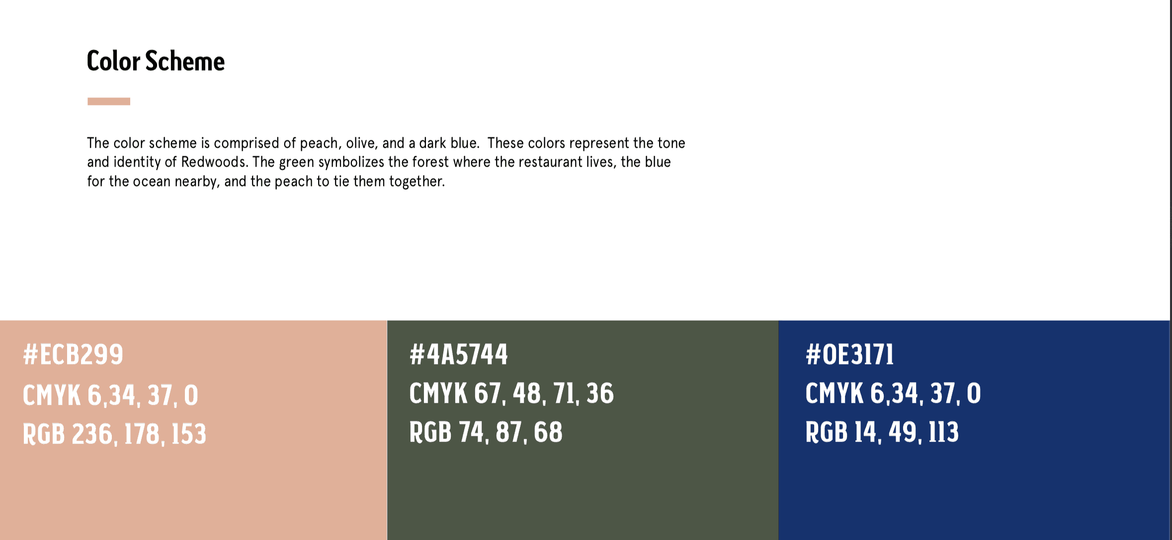
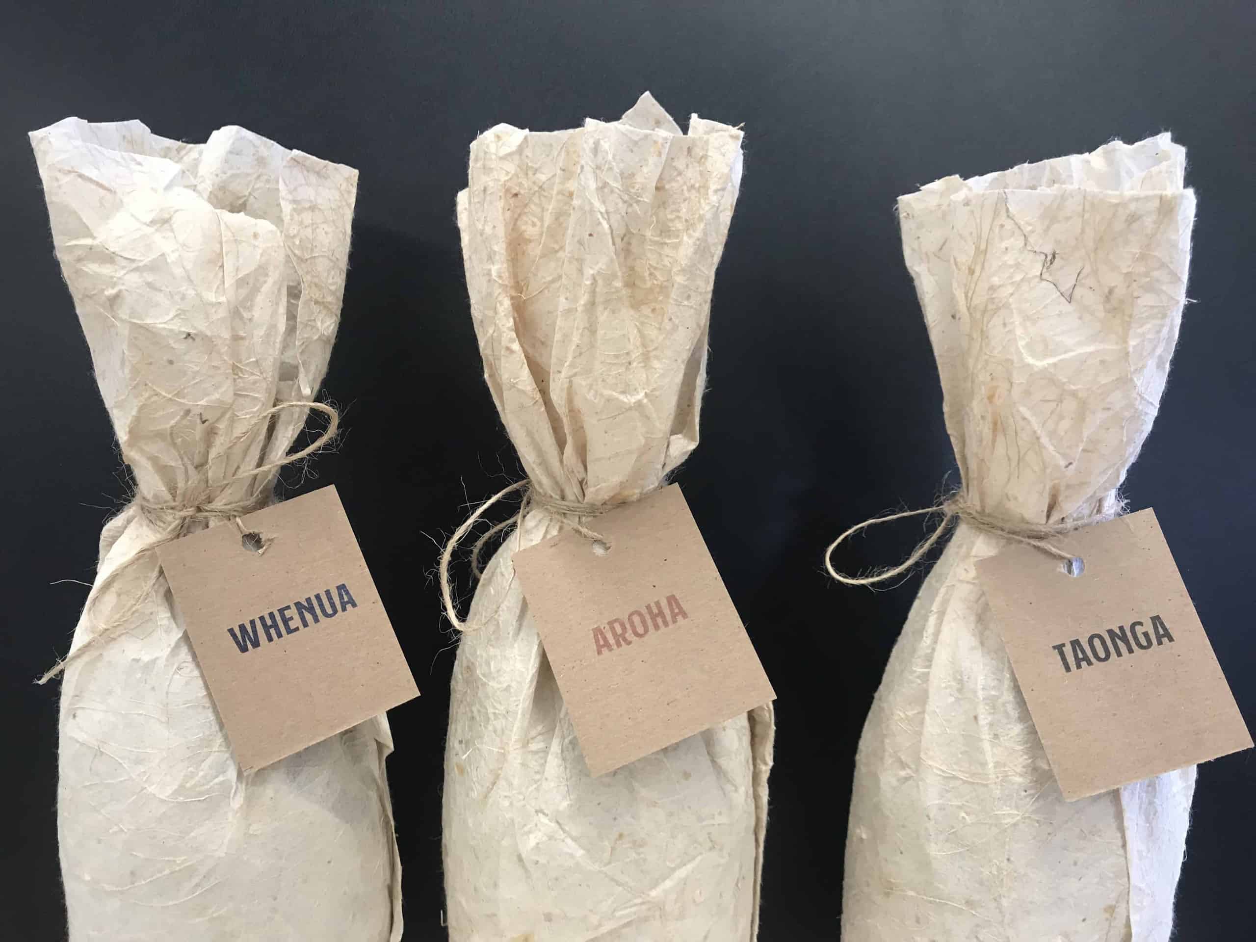
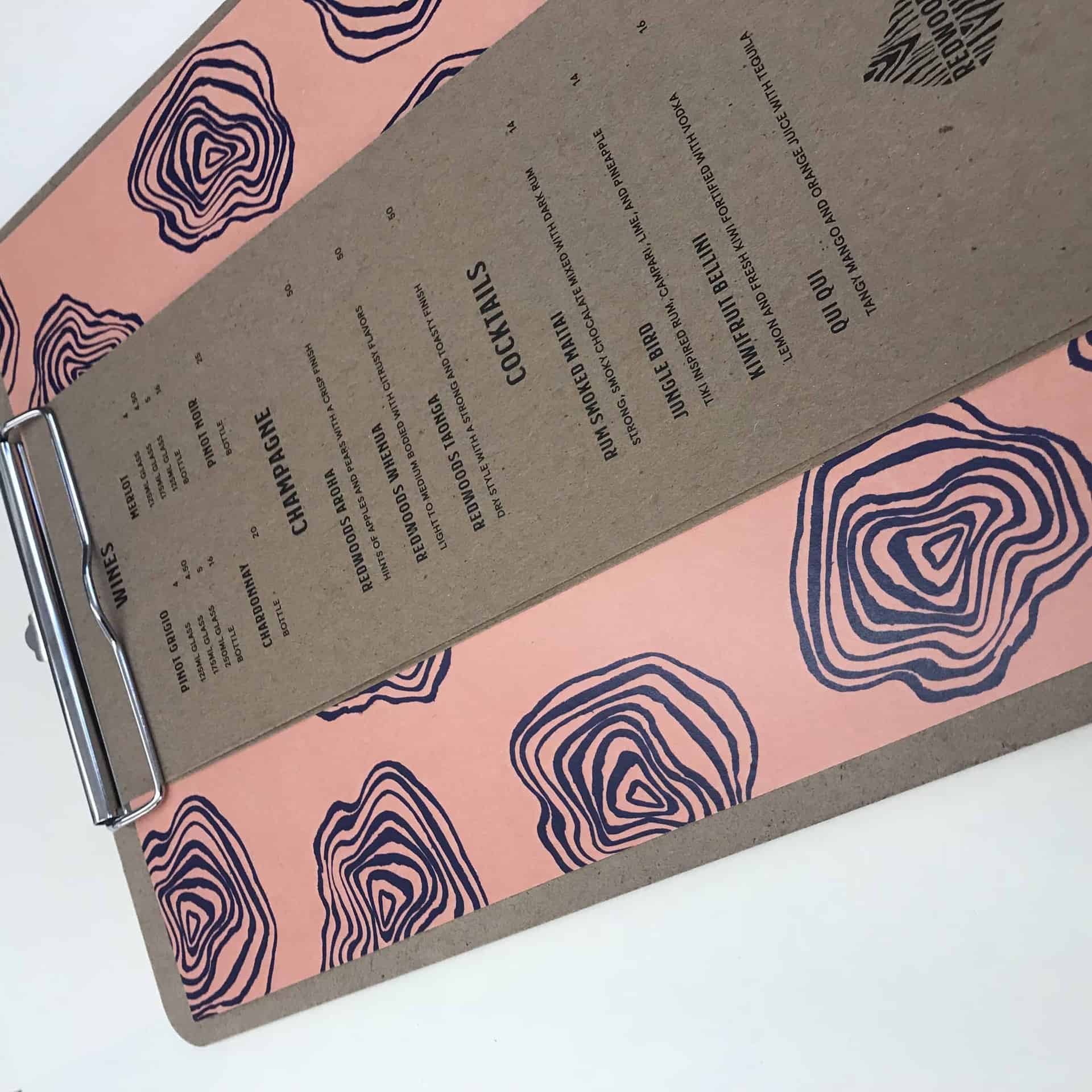
I came up with the logo concept by the pod shape of the restaurant in the sky. The shape is so unique I wanted to incorporate it into the branding. I chose the textures because the restaurant is completely made of exposed wood, so I used a grain effect. The colors I chose were blue, green, and peach to represent the forest (where Redwoods is), the ocean, and peach to tie them together.
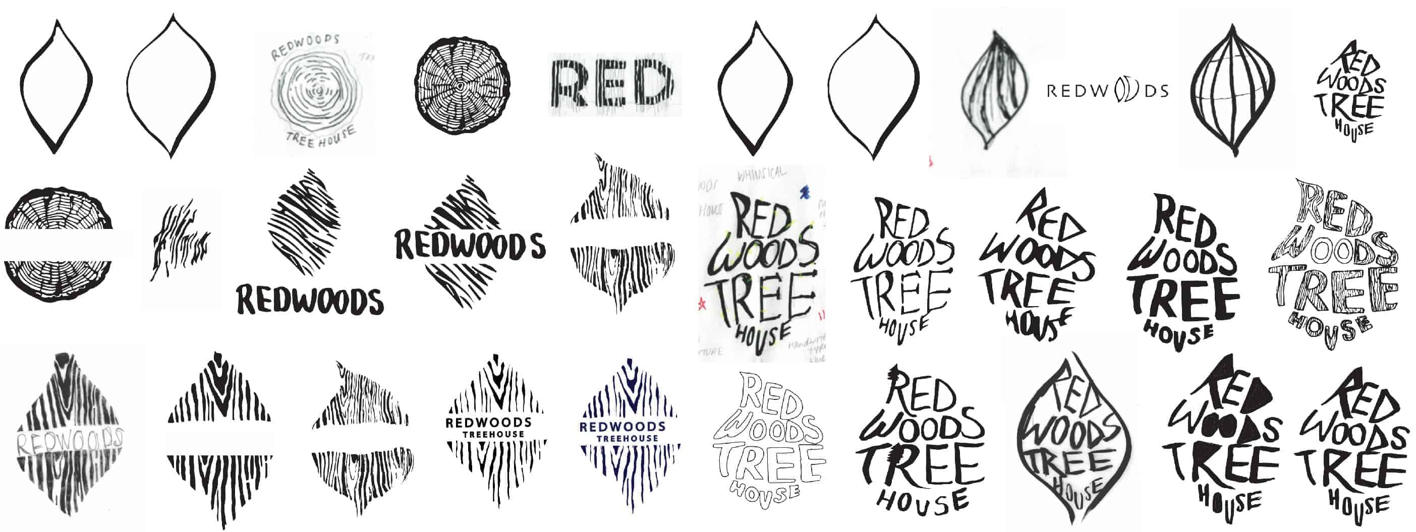
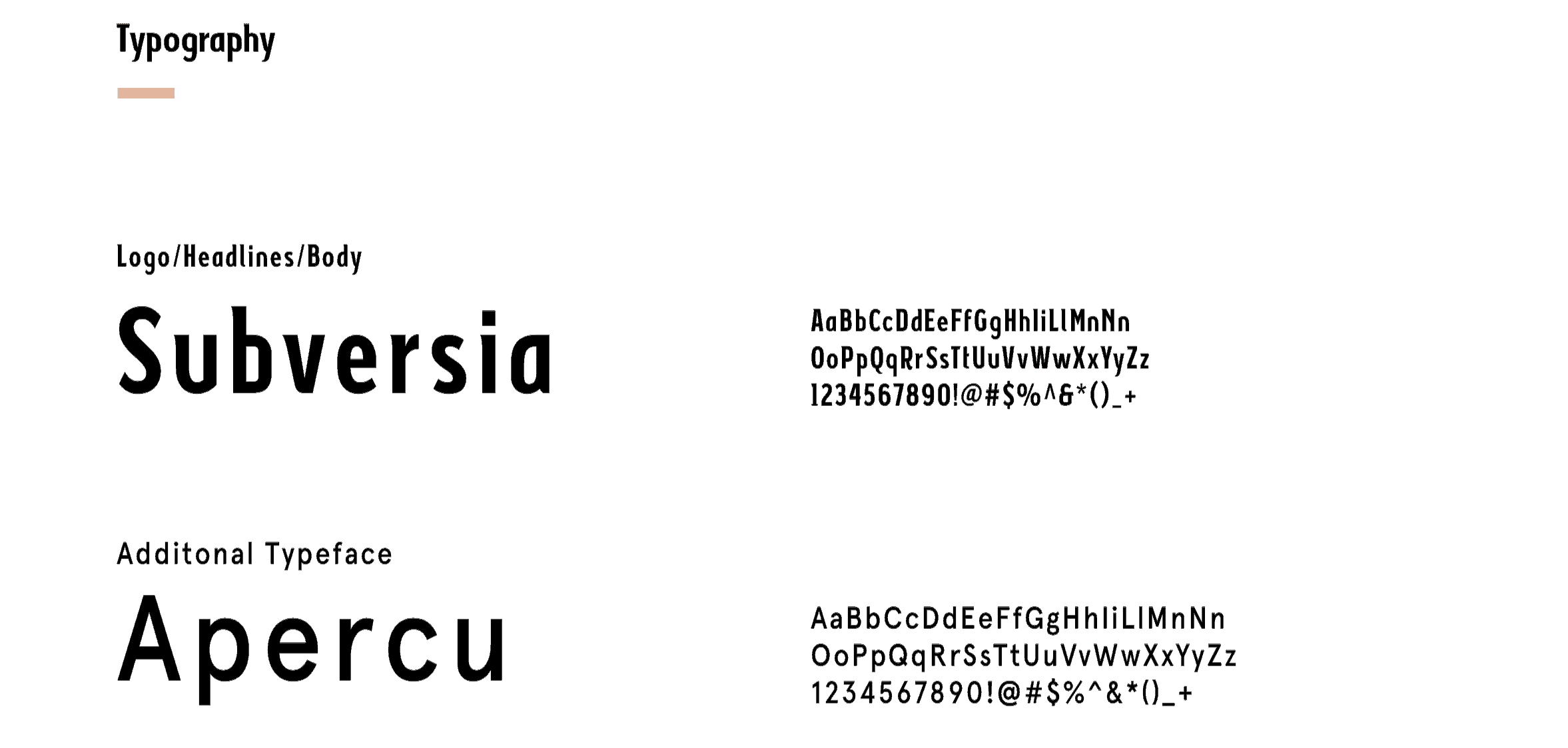
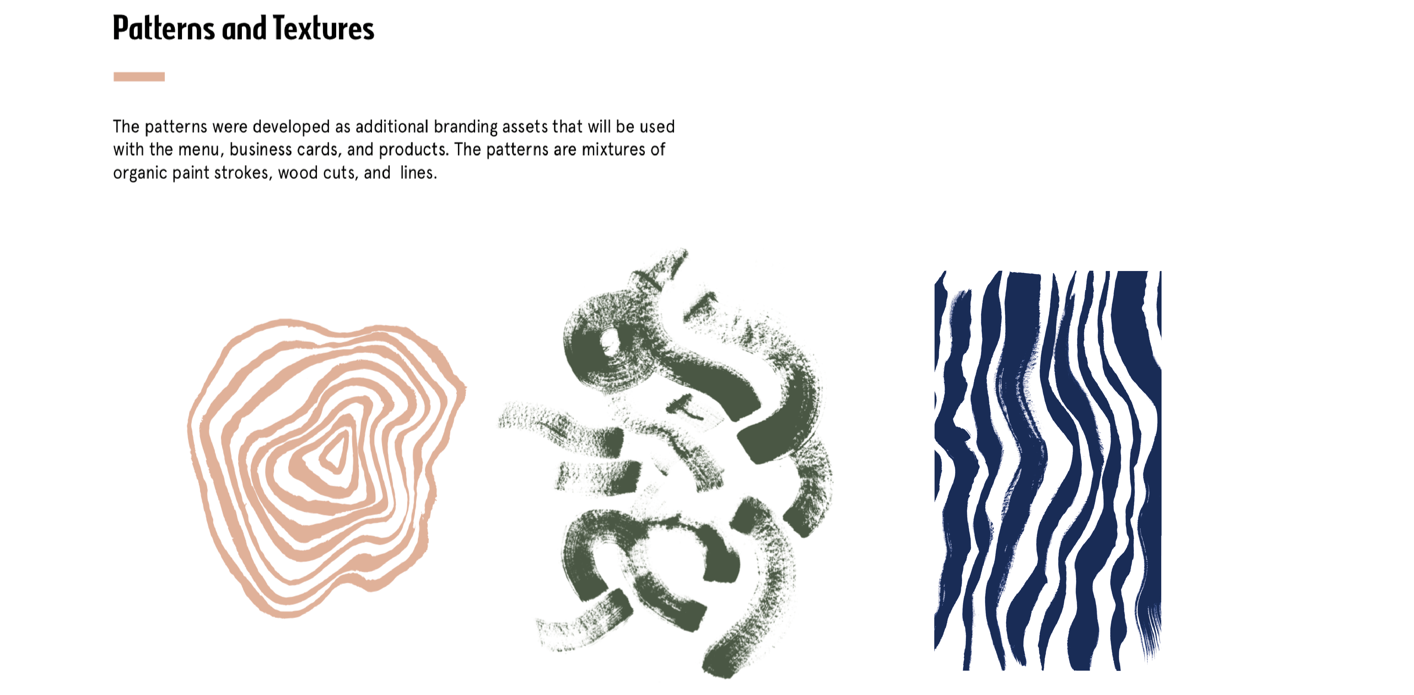
I used Adobe Illustrator and Photoshop to create this brand identity. I started with 50 hand-drawn logo sketches, then brought into digital iterations. Then I decided on patterns and textures. I wanted to play with organic shapes and brush strokes because the restaurant was made from natural resources.
The overall response to the project was positive. The things I would change would have been I may have committed too early to a logo. I learned a lot from this project considering this was my first rebrand. The logo, stationery, and product deliverable were all new to me. I had to create an identity that would be fluid and recognizable throughout the branding.
I love the chic design!