Republica Pet

Based on the idea of offering an adventure for the pet, we combine the seriousness of the service with the fun it delivers.
The result is a brand that put the pet as the protagonist of the experience in a friendly and fun way.
I think every time a pet leaves a house it looks for them like he will go on a trip, an adventure through the world.
And going to the Republica Pet it isn't different from that. He will play all day, eat, bath and all the other good stuff
pets love. So I translated that feeling into the logo.
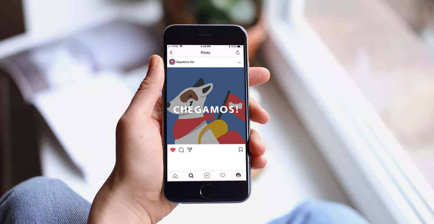
The dog has a travel bag and a bandana so he can look cool and adventurous. The flag represents the republic, an ideal,
a mindset of freedom but at the same time the feeling of group because he will unite with other pets.
The rounded type and the round edges on the dog were chosen to give the feeling " We are not a square company.
We want to be different, be friends with your pet. "
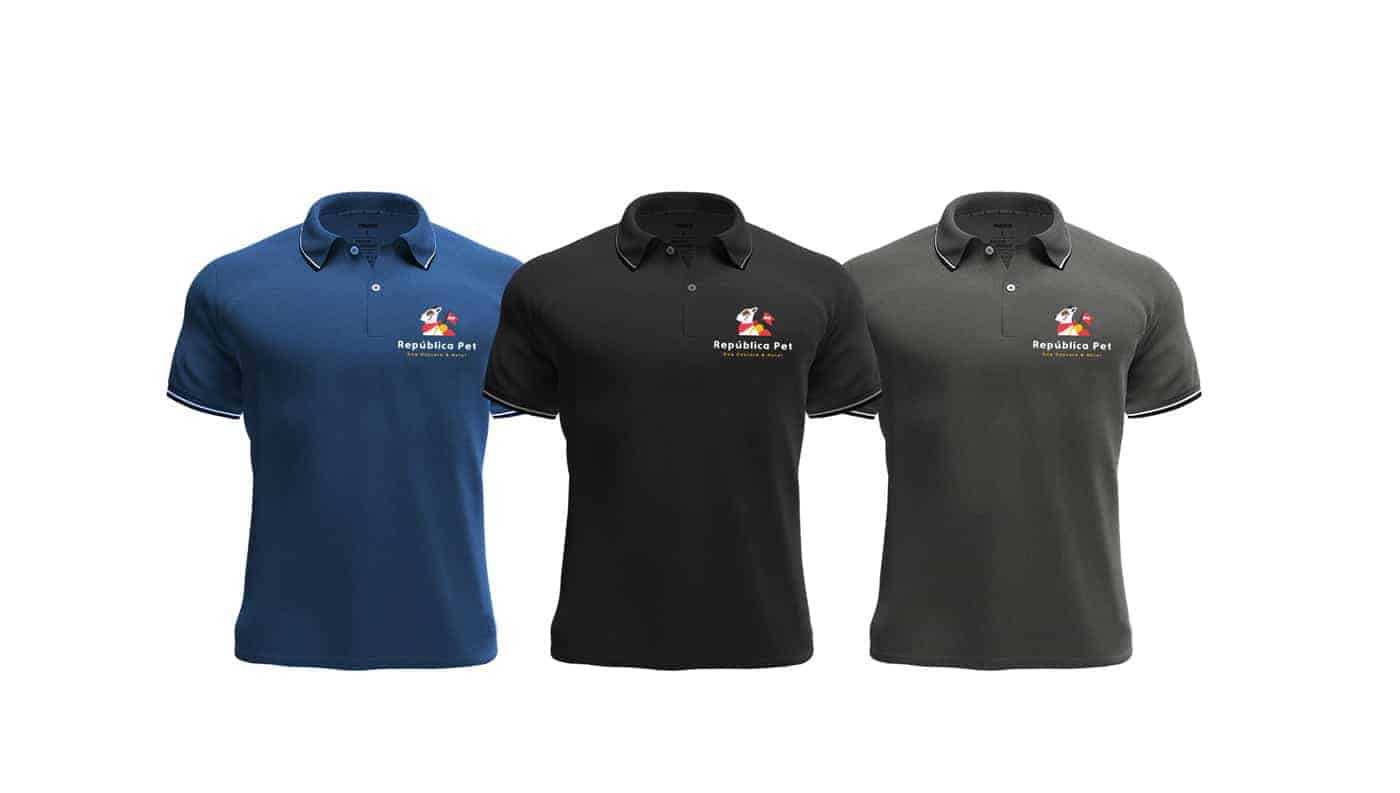
I choose basic colours to represent that Republica Pet is open to everyone and it looks fun and joy.
The black comes to combine this fun with the refinement of the service.
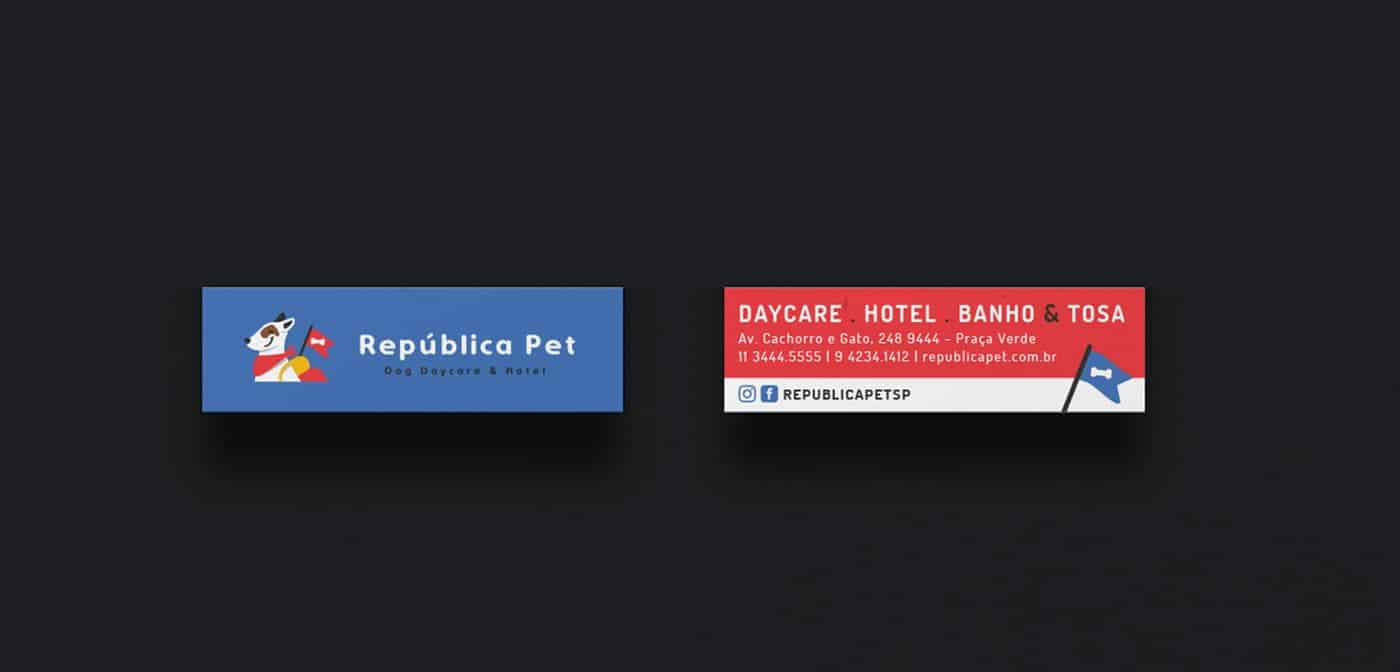
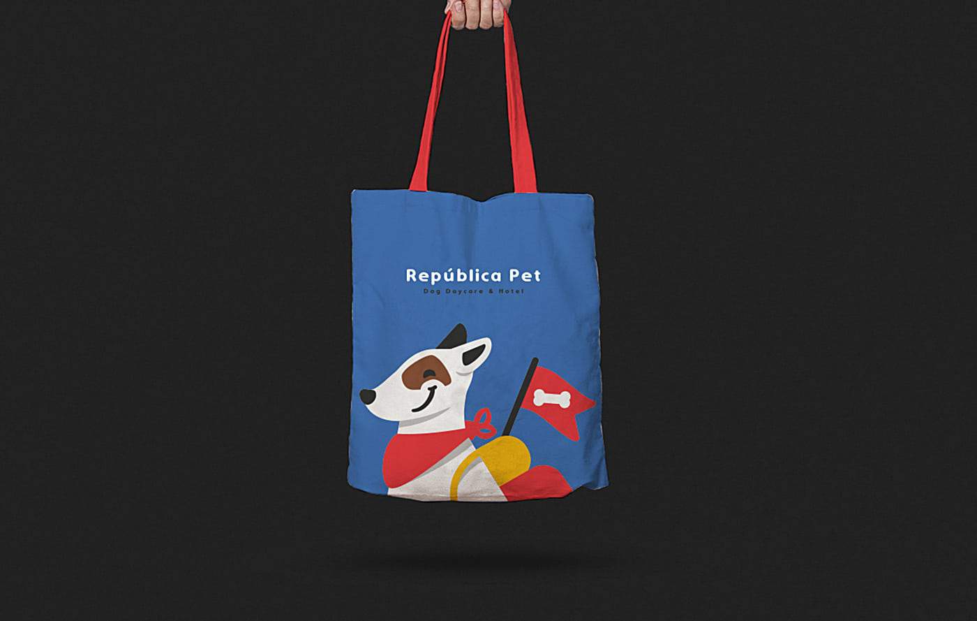
To make this project come alive I have used pencil, paper to draft my ideas and then I brought to digital. I even bought some pets related magazine and did some collages to stimulate my creativity. On pc I used my wacom tablet (old warrior Intuous 4 ) and Adobe Illustrator
Everyone loves Republica Pet. They have been open for like 6 months (They open in October 2018) and already
has a huge public! The owners said that the branding really impress the public.
Well this project taught me that we have to believe in our ideas and be confident with our style.
The owners were a bit afraid to approve the material because it looks so different (may I say BETTER lol)
from the competitors.
But in the end, they trusted me and everything went really great.
Keep up trying to do your best and bring your heart, mind and soul to all your projects <3