Sake Ok—A Hybrid Creation

Re-defining the preconceived notion attached to craft beer consumerism. Finding new means of distribution the audience is able to connect with the idea of tactility expressed through form.
A hybrid creation brewed and bottled in Northern suburbs of Melbourne, gentrifying a stereotyped and saturated market.
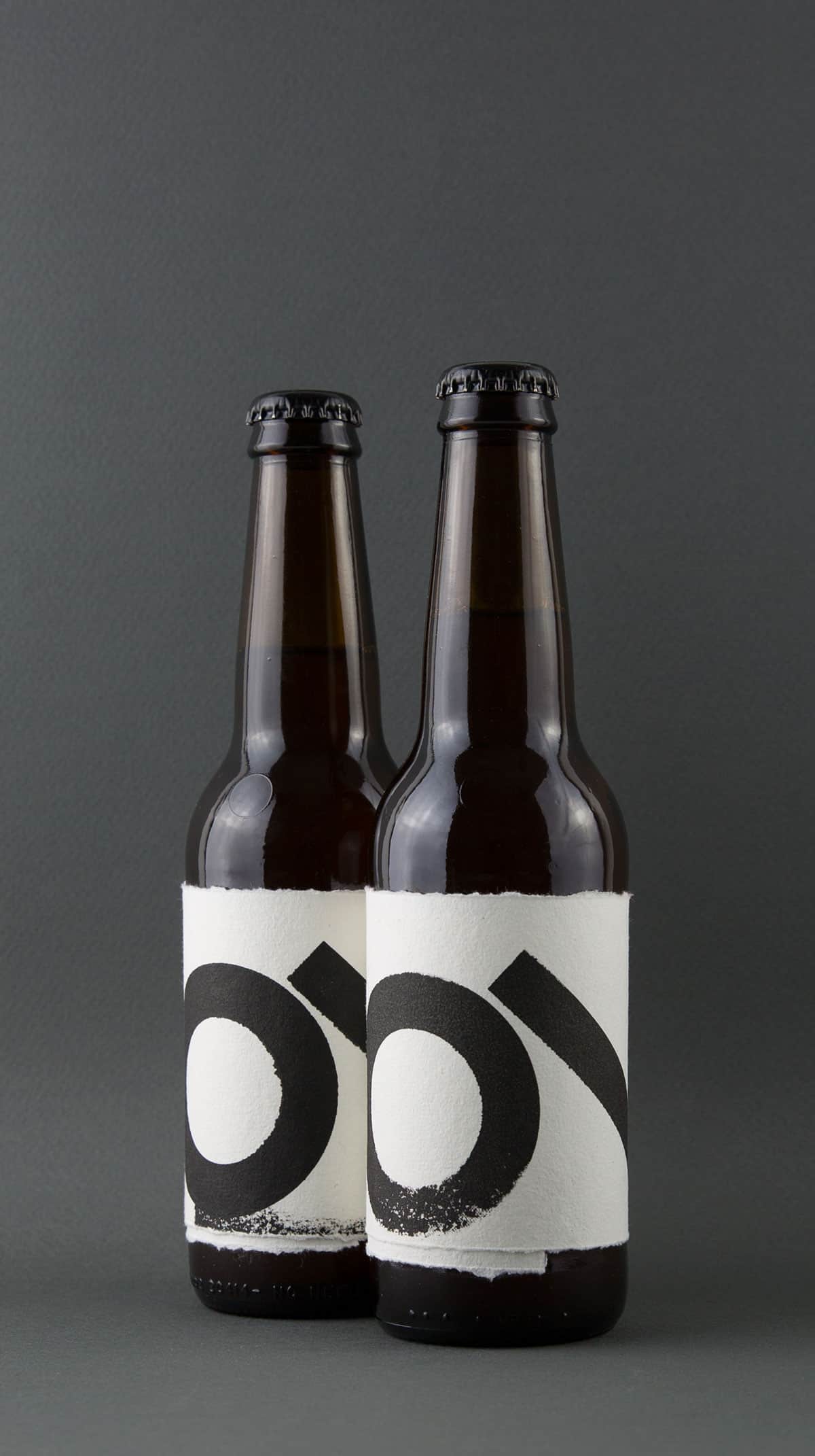
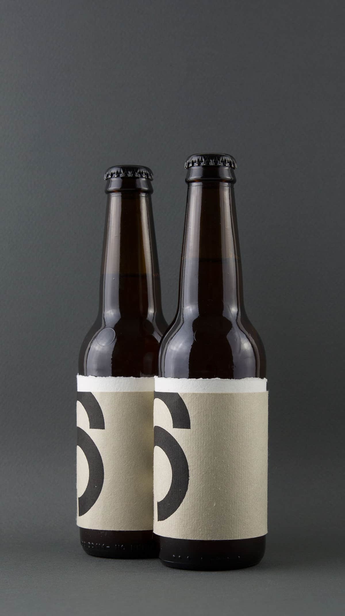
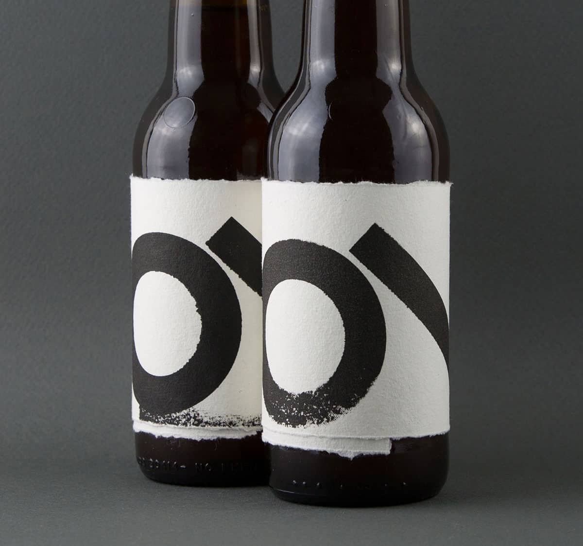
The style and material are a direct reflection of the brand ethics and philosophy. The high contrast tactile design aimed to stand out against the monotony of many labels. Again the colour rely's heavily on the tactile contrast between paper stock chosen and method of application.
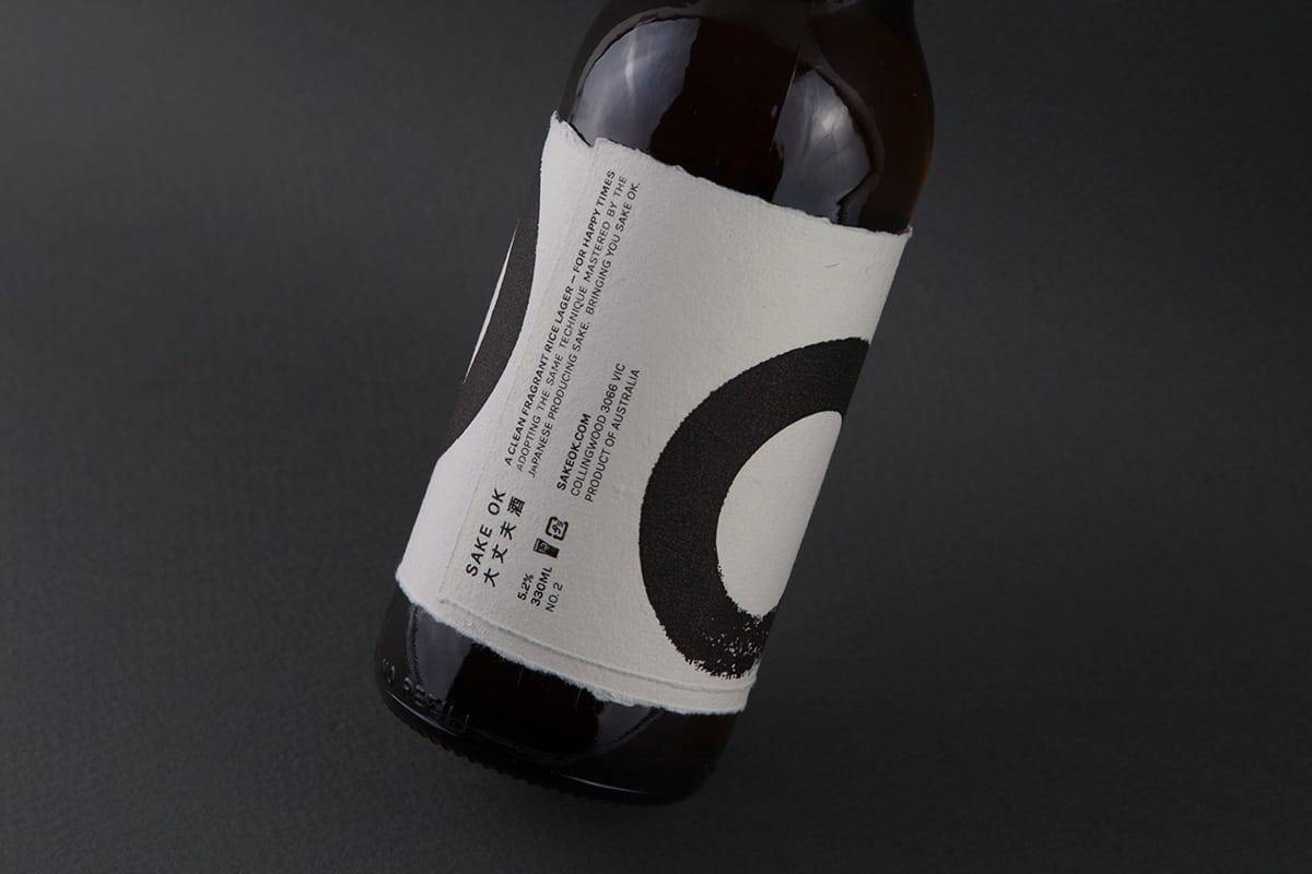
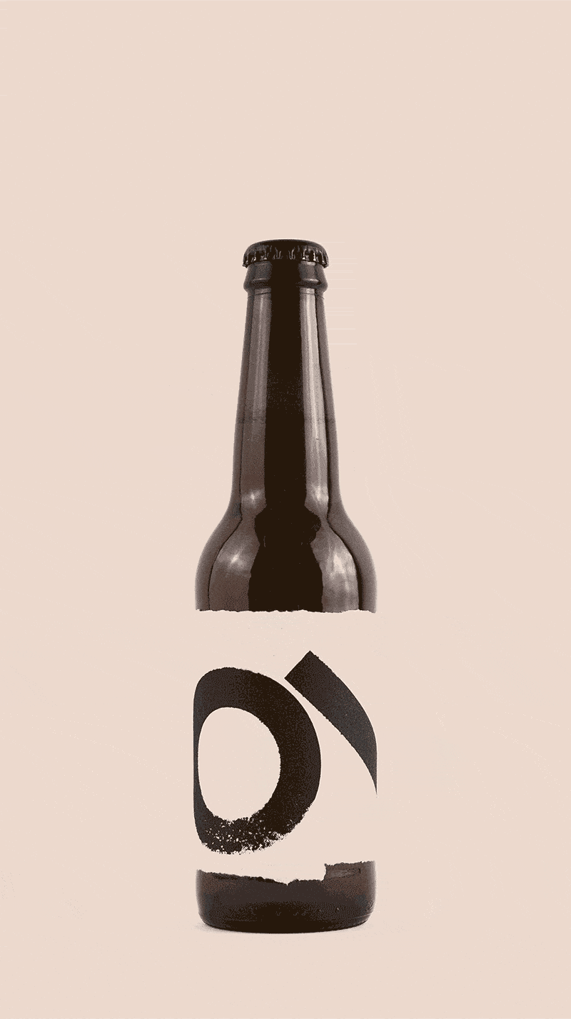
Hardly any software. I wanted this process to be organically shaped. Starting with hand drawn sketched, exploring shapes and patterns. In between I used Indesign sparingly, and Illustrator for some clean lines before sending the design to a laser cutter before being printed. The final result is a screen print onto a 100% Japanese cotton label.
The response has been positive, people appreciate the direction taken. I think it was the right time and a much needed change from the ubiquity of the current market. By bringing in varied cultural influences it creates a natural intrigue. The idea that the beer is not necessarily stereotyped to one nation but does have subtle references.
Really nice design, I admire how you take its history into consideration.