Sakura Cosmetic Oil
Sakura is a cosmetic oil brand specializing in creating organic oil. Inspired by Japan tradition, Sakura makes one of the most organic oil, completely safe and usable for sensitive skin type. The scope of the project is to develope a identity which looks modern and traditional at the same time, it needs to be inspired by Japanese culture and shows the natural feel.
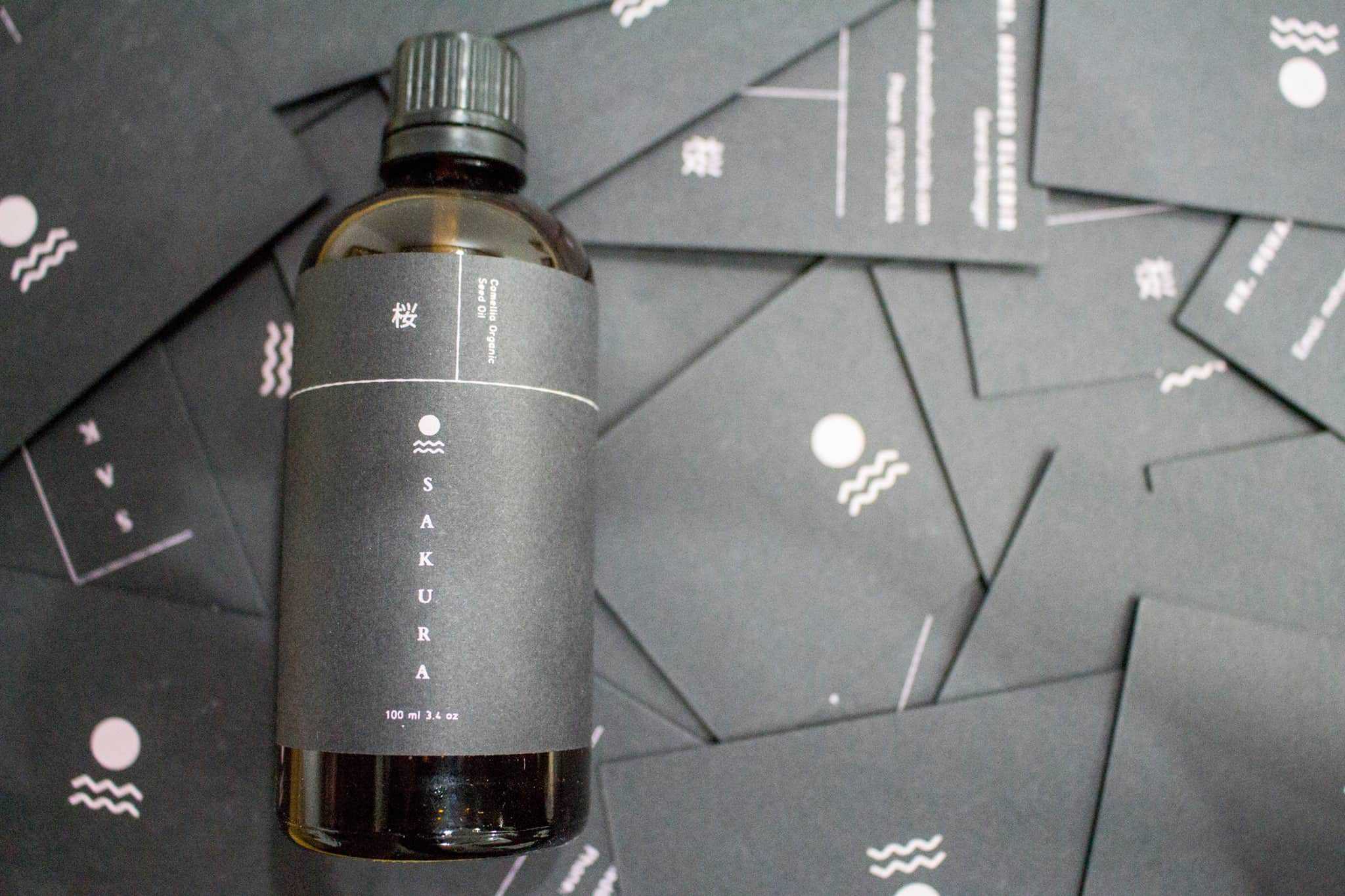
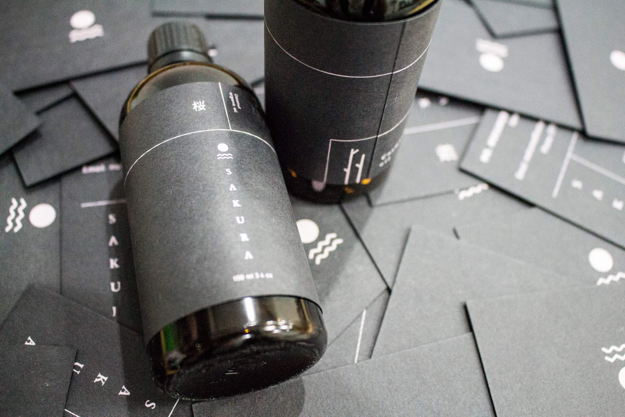
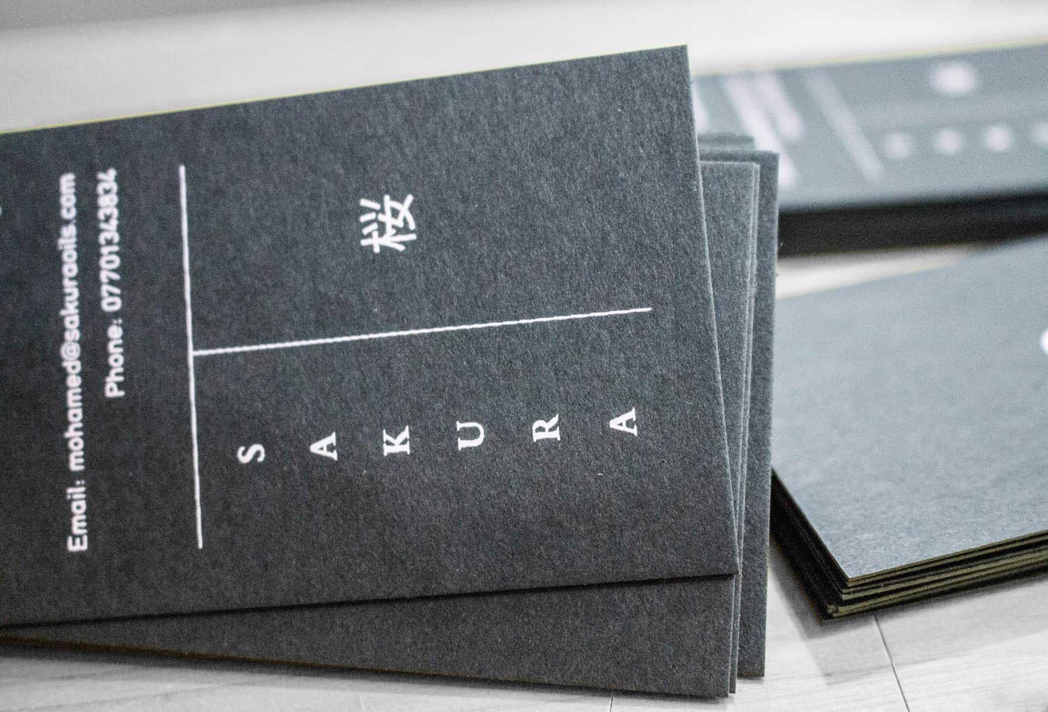
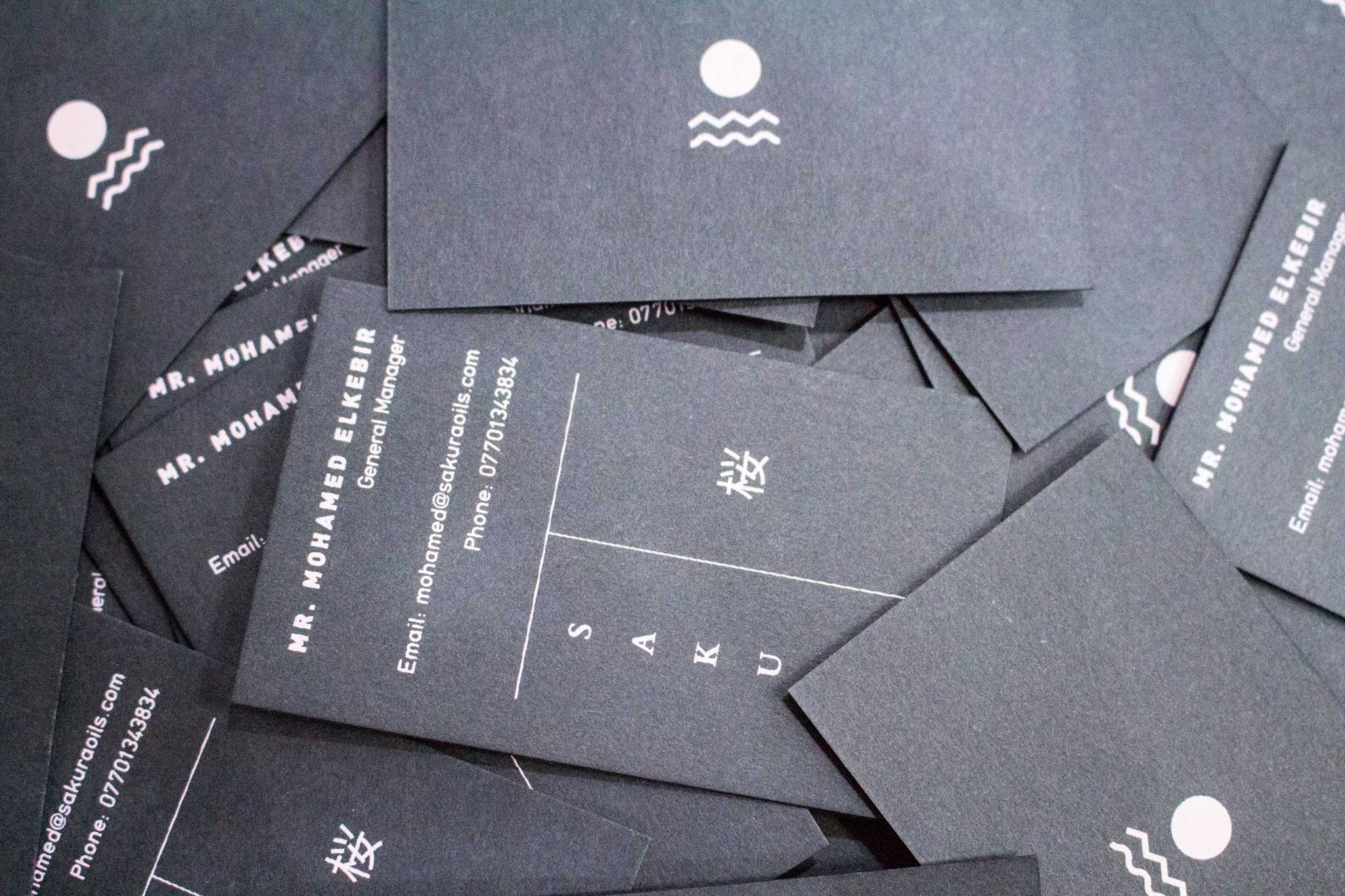
I come up with the idea by researching for traditional paintings of Japan. The Great Wave caught my attention. I tried to simply the element I see in the painting. The logo was finally constructed from the wave, the Fuji mountain and the Sun. The color resembles the color of Sakura flower (cherry blossom). The paper was also chosen carefully. By emphasizing on the texture, I want people to feel the roughness and natural surface, just like the products came from the most natural source of life.
I use Ai to draw everything. First I scanned my sketch in and then I outlined it. It didn't take much time since the idea was already there. Most of the time I tried to adjust the length and the thickness of the lines.
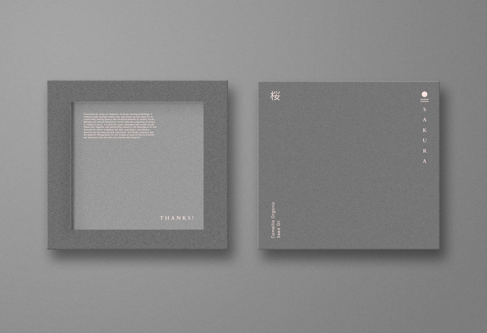
The client absolutely fell in love with the project. Other people too, they said they love the simplity of the design. And also the paper choice for cards and labels. I used screen printing on the cards and labels so they look quite natural and nice, it's not so visible but it really helps the design.