
San Mateo | Frozen Seafood by Freddy Agostini

Frigolab San Mateo is a privately owned company located in Manta, Ecuador and is a member of the Alfa Gamma Group a conglomerate of seafood companies which operates seven facilities and fishing fleets in Ecuador, Panama, Peru, Suiname, Mexico and the United States. San Mateo has been in business for more than 20 years engaged in harvesting, processing, exporting and marketing fresh and frozen ocean-caught seafood. Read on and enjoy this great art set!
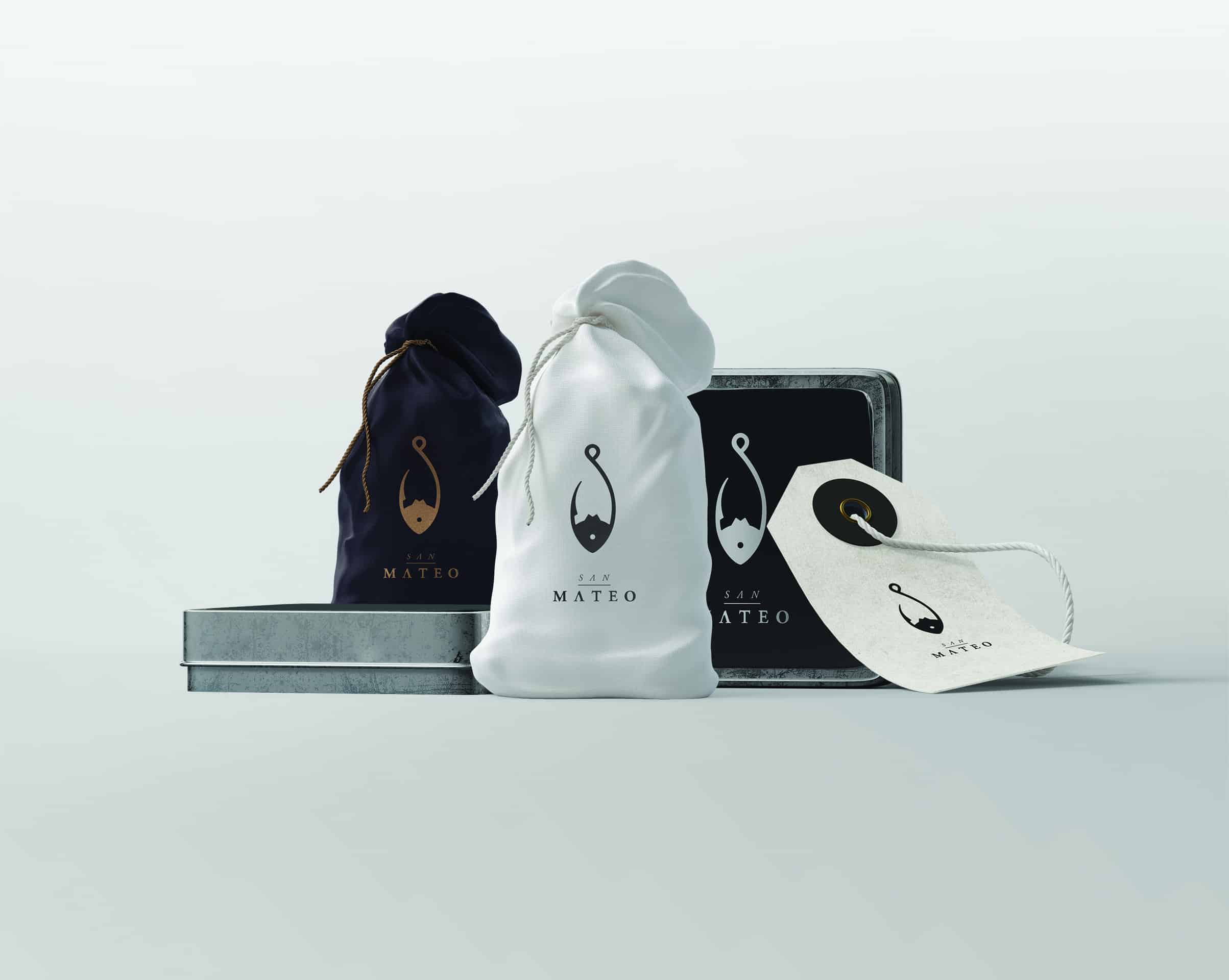
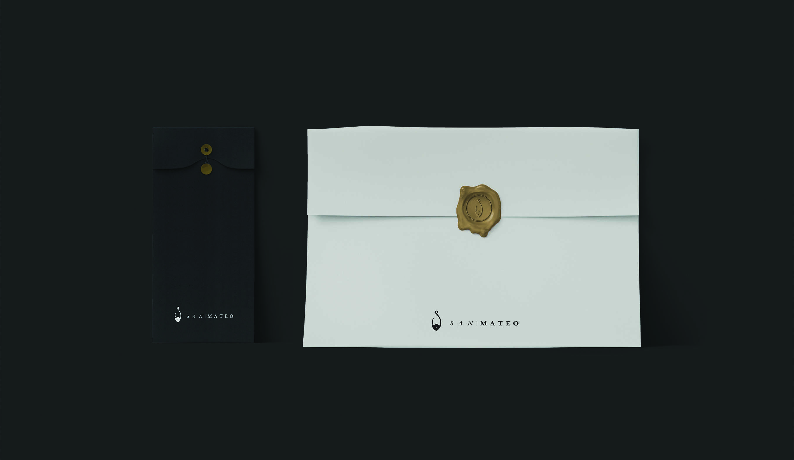
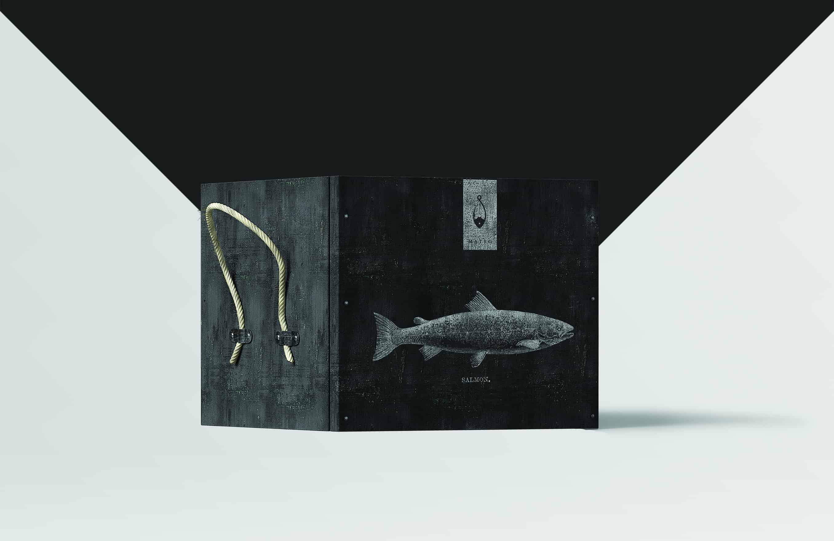
Our task was to develop the logo for its own frozen food products “San Mateo”, a new product to be commercialized in supermarkets. To gain a wider understanding of the identity in Ecuador this logo had to stand out from the rest of its competitors, and allow an easy recognition for it’s upper middle class customers.
- Freddy Agostini
It's kind of a funny story, it was my final project in my old job. It was one of those one night briefs that you had to do finish it as quick as possible, but I took my time, it took me about 5 - 6 hours to finish my final version of the logo, my creative directors and of course the client loved the logo. Couple of days later due to personnel downsizing I got laid off, so I decided a week later to publish it on Behance and got tons of great feedback from the community, the logo will be published on a logo book and a couple of job offers.
- Freddy Agostini
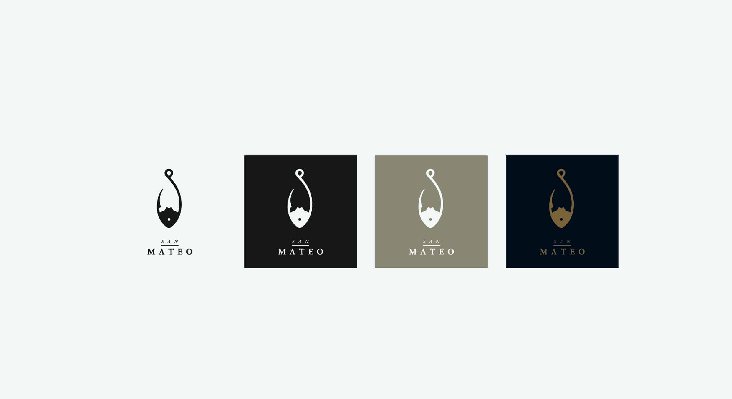
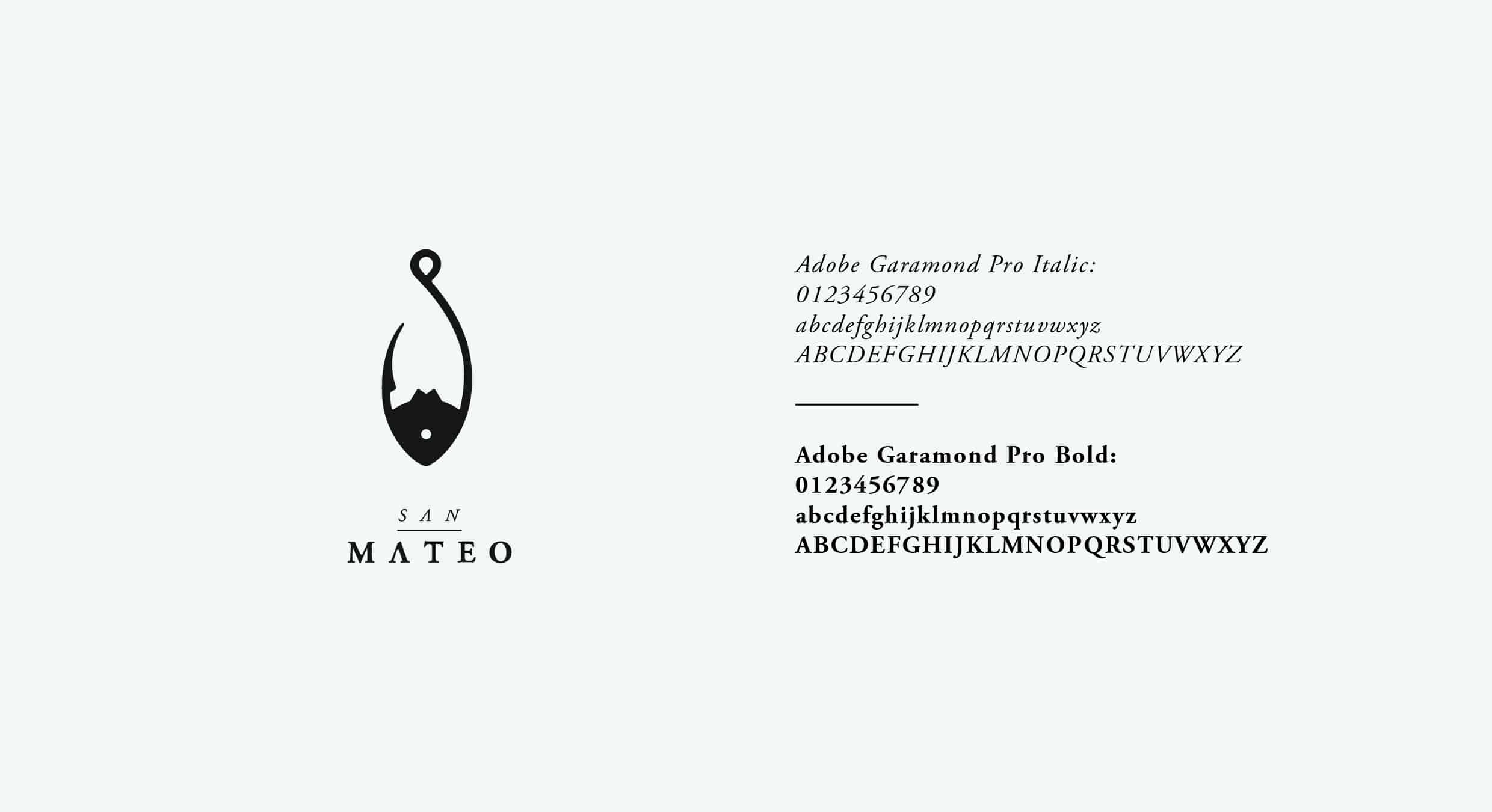
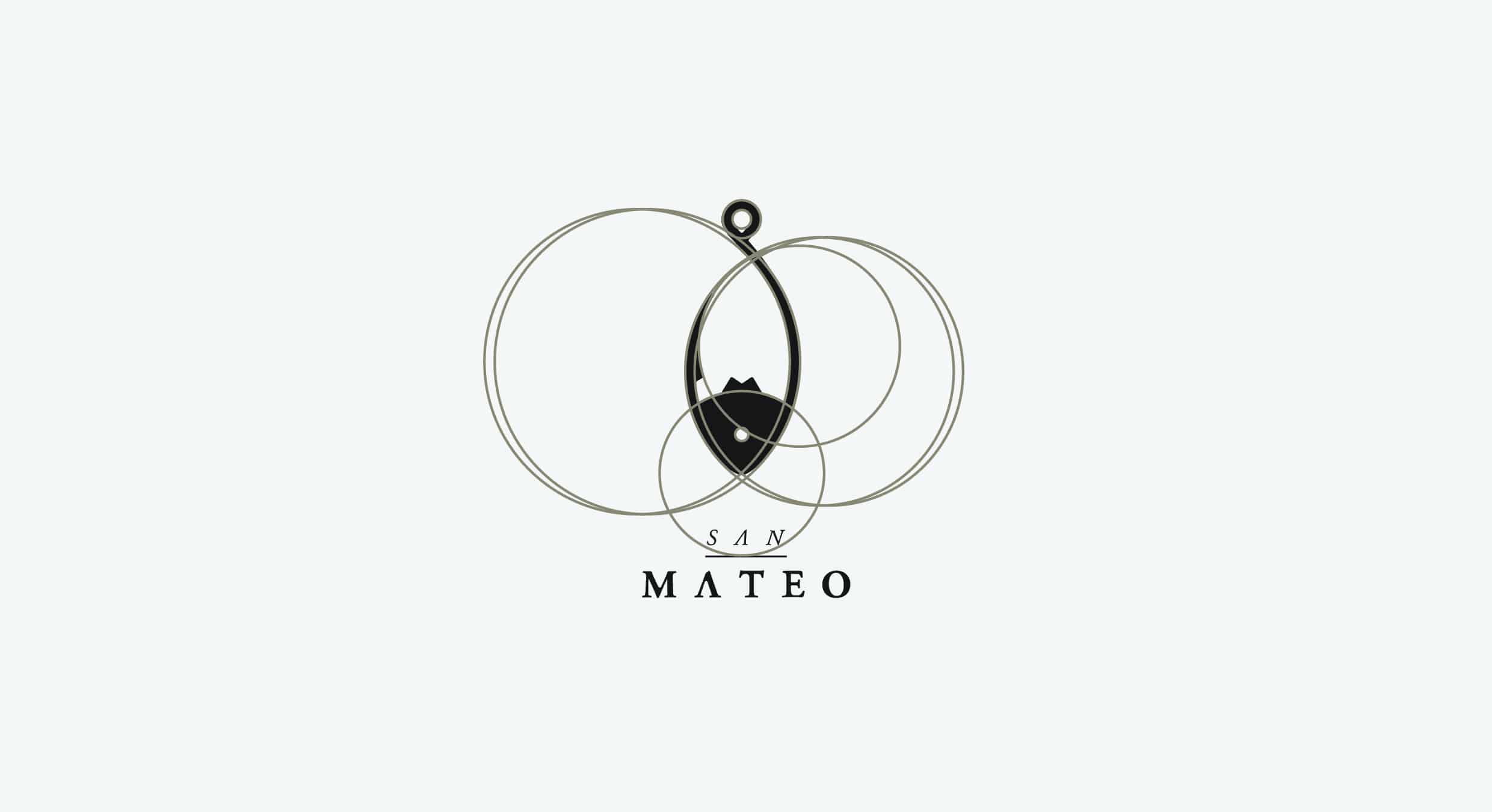
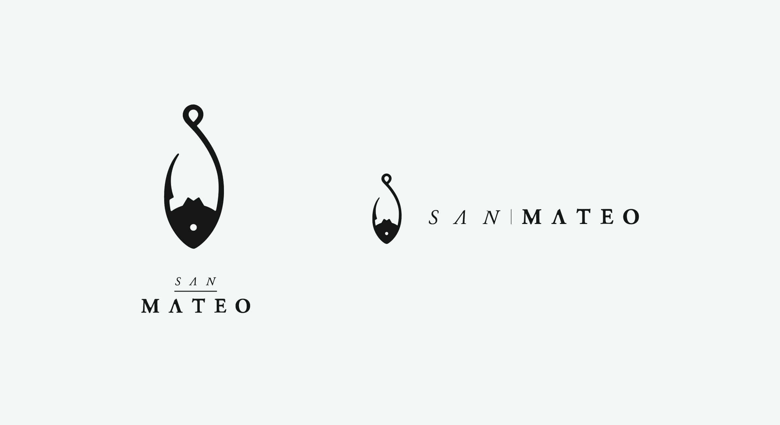
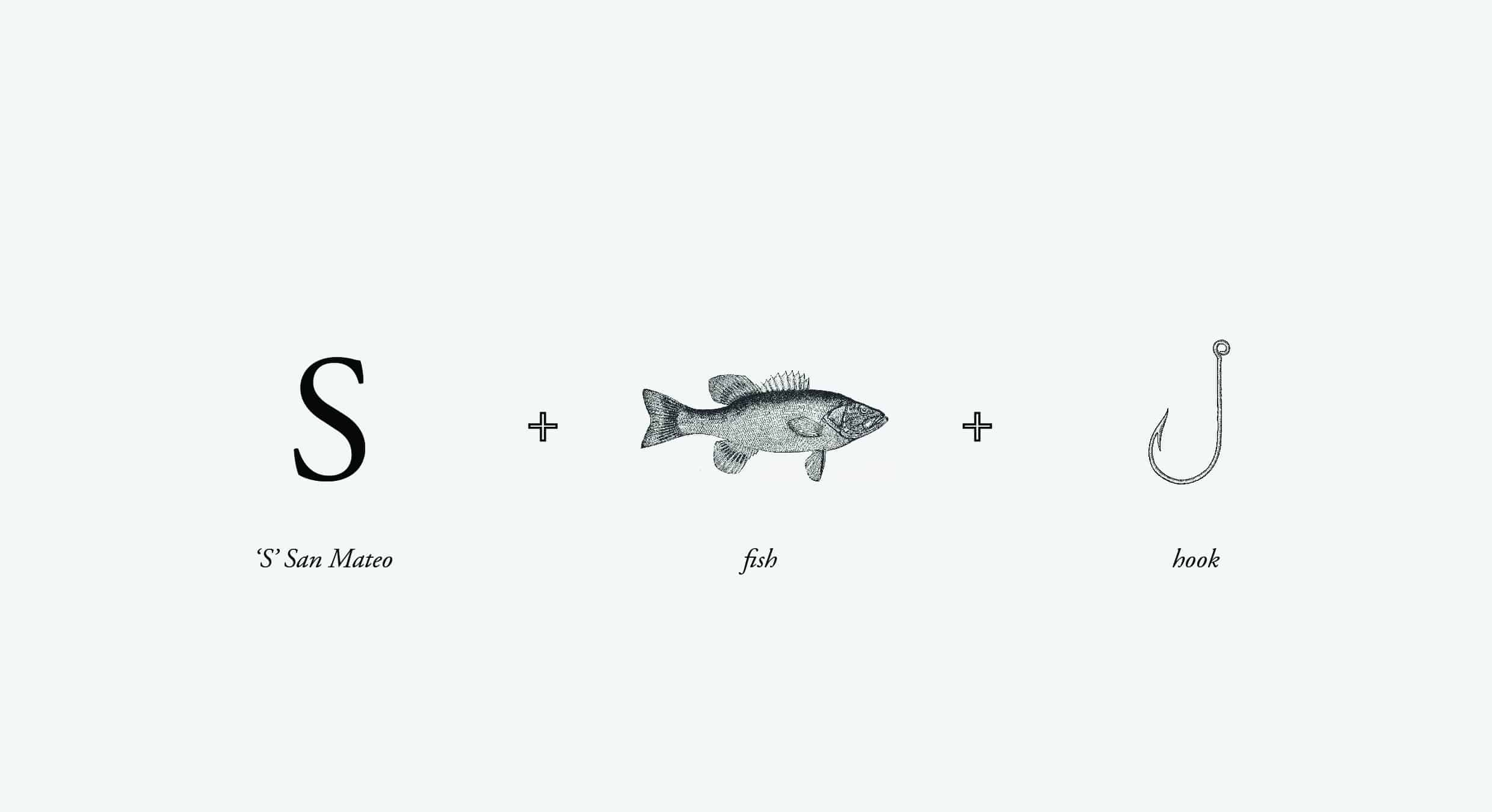
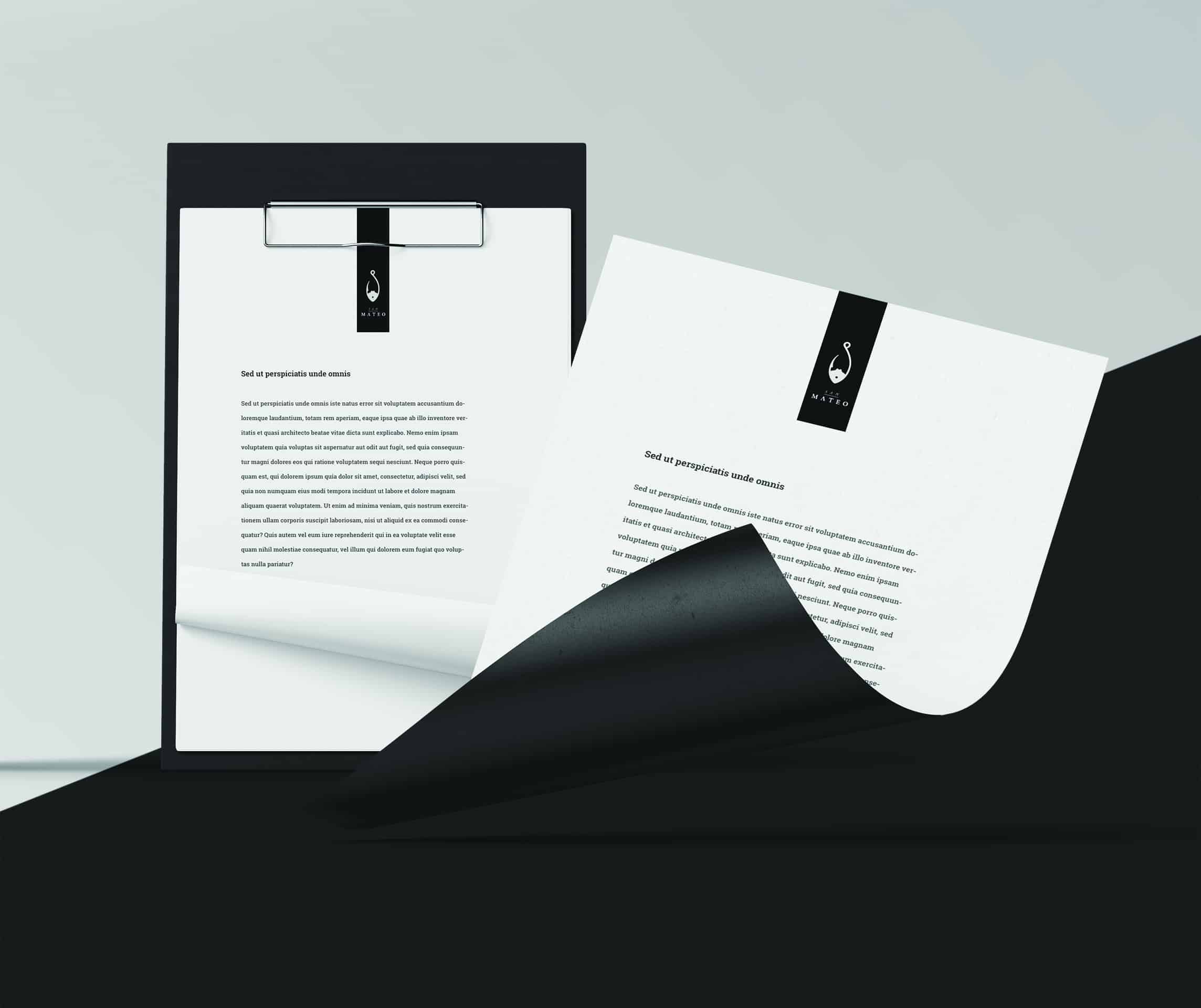
During the design process, we focused on achieving 2 key qualities: simplicity and legibility. There are many ways to create a visual identity for a brand. Minimalist and negative space are growing trends that favors simplicity and clarity over excessive ornamentation. Minimal designs puts a brand and its message before form, allowing for better recognition and easier communication with their customers. We paid special attention to the design of a fresh and unique logo; conceptually using the S of San Mateo as a hook, and it’s negative space as a fish shape which promises new discoveries, achievements, harmony, and unity.
- Freddy Agostini
Started with the usual paper and pencil for a couple of hours until I got my final draft. Then I scanned the paper and started working with the grid on Adobe Illustrator.
- Freddy Agostini

My favorite quote is "Do. Or do not. There is no try." -Yoda
- Freddy Agostini
ABOUT FREDDY AGOSTINI
Freddy Agostini is an Art Director and a CGI visual designer, effective in 3D visuals, ad campaigns and branding. He has a Bachelors degree in Graphic Design and Advertising. He is creative and resourceful in generating new ideas and solving problems, confident and decisive under stressful conditions. He was born in the USA but is currently residing in Ecuador. See more of his artworks in Behance.
This is just lovely!
Clean and simple.
It really fits the brand.
Good job on creating the logo. Fits the brand.
Awesome work!