Segals Fruit Solutions

Product Labels, Print Collateral, Bottle Mock-ups
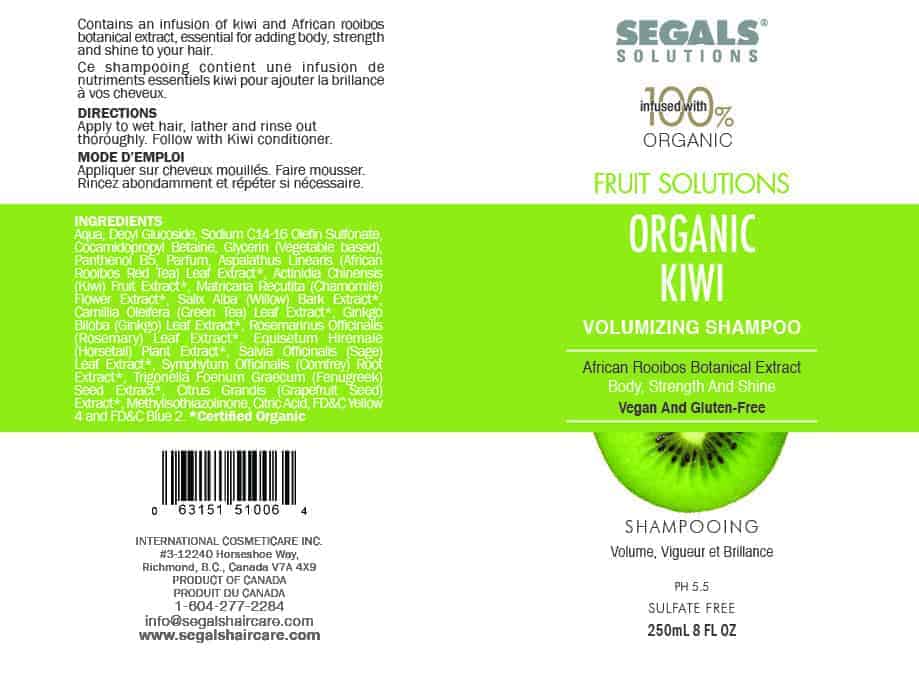
Segals Solutions is a professional salon brand whose key formula was founded by Chemist, Lou Segal while visiting South Africa. Lou accidentally discovered a tribal ritual remedy that helps grow thicker, fuller & stronger hair.
Objective
To create a vibrant, fresh, fruit-focused bottle label and sub-brand.
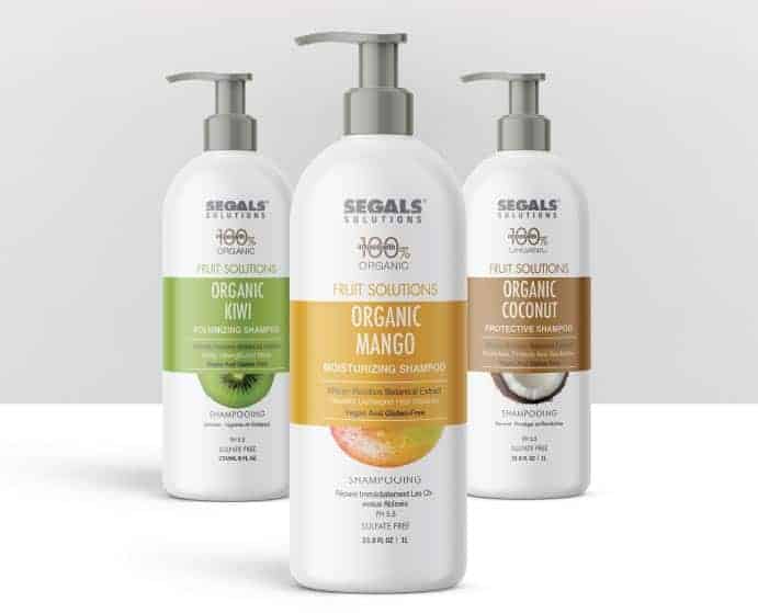

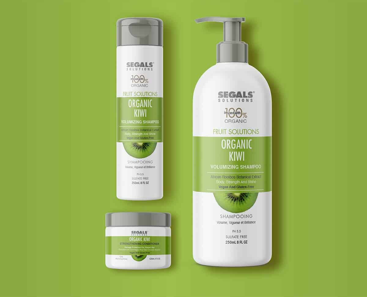
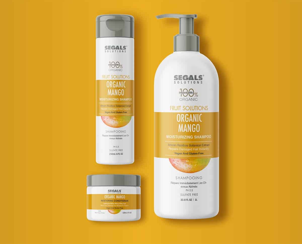
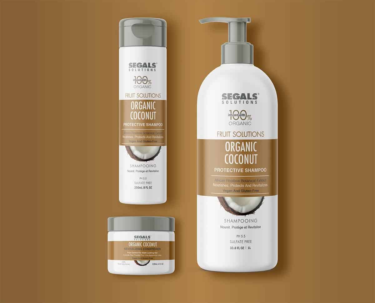
The fruit-infused ingredients and vibrant colours native to the African tribe inspired the brightly colored label designs. I chose to use white bottles since the label would be printed as a rectangle sticker rather than be printed directly on the bottle. Sticker labels allowed for significant print savings. The lids are dark grey to coordinate with silver lids used on other Segals product bottles. The dark grey gave the product a slightly higher-end feel.
During the design process, I primarily used Adobe InDesign and Photoshop. My layout program of choice is InDesign so most of my time was spent working in InDesign to make sure the type and label artwork elements lined up correctly. Once the bottles were ordered, a series of test prints were cut out and taped on the bottle to make sure text was legible and the design looked as expected. After the labels were printed and applied to the bottles, Photoshop was used to create mockups for marketing purposes.
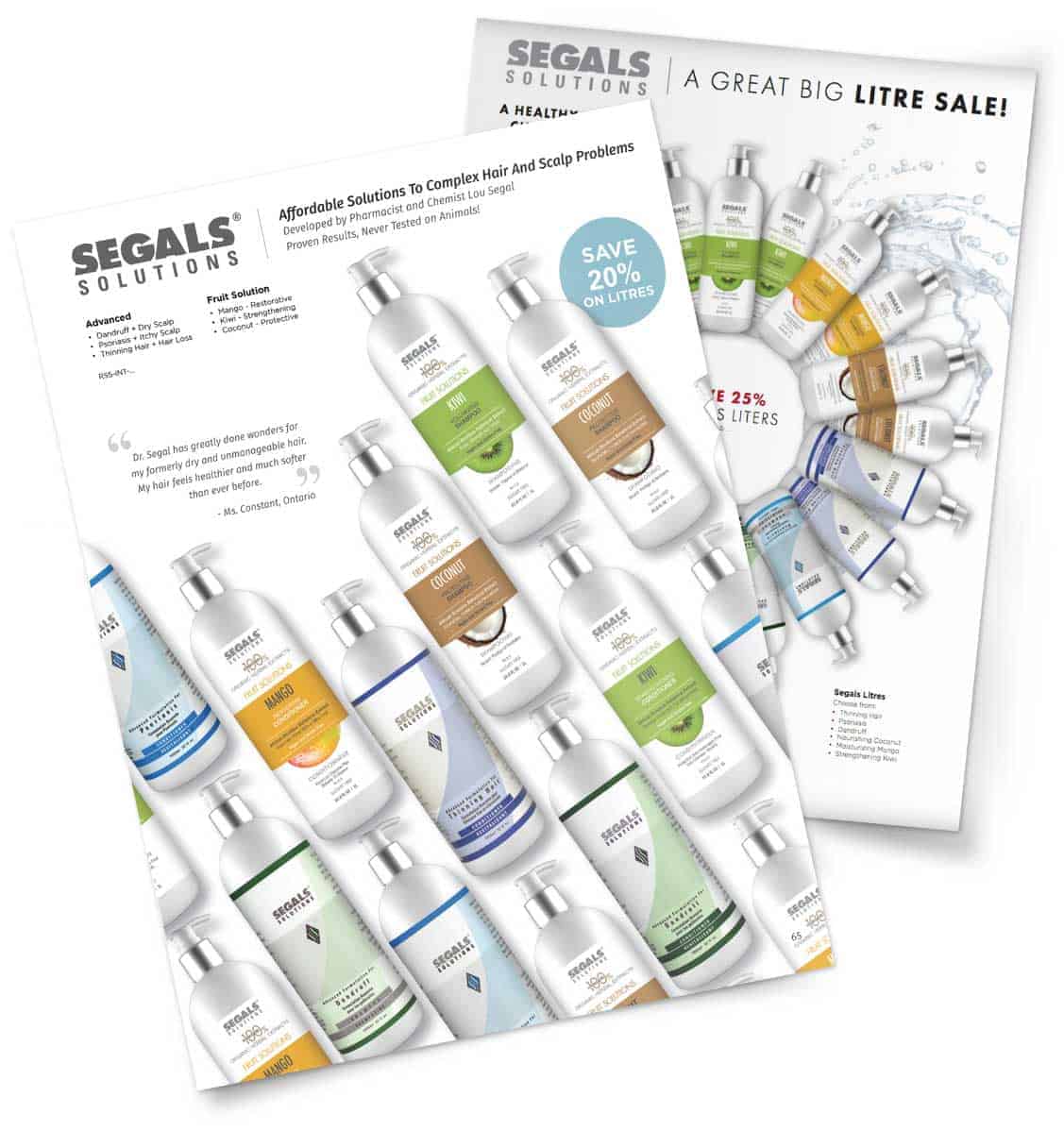
The response was very positive from the client and customers. Most feedback included positive comments about the clean design and bright colours.
This project helped me realize that it's best to know all of your label sizes ahead of time so you can plan your design accordingly. I worked on the 1L (largest) label first and had difficulty creating a much smaller 4oz (smallest) label following the first design.
I like the design, something that I'll probably pick up at store :)