Sibir

It is thanks to the Erasmus experience that I discovered in Poland a cultural reality completely different from the Italian one, rich in a thousand facets and highly innovative aspects. Looking at it, the idea of the thesis was born and in particular the desire to "import" a new product not present in our territory. The construction of a brewing company with very marked and original aromas that echo the taste of sour cherry. This drink is ideal for the summer and is also pleasing to a female audience.
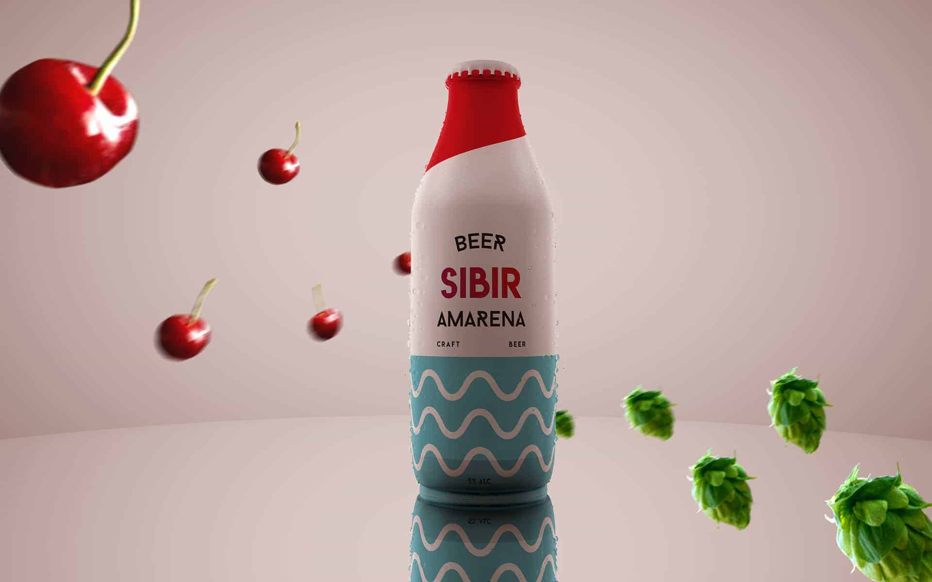
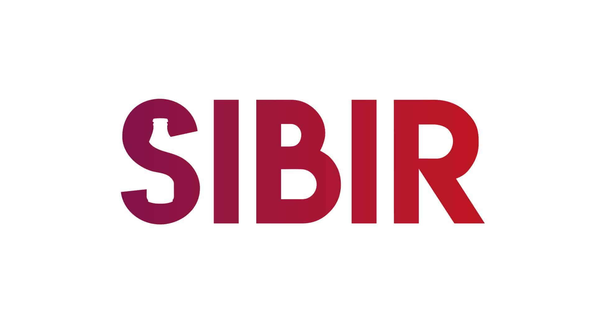
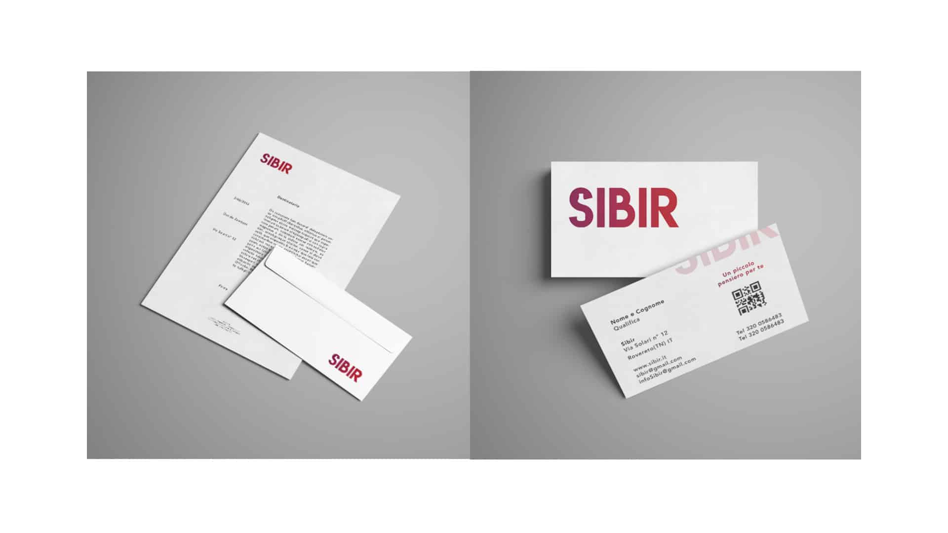
The logo is made in a minimalist style, The newly brewed beer will have a fancy name: Sibir. Recalling the English linguistic sounds to define the term sea, "BIR" clearly suggests the idea of beer but together with the previous sounds it leads one to think of cider, a sweet drink made with fruit. Finally, the term Sibir evokes a particularly sweet female image.
The colors we have chosen for our logo are mainly two: purple and red (and the nuances between the two). Violet was chosen because it is a color used for revolutionary products, it is very appreciated by women because it recalls the nature and color of many flowers.
Red symbolizes strength, passion and in the food field it recalls sweetness.
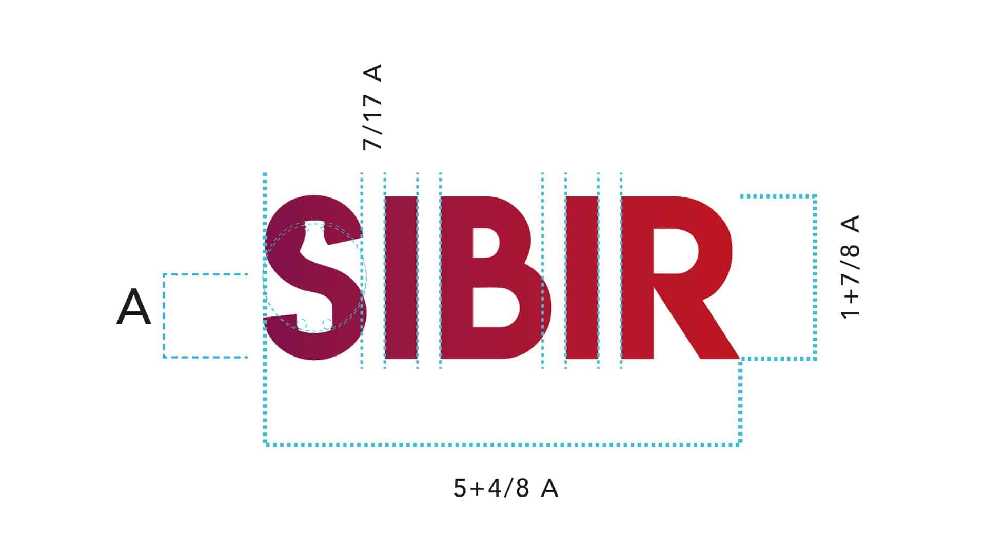
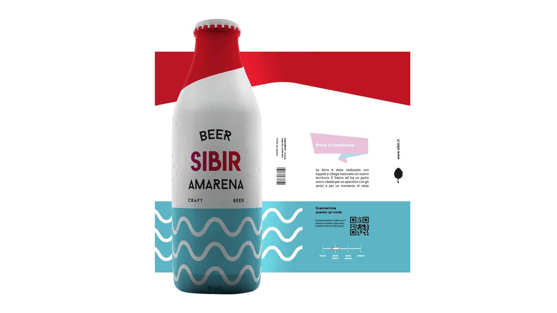
First of all I started with the search for competitors, and after a careful study I identified a target not yet covered. Then I started with pen and paper, and once I created the logo and the label in Illustrator I used Cinema 4d for the realization of the finished product.
The feedback has been very positive, I tried to put all of myself into this project, and trying to create a truly functioning product on the market. It is thanks to Erasmus, and the meeting of new friends in art academy that I have grown personally and professionally.
I really like this packaging <3
Thanks Jane,
I leave you the link of the presentation on behance where you can find more material on this project. :)
https://www.behance.net/gallery/79789107/Sibir-Brand-Identity-Bachelors-Degree-thesis