SígueMED | Brand and Identity

This project was for the SígueMED Clinic located in Aguascalientes, Aguascalientes, Mexico. Its services includes a comprehensive plan to the family centered on prevention, diagnosis and timely treatment of diseases in the stages of life.
The client required a professional brand design that allows him to have a better position in the field of the medical health care.
![]()
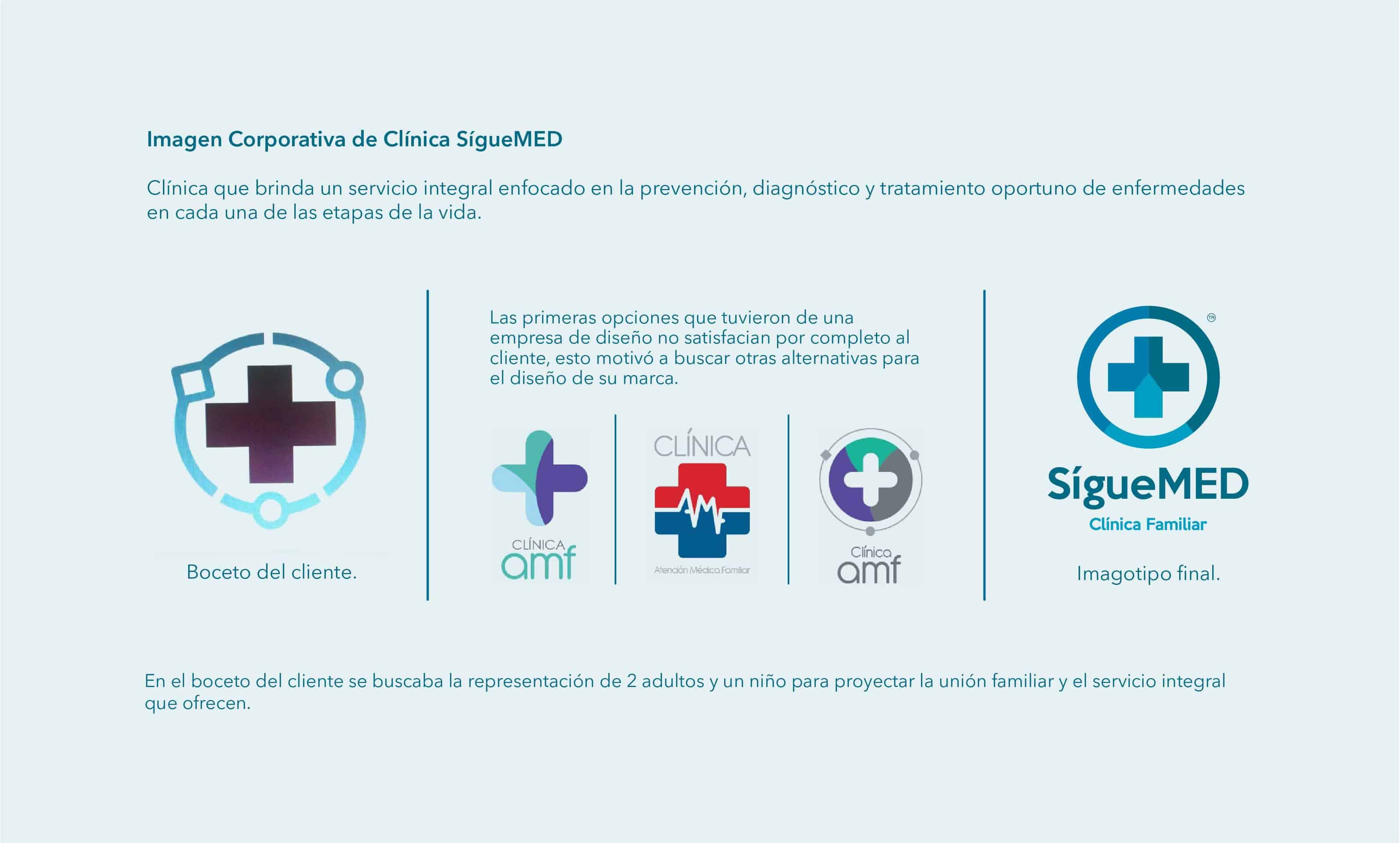
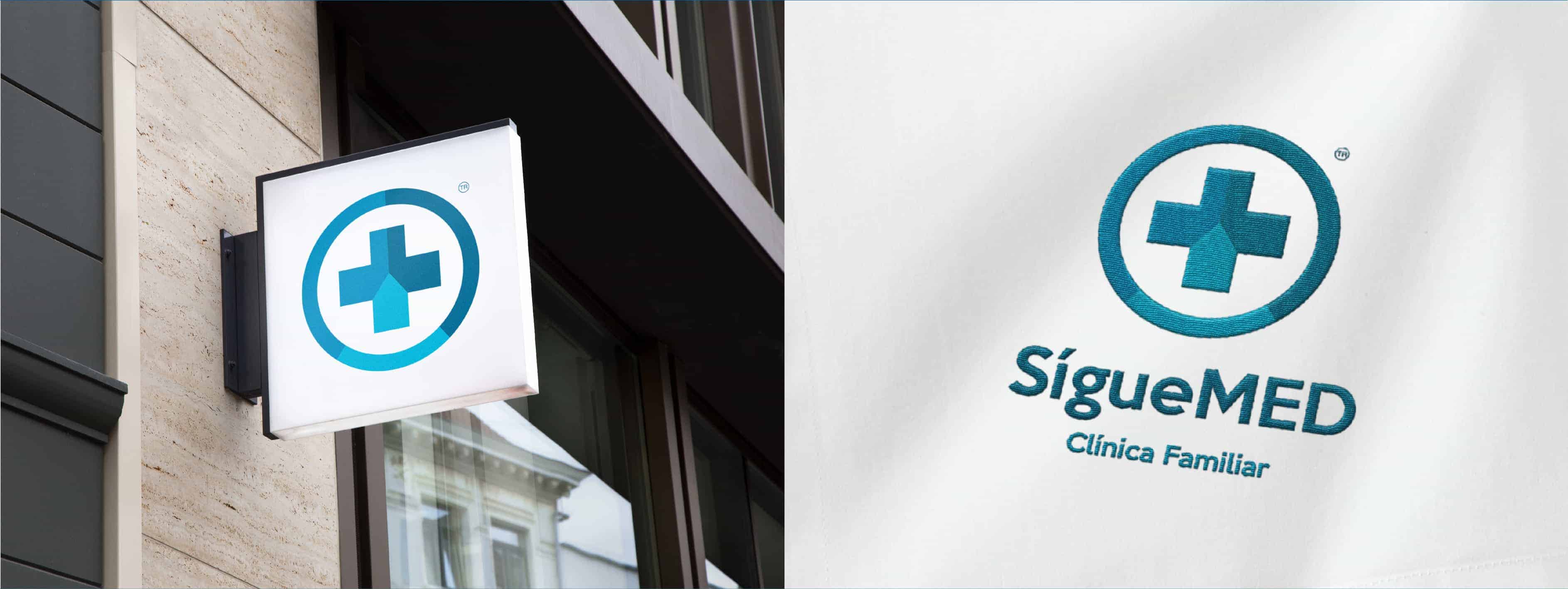
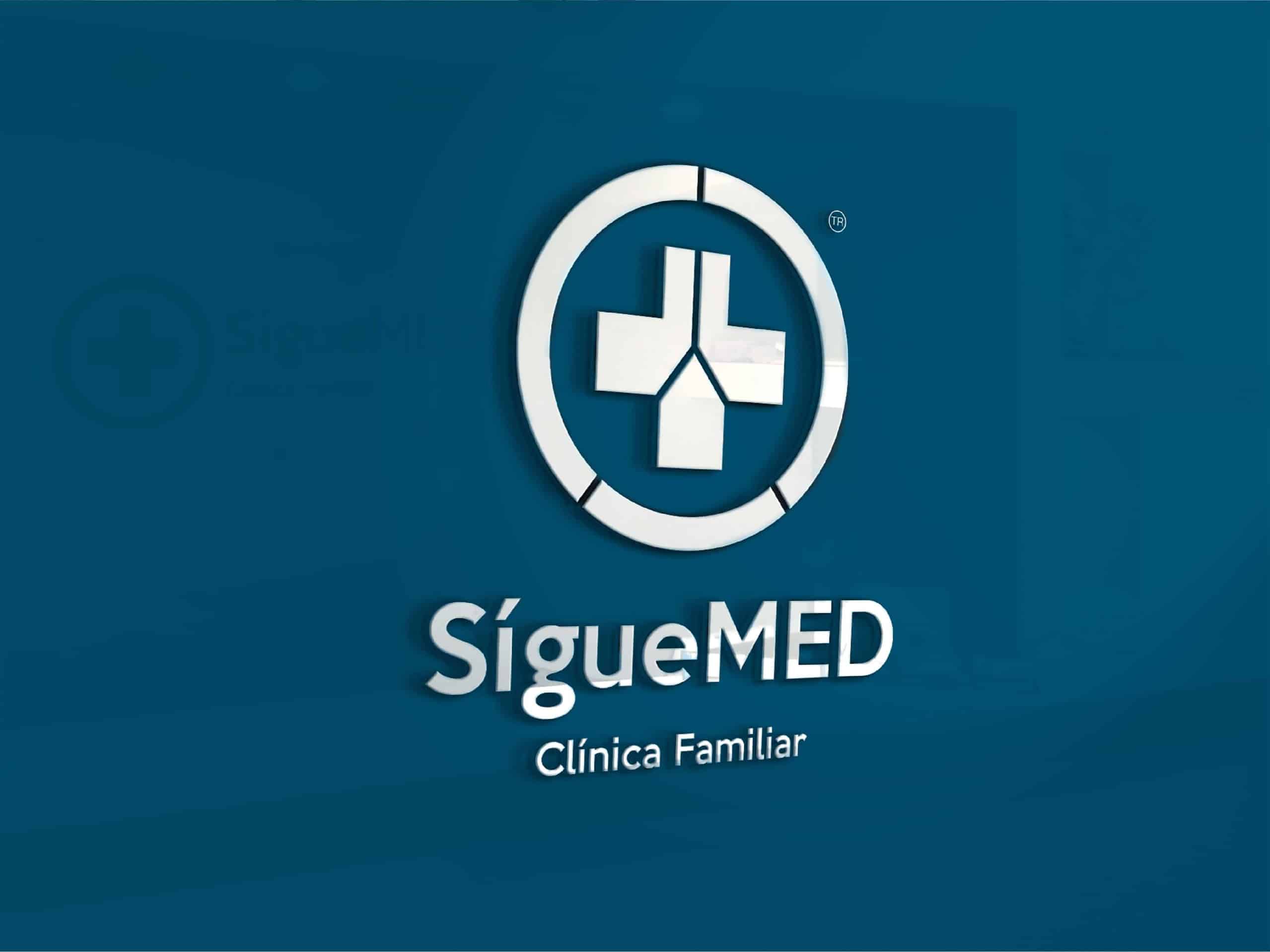
The client was looking for a way to represent 2 adults and a child to project the family union and the integral service they offer. So we worked for an Isotype, a circle of union with a cross in the middle (which is the world representation of medicine) in three variants of a blue color, 2 tones on the sides and a small one below to give the representation of the parents and one child.
The blue color was chosen because people identify it with clinics and hospitals, it represents health, healing and tranquility.
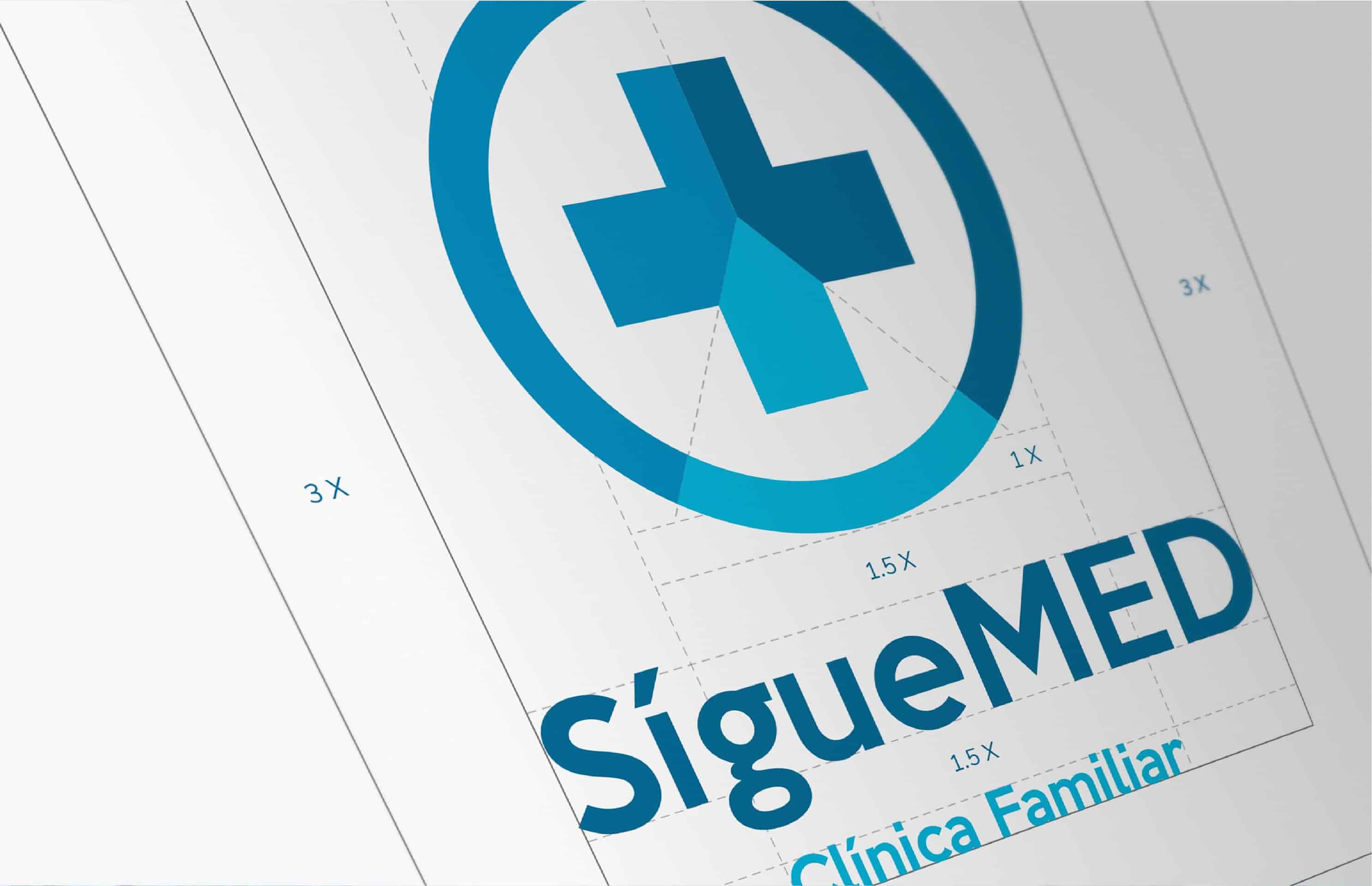

The first sketches or ideas i always do them by hand, then i vectorize the proposals in Adobe Illustrator, the next step is to perfect the logo, make color probes and i finish it with the brand book.
I use Adobe Photoshop for the retouch of images and photo manipulation to present my project.
The client was satisfied with the result and the brand has been accepted and well-know in the city.
This is my first project for a medical clinic, it was a new challenge for me. The truth is that each project has always brought me new experiences and interesting learning.
Here is the original project: https://www.behance.net/gallery/68201917/SigueMED-Diseno-de-imagen-corporativa
I hope you find it interesting...
Regards!