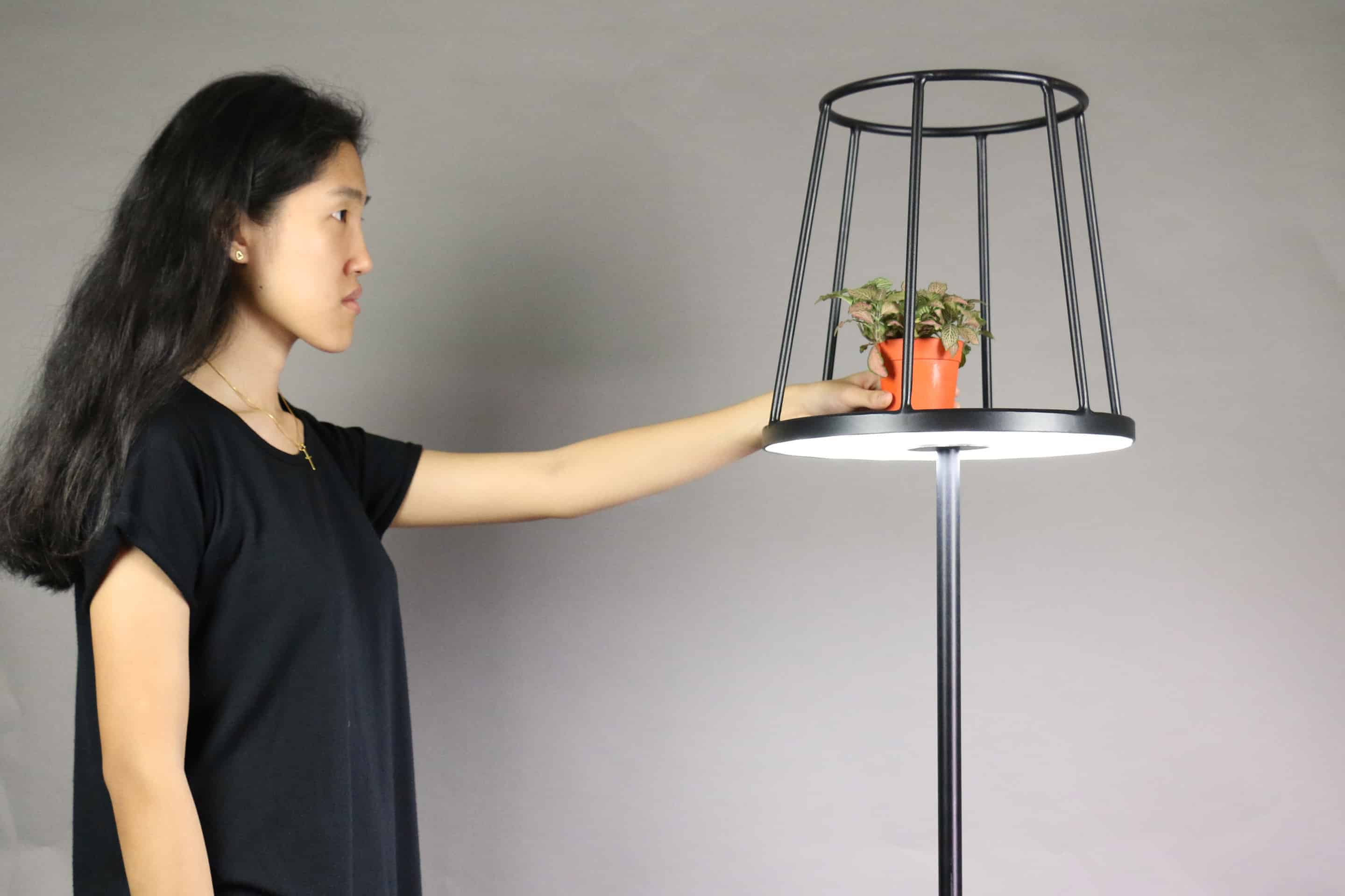
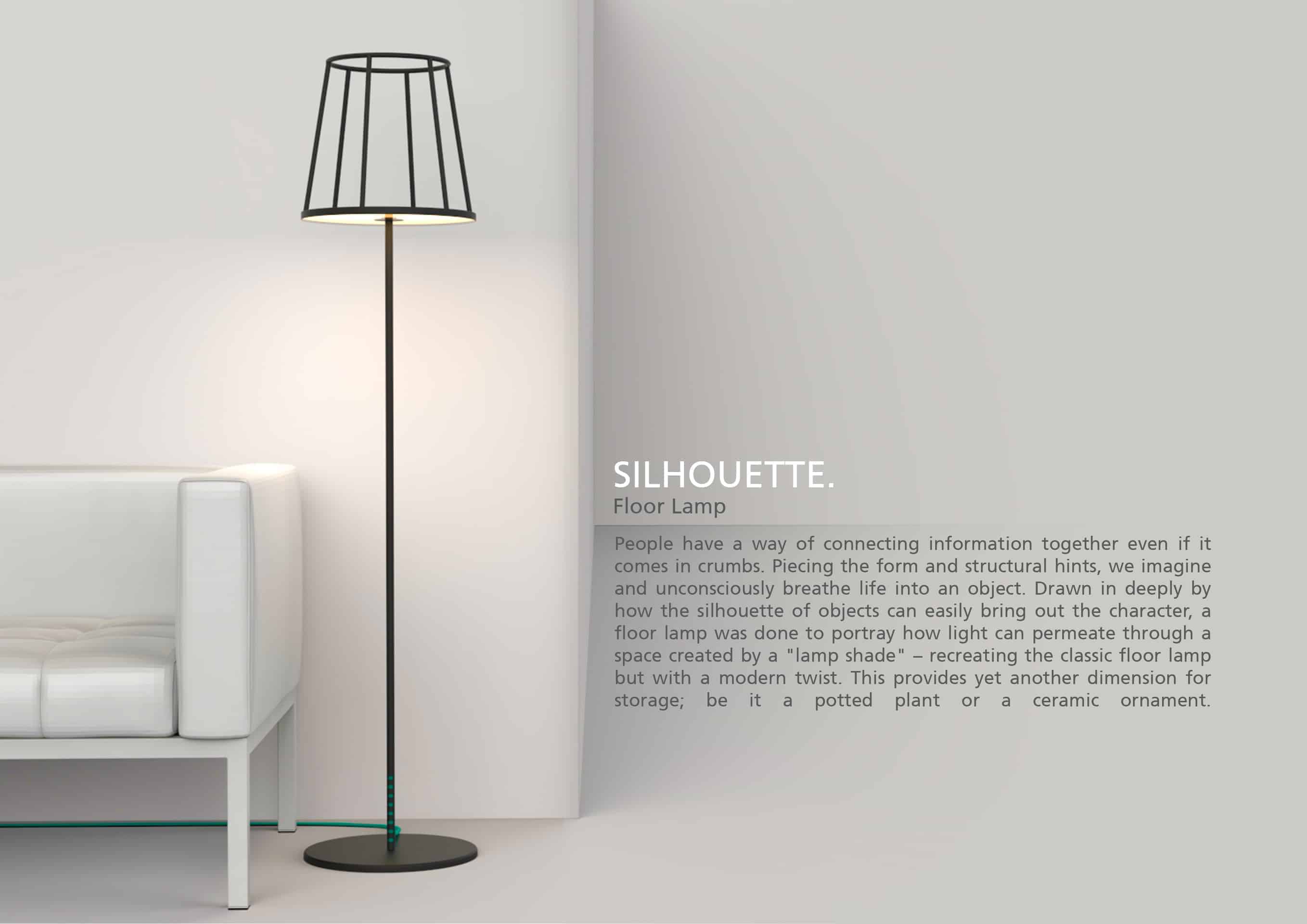
Silhouette Floor Lamp

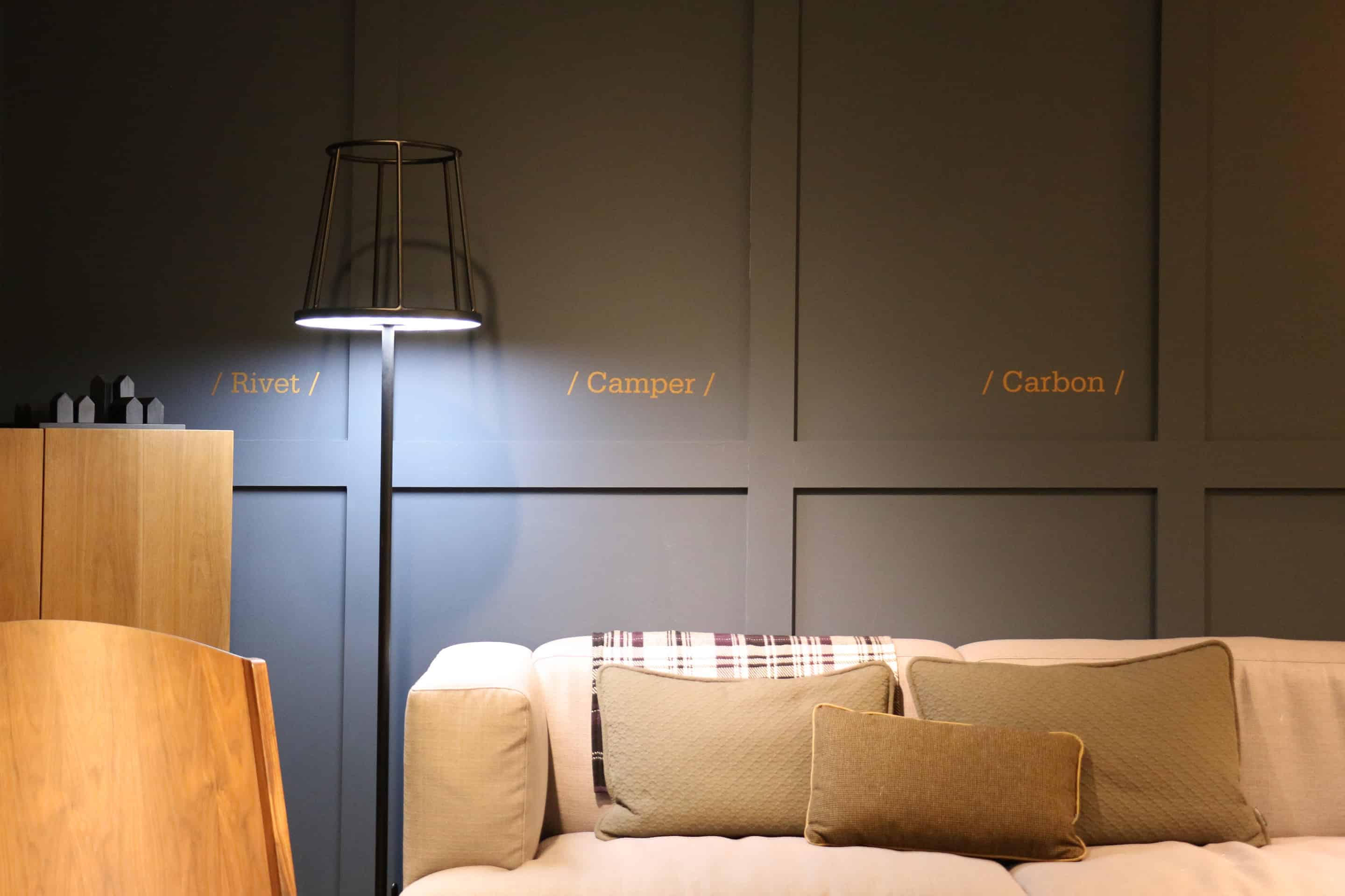
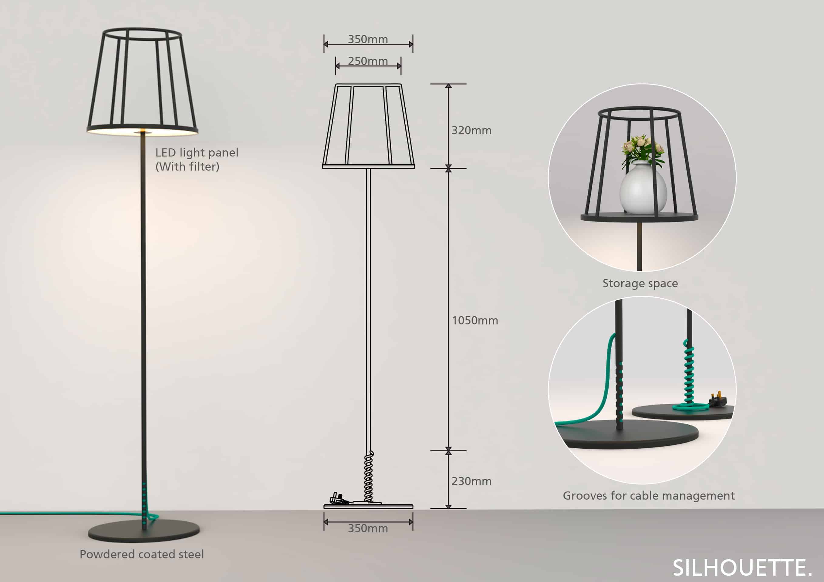
Humans have a way of connecting information together even if it comes in crumbs. Piecing the form and structural hints, we imagine and unconsciously breathe life into an object. Drawn in deeply by how the silhouette of objects can easily bring out the character, a floor lamp was done to portray how light can permeate through a space created by a "lamp shade" – recreating the classic floor lamp but with a modern twist. This provides yet another dimension for storage; be it a potted plant or a ceramic ornament.
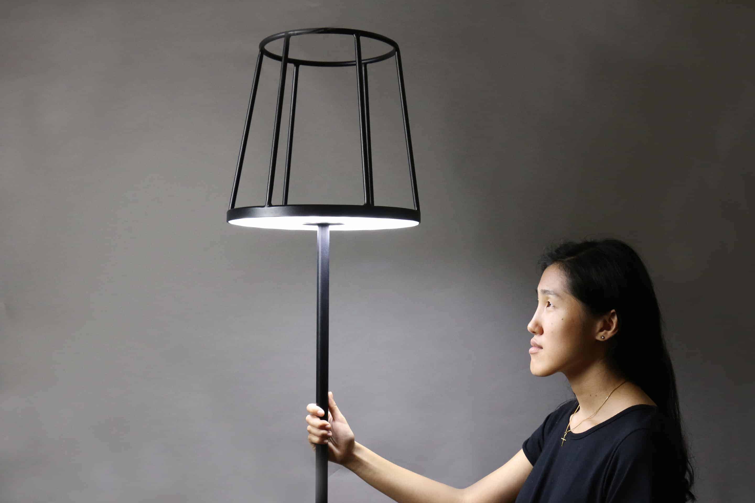
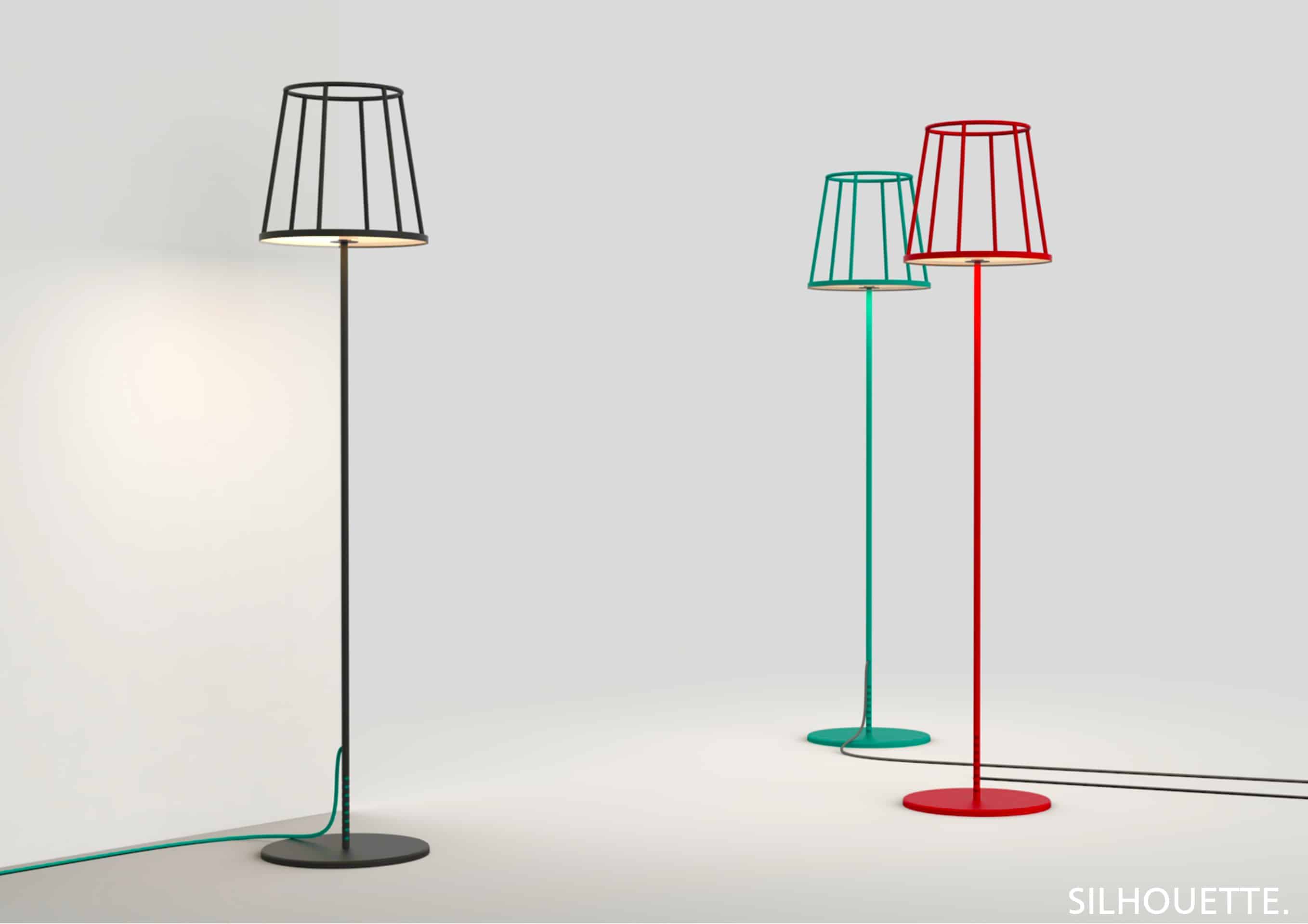
I was inspired by cartoons and how complicated objects were represented with simple, neat lines. The choice of steel was due to the fact that it is possible to achieve a sleek and streamlined silhouette while possessing the strength to hold the structure and weight.
To visualise the structure, Rhinoceros 5 was used to build the lamp to dimensional scale before it was tested for stress and yield strength in Solid Works. However, sketches were the first line of execution to visualise the form as it allows me to think and ideate easily and freely.
Unexpectedly, viewers responded positively to the project and provided comments on how the design can be further stripped to another level of minimalism. From this project, I have learnt that certain objects that we own can sometimes be superfluous and redundant. Instead, by removing and abstracting the essence of common objects, the raw, often neglected, beauty can be better appreciated.
None.