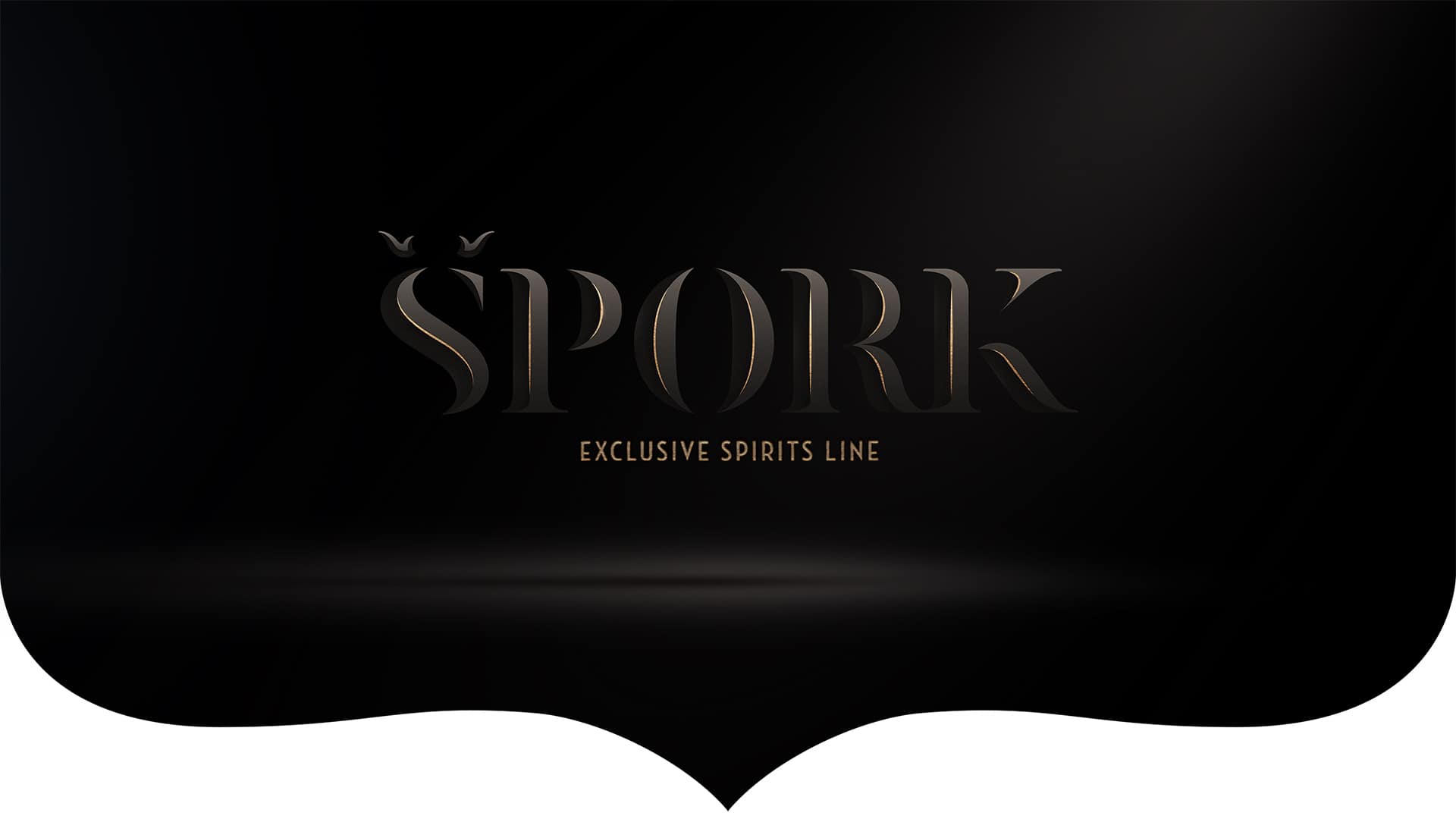
Špork: Crafted for Lifehunters

Špork Spirits is an exclusive line of spirit distillates crafted for "lifehunters" - the adventurers who appreciate and enjoy life in all its iterations. Inspired by history as well as modernity, we created a set of labels that combines the motifs from past and present with the endless passion for life and art.
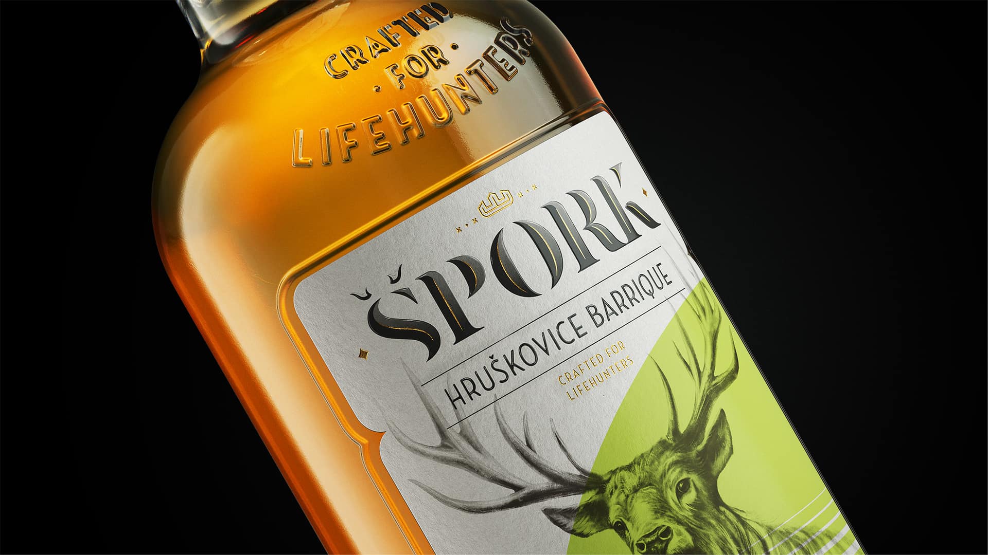
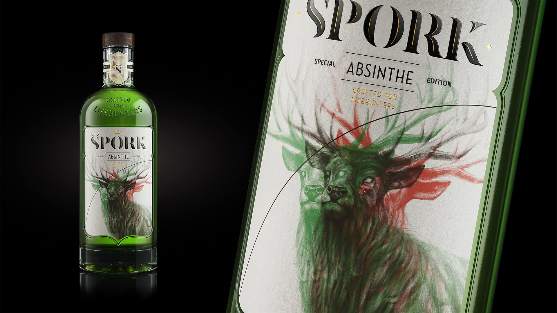
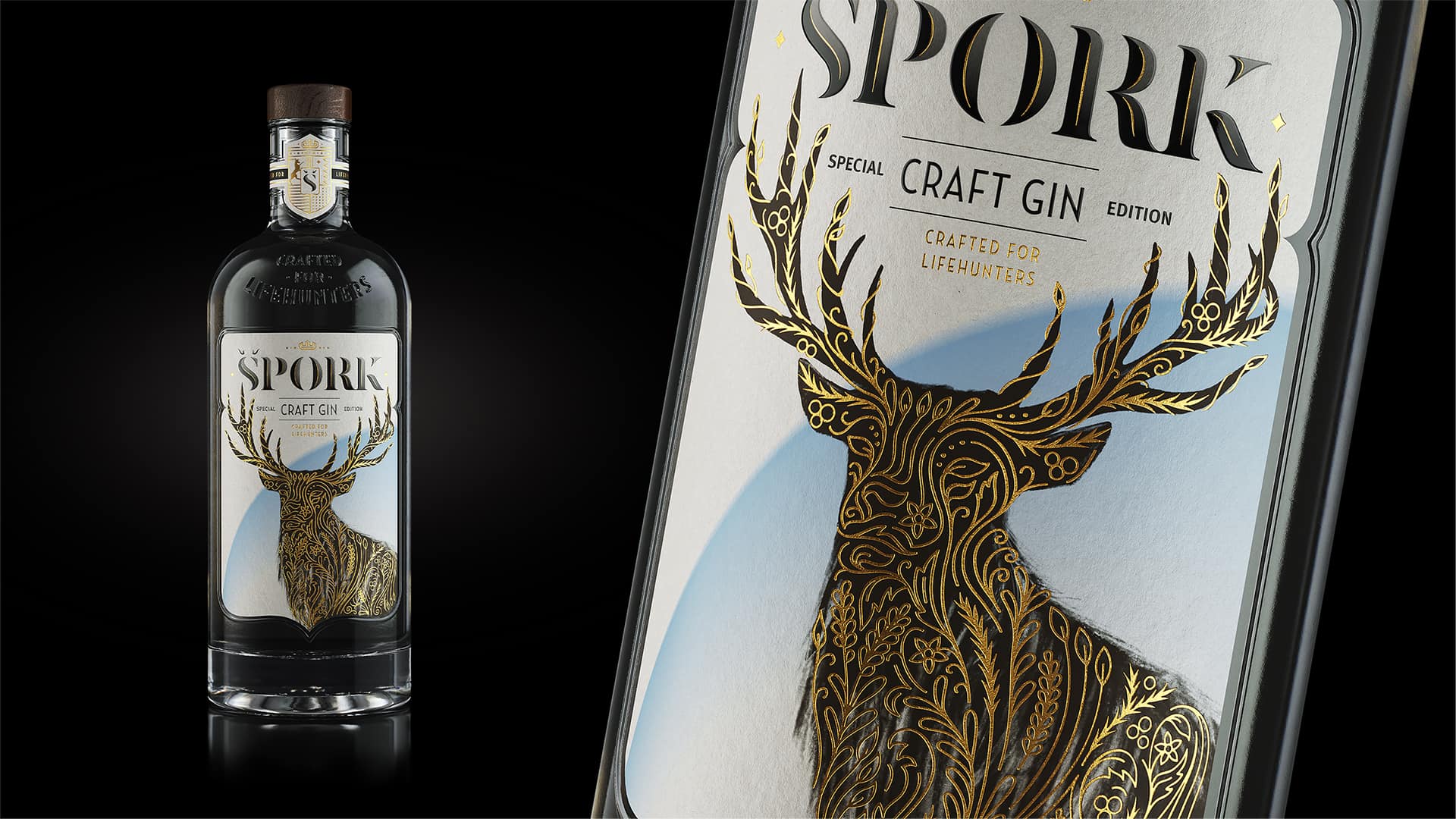
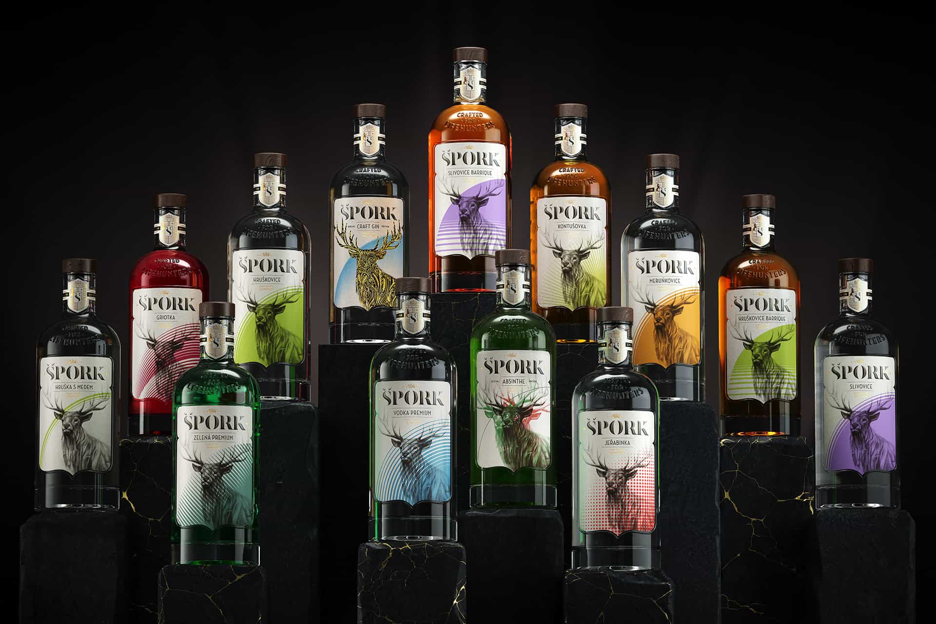
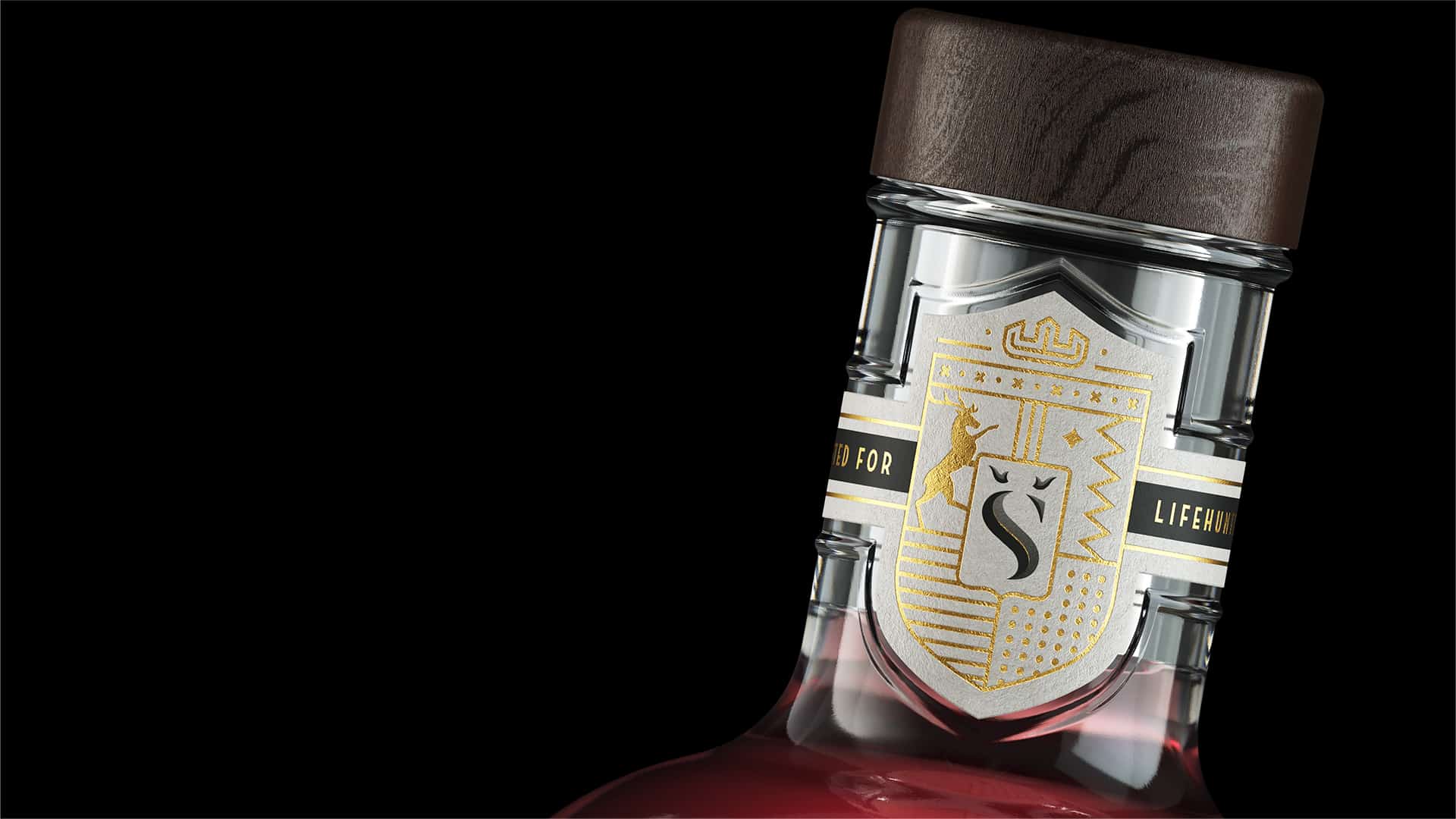
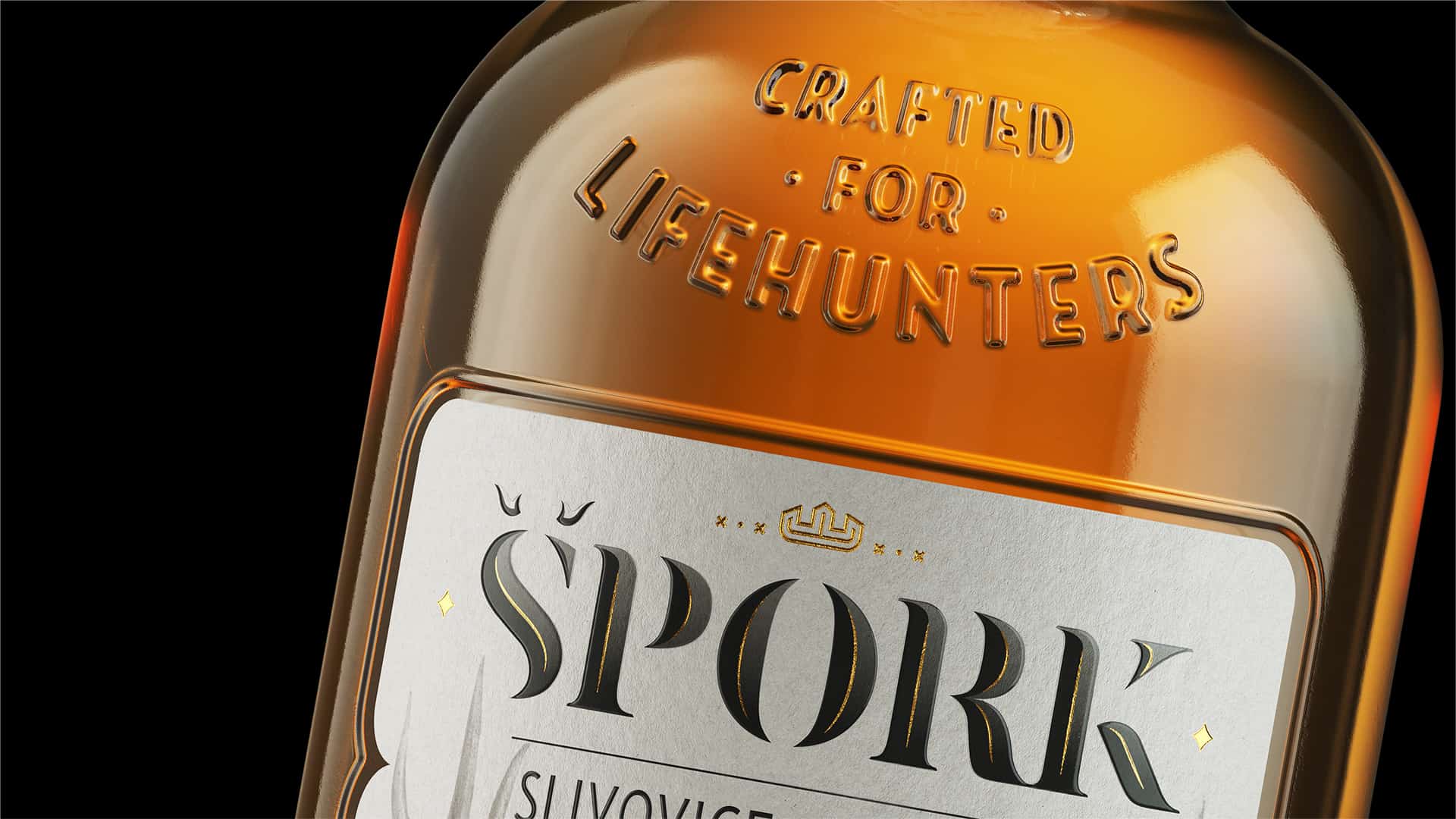
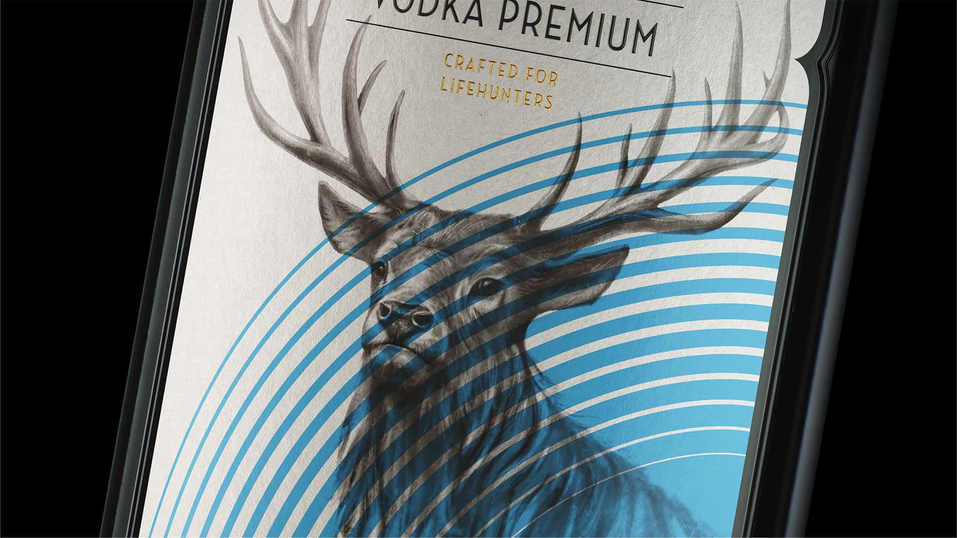
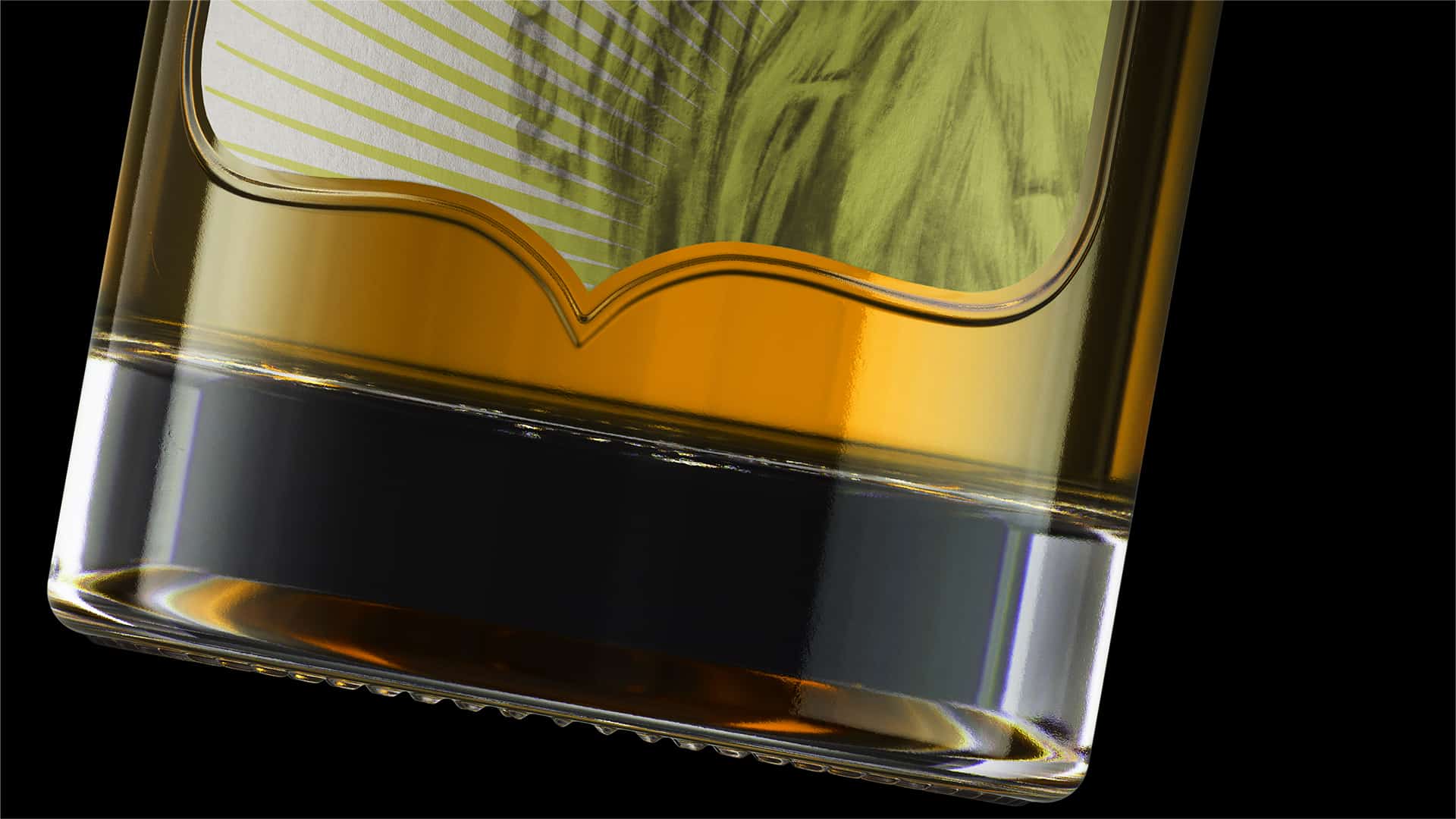
Špork Spirits were created for a very special occasion – the opening of a restaurant Red Stag in the heart of historical Prague, in Špork Palace. Špork palace as well as its owners are known for their vivid history. We began by tracing and gathering some of its most interesting and important facts. We then translated these facts into visual language and combined them with the elements of contemporary reality. This is how the realistic illustration and abstract vector graphics came together on one label. Our design also had to accommodate different color codes for each of the eleven fruit spirits within the Špork line.
The unusual shield-like shape of the front label was inspired by the coat of arms of Sweerts-Špork. The label does not simply imitate the Sweerts-Špork’s coat of arms – it also brings out the characteristic features of the brand itself. The realistic illustration of the stag refers to the paintings of the 17th century and brings us back to Antonin Špork’s interest in arts. The vector graphics reflect the type and strength of each spirit within the line. The shield reoccurs in a slightly different representation on the neck label as well.
The slogan of the brand – “Crafted for Lifehunters” was inspired by Špork’s passion for hunting. When turned into a metaphor, it perfectly expresses the key message of the brand. Even though hunting is not as popular as it used to be in Špork’s times, its figurative meaning remains strong. Lifehunters are those who have clear aims in front of them and are not afraid to overcome obstacles on their way to victory.
We used Adobe Photoshop and Adobe Illustrator during the preparation of the label design.
We received positive feedback from the client and learned that they are planning to expland the product line. The process of creation itself was very pleasurable, and we are proud that we had a chance to develop the design for the exlusive spirit line for one of the biggest restaurants in Prague.