Stadion - Athletic Gym / Brand Identity

Stadion was born as a Spain based gym (franchise) aimed at the physical preparation of elite athletes whose aim is athletics competitions. As a specialised gym Stadion tries to communicate values that are in relation with the target audience such as; strength, improvement, dynamic, specialised, current and singular. The objective of the project was to design the naming and brand identity representing all the values and symbolising the service offered, being easy to apply. Other first objetive was apply the brand identity to three-dimensional space.
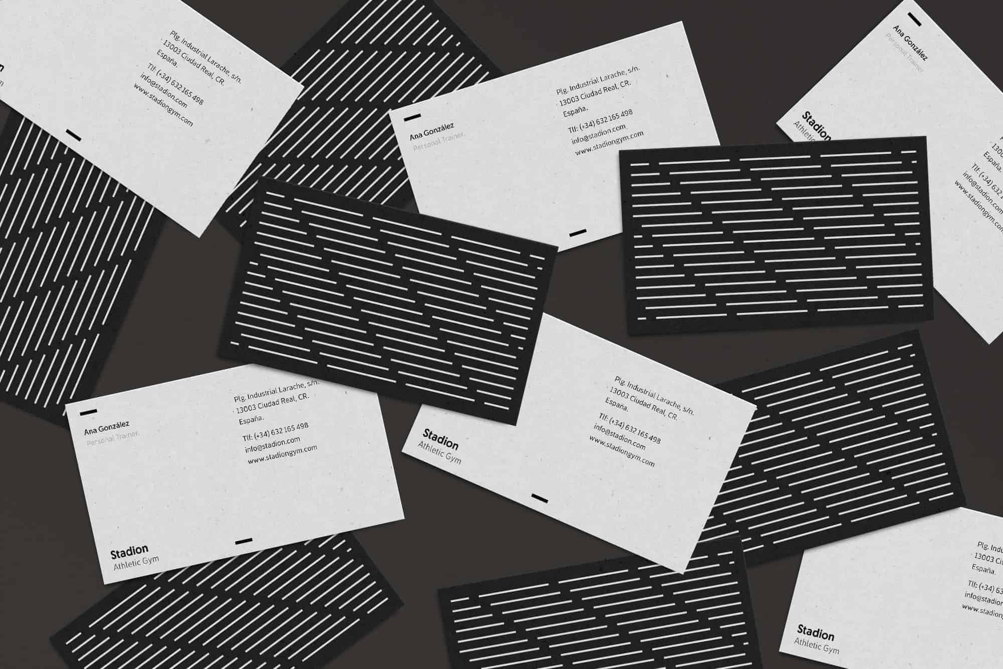
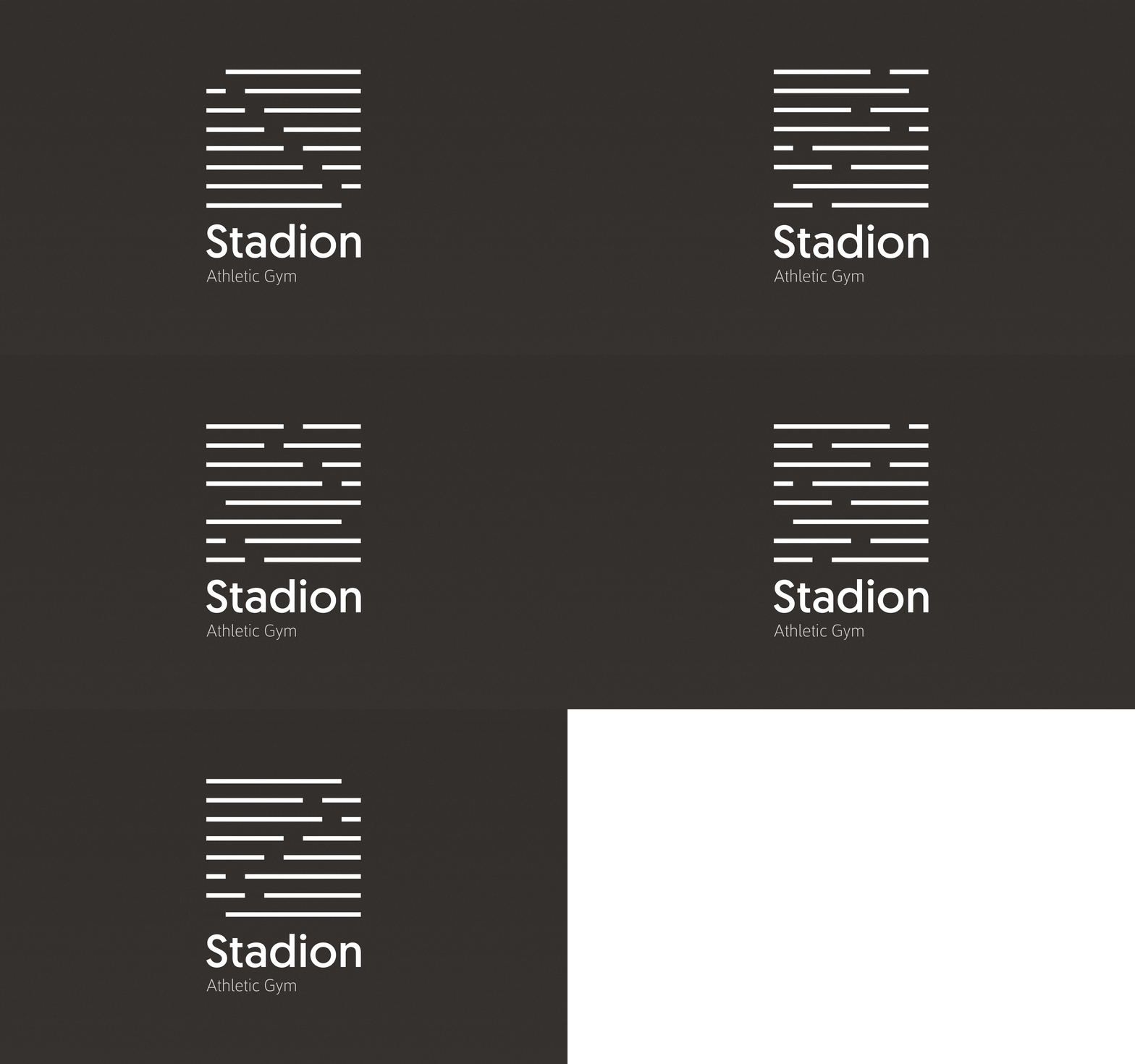
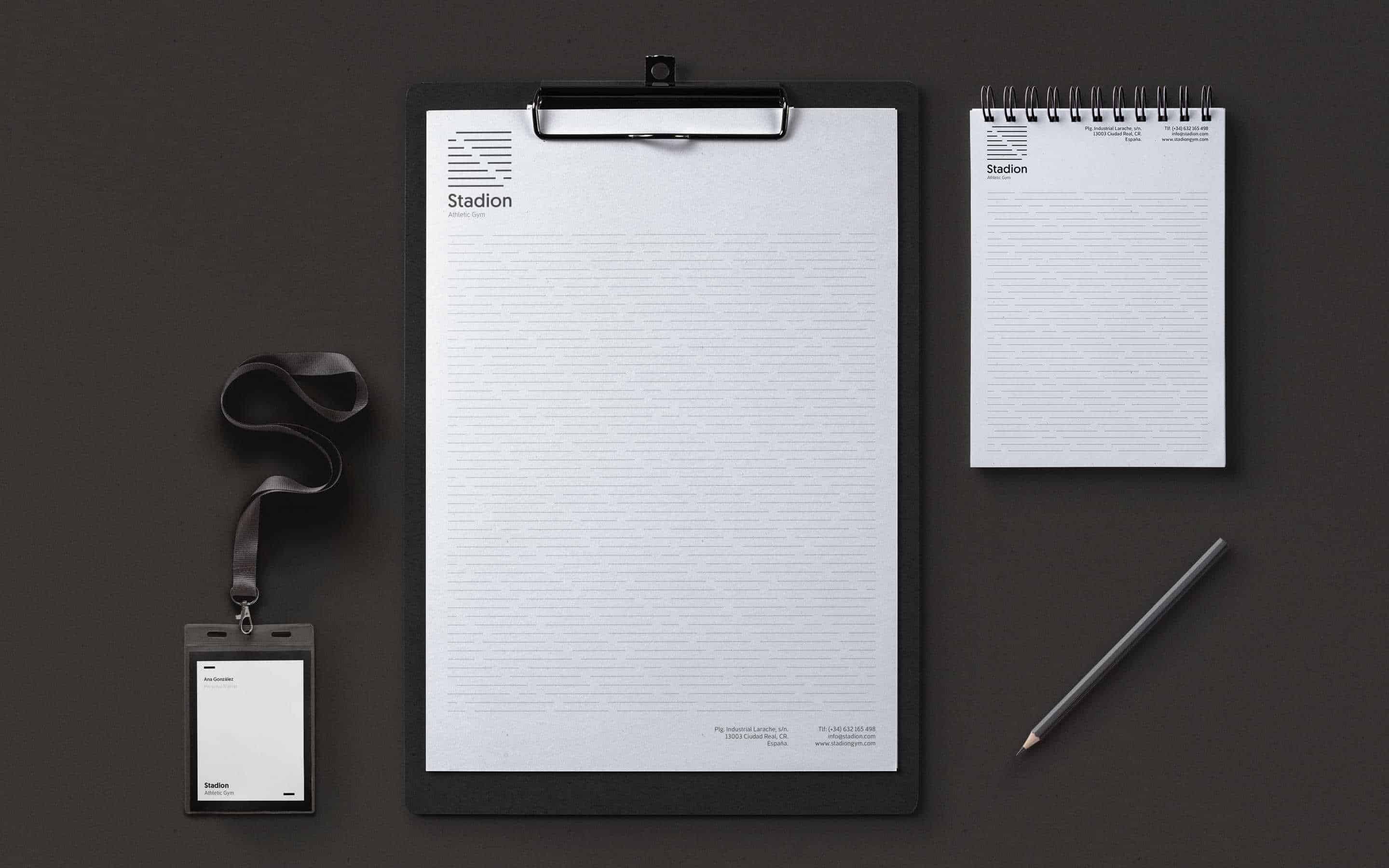
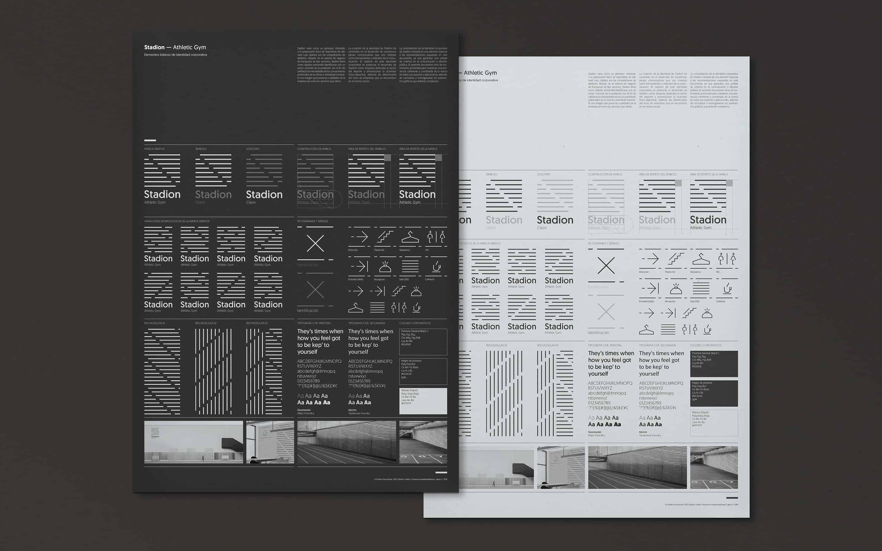
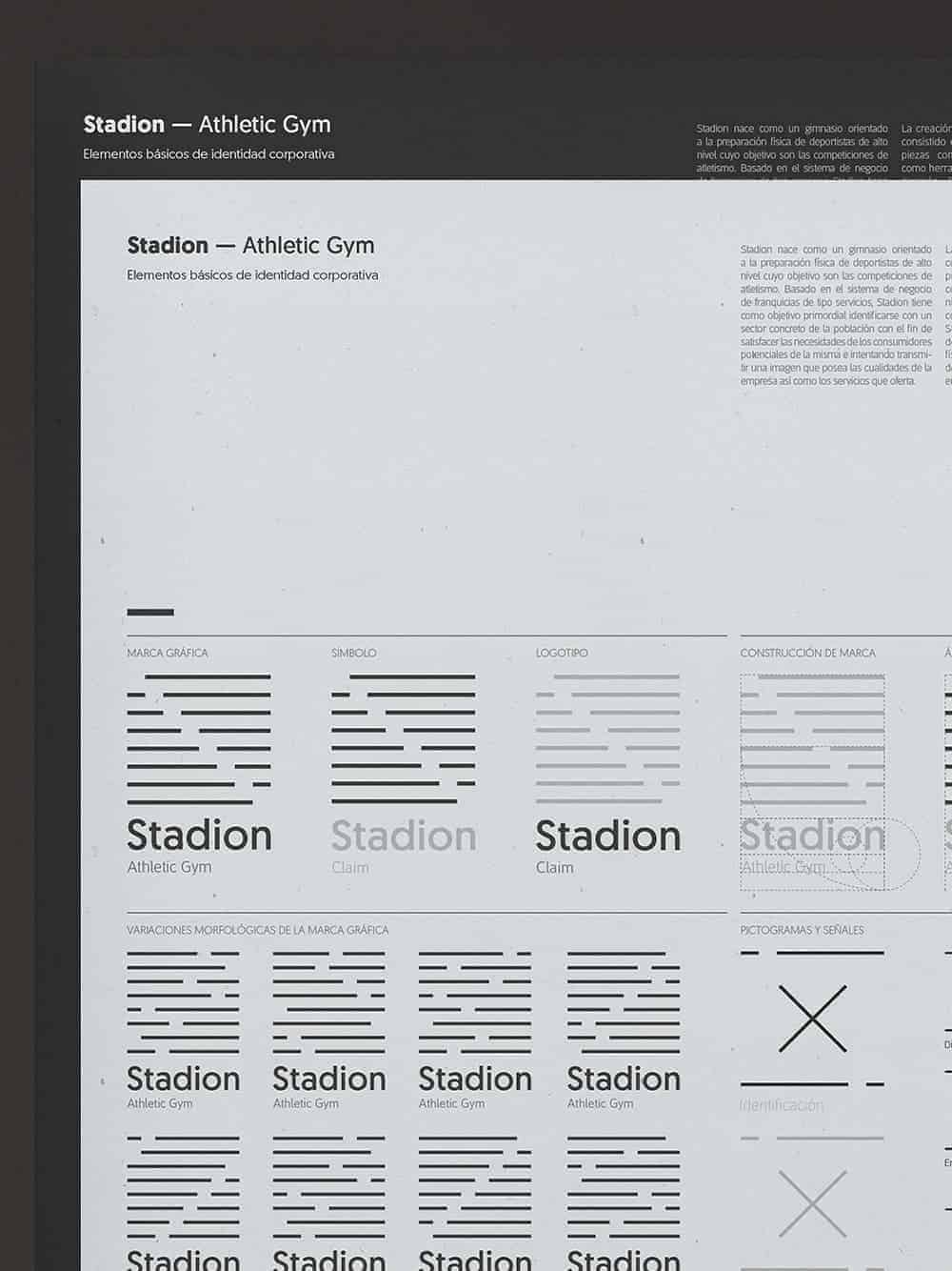
I developed a graphic system which is based on the concept of the «line» as the main element, which makes reference to the athletic track and that, as a basic element of design, also alludes to the antiquity of this sport together with the name Stadion. The graphic system is based on a modular structure from which the brand is built, where all the values are represented, the movement of the runner, the athletic track itself and the concept of "lane" that refers to the individualisation of the athlete and the service of the company. The result of branding was the combination of modern, minimalist and geometric design, mainly in black colour alluding to the antiquity of this sport and the target audience with the concepts such as specialised, current and singular, etc.
The interesting part of the project is that dynamic brand built. Because the different lines can be displaced by means of the modular structure and represent the strength, improvement, dynamic and the speed of the athlete. The brand combined with the material used on the stationary print, a recycled paper of 90gr where this paper rough texture represent the floor texture of athletic track.
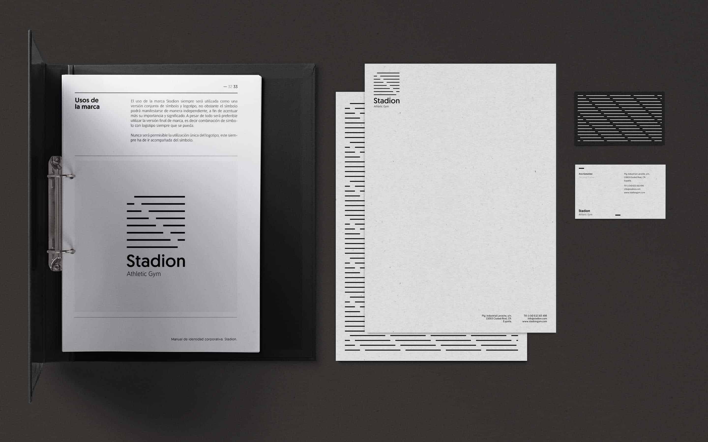
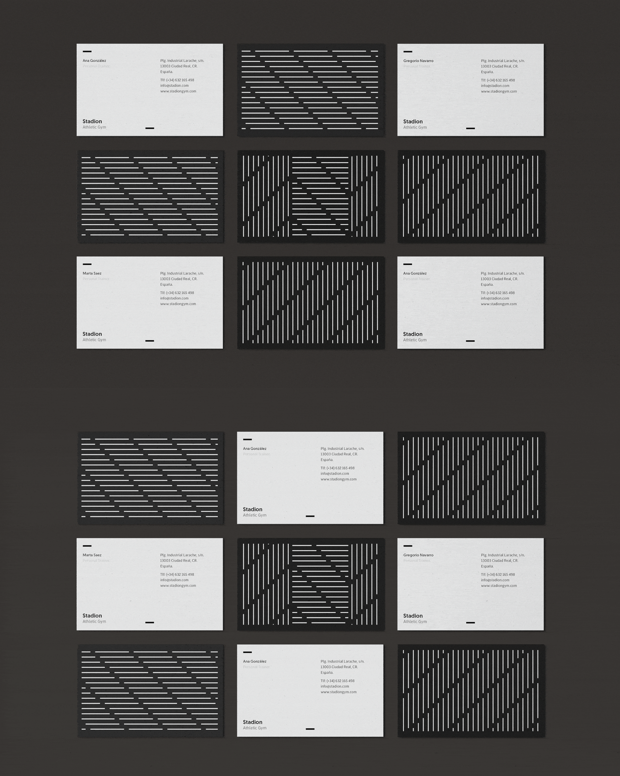
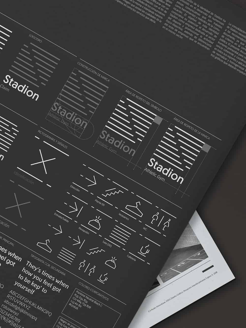
I am a lover of paper, the sequence of numbers and complex brand systems, so the first thing was to sketch the brand system. I used Illustrator to design the system visual identity. First, I developed a modular structureand from where I built the brand, later I realised that the system also allows the development of signage for wayfinding and patterns to apply to three-dimensional space, with this all pieces of identity have a unique graphic coherence.
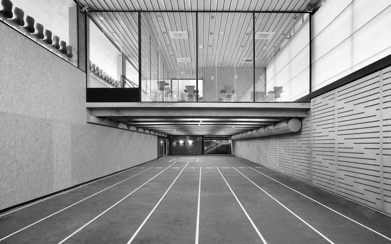
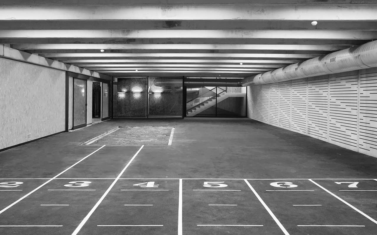
Although the project is currently being implemented, I learned on this project is that geometry and black color they are indispensable to create a timeless system that allows to last in time and most importantly allows a quick and easy to apply to all the sites that the franchise has.
You can see this project on Behance; www.behance.net/lajara-a
Thanks!
Nice! I love the whole look of it