Starbucks Reimagined

Short story of making the popular brand looking different by connecting the past and the present. I wanted to keep the main focus on the elements that are the essential to the coffee chain and removing everything that was completely chaotic.

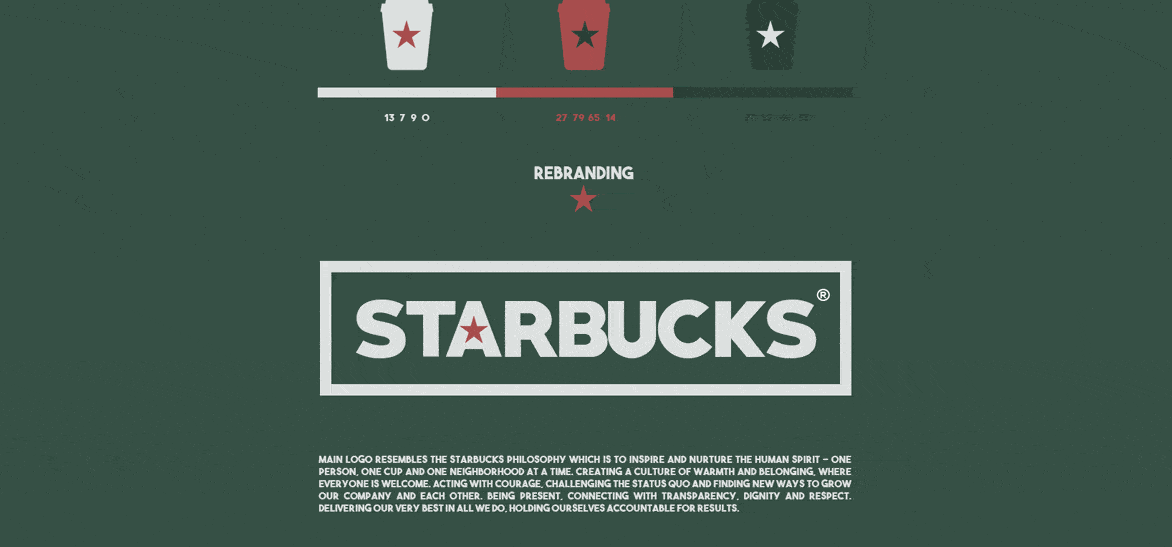
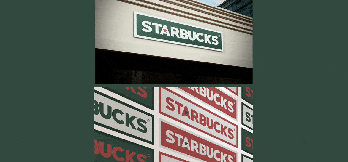
Oh, the idea came up actually at Starbucks itself. I thought there is too much going on everywhere. When you sit at Starbucks you are surrounded by, what they call it - The controlled chaos. There are too many messages, and let's be honest - This marker used for writing our names? I think it should see its end in 2017.
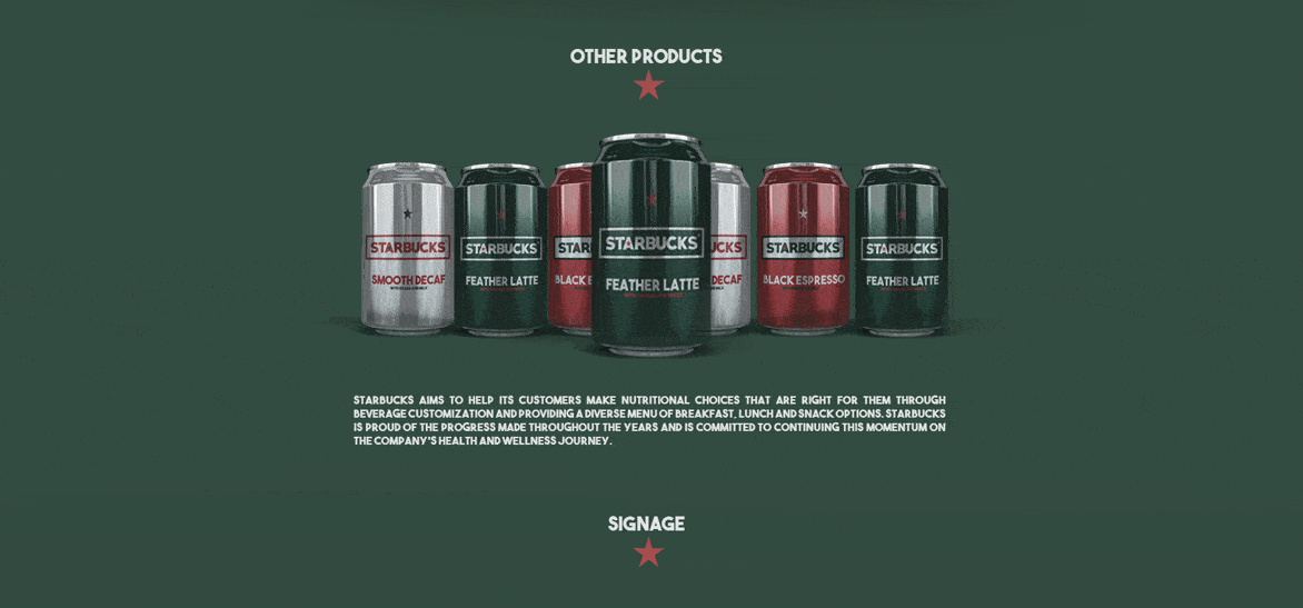
I used mostly the knife tool - Chopping everything what was unnecesary for the image of the brand. So I started cutting, and cutting and in the end this is what was left - more modern, more futuristic, but still instantly recognizeable.
It got featured in couple of design portals which I respect very much. Which was a great surprise because I never thought that anyone can share my passion for creating brands simpler and more impactful by breaking them in half and remodeling everything from scratch.
Stay fresh. And take a look at full project here https://www.behance.net/gallery/43969021/The-New-Starbucks-Complete-Rebranding