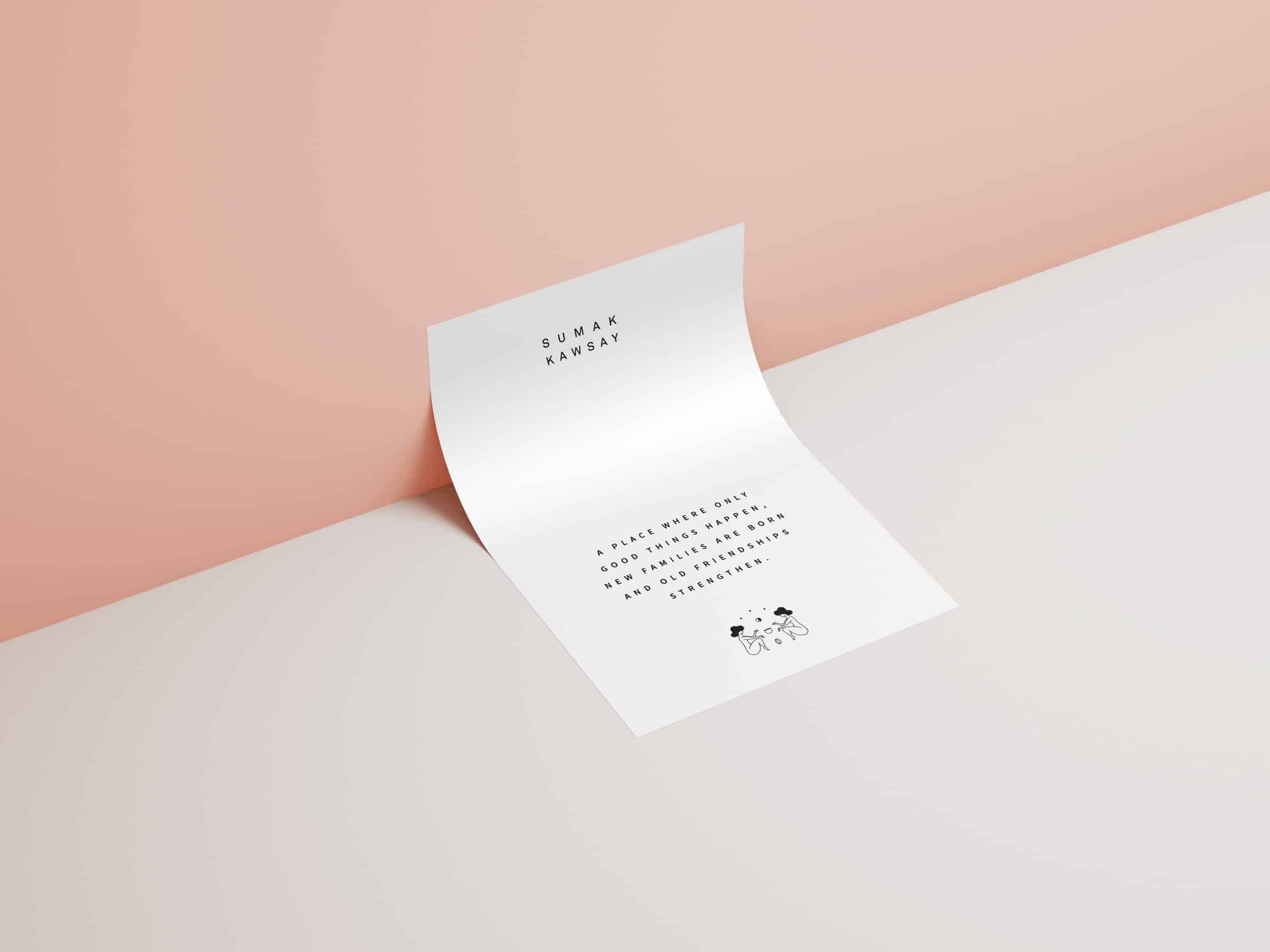
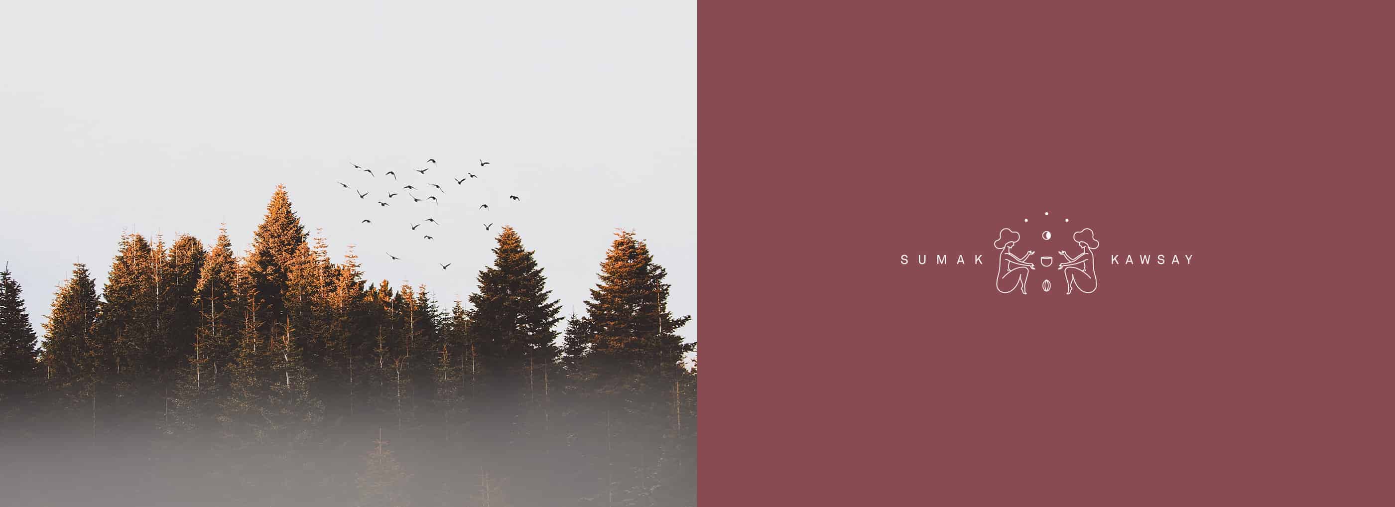
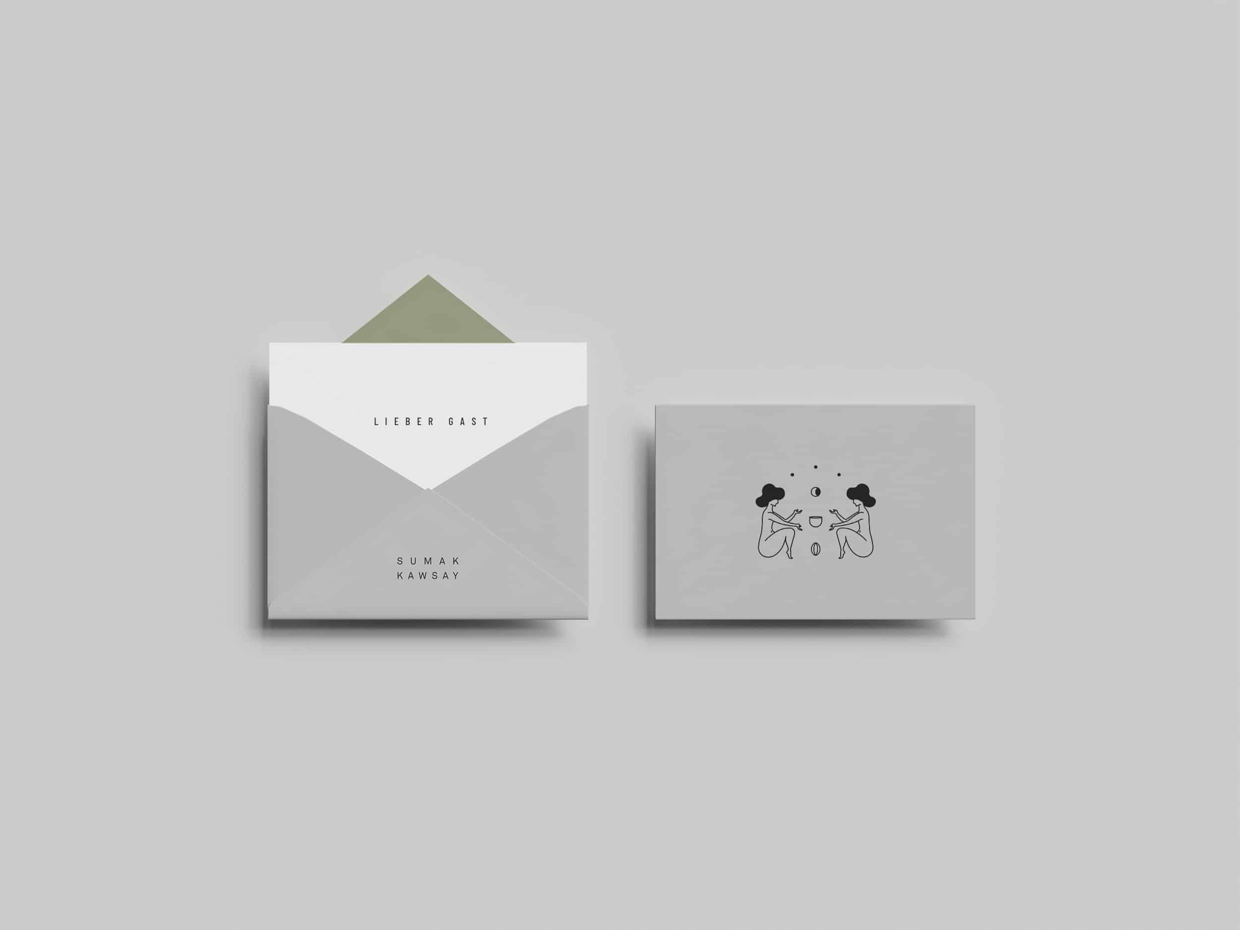
Sumak Kawsay
Sumak Kawsay is more than just a project.
It aims to become a lifestyle, for us and for everybody who wants to be part of it. It is much more than ourselves, it’s you and it’s me: it’s us.
A place where only good things happen, new families are born and old friendships strengthen.
It’s conscience, rememberance and belonging, a gentle reminder to stay humble, and from there, create, feed, learn, teach, breathe, take care, dance, and be happy.
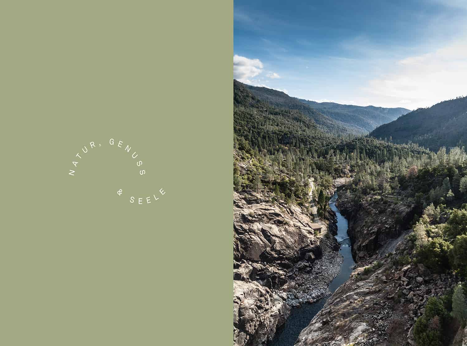
Sumak Kawsay is a good life,
and in this life,
magic happens.
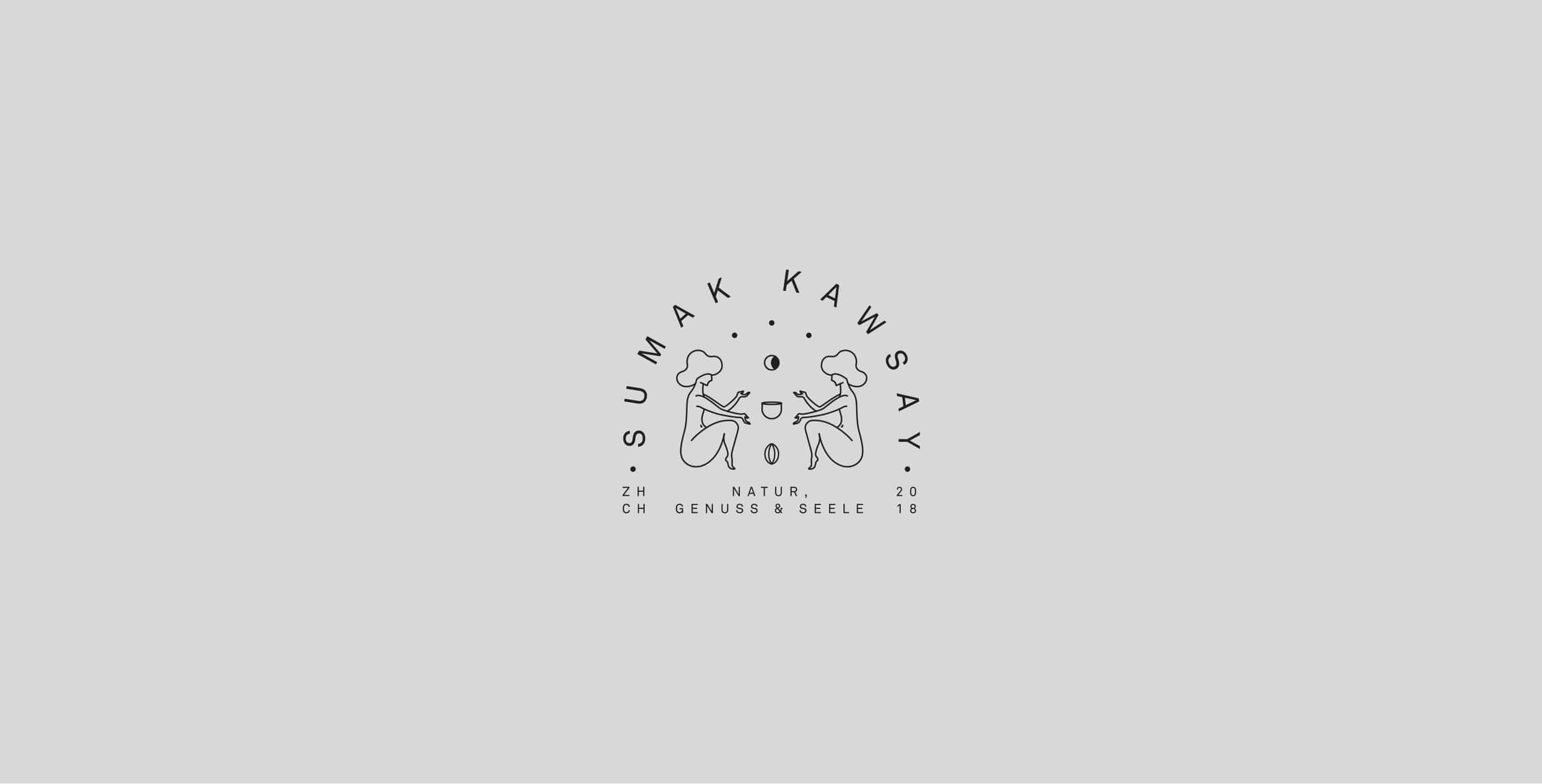
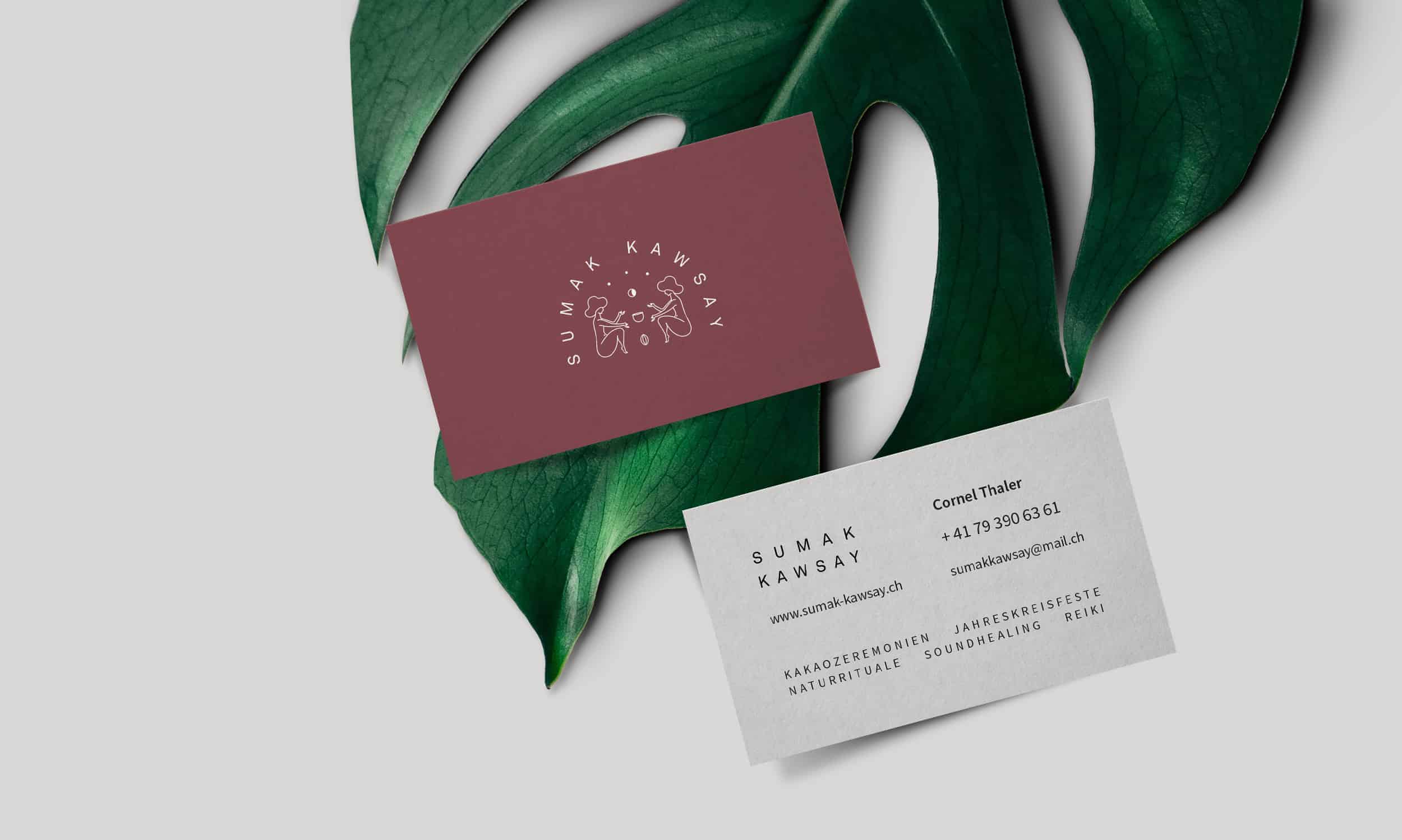
The icon comes from the idea of the interaction in some "spiritual" and profound level between two humans who seek only good things in life. There's a cacao nut coming from the soil, "floating" it's way up to the container (which could be a cup of cacao or a plate of food), for it to be shared by these two people. The romanticism and magic profile of the graphic pretends to deliver a visual experience that goes in accordance with the real experience that takes place in the ceremonies Sumak Kawsay provides.

Basic tools were Photoshop & Illustrator.
The process begins with a creative concept that will permeate throughout the whole identity. The sketches are worked by hand until we have a potentially functional idea, then the idea is worked in vectors (illustrator) until an aesthetic and functional result develops. The color proposal, stationary and identity elements start to come to life almost naturally following the base that the logotype has stated.
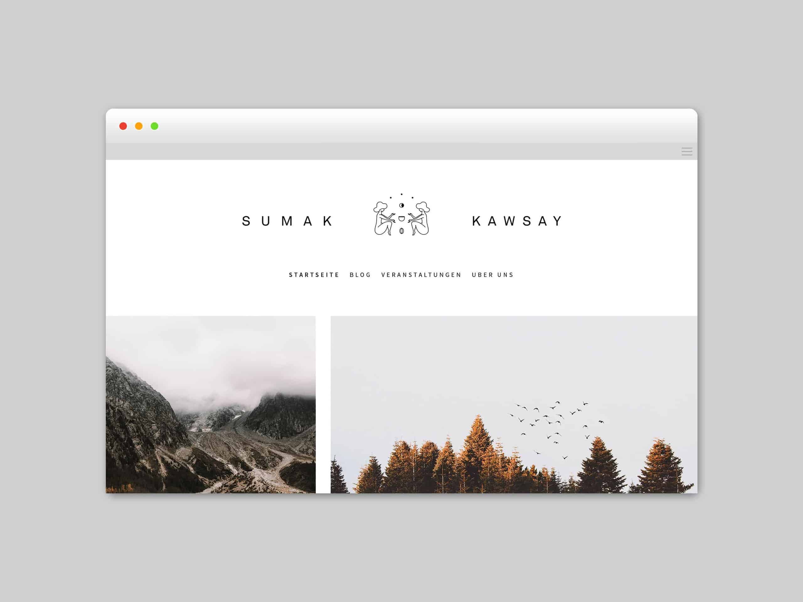
The identity produces an immediate connection with it's spectators, the fact that you can see two humans interacting in such a blissful moment provides a clear image of magic and peace that makes you want so much to become a part of that world.
I like the simplicity of this.. It looks elegant