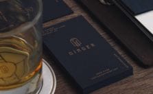
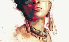
Bar Ginger is a branding project for a whiskey bar located in Hong Kong Central. Besides the visual identity which express their background story, one of the challenges our artist encountered is putting large amount of items in the menu. Let's check out this amazing art set!...
The series Human Space is Mária Švarbová's personal project. It aims to record the spaces in the existence between humans. We have seen her other art set A Plastic World and we are in for another treat with this one. Let's check out the amazing photos! Enjoy!...
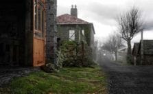
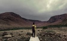
Have you ever gone on a solo trip to discover new places and excite your inner wanderlust? Or just simply to explore and take a walk on a fine weather? Our artist, Jiani, a Graphic Designer by profession, went on a solo trip to discover what she considered as her "newly found land". Trivia: Newfound...
Singularity is project which describes an era in which our intelligence will become increasingly non-biological and trillions of times more powerful than it is today—the dawning of a new civilization that will enable us to transcend our biological limitations and amplify our creativity. Read on an...
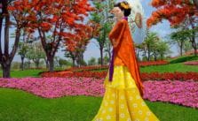
The Lost Geisha is a project that was born because of Jvdas Berra's love for Japan. In this story, he wanted to merge the Mexican folklore in a dream location called "Jardines de Mexico," the world's largest themed garden. Let us take a look at his project and may this inspire you to your future [&h...
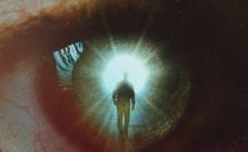
The eyes have potential to be a canvas for greater things. This project of Nevan Doyle, a graphic design student at Oregon State University, seems to have the most impact, and they get the most response. What he likes about them is the variety and depth you can create, whether it's by using a little...
The name Twinkle Books refers to the children's lullaby "Twinkle, twinkle little star", which gives the proper character for the brand. It's connected to the word "books" which represents the product itself. Let us take a look at these designs and enjoy!...
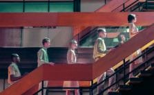
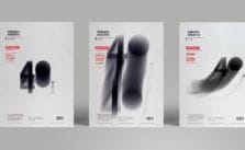
The aim of this project was to promote a large team consisting of 40 creative people. The number "40" was used instead of the word "forty" which makes the whole design more interesting and attention getting. Read on and enjoy!...