
Tea Shop Identity by Robinsson Cravents Culteavo

Tea Shop Identity project is a mixed of contemporary and minimal style of branding that conveys honesty, balance and peacefulness. Developing the design was a challenge for our featured artist. It involves illustrating different sizes and proportion of dots just to make the perfect look. Read on and be amazed how this artist pulled off the perfect look for this project. Enjoy!
This project was created for CULTEAVO TEA SHOP based in Connecticut USA. Owned by Viviana Pinhasi and her husband Claudio Schutz. It took me around 9 months to finish the project. It was March of 2015, when Viviana and Claudio approached me to create the visual identity and packaging for Culteavo. I must say this has been one of the most exciting projects in my 9 years of experience with branding.
- Robinsson Cravents Culteavo
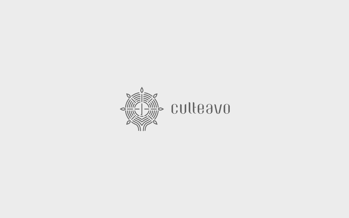
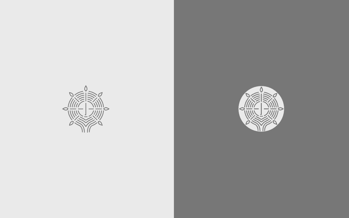
Viviana (co-founder of Culteavo) wanted the brand to convey a feeling of honesty, balance and peacefulness. It should look contemporary and very clean. These principles inspired the design of Culteavo’s logo/ sign, and are also reflected in the brand slogan: “A TEA STATE OF MIND”.
The design of the container tins for the tea was a long process. We spent almost 4 months on this subject only. From choosing the right material, texture and color for the tins, to experimenting over and over again with different sizes of dots used in the illustrations, to getting samples printed and again adjusting sizes and proportions, to ensure the finished product would look perfect.
- Robinsson Cravents Culteavo


Creating the illustrations with this style was not something planned from the beginning. I tried other graphic styles, but was not fully satisfied until I found one that truly connected with the meaning of the brand, and it all came together with the right textures, color styles and logo.
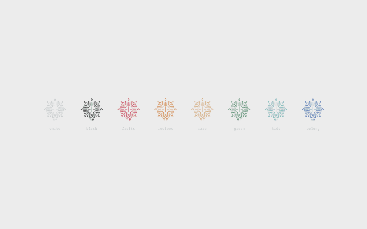
The inspiration came from the circular fine orifices found in a tea infuser, which immediately reminded me of the delicate technique of pointillism. I went straight on to my graphic tablet and started to design small leaves made out of points. After mocking it up on a tin, I realized that I have found what I was looking for: a subtle, clean, organic and charming design! From there I took it to the next level and decided to create various ‘characters’ to give each tea family its own identity.
- Robinsson Cravents Culteavo


They came about by thinking about the diversity of flavors, the different experience that consumers would have with each tea. I wanted each tin to be promptly recognizable by its visual elements, but most importantly, people would have to love the tins and want to hang on to them after use, thus creating a connection and making the experience memorable.
- Robinsson Cravents Culteavo

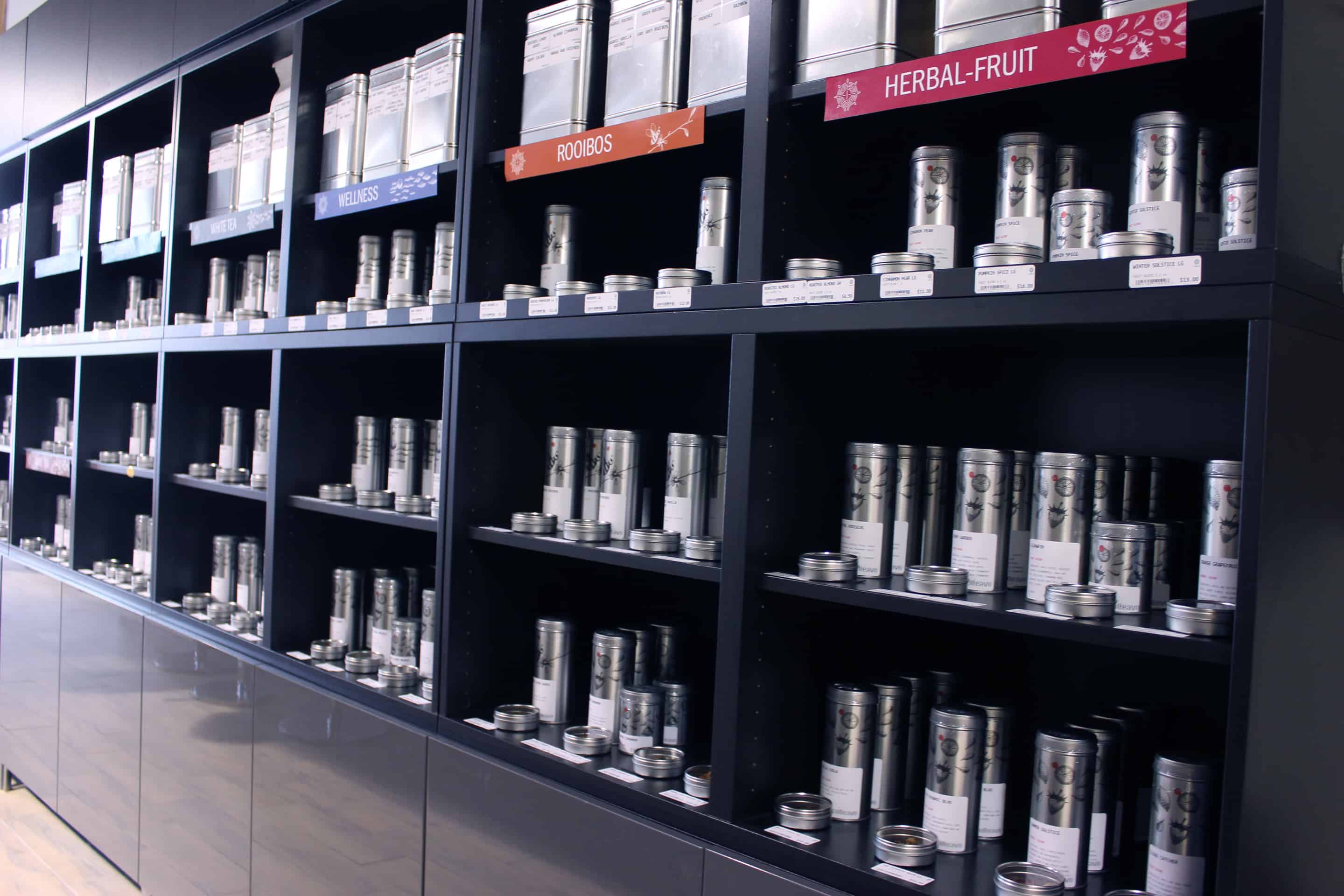
Finally, each tin has a colored circle in the upper front section –it was purposely a circle, a larger dot, in line with the pointillism technique used for the illustrations. The color of the circle would serve for proper and prompt identification of a specific tea family. The same color is repeated on the text showing the name of the tea family and the logo on the label.
The labels are kept very simple and basic and I chose Lekton Font type, for its clean look and feel. The resulting packaging is one that seeks to capture all the looks, not because of its visual aggressiveness, but rather the opposite, by inviting to a sensuous appreciation of its subtlety and balance, like the feeling that one would experience when tasting the premium teas it is designed to contain.
- Robinsson Cravents Culteavo
I used Illustrator, Sketchbook Pro for Illustrations, Cinema 4d for visual simulation, and Nikon d810 for photography.
My advice to aspiring artists is to never stop experimenting, Think and imagine like a child often do....and when you feel so excited for your creations, when you can't wait to show it to others. Then you have a smash one! But if you feel it don't are totally great, then spent more time in it!
- Robinsson Cravents Culteavo
ABOUT ROBINSSON CRAVENTS CULTEAVO
Robinsson Cravents is a senior graphic designer specialized in corporate and brand identity development, creative direction and design implementation for analog and digital medias.
This is pretty chic! Great work, I adore the overall design.