The Art of Kintsugi: Japanese and Cyrillic Calligraphy
Japanese people underscore the imperfection of broken jar. For what reason? A Man meets a lot of challenges in the course of a lifetime. The stream of time flows through each one of us, leaving a lot of seams and scars on it's witness. Just like the dishes, we happen to break apart by falling on a hard surface of fatum and then try hard to stick ourselves together again. Kintsugi Art teaches us to value the experience, not to hide it. The Illumate is going to present his new conceptual mini-album soon, which has Kintsugi as it's fundamental idea. I have been working on it's design during all December and now I share my work with you.
The whole philosophy of this art lays in accepting of imperfections and flaws. Japanese aesthetics highly appreciates details, catching attention to the wear from subject using. From this point of view kintsugi wins for both sides: the practical side, allowing you to continue to use the thing after it was damaged; and aesthetic side, highlighting repaired cracks and signs in the context of the continuation, but not the end, of its life. Kintsugi like wabi-sabi teaches to cherish simple, unpretentious and aged. Kintsugi doesn't hide the traces of damage, but even more, it also highlights them, reminding us about the frailty of life and the vicissitudes of fate, either passed and upcoming.
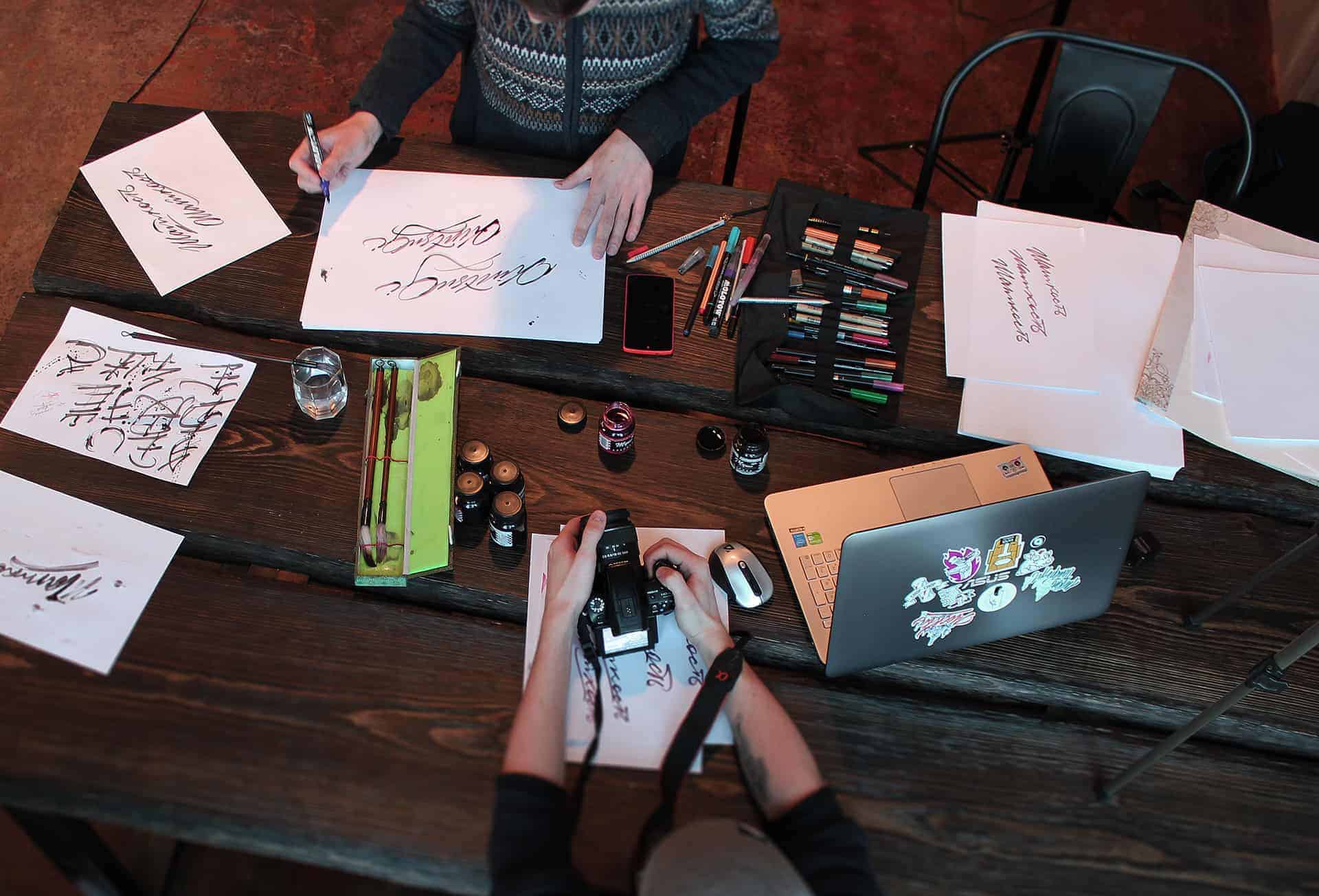
In mid-2016, I became very interested in East calligraphy and began to work with it. Having done several works, I wrote to a well-known Russian artist with a proposal to contribute to the design of his upcoming album in Japanese stylistics. Andrei liked my works and we got down to business. The concept of the album is the idea of Andrei, my task was the correct graphic design of this release.
All colors and styles are chosen not by chance. Each cover symbolizes the different stages of Kinsugi's art. In the first cover my main goal was to show the instability, that a person is experiencing during the "Imbalance" phase. To achieve these condition, Me and Illumate decided to use the blue shades (blue symbolizes doubt, depression) and to deform the whole composition of this cover's elements. Through trial and error I found an organic background. I used a lot of grunge textures, which were deformed into some kind of dust during a hurricane.
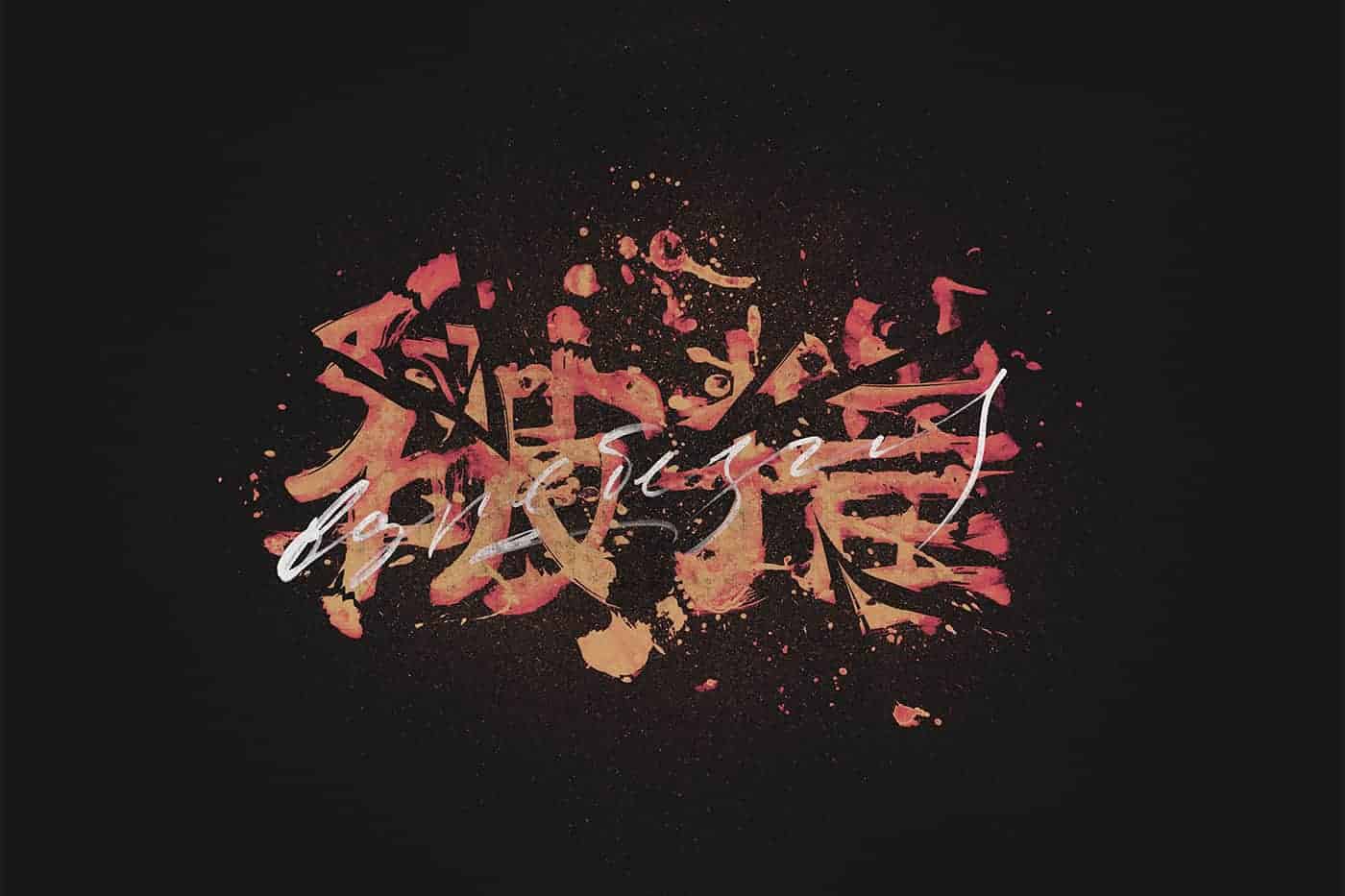
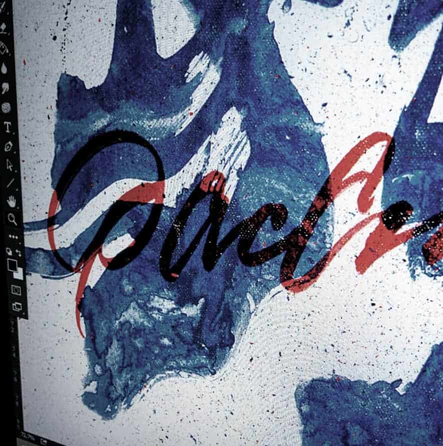
"Shattered to pieces" is the second stage. It is the phase in which a person breaks down under the weight of his problem. Just like the pot. This track is about a creative collapse. The colours and the overall structure of the hieroglyph perfectly capture the atmosphere of the inner battle of existential anguish. Red colour symbolises danger and internal strife, anger, desire for revenge, perhaps. I've broken my Hieroglyphs, added space to letters, which is typical for brushes, grunge and splashes of ink. Tonnes of paper haven't been spent in vain, because the result exceeded all expectations. “Gradient map” is a great tool for colouring your design, it’s the best way to make a right mood.
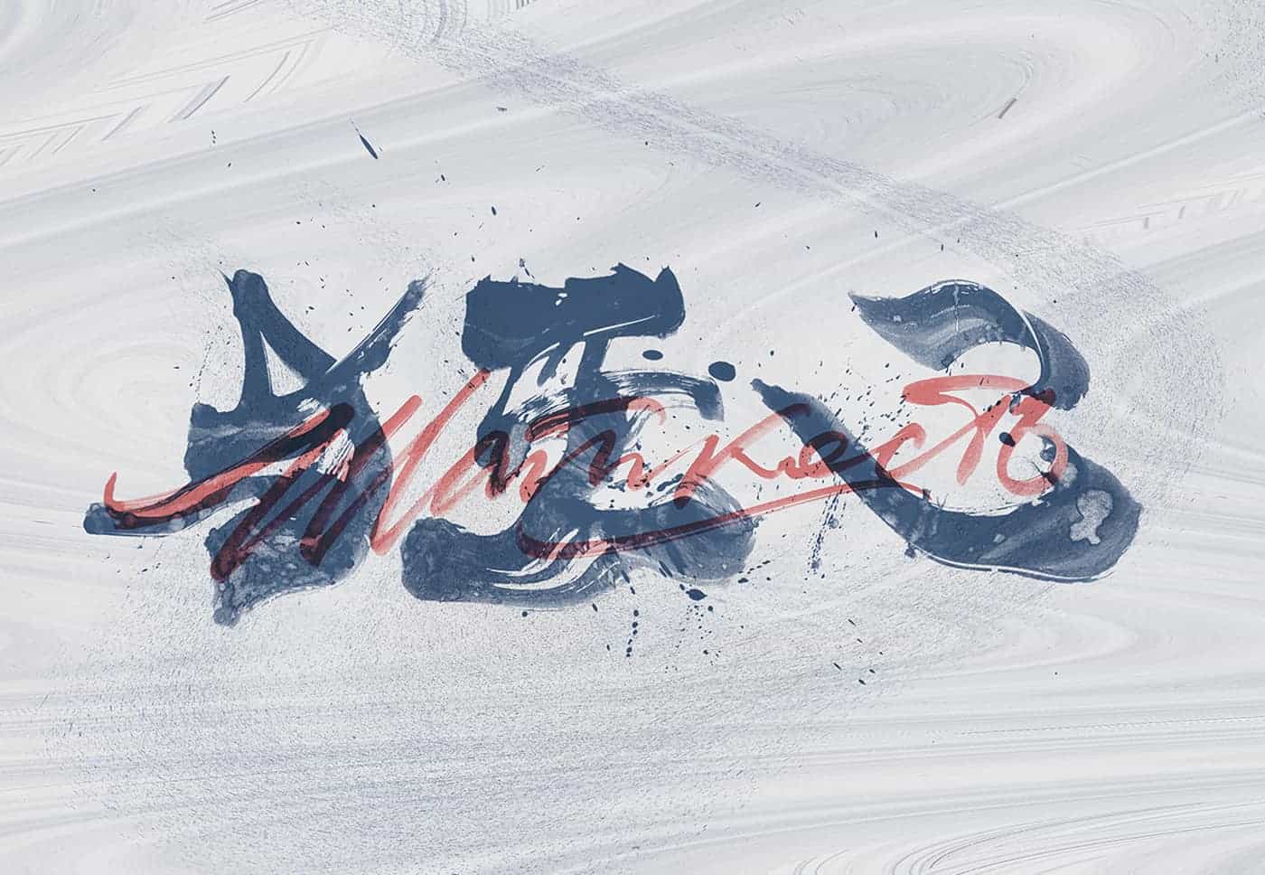
Kintsugi is the final stage of the battle. Man finds harmony, learning from past experience. Own mistakes make its appearance, give the individual character. Like a bowl pitched a person acquires an integrity, but does not become the same. His problem - his precious experience that makes him who he is. Hieroglyphics, crashed like a bowl, were glued together by means of gold. The main metaphor album finds its completion in the cover.
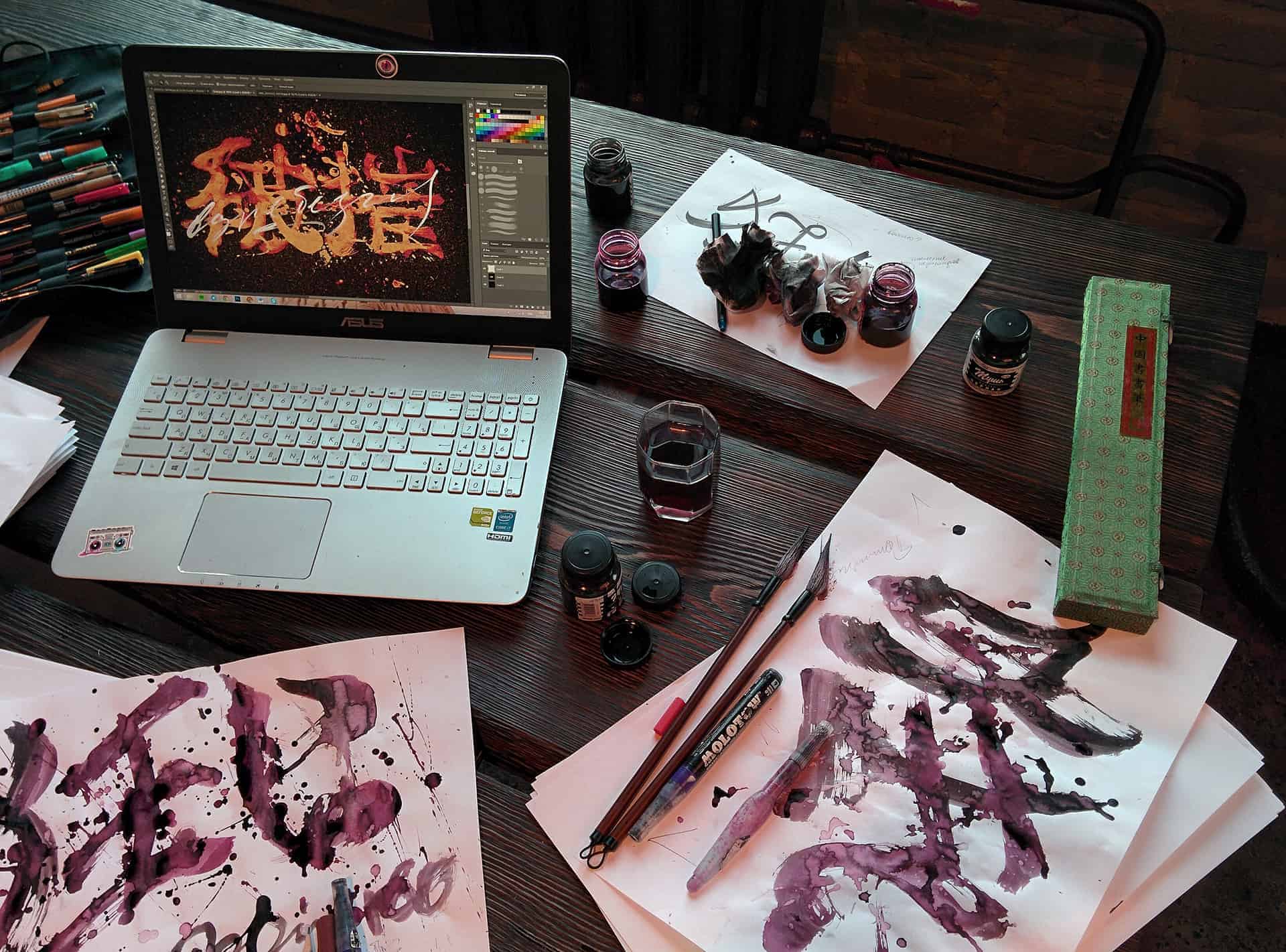
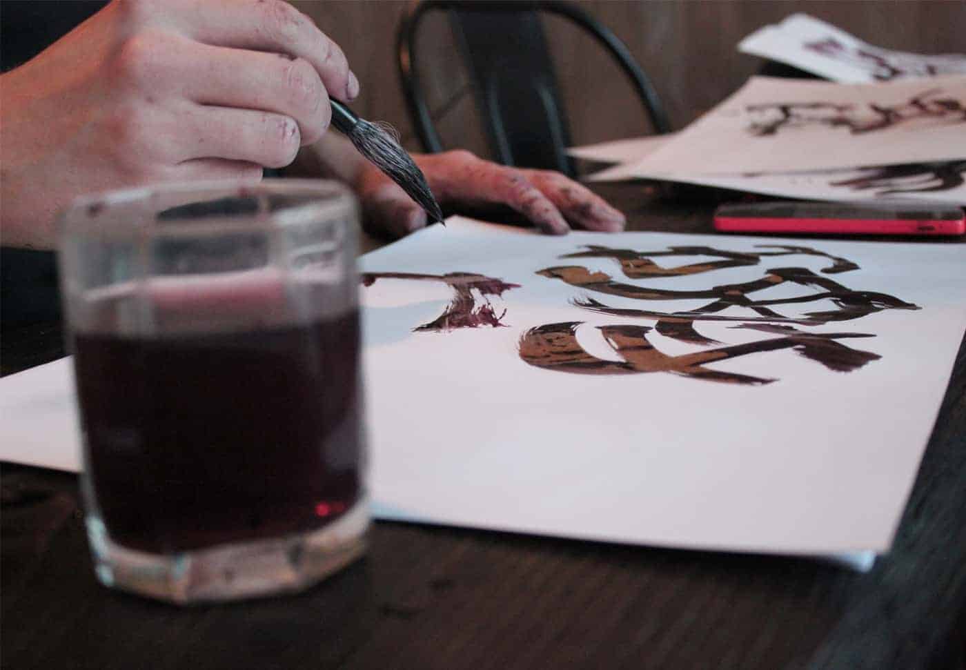
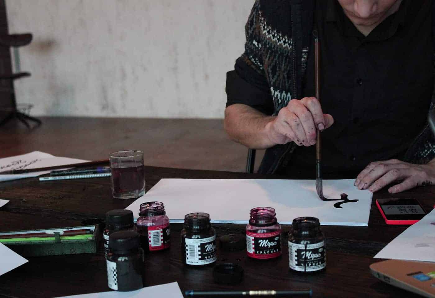
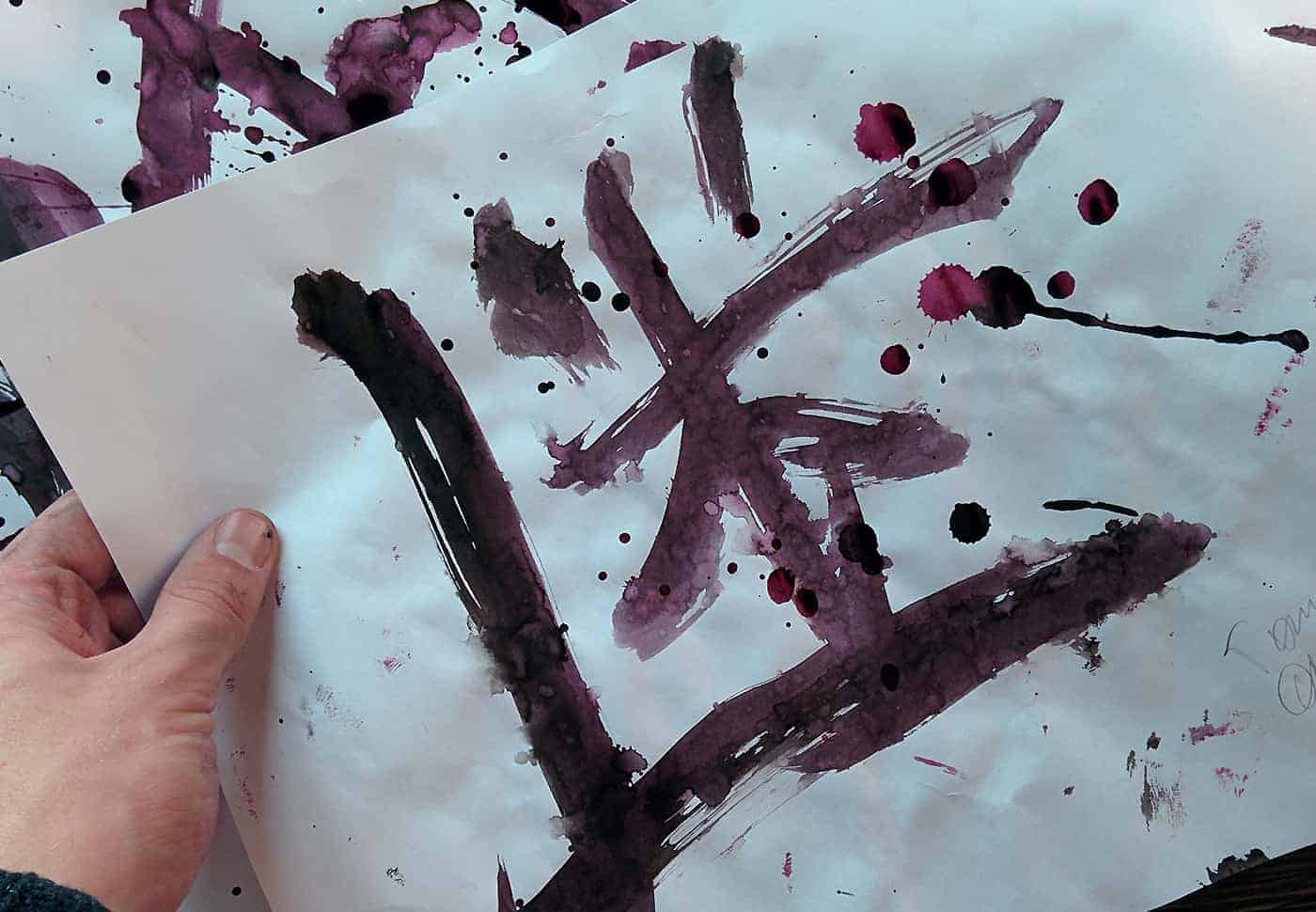
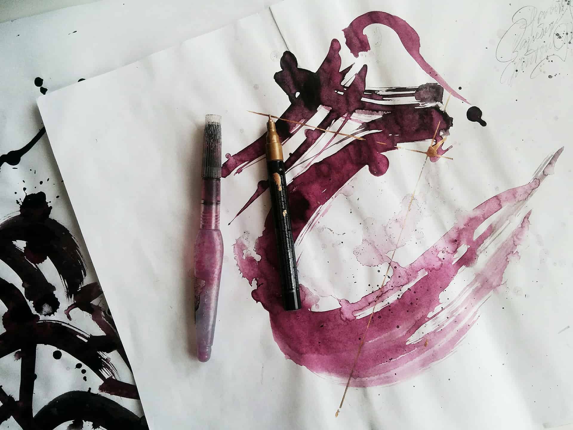
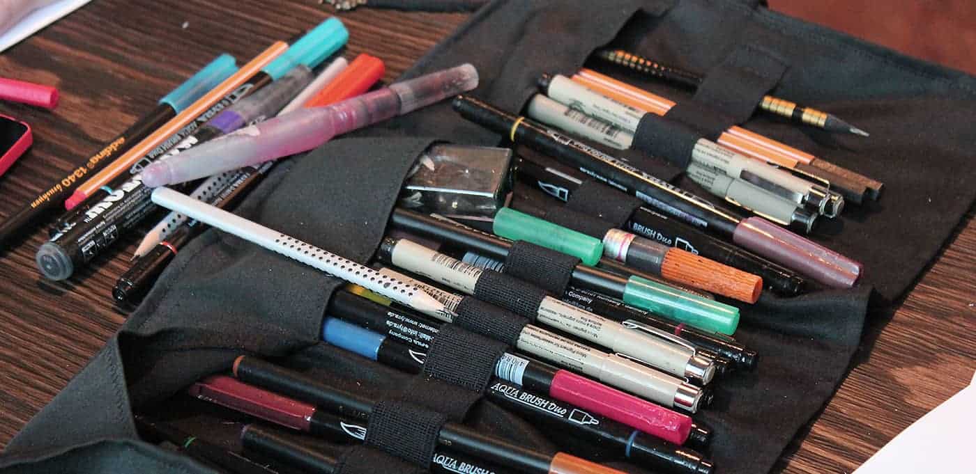
I used Chinese brushes and Adobe Photoshop. Most of the work was done on paper with the help of brushes and ink, after which the received hieroglyphs were processed on the computer, the necessary colours and graphic attributes were added.
People were very warmly welcomed this project, not a single person did not criticize me. Although I really like criticism and very well perceive it, I try to change every day and become better. I want to grow, because I'm very young and ambitious. For two weeks, the project scored more than 6,000 views and almost 800 likes on Behance.
This project was very difficult and taught me a lot. First of all, I got the experience of communicating with people, coordinating joint work on something common. I had to look for a photographer and a videographer, I had to look for a studio for shooting. At first glance, this is not a difficult task and I thought exactly the same, but without any connections in this area I had to work hard to find the people I needed.
This is one of those projects starting to work on which you only have a vague idea of how it will look in the final, and your process consists not only of hard work but also a parallel study of the tools and techniques, with which you are going to implement the conceived. Someone once said with an intelligent look, "Trust the process". Through the stress, from time to time passing into rapture, I finally began to trust it.
I advise everyone who reads this, never give up and follow your dream to the end. This summer was very hard for me and I did not know what to do next. I wanted to quit everything. I wanted to give up the dream of becoming a graphic designer and an artist, a calligrapher, I wanted to give up the way of life I've dreamed about since 13. It was incredibly difficult, but I overcame myself and made the right decision. Nothing should lead you astray and interfere with you. Despite everything, continue your journey and on the top, you will be grateful to yourself. Do not be lazy.
Valoriser l'expérience de la vie au travers des gestes ou des faits quotidiens. C'est une calligraphie avec tout un jeu d'imperfections fictives .superbe.