The Chocolate Rebranding by Laura Beretti
The chocolate fish is a New Zealand chocolate brand, which sells chocolate sardines individually wrapped in realistic wrappers, all destined to a children market. Read on and enjoy!
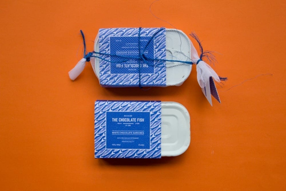
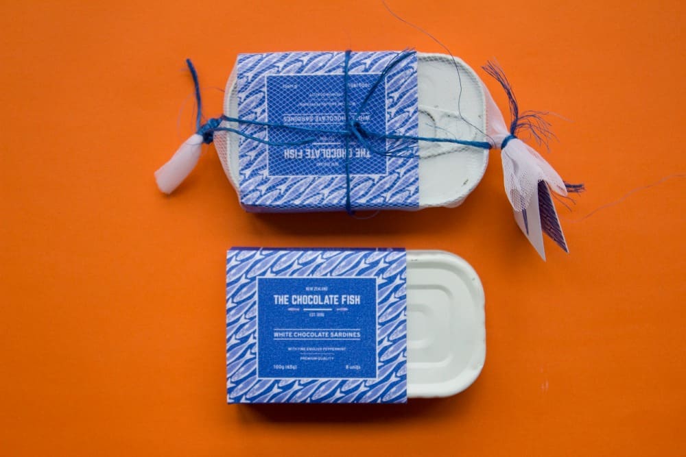
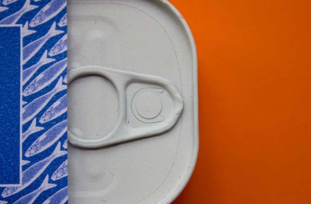
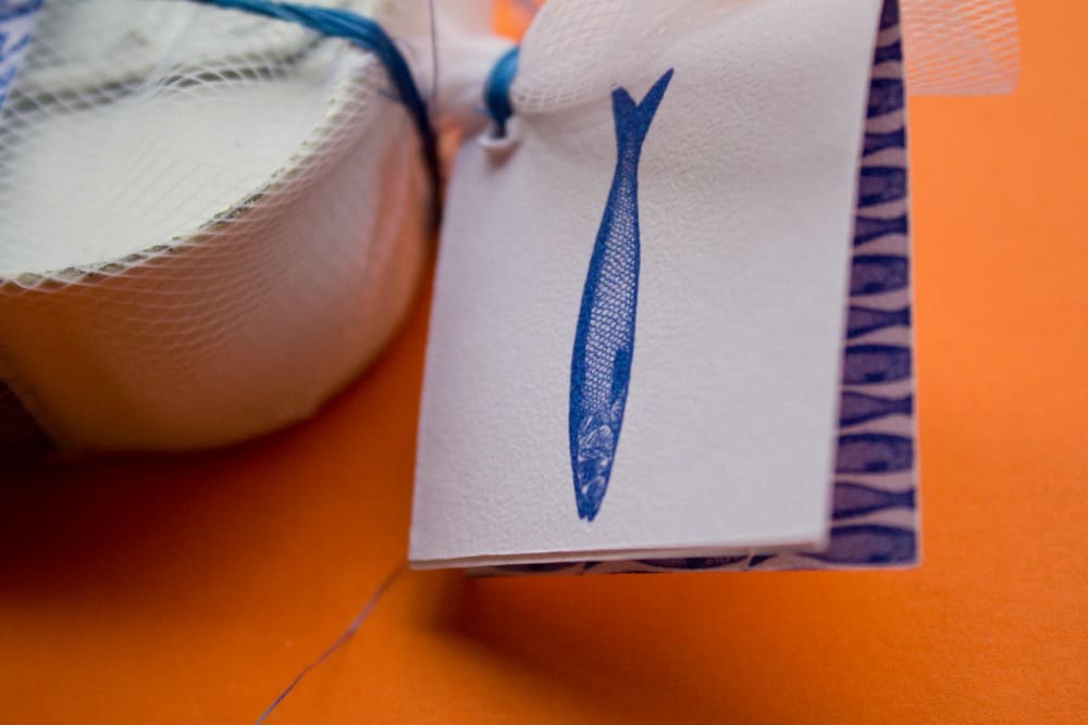
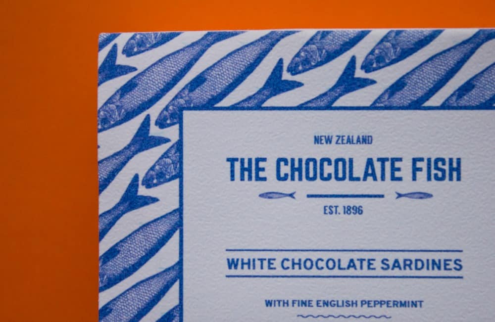
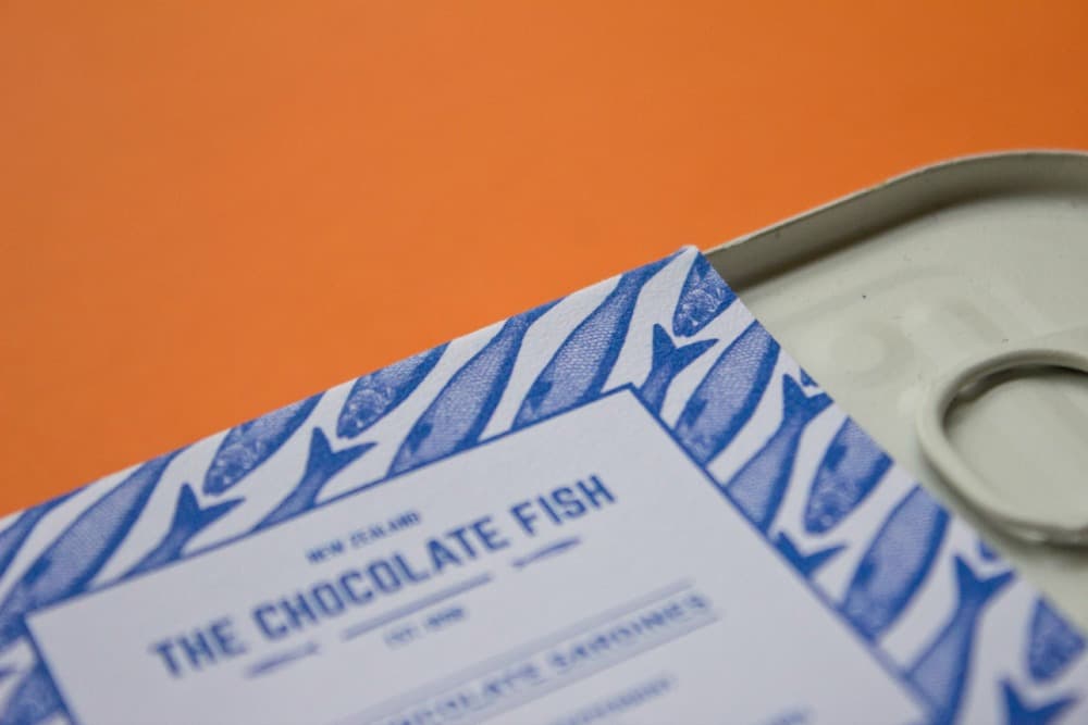
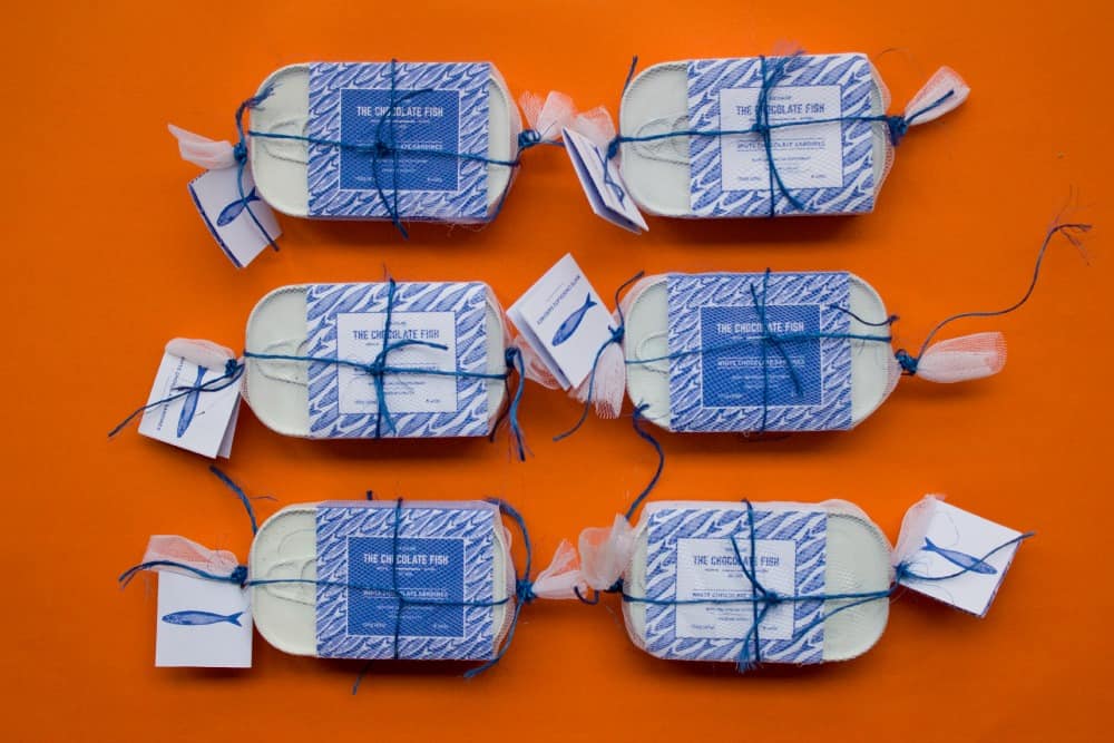
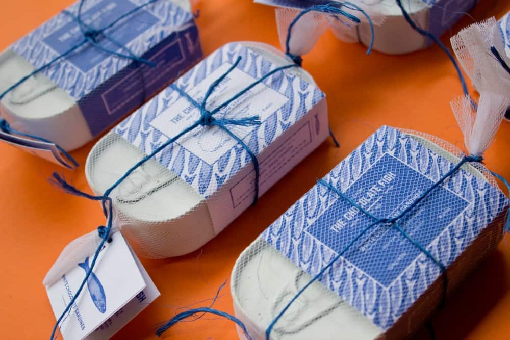
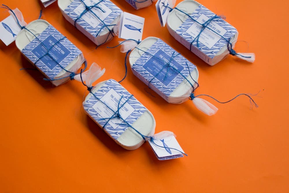
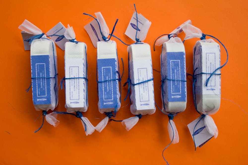
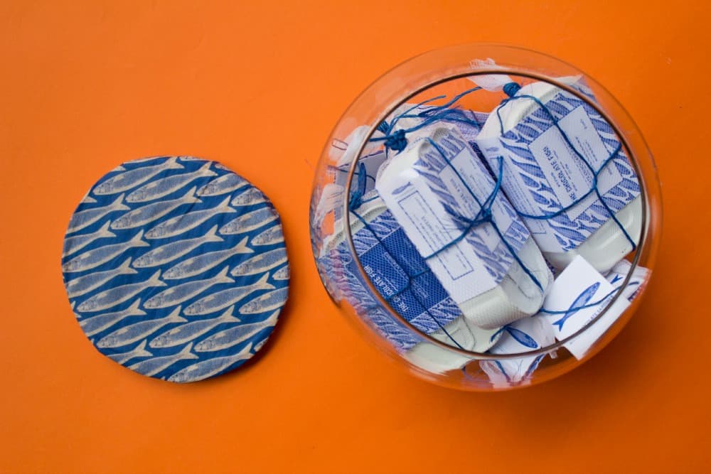
For this fictive student project, as I was studying abroad in Bogota, Colombia, in my graphic design course in 2014, I enterprised to rebrand the overall image of the company. I strived to make it more accessible and handcrafted to a broader, more adult market too, and make a parallel with it to craftsmanship, which is as delicate and dedicated as the chocolate making process. I wanted to keep things simple, and go for a two coloured chart, white, for white chocolate, and blue to evoke the sea and the art of fishing ( we are evidently talking about sardines here). The sardine cans were bombed with white paint, and tied together with blue raw string. I wanted to play on the ambiguity of real canned fish, and chocolate goodies, which is a very mind-stopping, confusing concept all in all at first sight. The packaging has to be as good as the inside, and attract consumers' into wanting it as an object, and not only as a wrapper.
- Laura Beretti

About Laura Beretti
Laura Beretti is a final year graduate student in an Artistic direction master degree at l'ESAG Penninghen, Paris, France. She have lived in New-Caledonia, studied in Australia, Paris and Colombia. Also, she works as a free-lance designer on my spare-time. She has a great interest in typography, photography and packaging. She'd like to think of graphic design as an aesthetical answer to everyday's problems, always thriving to make the world a little better, more functional and beautiful. She uses a lot of colors, bold ones in her body of work, and she likes work that is moving for the eye, engaging, fun and that raises that one question that could make any designer twitch "how was it done?". You can find more of her artworks on her Behance profile or website.
