THE MESSY CORNER

The Messy Corner is an online store selling personalized accessories handpicked from around the world striving to create a personalized style for its customers. The young entrepreneurs wanted to create a brand identity that reflected their young and fun outlook but also defined luxury and quality while extending their life motto of 'if you like it, put your name on it'.
![]()
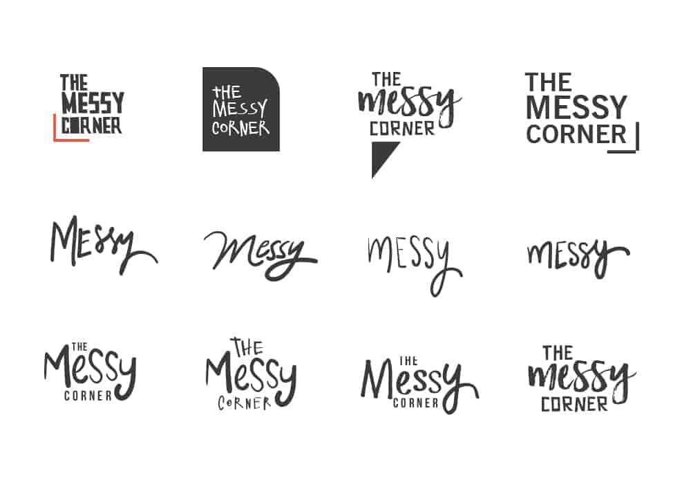
The idea was to replace their static logo type, with an identity that could relate to its young, travel savvy audience, that loved the brands hipster cool vibe as well as high quality luxury standards. Since all the products sold were personalised to the customer, I choose to hand letter the logotype to add a personalized touch instead of using generic typefaces.
The challenge was to express the "messy corner" but not make it look untidy. I tested several hand drawn lettering along with hand drawn fonts and script fonts. After several mock-ups we decided to also add a sans serif font adding strength and energy to the logo unit. The hand drawn elements helped express "messy" while the sharp and bold typeface helped create a study unit which was important to the client.
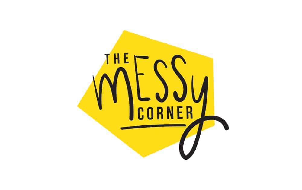
Further I wanted to add an element that expressed the word 'corner' and experimented with all kinds of shapes and lines. Eventually inspired by the shape of a road sign I decided to add a pentagon background. The pentagon with is unusual shape (with corners) that symbolised the offbeat products this special 'corner' carried. It helped to introduce color without having coloured a typeface, balance the whole unit and call more attention to the brand identity.
![]()
I began the process making rough sketched on paper to see what layout possibilities I had, and then used my Wacom tablet to digitize these drawings. On paper I experimented with initial sketched with the pencil and then moved on to free and drawing with my tombow calligraphy pens.
While digitizing options I prefer using the brush tool with the wacom on illustrator as the pressure and various strokes help add a quality of hand drawn that the pen tool rarely offers. It also allows me to experiment with more options at this stage that I couldn't have sketched or drawn on paper.
For the logo unit I tried combinations of script, hand drawn and sans serif fonts to create a complete unit while experimenting with shapes in Adobe Illustrator. For creating the branding collaterals like stationary and the invoice I used Adobe InDesign. Adobe Indesign is great for building print materials as it helps build grids easily and thus helps in making layouts and perfect alignment.
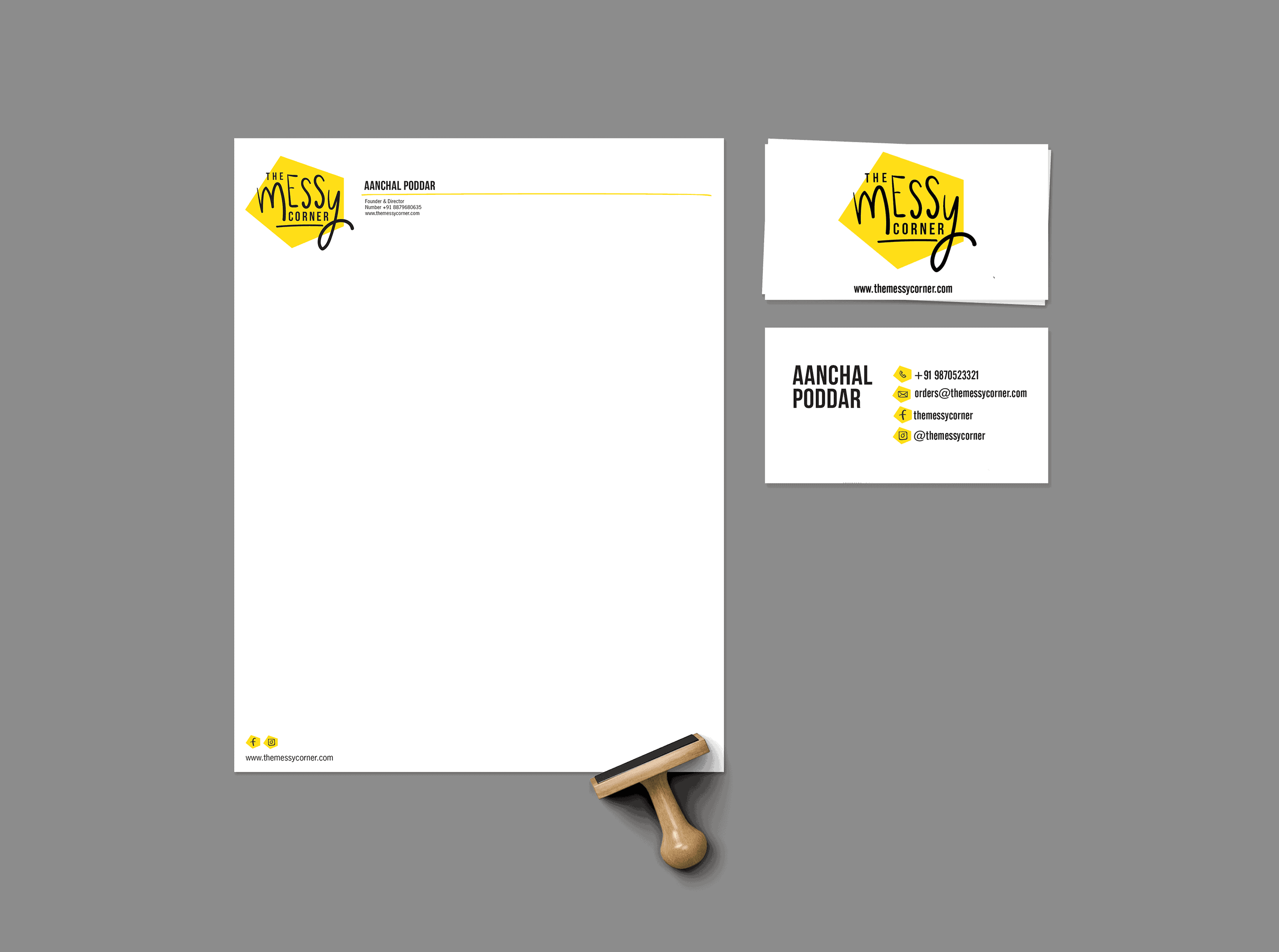
With any project in the industry client satisfaction is the most important. With every new client interaction you learn valuable lessons on how to communicate and reach a middle ground between your vision and the clients expectations. From this particular project I had to keep in mind to create an identity that not only defines and projects a brand image but is usable in daily life, through packaging, invoices and maybe even extend into products in the future. The success of the project was that the client found it easy to use through their different mediums including website, email signs, and watermarking images.
Can u share me who had made these website
This is actually nice!
Aanchal Poddar