The New Yahoo! Re-Imagining the Brand and Experience

One of the pioneers of the modern internet was Yahoo! It was one of the biggest and most important sites during the mid 90's before Google took over late 90's.
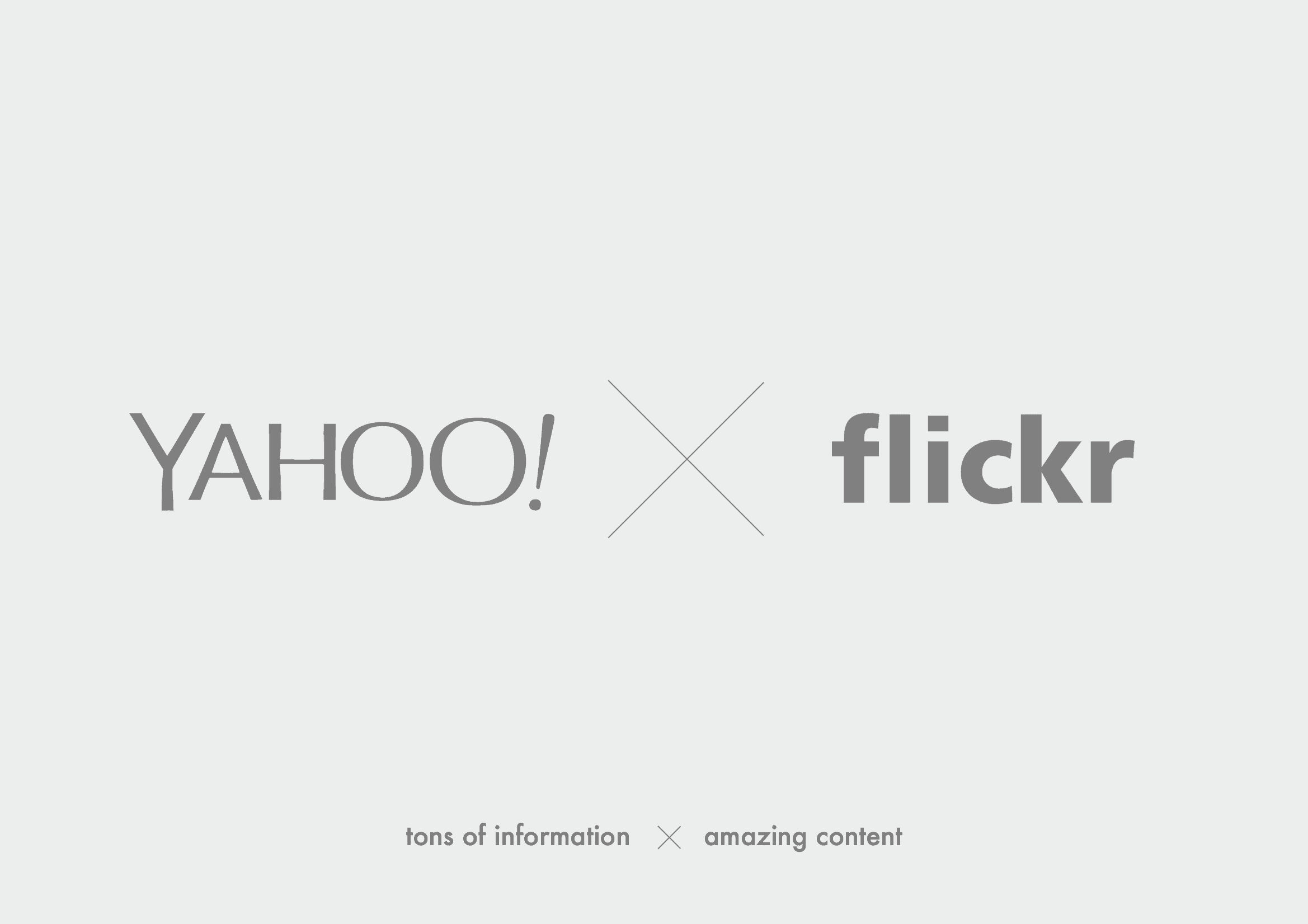
Yahoo! bought flickr in 2005 and Tumblr in 2013. I thought there were interesting opportunities to completely rethink the way Yahoo! communicates based on them owning flickr.
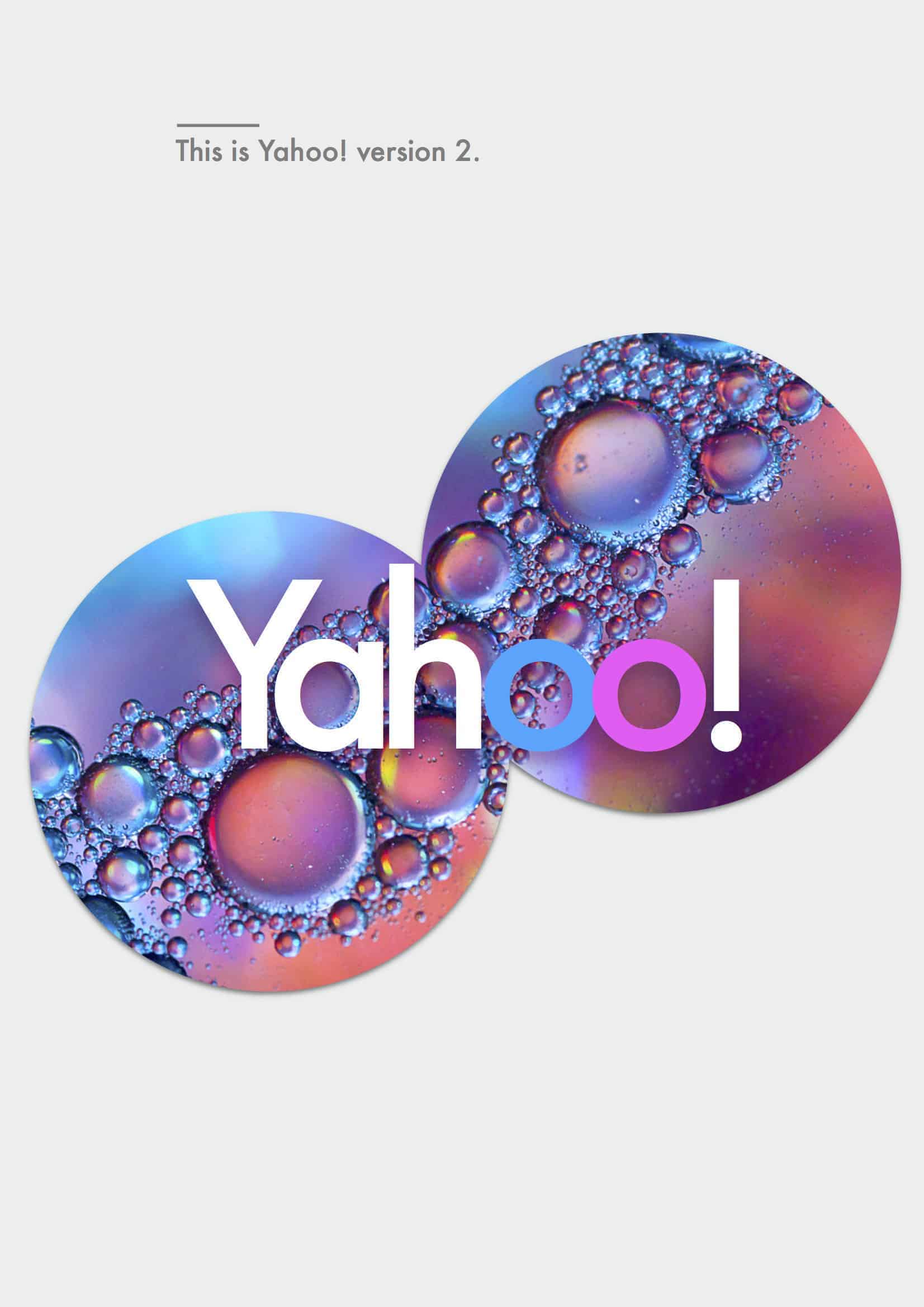
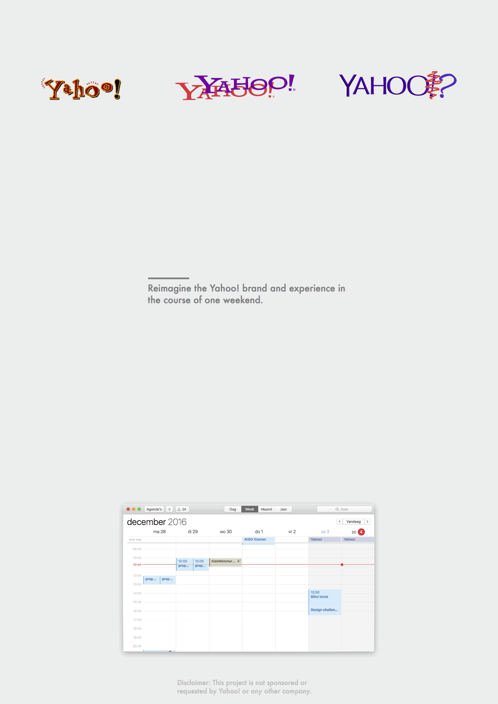
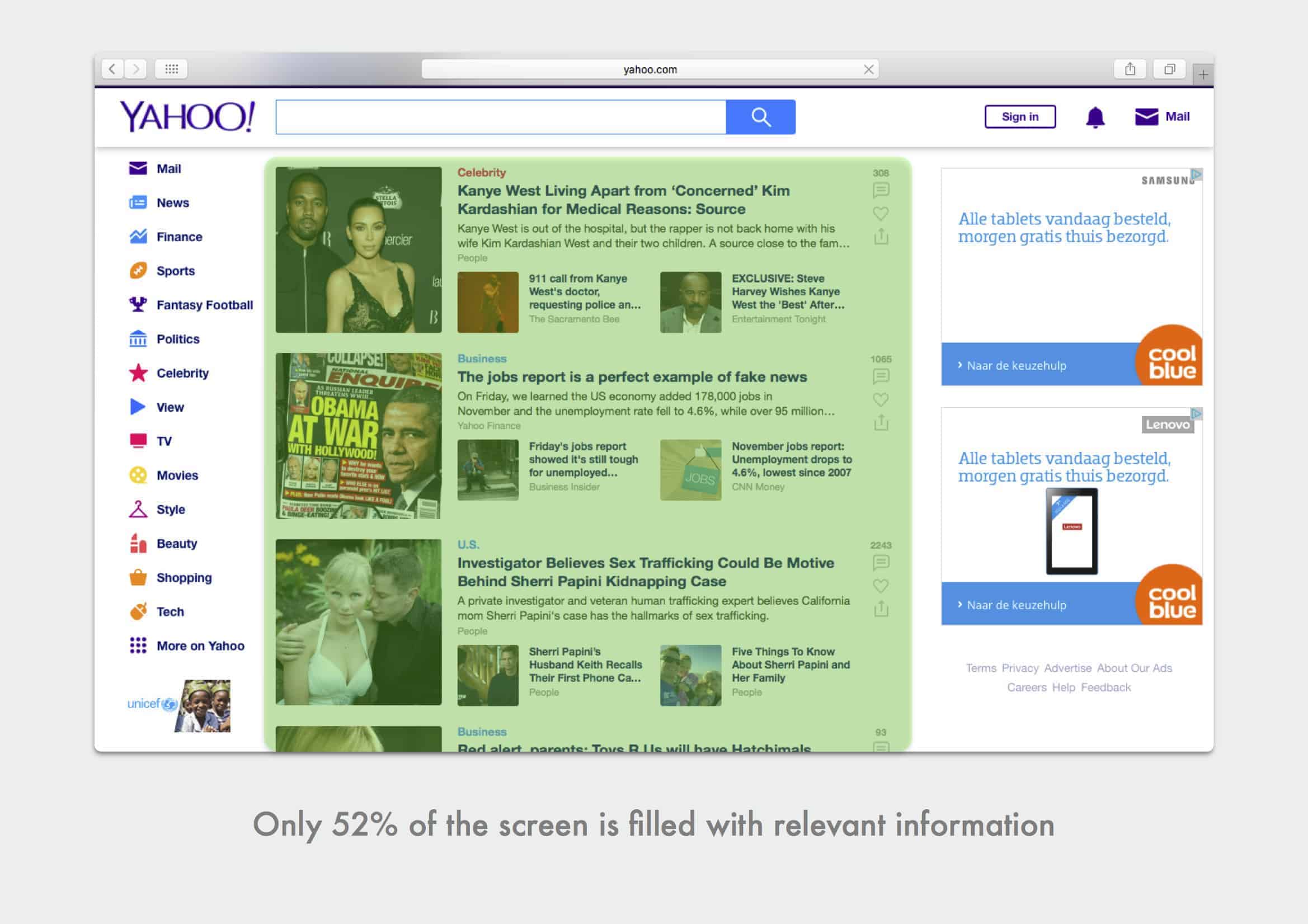
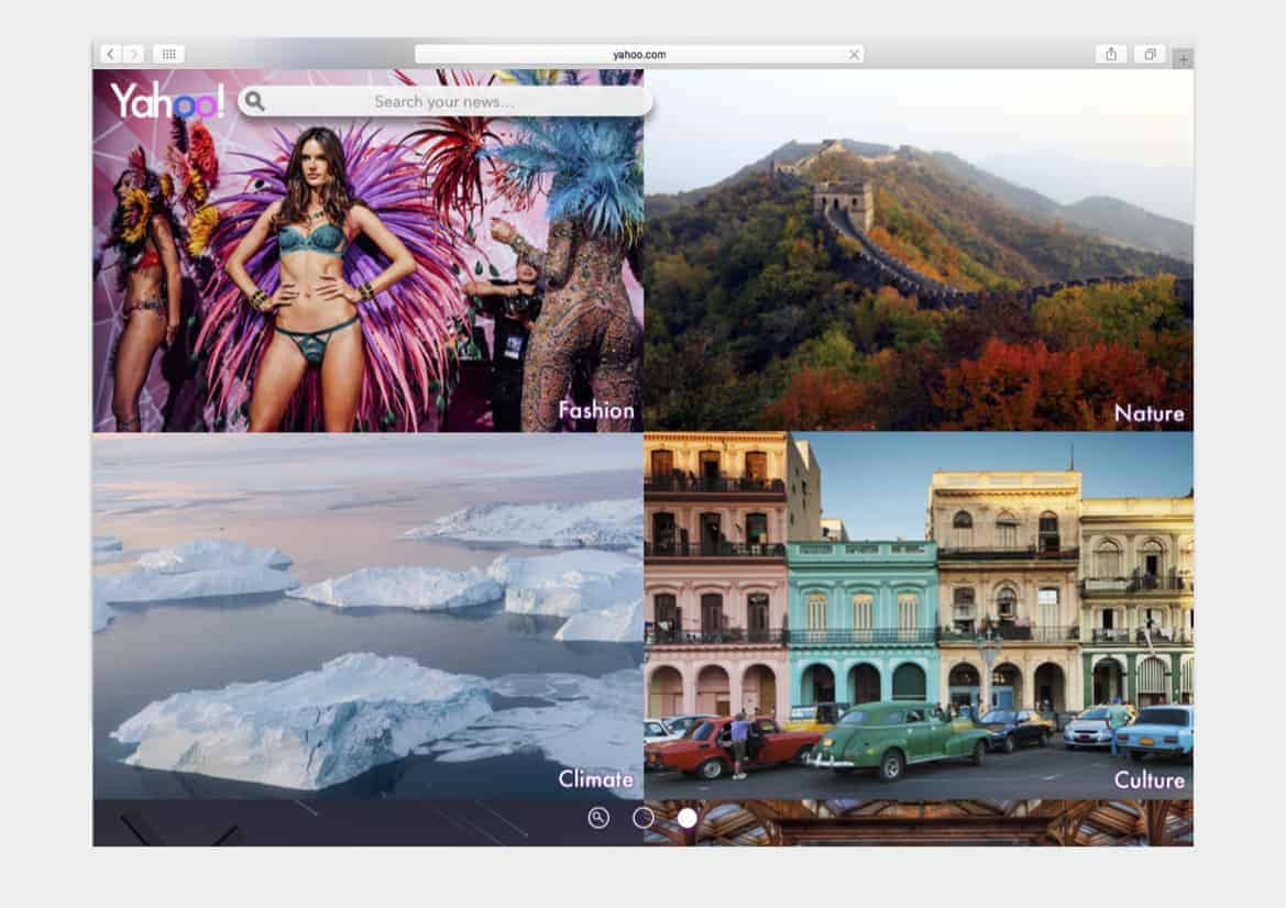
To redesign something was in this case not to simply make another variation of some logo. There is a much larger problem that rooted in their product experience.
Although Yahoo! has made some questionable decisions and horrible mistakes over last 5 to 10 years, they kind of seem to care about good content. They've bought Flickr and Tumblr I guess in spirit of encouraging a community to keep making good content. In reality they're failing at that. They started to put ads on tumblr and their main page is littered with ads, even in small corners where they managed to squeeze a logo in.
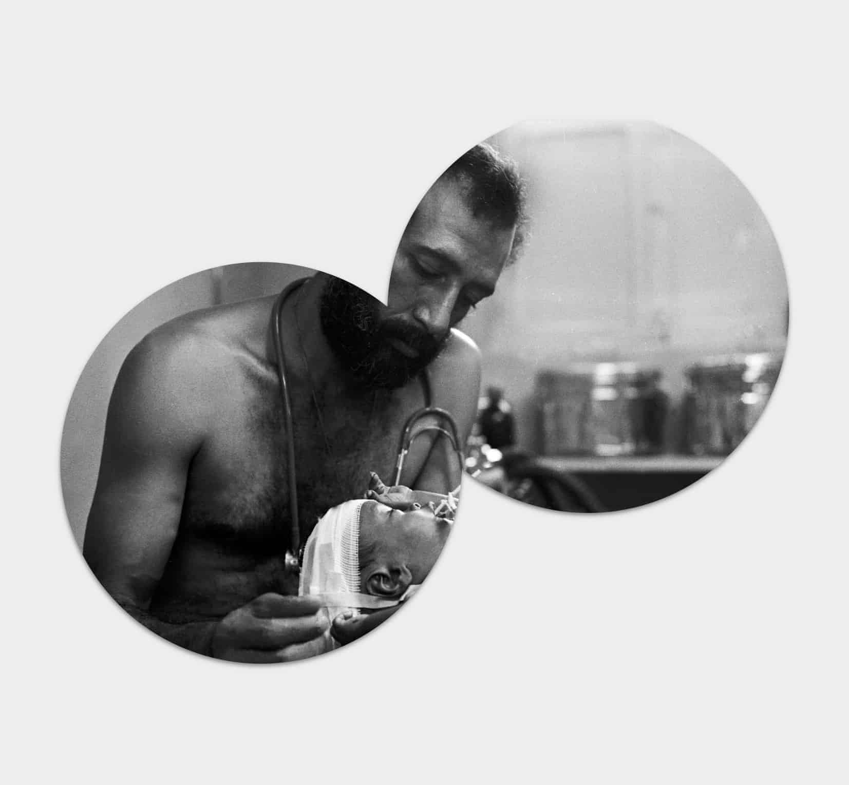
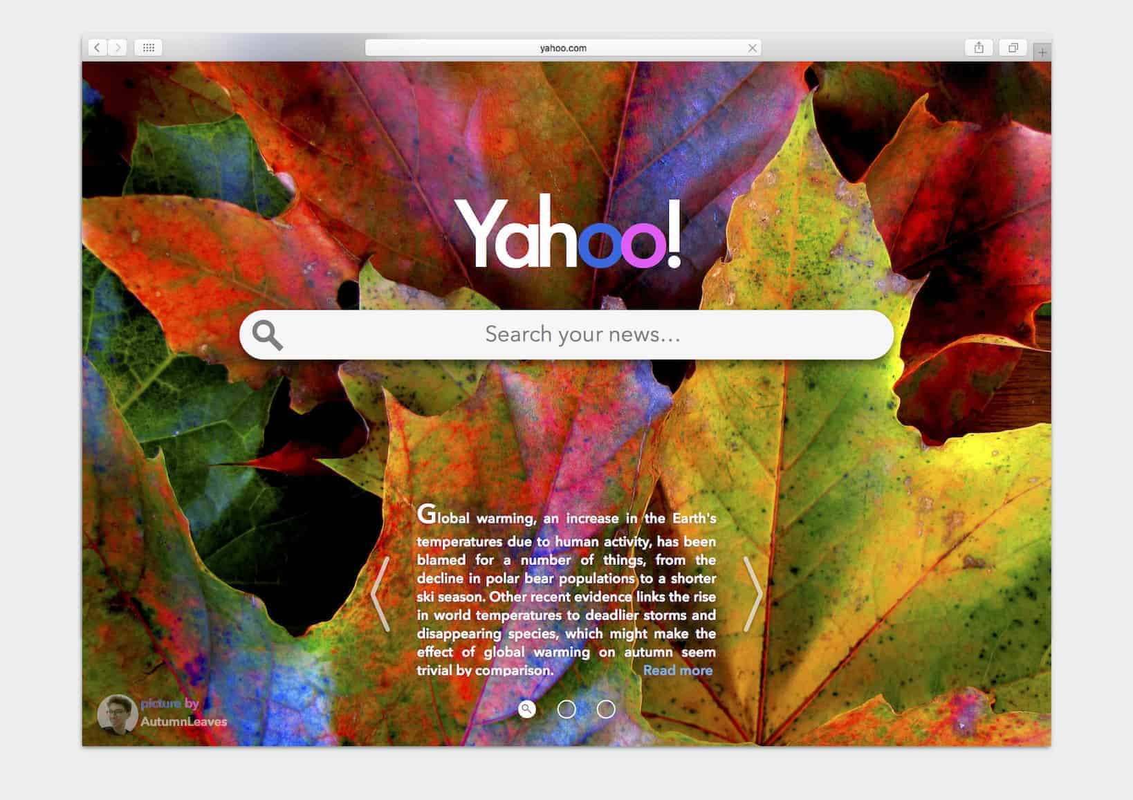
Combining flickr and Yahoo! creates a whole new experience that inspires people to see the real world in this bite-sized 144 character news world.
For this project I used Adobe Photoshop, Indesign and also Apple pages believe it or not.
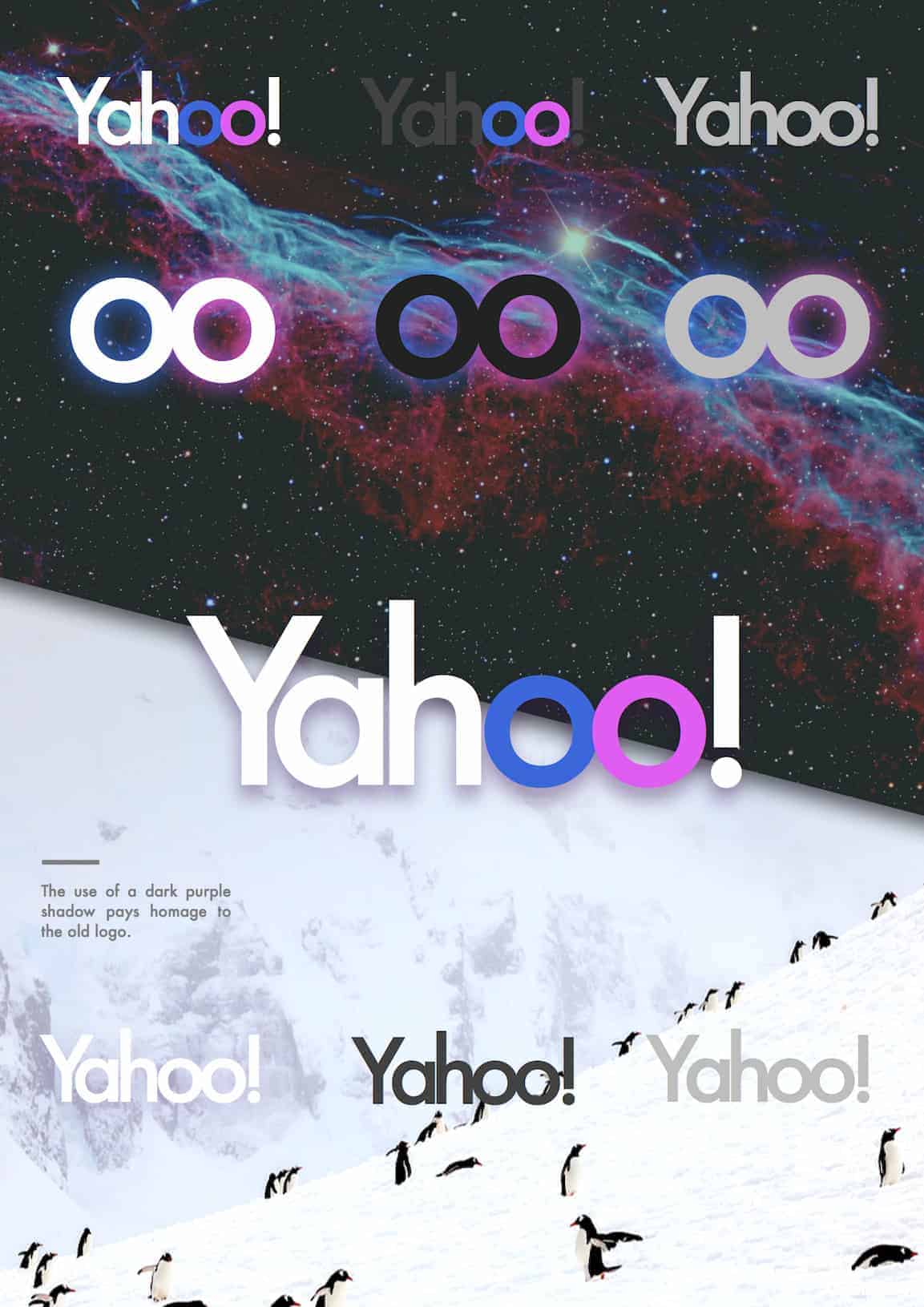
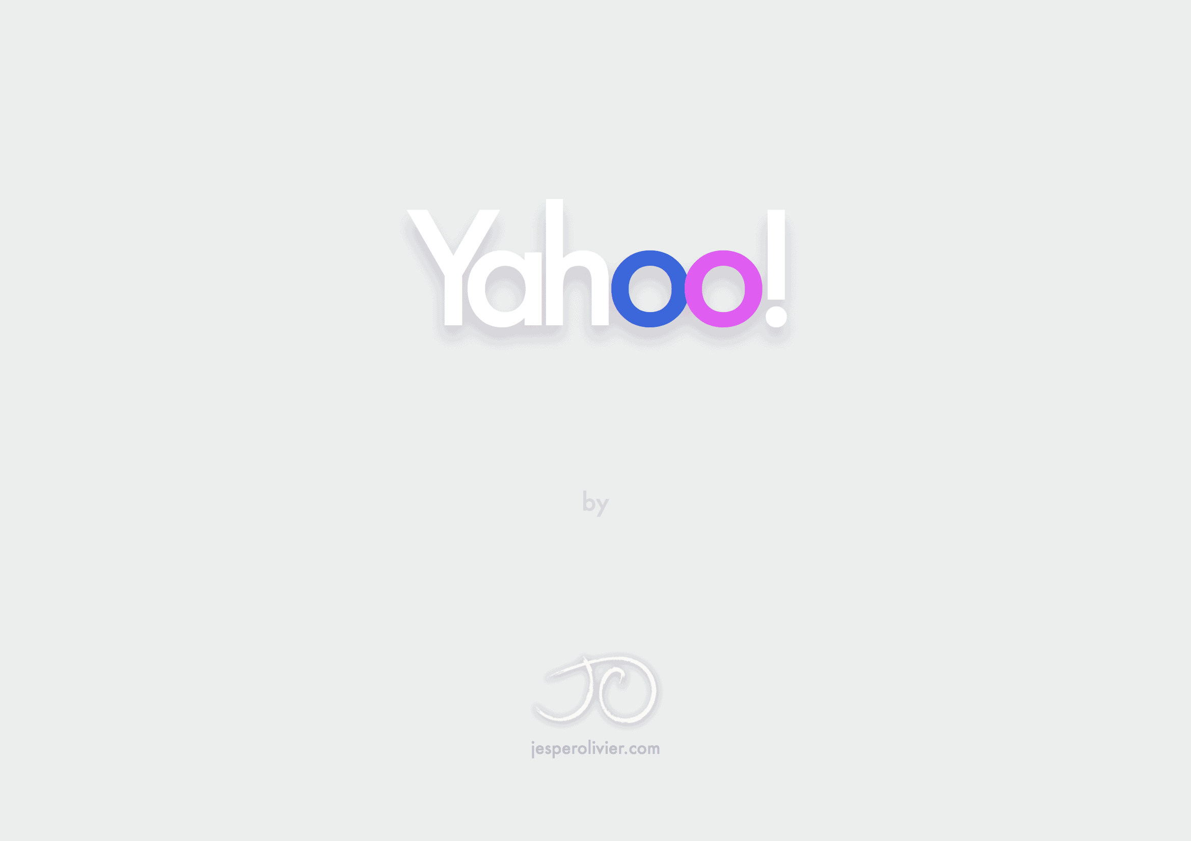
I started out with just looking at the Yahoo! site. By then I have seen some variations of the logo. What I decided to do was to start with the experience, and how this could be improved. Making the click with flickr was quite straight forward then. I choose to stick with a uniform font that does not taper in font-size like the old logo. The incorporation of the flickr logo is done by giving the oo in yahoo their distinctive color. Stepping away from purple was importent in order to leave behind their weak brand identity.
I guess the main thing I took away from this weekend is that to just design a new logo is useless in rethinking a brand. Starting the design with an experience or an underlaying philosophy creates honesty and clarity that will be ultimately functional.