The SAUCEBAY | Brand & Packaging

Project of branding and packaging for The SAUCEBAY, a handmade sauce company that was founded in 2015, based in Curitiba, Brazil. Two friends and engineers passionate about the gastronomy's flavoring diversity discovered in the sauce business an opportunity to provide unique experiences for the local community interested in cooking and tasting.
Having a close engagement to the partners and working from the beginning to end with an open design system allowed us to develop the company's identity in an organic way as the company itself.
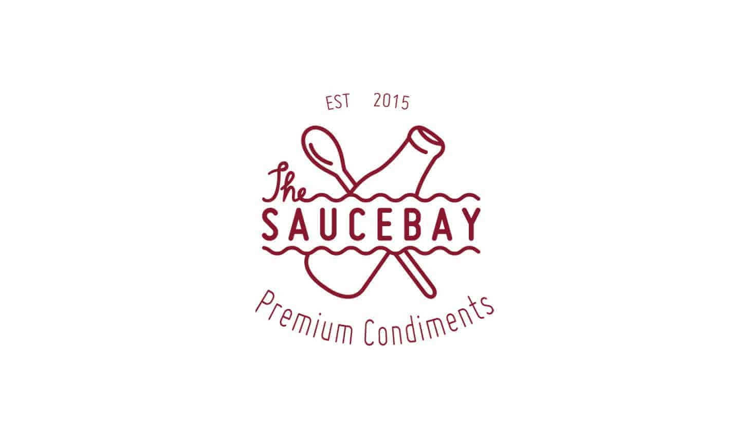
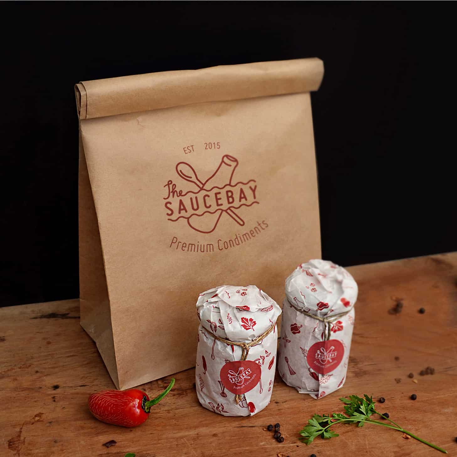
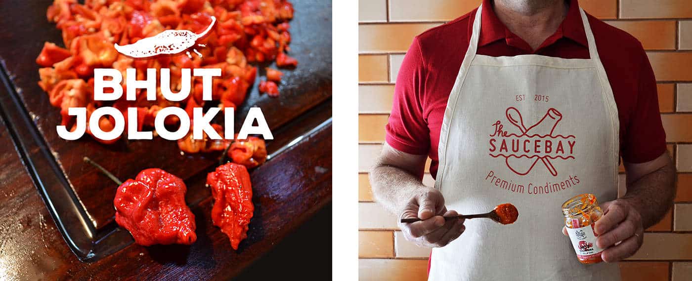
The logo is simple and friendly, bringing ideas of quality and the handmade process evident by the spoon icon, revealing the human care, together with the bottle which represents the convey to the consumer. The graphic waves bring the ideas of the sauce and the bay spreading the new flavor experiences all over the places.
After studying the context and a long work on the concept I started with manual sketches to generate visual ideas. Then I migrated to the computer and worked basically with Adobe Illustrator and typography mixing with a bit of lettering.
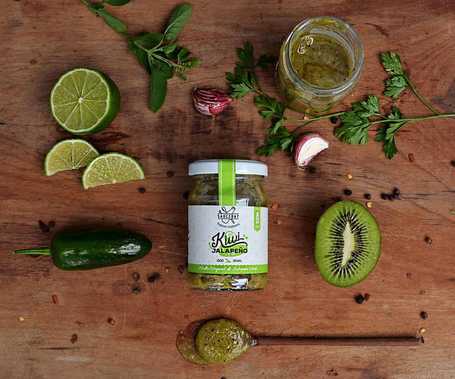
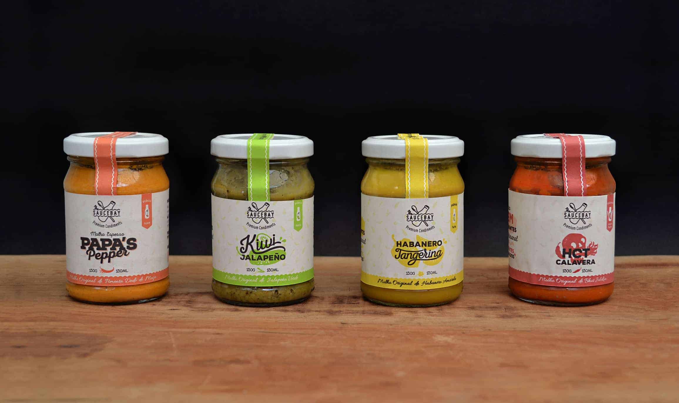
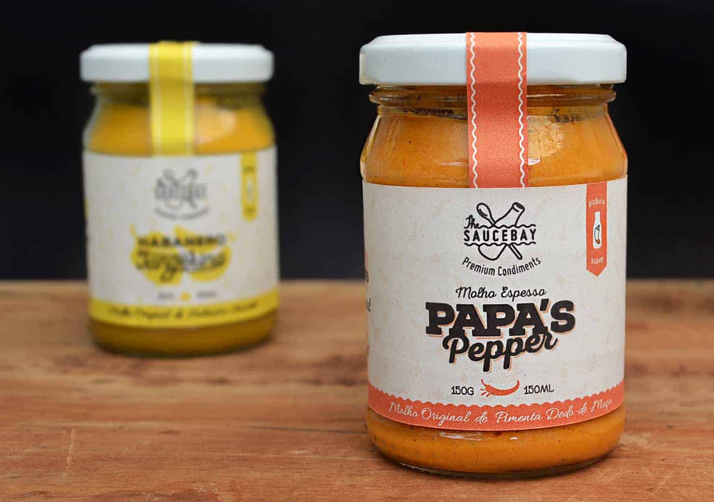
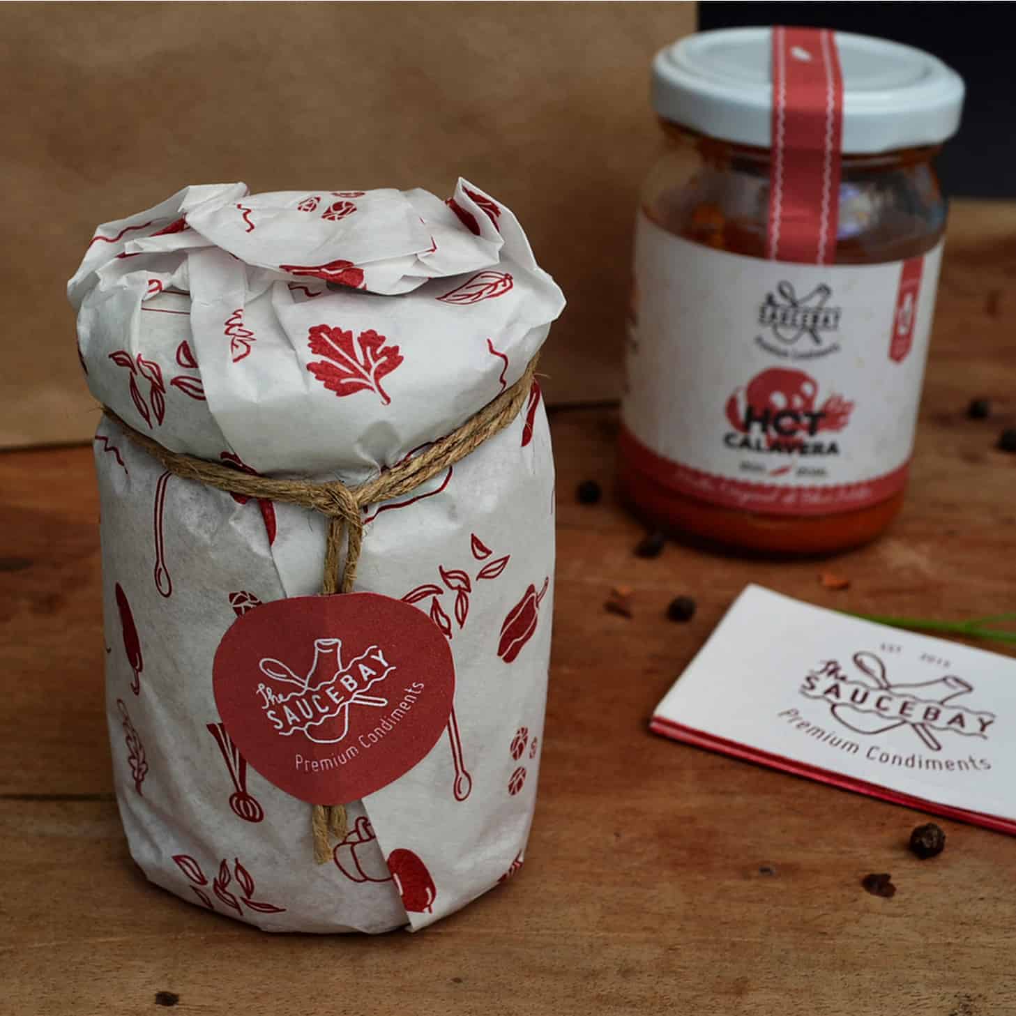
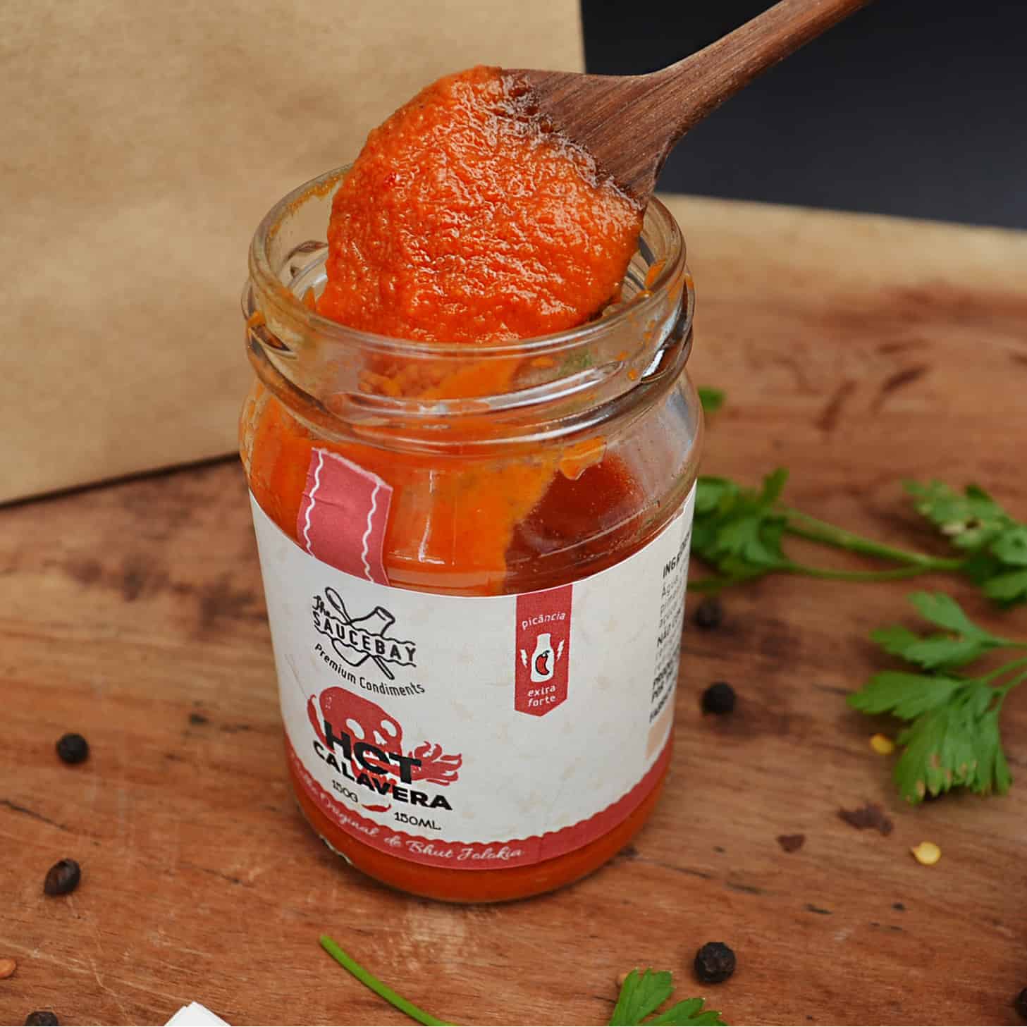
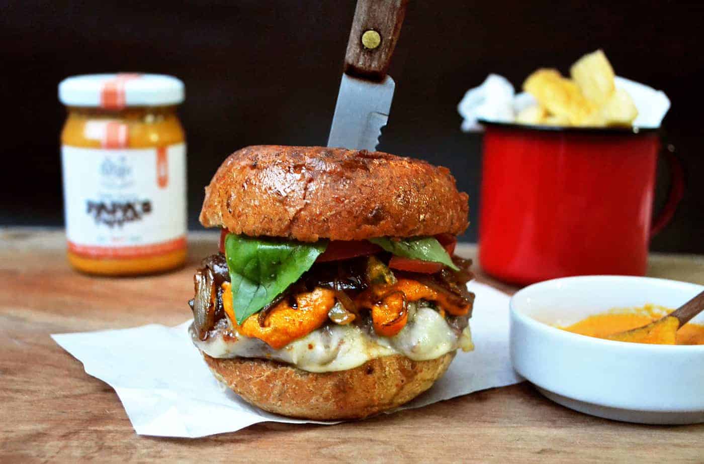
For the first set of labels it was developed four sub different brands to highlight its essential features of every sauce. The rough, but playful, illustrations and the colors visually express warmth and the remarkable taste of the products. A spicy label icon was created to show the spicy scale where each sauce has an indicated level depending on the pepper used.
The jar was chosen as an economical packaging - to give it a hometown feel and the labels with a spot for handwritten information and a string for tying the paper showing the manual care of the producer with product.

The people directly involved with the business, final customer, has shown positive feedback about the whole brand aspects. This was the first time working in a food project, the final customer are very rigorous when comparing to the competitors. It has been a very good experience.
I've seen that the client has reached what they wanted. Being placed on the desired market with the appropriate brand/product. It's very important to catch the client feedback and also hear the positive feedback.