The Smasher's

The project was developed for the opening of a friends hamburger business in Buenos Aires, Argentina.
When they contacted me, they were clear about the name of the business THE SMASHER'S, they explained to me that the smasher was the tool used to crush meat, and that what they were looking for was to start selling their homemade burgers.
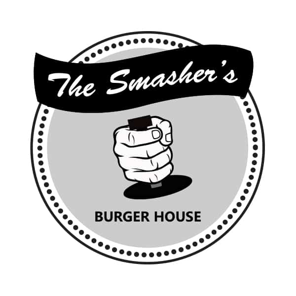

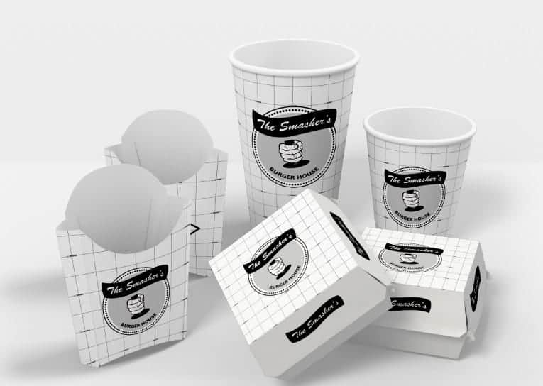
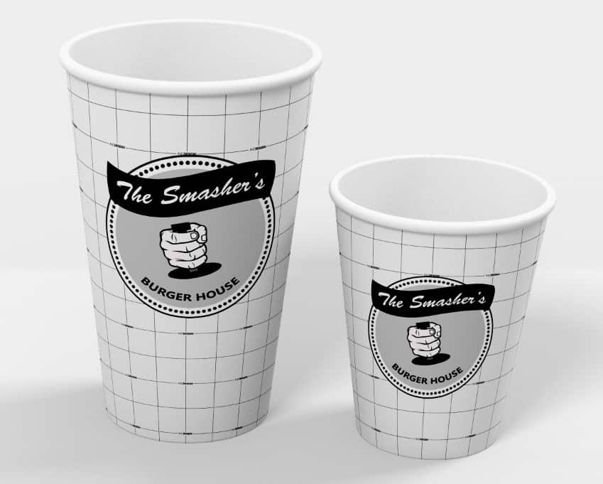
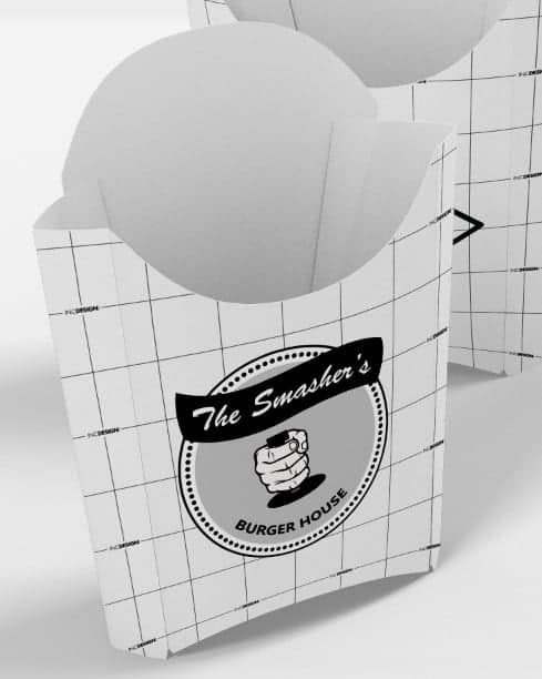
The logo is showing the tool used in making hamburgers, known as SMASHER, highlighting one of the main characteristics of the product, which is completely HOME-MADE, made by its owners.
It was sought to make a North American style design.
The typography is Brush Script. The colors used were BLACK, GRAY AND WHITE
The tools used for the design were, adobe illustrator and photoshop.
To start designing, look for smasher models on the web, logos of North American brands, and I was making various designs playing with colors and fonts. Finally, we realized that if The Logo did not say the word hamburger, the logo was not understood, then the word Burger House was added.
The business is in the pre-opening stage, my friends were satisfied by the repercussion on social networks. They have already received several inquiries, that is, the message is clear, and we achieved what we wanted, an acceptance of the brand.
Whenever you go to design, get involved with the project, make your clients contribute their ideas, research what you have to sell, look for models, not to copy, to get inspired. And my advice is that you should at least put together 3 different designs to offer your client at the time of the first presentation.