The Things | Fruit Juice Brand Design

The Things is a juice brand. The brand means "important little things”.The design inspiration of brand logo comes from "handwritten letter and signature".The concept of "important little things" is embodied in the expression of "handwritten signature”.At the same time,the brand application and packaging also continue the concept of "letter”.

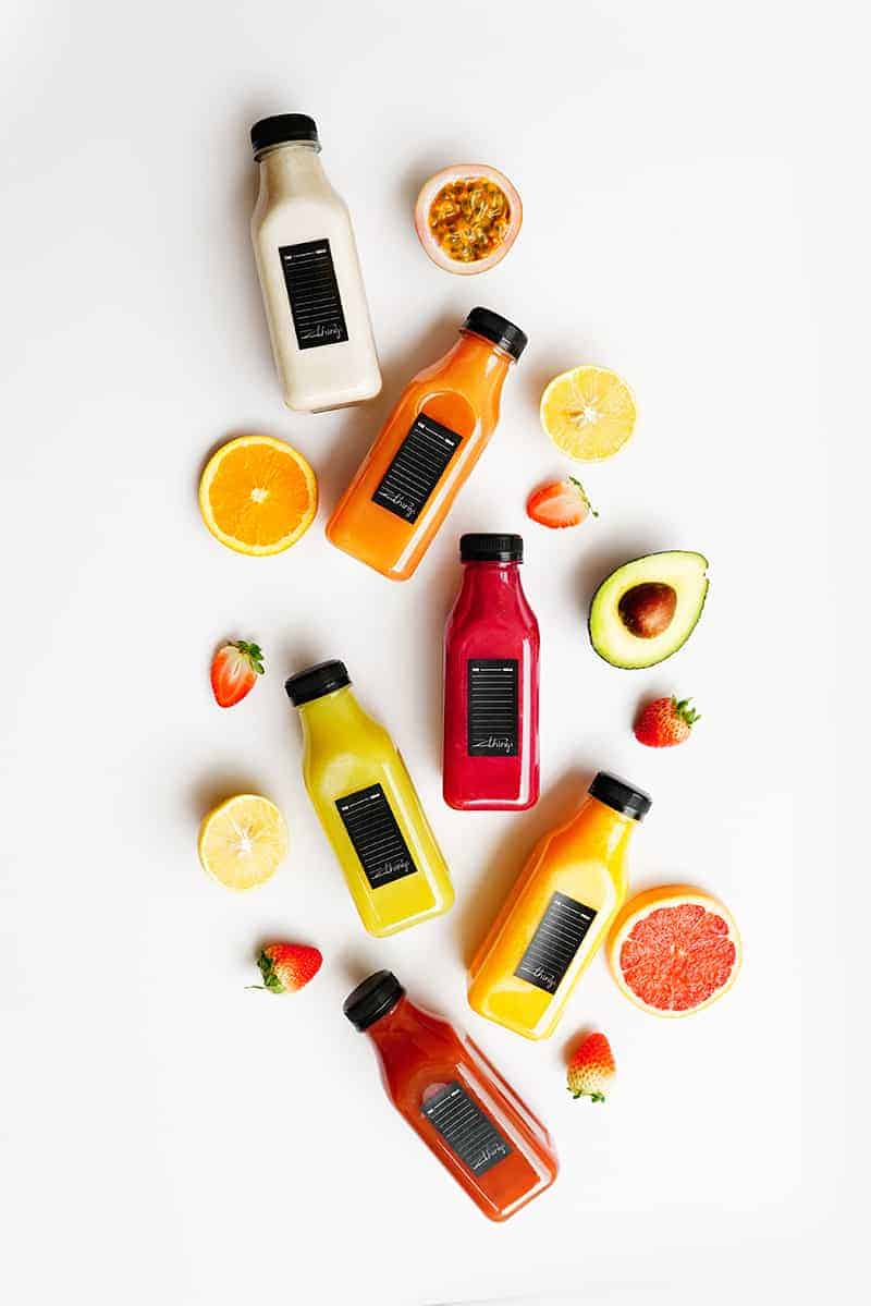
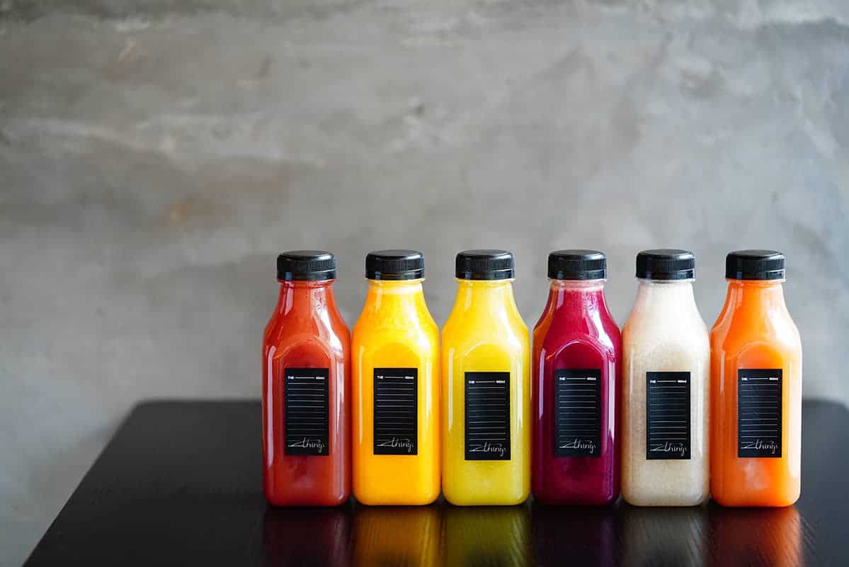
The name of the brand is "Important Little Things". It is a healthy juice brand that advocates the use of no added pure fruit. The explanation for this name is "It is a small thing, but it is important" or "It is important, but maybe it is a small thing." We did a few brainstorming during the design process, and think that “a letter with an autograph” accords well with its design philosophy. Because writing a letter has no sense of burden, and the state of writing may be as light as a piece of paper, but the content of the letter should be important. More importantly, a signature that looks very handwritten is simple but ritual, highlighting that a small thing being taken seriously. In the proposal, we communicated this concept with brand side, and both sides agreed on it without any opinions. So we used the format of "a letter with an autograph" as its logo. In terms of color, we proposed two kinds, one is plain green, which means health but may not be very shiny, and relatively safe. The other color is warm gold, which means good quality but may not necessarily noble. Because the brand's audience is also very popular, it is not necessary to reflect the expensive gold, but a little bit is enough.
We basically used AI to create this work.
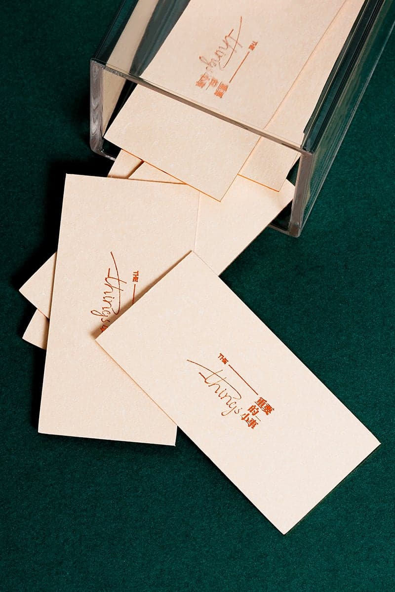
About the logo of the brand: we use "THE" as the heading and "things" as inscription. In the middle of these two words, we use "line" to express the "envelope format". The font of "things", in order to reflect the ritual feeling of "autograph", we especially wrote more than 100 handwritten fonts, and finally turned into vector graphics with software. It must have certain aesthetic sense, but should not be too abstract to be understood, also it cannot be too separate which may lose the sense of joined-up writing. So we chose one of them as the final version of the "things" in the logo. Of course, we should also consider the final use of slender handwritten font in the space sign. Some process of making sign may not produce slender lines, so we have to adjust the thickness of the "things" appropriately.
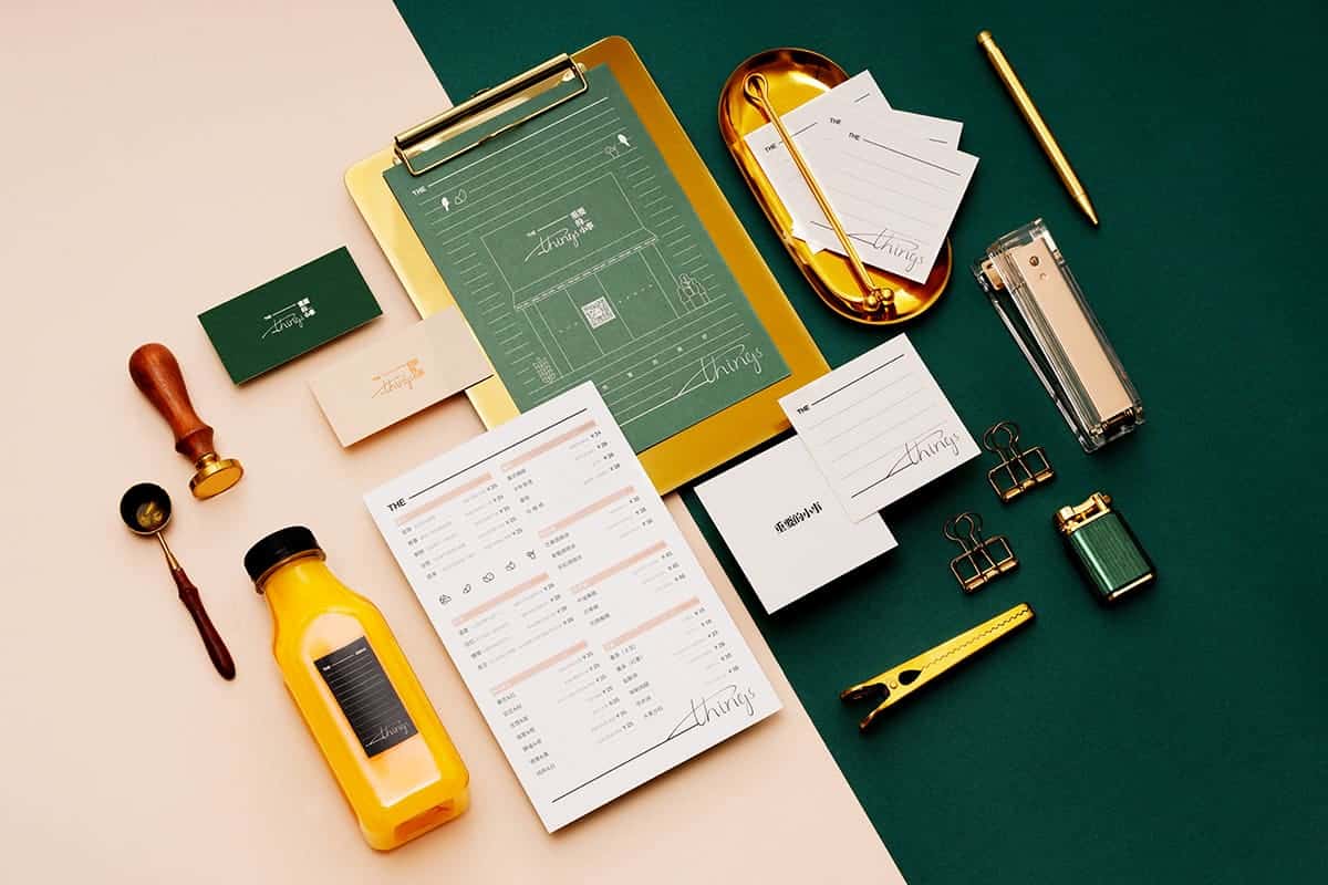
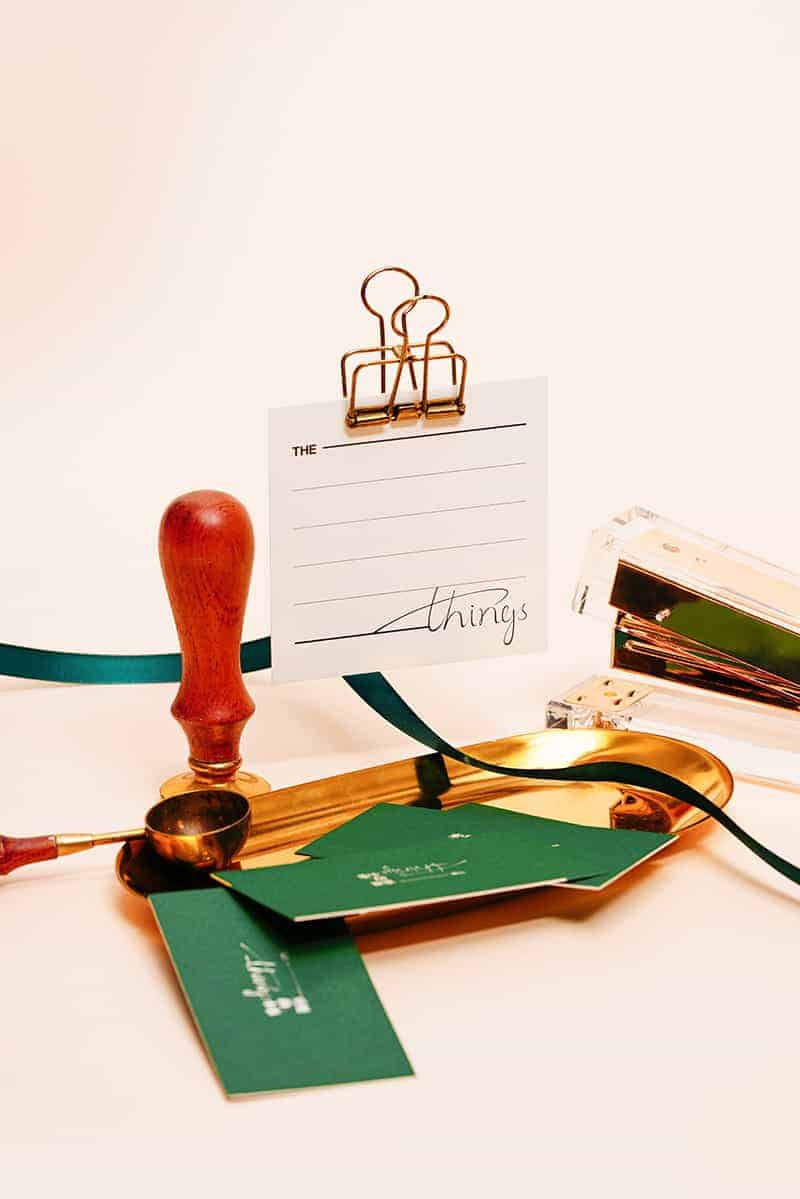
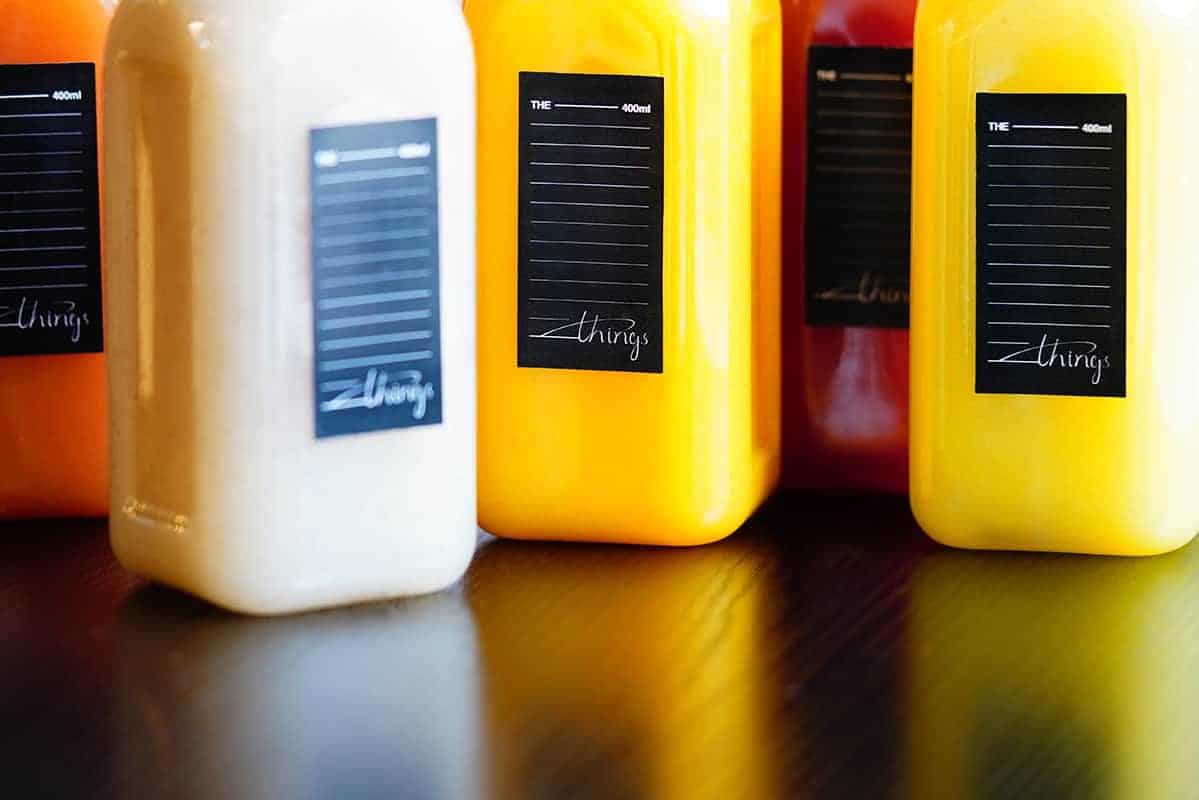
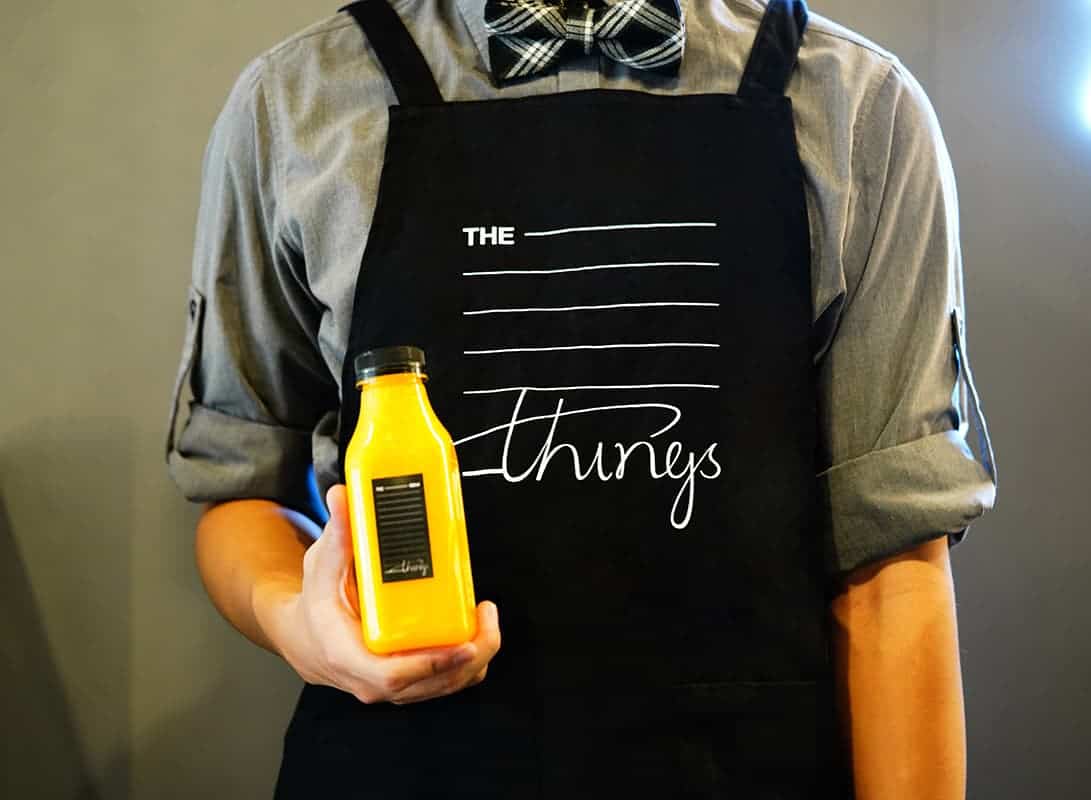
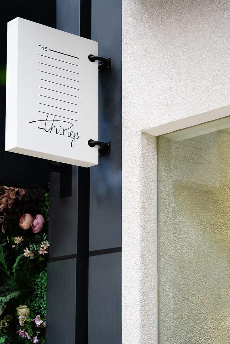
About the application of the brand: we extend the overall logo into a graph that can be arbitrarily changed in length, width and height. We hope to fully reflect the brand in the scope of application of different materials, breaking through the current status that the logo is single reflected in VI, and in an attempt to make this brand more flexible and three-dimensional in the extension of material.
As you can see, the logo of this brand is extended in different forms on almost any material.

Public response to the brand logo's appearance is: the logo can be designed like this, and the brand VI can be applied in this way. Most people may still think the logo of light food industry is just expressing product attributes, but we did not do that. In order to make design differentiation from the same type of brand, we directly expressed this logo with a more conceptual concept. Of course, this is because the name of this juice brand is quite abstract.
We have learned from this project that we must not only design the brand well and responsibly for our customers, but also bravely put forward ideas that we think we can try. This is innovative and meaningful.
I hope to tell my readers that the creation of brand design can not only be a breakthrough in form, but also should think more about brand connotation and concept, breaking the convention, letting form and concept merge and innovate better. This is we can try and think for the progress of social culture through design in this era.