TOG Membership Pack

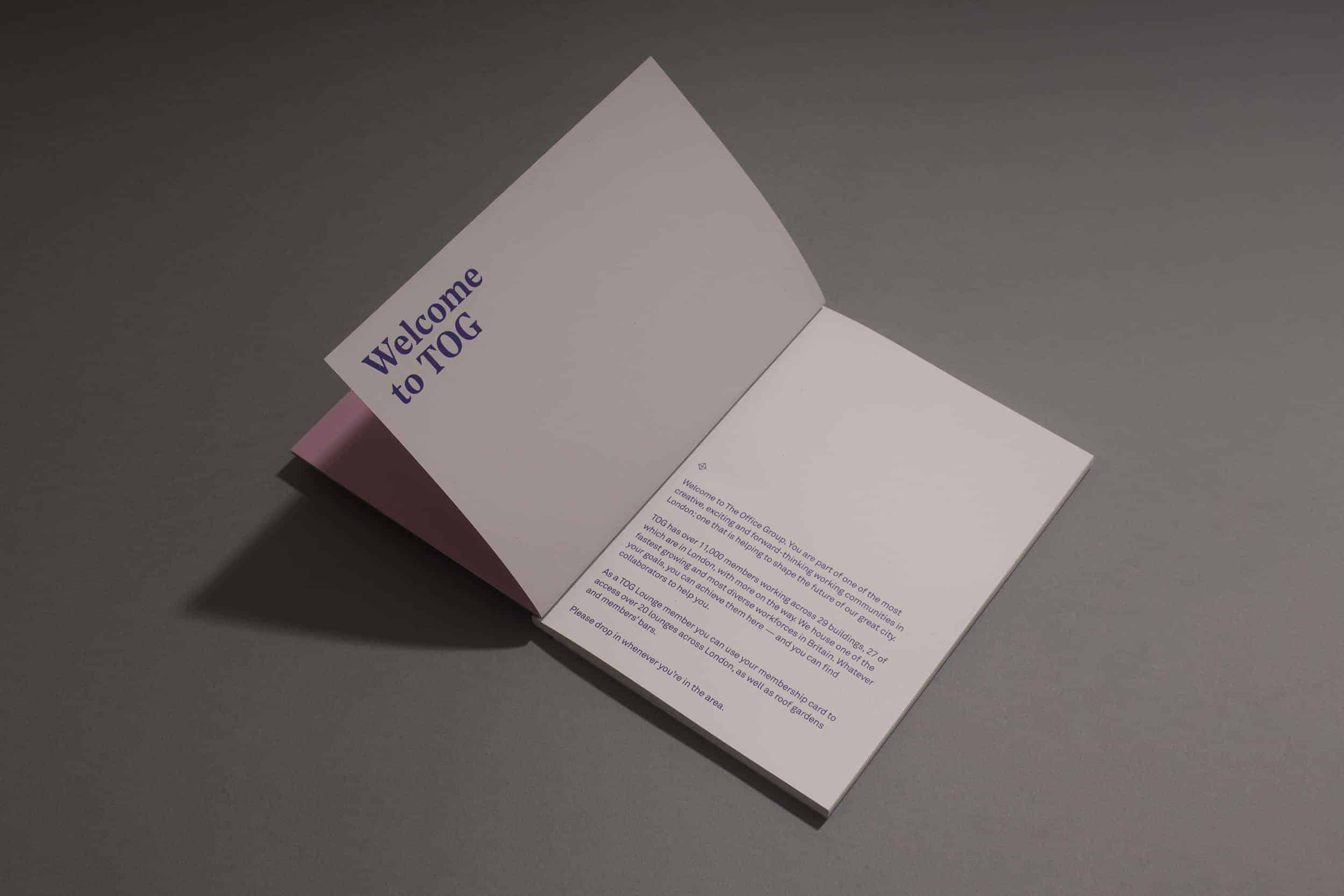
"TOG is home to one of the most creative, exciting and forward-thinking working communities in the UK." This project was part of a wider re-brand for The Office Group (TOG). We designed the membership pack to distribute both information about the particular membership option, and as a means to distribute individually packed membership cards.
Additional Credits:
Creative Direction & Design - Wais Akbari
Studio - Brave New World, London
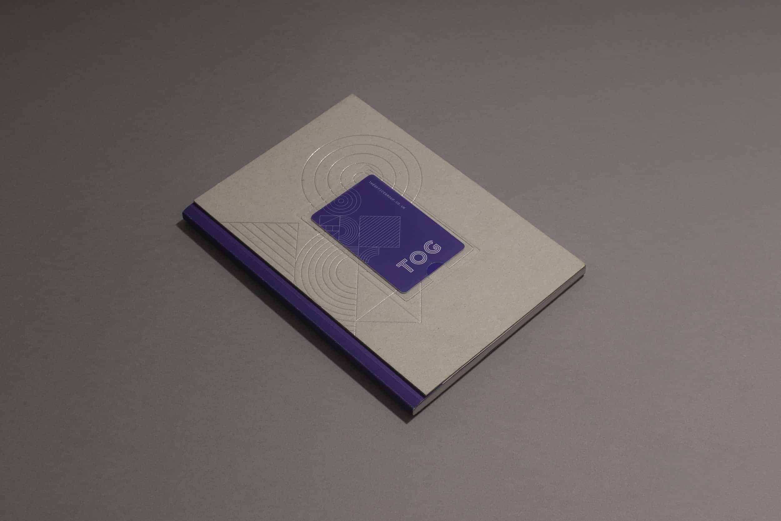
The main idea came out of a problem, in which we needed to send out 12,000 individually named packs. We needed a means of displaying membership cards on the packs externally, as these needed to be packed and sent individually. The design also needed to obviously distinguish the 4 kinds of membership options. This was achieved through a clever binding method which allowed the packs to be separated by coloured spines.
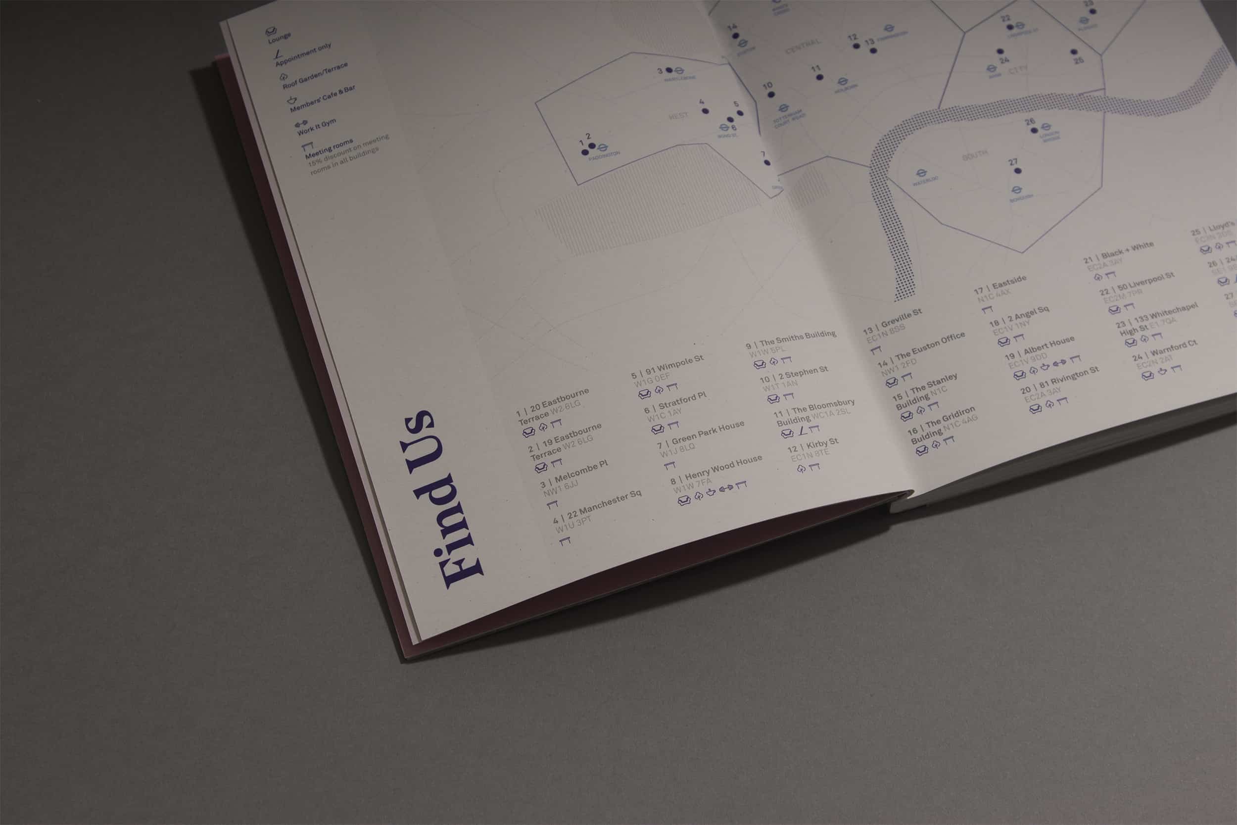
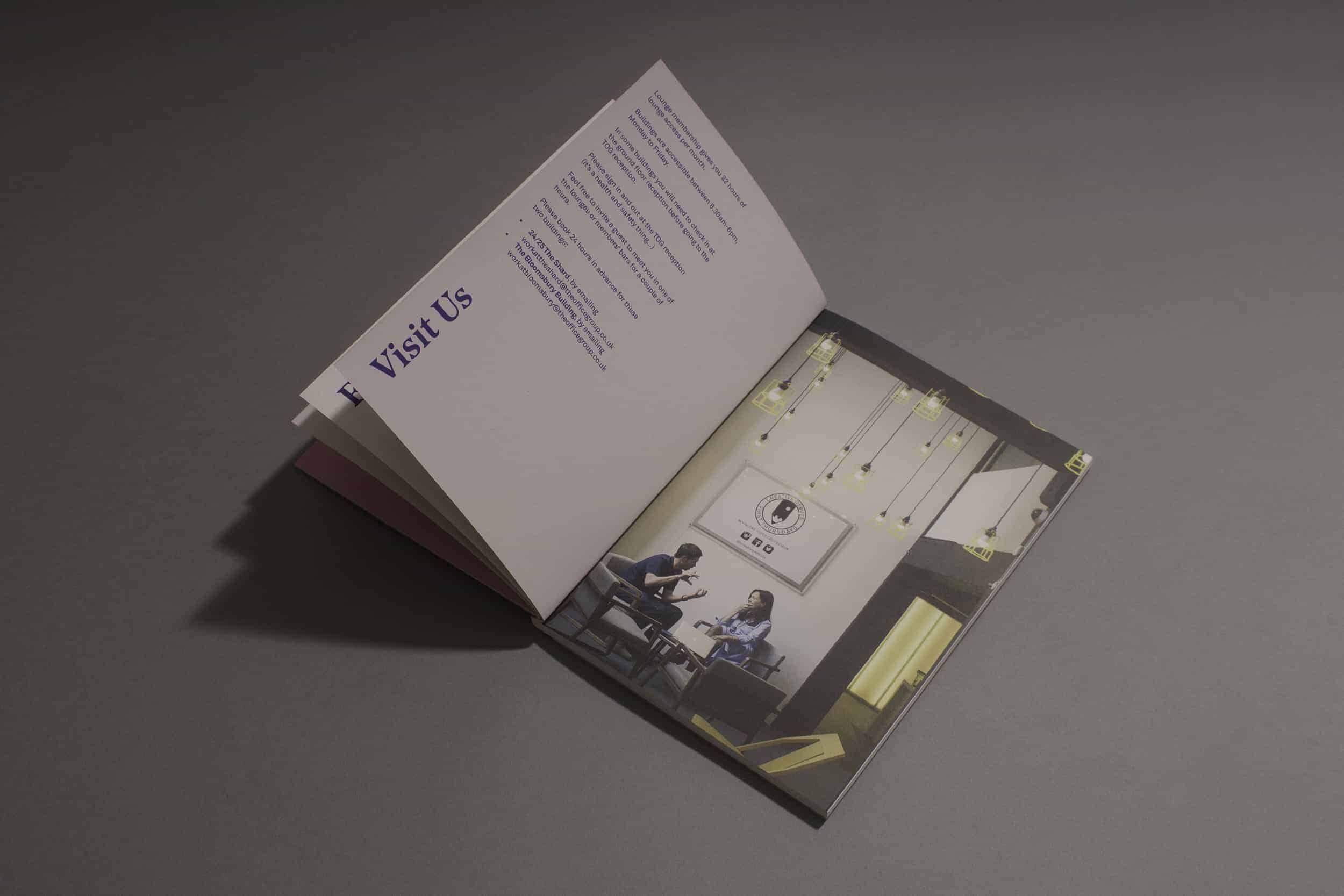
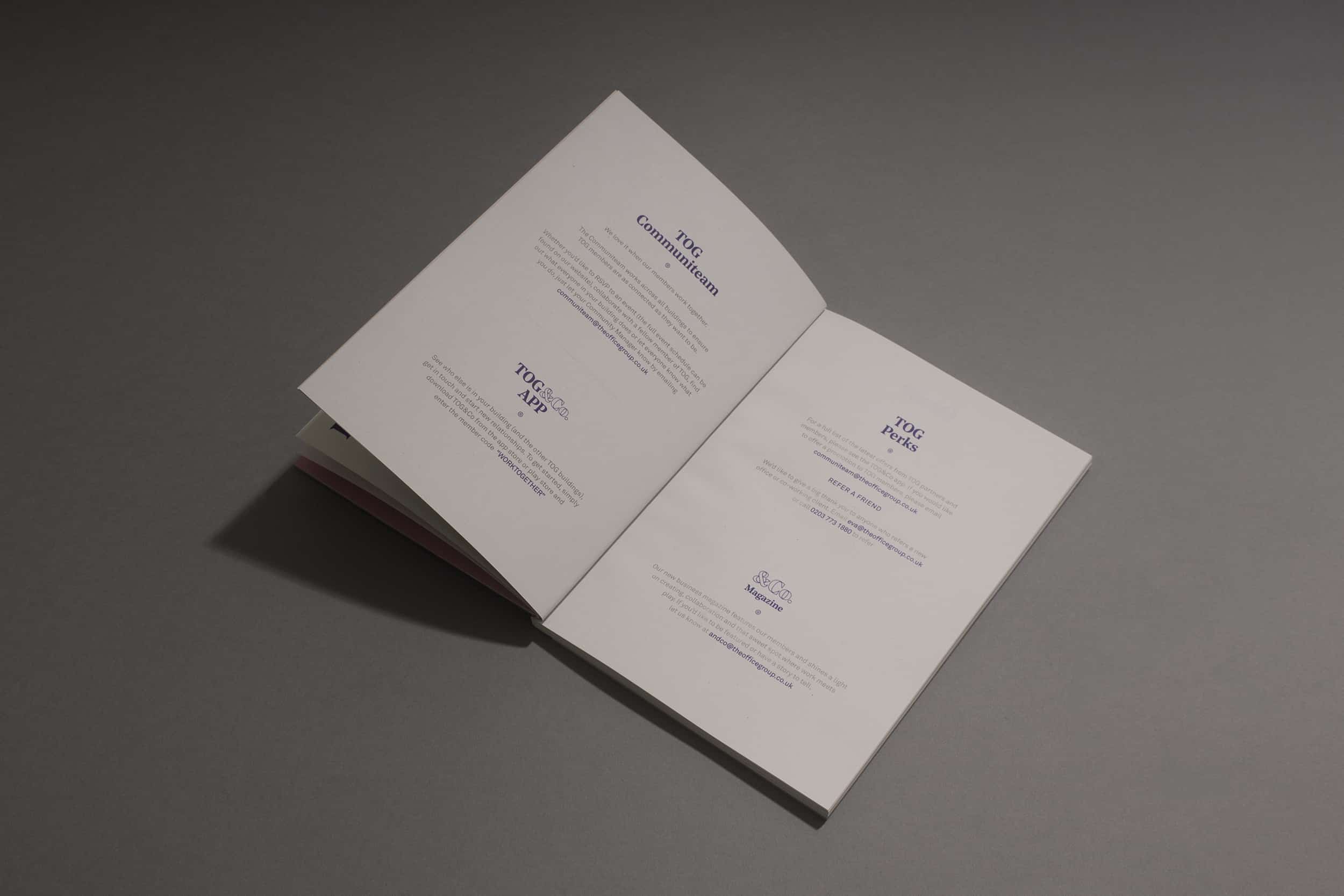
The design was all created between indesign and illustrator. Much of the design process was about translating the visual language of the newly-designed website into print. The next challenge was to distinctly separate the 4 different membership options, whilst keeping a universal brand language.
The card delivery method proved very successful, and the design has been well-received. I personally enjoyed pushing the limits of traditional binding techniques through the use of sandwich binding plus the marriage between the debossed card and glued envelope. It is important to have a good relationship with your printer when pushing limits in tight timelines!