
Touristic Icon Design by Yoon Jae Kim

I think it's important to spend some time figuring out what you're interested in and what you really want to do. It's hard, and might take some time but, in the end it will be worth it. As for me, exploring and experience are the best way to learn.
-Yoon Jae Kim
When I was in high school, feature phone was very popular in our country and then my parents bought me the Motorola 'Razr' phone. I don't know why but at that time, it reminded me of the 'Star wars' movie which is one of my favorite, it made me feel like I'm using a product which came from future. Since then, I started to get interest in design and I thought it would be really cool if I could also design a phone. So I went to the University and studied industrial design. But, after Apple launched the iPhone, it just blew my mind. It made me excited like when I first saw the 'Razr' phone. So I started to learn about interface design and also fell in love with icon design since then.
-Yoon Jae Kim

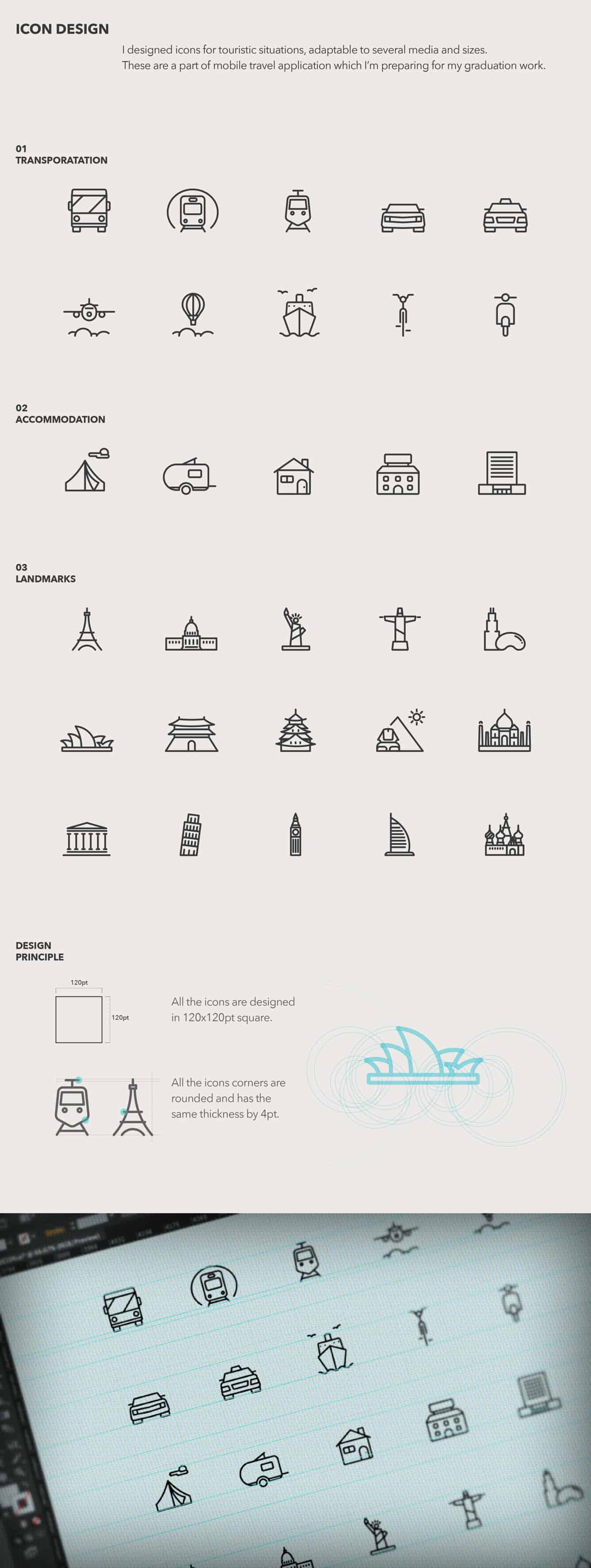
I started this project when I was in University. I was working on travel mobile app for my graduation project. So, I was very interested in cities and landmarks at that time.Landmarks are a symbol of the city and they have their own sophisticated architecture related to each culture. Also, many people will recognize it even though they might not know the exact name of the landmark. So, I thought it would be fun to make those complicated shapes into minimized icon and see if people would still recognize them. It was exciting.
-Yoon Jae Kim
ABOUT YOON JAE KIM
Yoon Jae Kim is a graphic designer skilled in icon design, interface design, and also illustration. He was born and raised in Seoul, Korea but recently moved to San Francisco and started working in the Bay Area. You can see more of his works at Behance
The most important thing to me when it comes to an icon design is that it should have a neat design without any clutter in it. Many designers over complicate their icon designs, rendering the icon difficult to comprehend. I'm so glad that Yoon Jae Kim didn't went the same way and chose to keep it simple and clean. I absolutely loved his work on icons of different monuments of the world. They can so easily be recognized.
대박!! Very Nice
So neat. Simplicity is beauty. :)
These are so clean looking. Really nice!