Twenty Two by Markos Evans
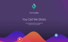
Twenty Two is an iPad application by Creative Director and UI/UX designer - Markos Evans, it was made for Real Estate agents to manage and monitor properties in their portfolio. The idea was create an application for agents who are out of the office and on the road so that they could easily monitor their projects.
The design had to be clear and concise. With that in mind I had to treat the UX, as a “rapid interaction response”, in other words, the user would have to access information quickly and in a stressful environment. The term “response” is a new UX term which considers the emotional state of the user and how, under the circumstances, cushion and support their decisions when handling information. I sketched out the wireframes using pad, pencil and a whiteboard to discuss architectural direction with the client and the development team, amalgamating front end UI handling. Most of the wireframes were hand drawings and photographs. The project is massive but we decided that the best UX starts with a basic approach, it’s fast, easy to make changes and version changes end up in the bin. This might sound primitive but it actually worked best.
-Markos Evans
The design is spatial. Each module and element is given space to breathe and communicate with one another, giving the eye an ease to move in and out and working out functionality. This is the key to spatial design, its objective is to compliment how the eye is introduced to design and support intuition. Spatial design is bold and soft. I also used curves in the graphs, rounded icons and white space to amplify the visual journey.
-Markos Evans
The most challenging part I found was colour. Taking the branding and working in complimentary trends, using colour not only as an aesthetic but also to build structural hierarchy. Each element, icon, table, table heading, block headings and shapes were considered and challenged in the making. Also there is an additional complexity to consider when placing separate colours side by side and anticipating their interactions. I had to rely not only experience with colour trends but also intuition, to balance and voice a “visual tone” when deciding the level of “visual sound” to play.
-Markos Evans
ABOUT MARKOS EVANS
Markos Evans is an award winning Creative Director and a UI/UX Designer based in Melbourne, Australia. See more of his work at Behance.


Thanks guys n girls. The overall work is outstanding and completed. I had to change some of the brand naming and user flow for confidentiality purposes. The project began with the understanding I could mask the identity of the client. Why build this into the initial clause of a contract from the begining??
Because "some of the most beautiful and inspiring things created should never be hidden but shared" Natural evolution.
Be brave, be inspired, walk tall!
Well, I must say that it has a nice look to it overall. The functionality seems to flow well which makes it easier for the user to remain productive with it.
The design is clear and concise. ,The design will help the user to access information quickly and in a stressful environment.
Great design! It looks very neat and aesthetically pleasing.