
Typographic Bookjigs by Russ Gray

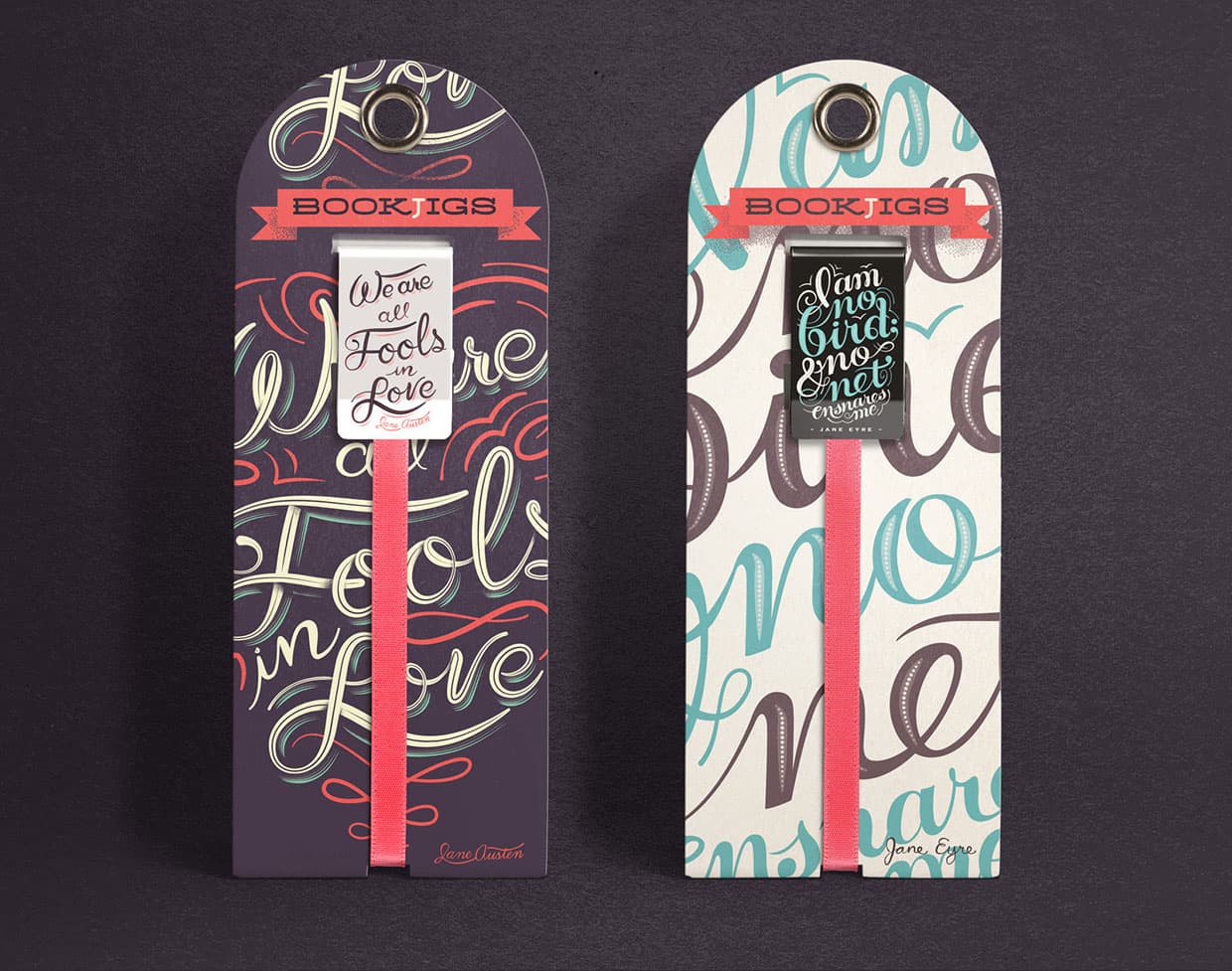
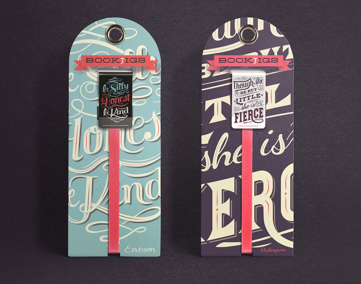
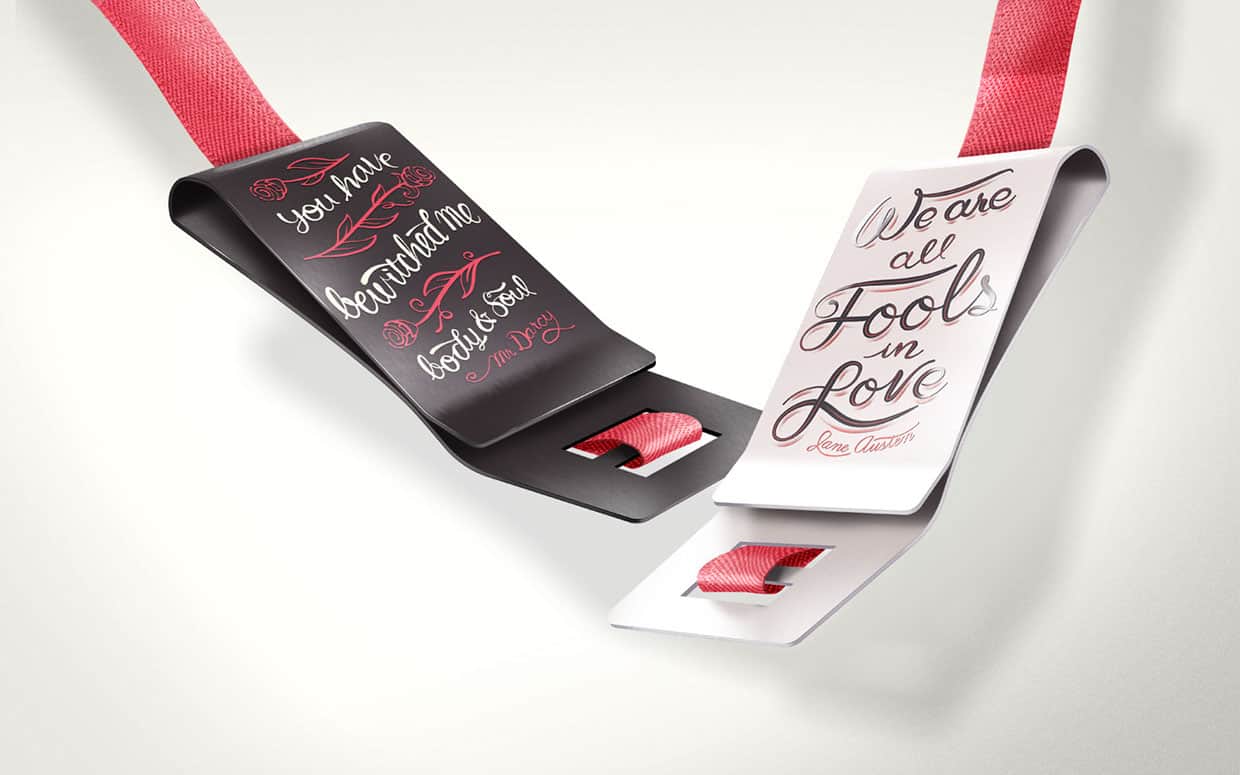
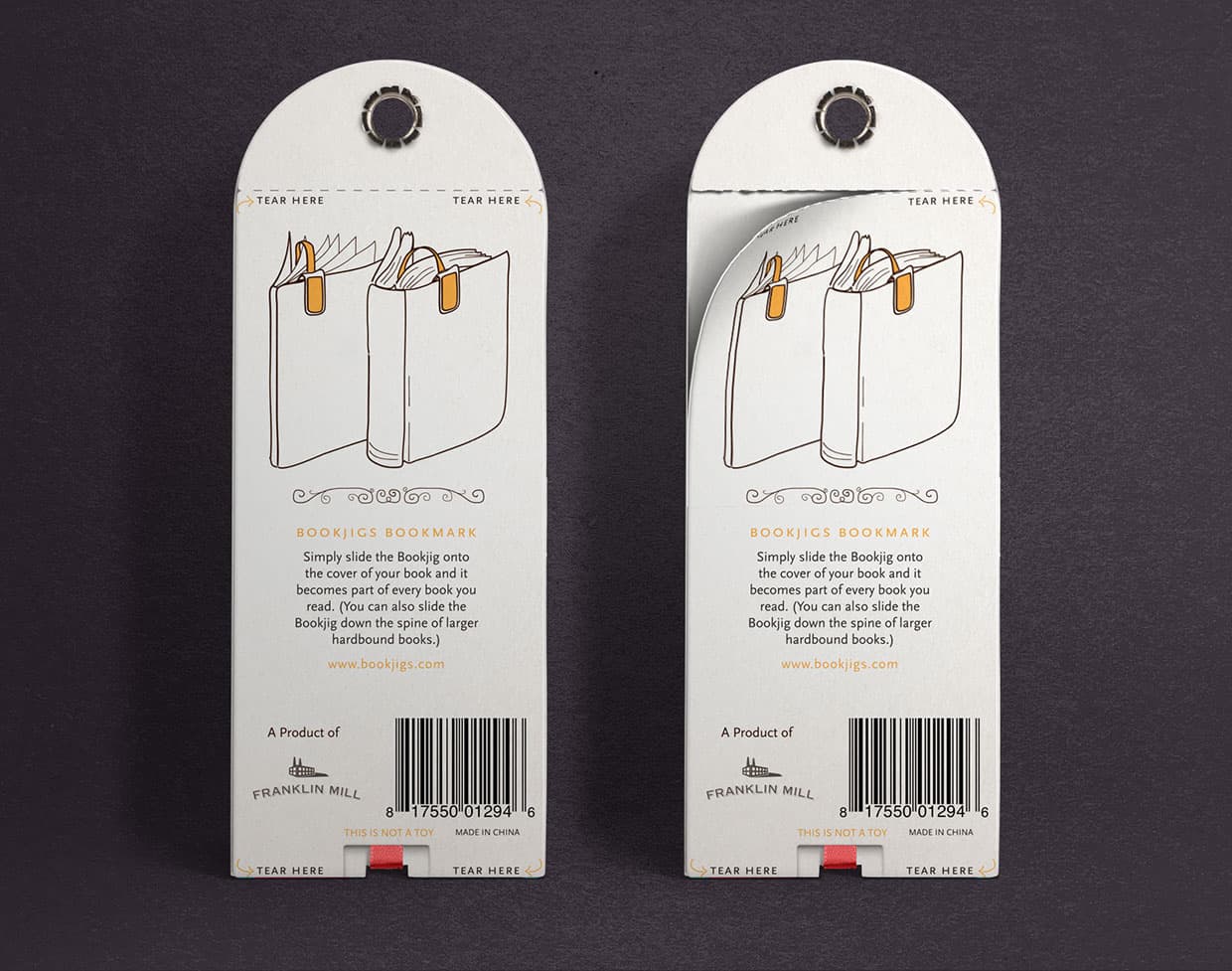
Bookjigs are bookmarks that clip onto the cover of a book, giving any book you read a nice ribbon bookmark. In 2014, multidisciplinary designer Russ Gray felt they needed a Bookjig line that could appeal to readers as an expression of their taste in literature. Problem was, there just wasn't the real-estate on their bookmarks for a quote.
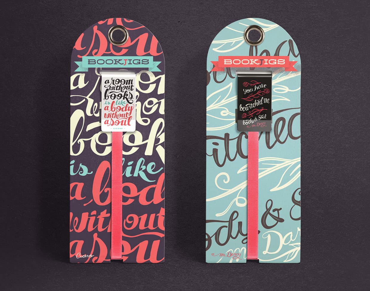
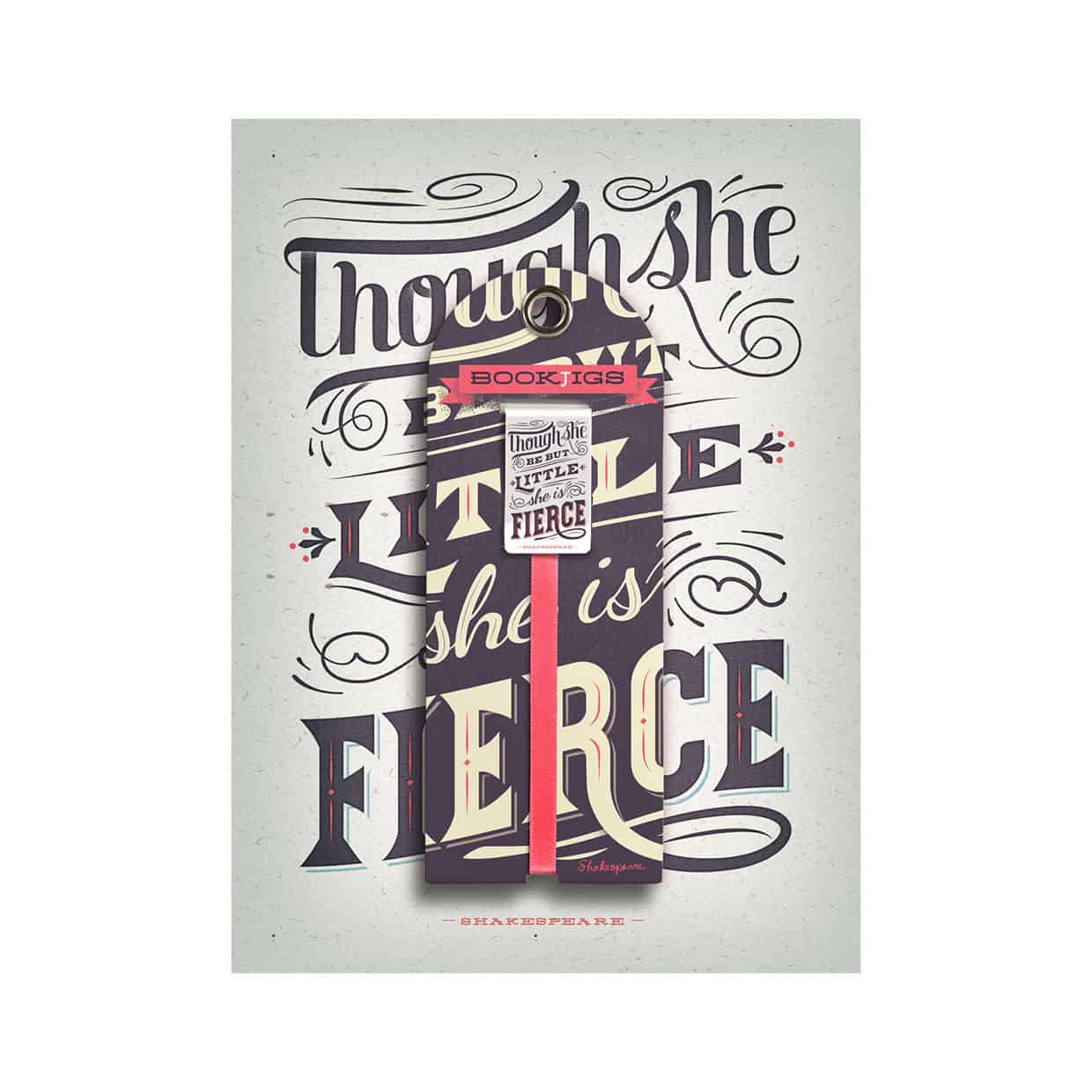
So, I designed a larger version of our existing Bookjig that would accommodate a typographic quote. We had prototypes made with heat-transferred art. The printed results were quite nice, and I was really looking forward to pulling the trigger and releasing this new line of products; unfortunately, we didn't have the time available before the company was sold, and this project never happened. Hopefully some day they'll decide to make a go of it!
-Russ Gray
I don't do a ton of lettering, but while working at Franklin Mill, I felt I needed to learn a little about it to be relevant in our product market. It became fun to me as I started exploring that world.
-Russ Gray
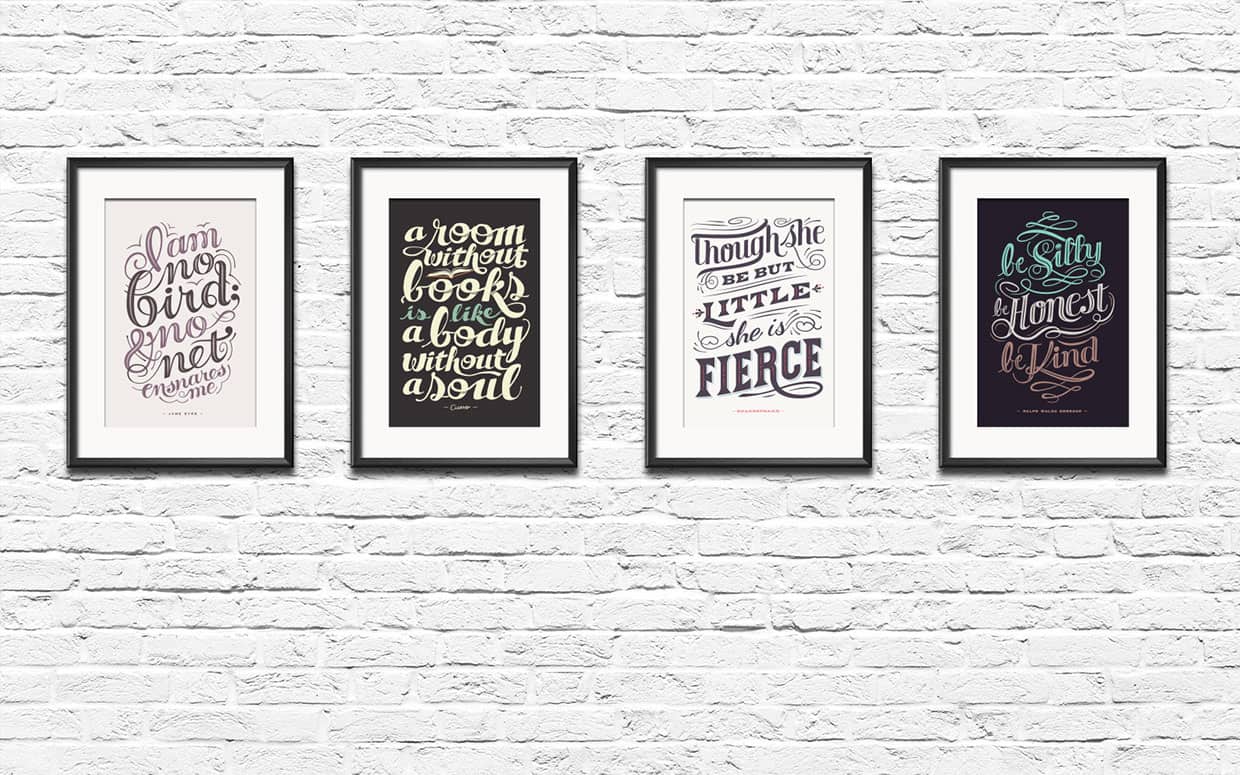
Since our primary product — Bookjigs — is a bookmark, most of our clients were avid, passionate readers. I ran across a lot of readers creating literary "fan art" in the form of typographic posters. I admired many of them, and thought it would make a great bookmark. And, it would give me a great excuse to practice lettering.
-Russ Gray
I might be like a lot of people in this, but I don't think I have a style. I feel like one of the things I have to offer is a versatility in style and aesthetic. And it's what I enjoy. I have an insatiable appetite for trying new things aesthetically. That said, I probably have more of a style than I realize. My inspirations are many: at the moment I'd say Miroslav Sasek, Mads Berg, Ty Mattson, and … well, more than I can list.
-Russ Gray
Well, the obvious stuff: work hard, don't give up, etc. The basics we all need to live by. In addition, as a designer: I always tell people to study up on and practice basic typography. I don't mean illustrative type or hand-lettering. I mean typesetting something like a magazine article, book, or brochure. When people have come looking for a job at agencies where I worked, good typography is what set the exceptional designers apart. Cool illustrations and nicely styled lettering can get attention for sure. But that attention to basic typography will always make you a better designer.
-Russ Gray
About Russ Gray
Russ Gray is a solo designer / illustrator based in Salt Lake City, Utah. He recently began his own creative studio, after years of agency and in-house work. Prior to this, he was a senior designer for the talented Ty Mattson, at Mattson Creative. Just before that, he worked for Franklin Mill as a Creative Director over product development. At Franklin Mill he developed products and packaging for paper goods sold in retail stores around the world. See more of his works on Behance or his website.
Ils sont vraiment cool ces marques pages. On dirait des petites œuvres d’art pour marquer la page de nos livres, ce qui très important, quand on est un avide lecteur ! En tout cas, moi je les trouve mignons et originaux.
The design is great!
This is cute and refreshing to the eyes! I want one for my books and planners.