Urban Socks // Brand Identity

Urban Socks is a personal project born in 2017 to show my skills in the visual identity field.
Urban Socks is a streetwear brand born in 2017 with the purpose of colouring people’s life through distinctive clothing accessories: the socks. Urban Socks tells the stories of youthful, creative and open-minded souls, such as street artist, musicians, creatives and in general people who want to stand out themselves from the crowd. Their product lives in the intersection of design and science, so they love to collaborate with illustrators, designers and engineers who share the same vision.
Creating a brand identity which reflects the vision and the mission of the fictitious company. The goal of the project was to an exclusive and urban concept following the brief’s target: young people who live in the city actively with an independent and creative minded. They needed a responsive logo for more stuff like print, web and social media supports.
Scope of project
- Brand Positioning
- Identity Design System
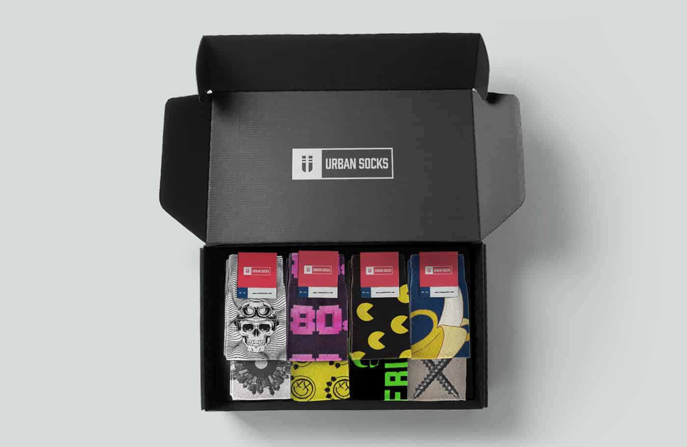
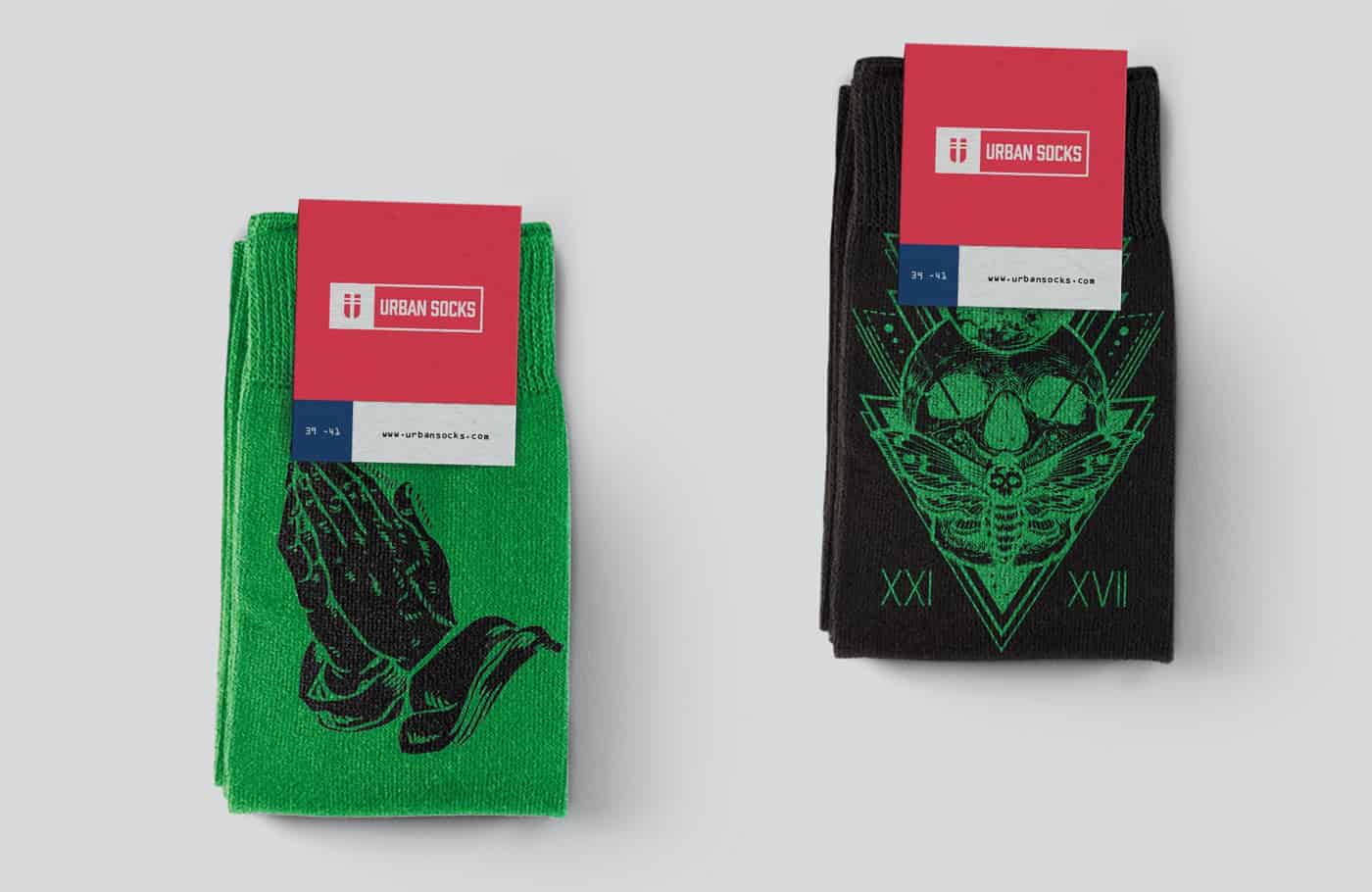
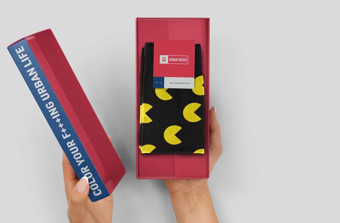
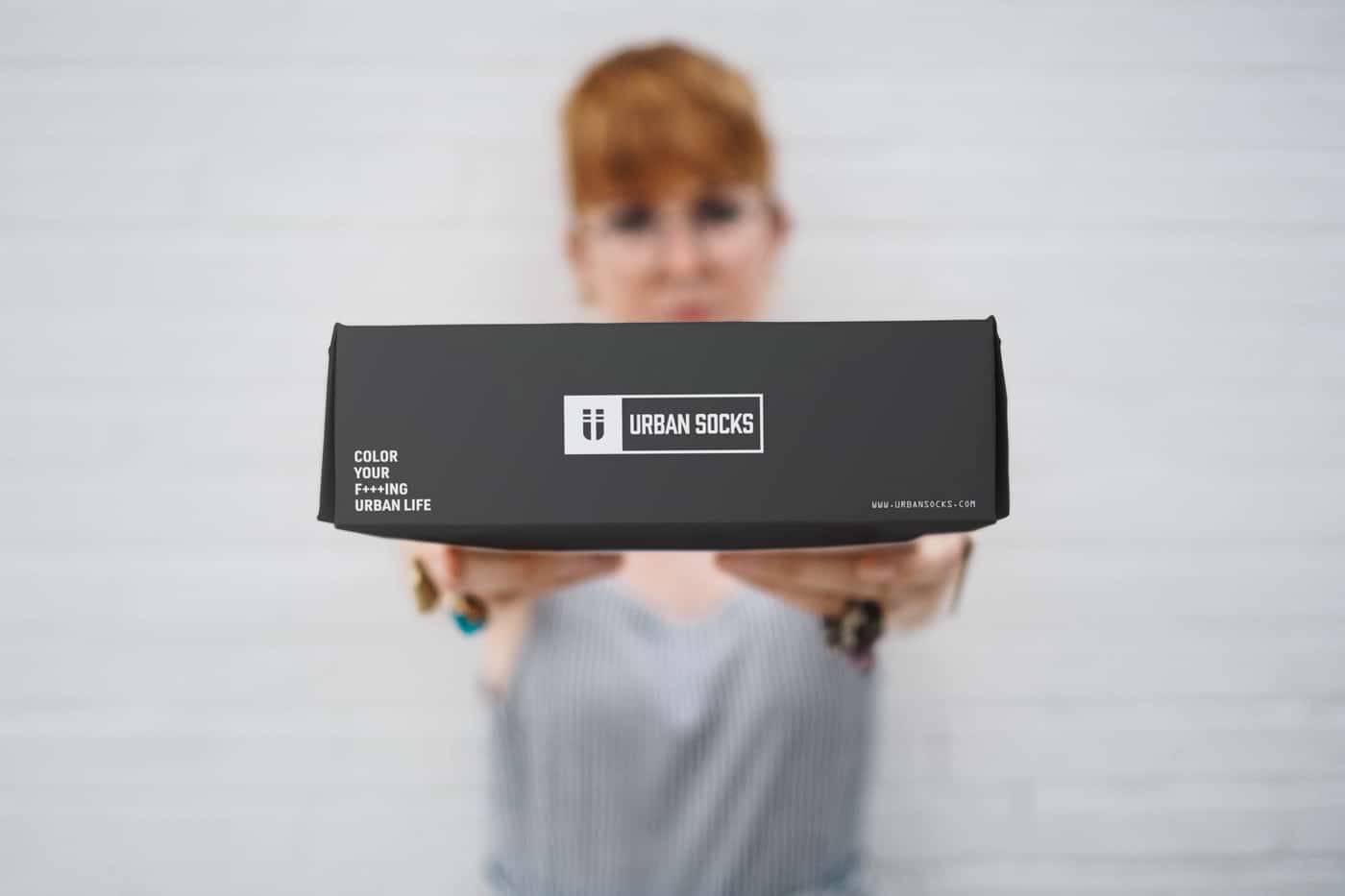
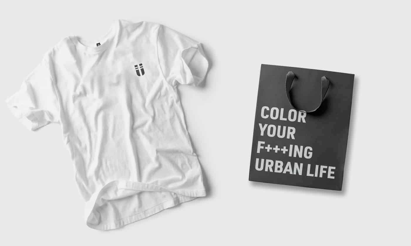
- Merchandise and Packaging Design
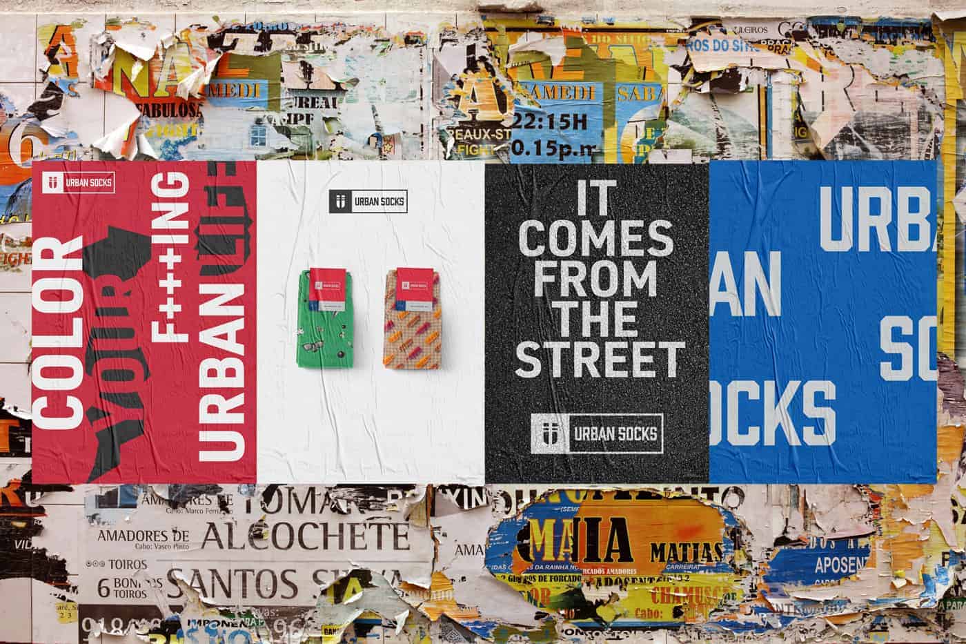
- Poster Design
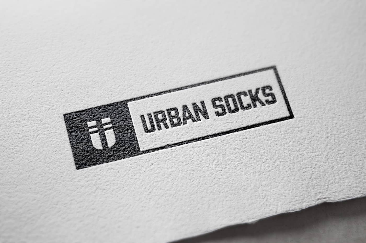
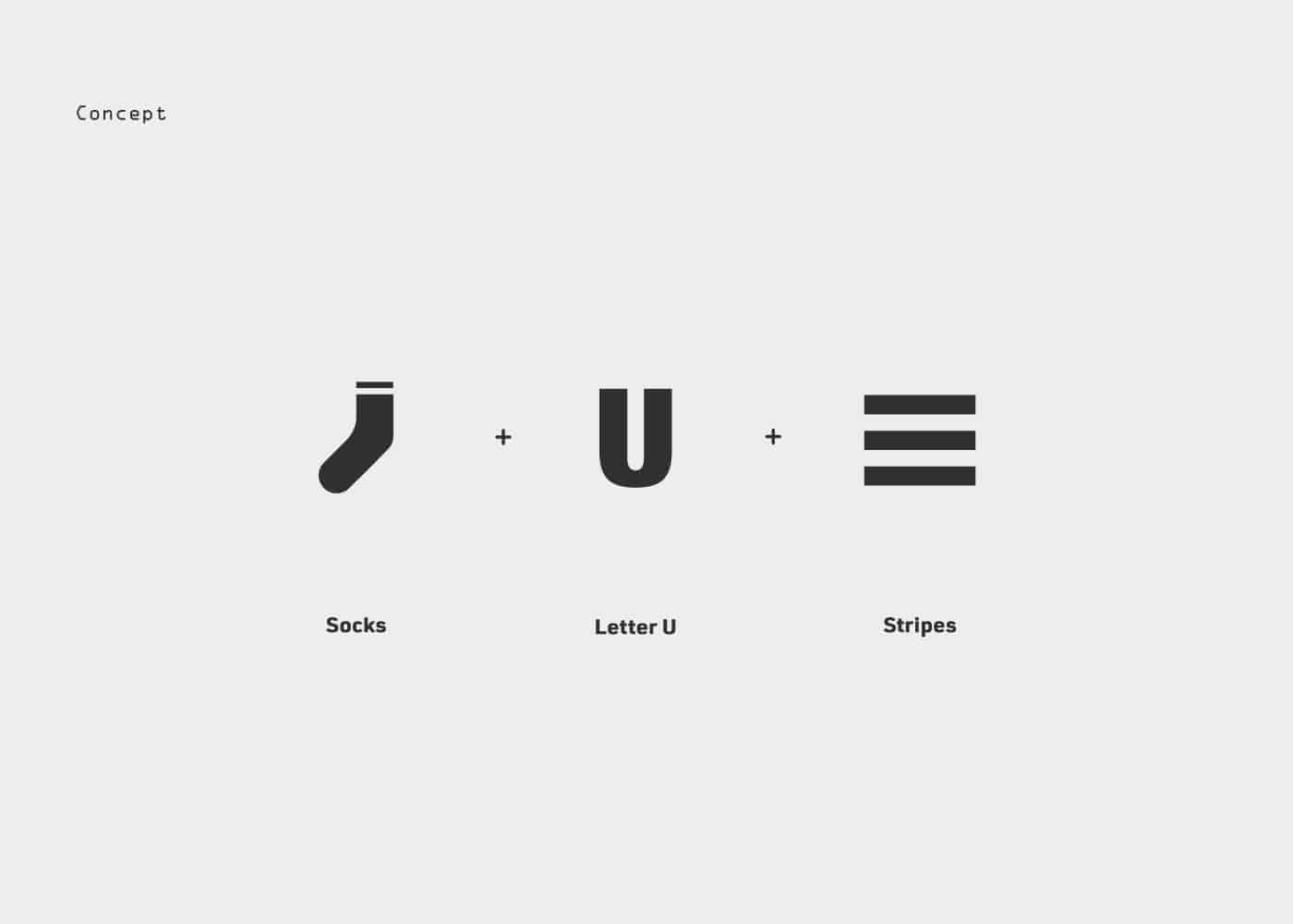
The icon is born by combining the letter U of "URBAN" with a stylised form of two socks and two strips in negative space representing a reference to the road signs. The tone of voice of the brand is very bold so they can convey core customer values. This main concept is also reflected in the choice of colours and typography.
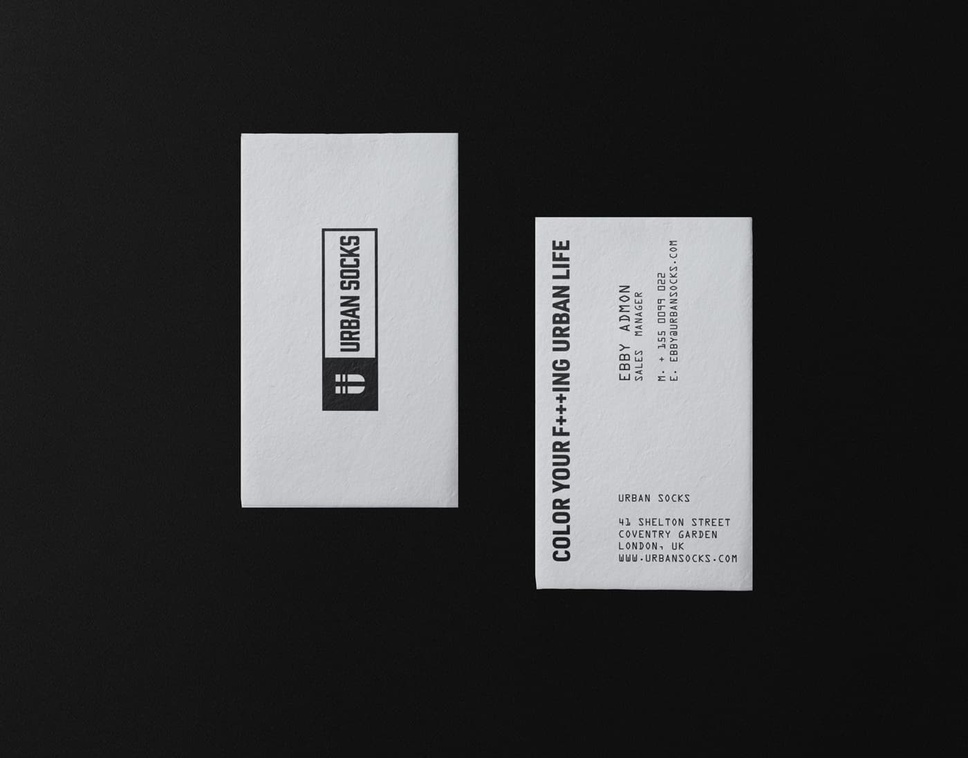
The idea is to create a contrast between internal and external communication. In the first, we choose a black and white colour for business cards, letterheads, invoice and the rest of the stationery. For the external communication, we choose a bold colour palette and a strong combination of typefaces. The main motif of the system is characterized by four responsive coloured blocks, adaptable in every situation, especially in the sock's label.
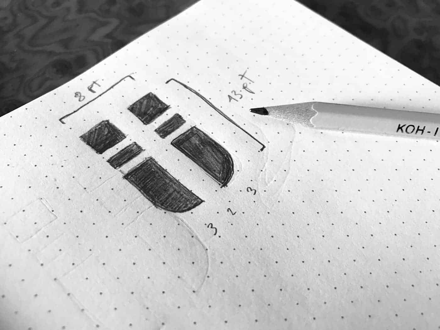
I started to analyze some competitors and the brand values of Urban Socks. Then I started with pencil and paper. I used Illustrator for the logo and brand assets and Indesign for the stationery stuff like business cards, letterhead and invitation. The final work was completed after 2 months because I create also packaging and some prototype of socks.
The audience was very interested in the storytelling and the process of this brand identity. The project was featured in the Aiga members gallery of Behance. Thanks to this personal project I received some request of collaborations and more attention for my business.
In this project, I put all of my competence of design thinking, as in all work, I think that the 80% of the success depends on the capacity to understand the customers need, analyzing all the aspects of the company and the remaining 20% is about technique and execution.
is it for sale?