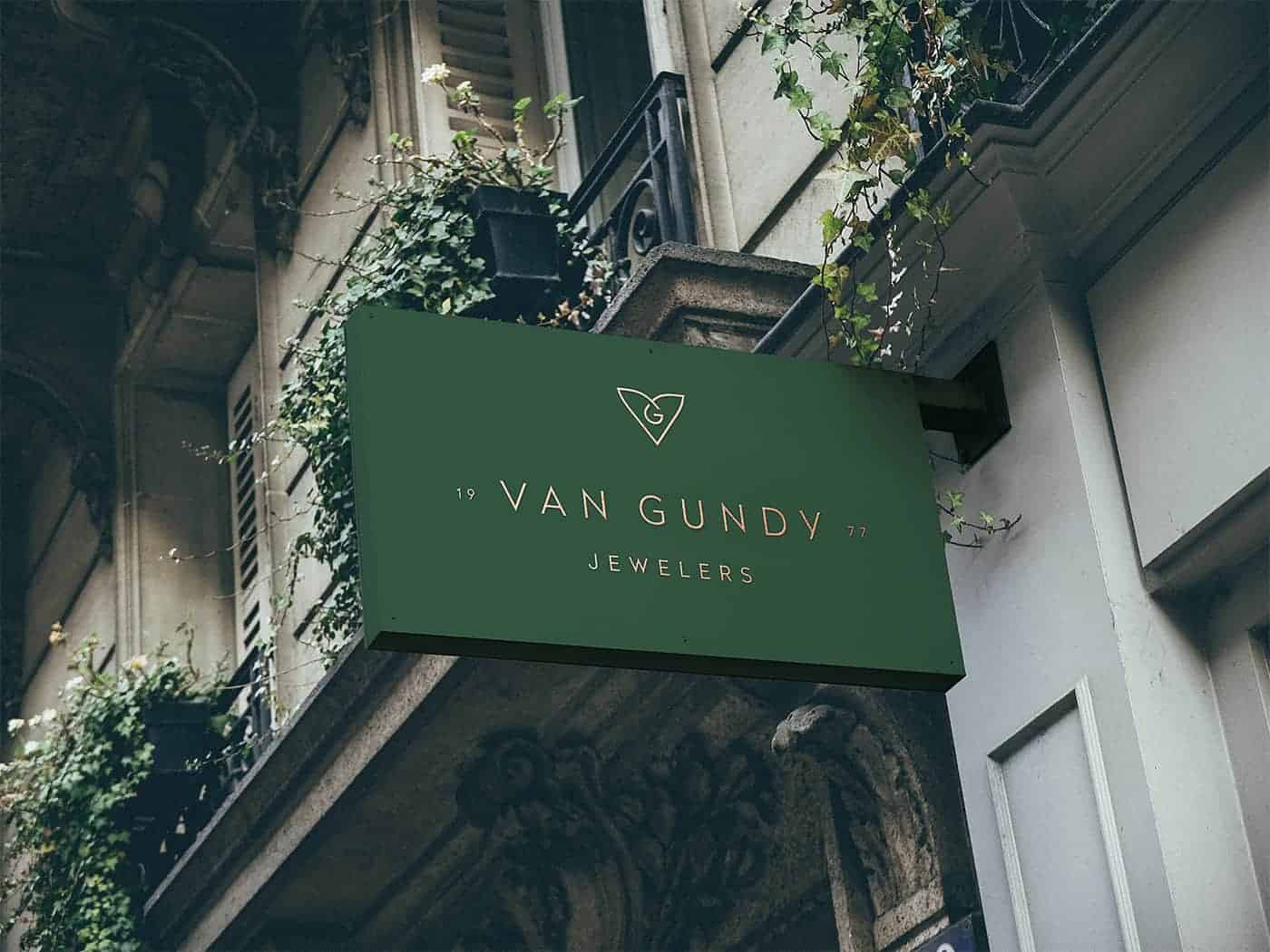
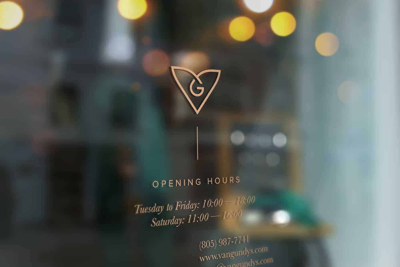
Van Gundy Jewelers

Van Gundy Jewelers is an independent jewelry boutique with two California locations Ventura and Camarillo, a long family history and community presence. I was hired by Phil Pallen Collective to help them with their rebrand. Our goal was to create an identity with modern, minimalist aesthetic so it would resonate with savvy millennial audiences. They needed a cohesive brand that would lend well to print, web and product design reflecting elegance, friendliness, and style.
After analysing the brief and researching, I’ve started sketching as I usually do to let my thoughts and feelings find their graphical shape.
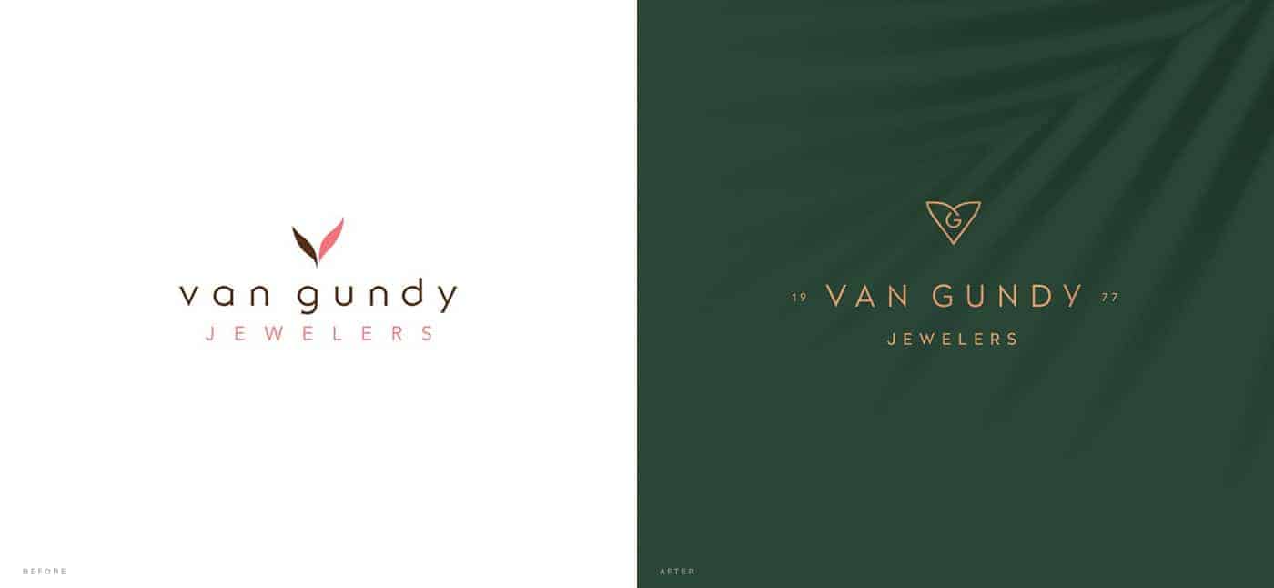
During my creative process I wanted to keep coherence with the initial mark bringing more depth and meaning into the new mark. That's how initial V shaped leaves transformed into more sophisticated VG monogram, bringing in more love.
When the mark was finished, I've designed some logo lockups for different needs and continued with the secondary branding elements.
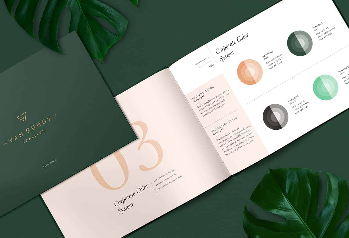
The complementary typography system is a mixture of elegant and timeless transitional serif typefaces with rational geometric sans typefaces.The combinations of pine greens and pinky golds creates refined, fresh and luxurious mood.
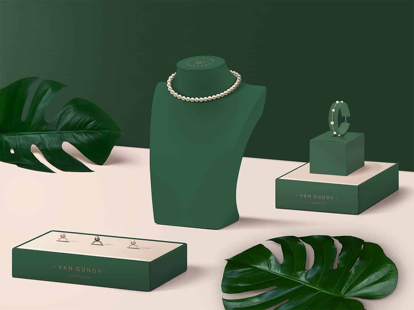
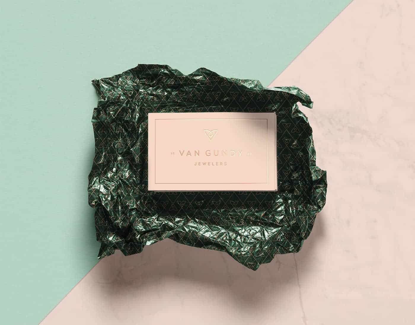
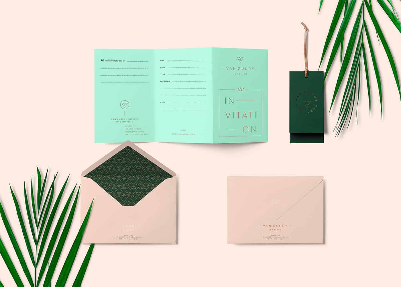
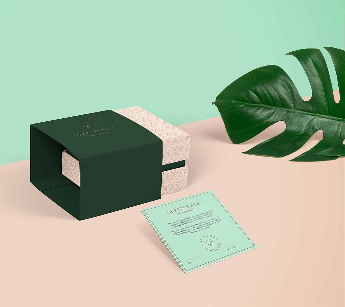
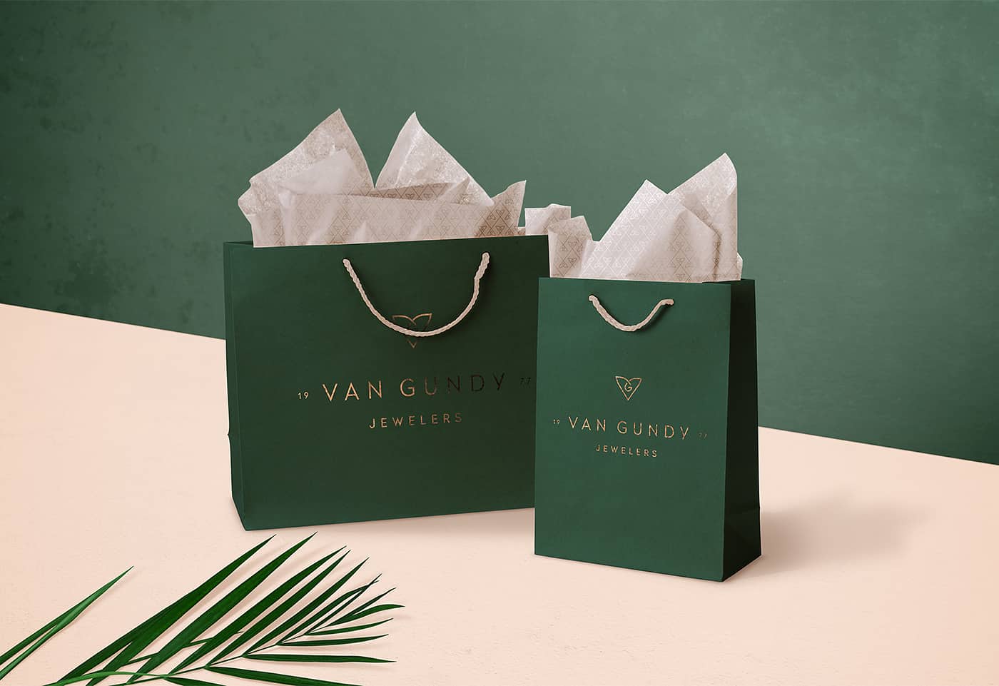
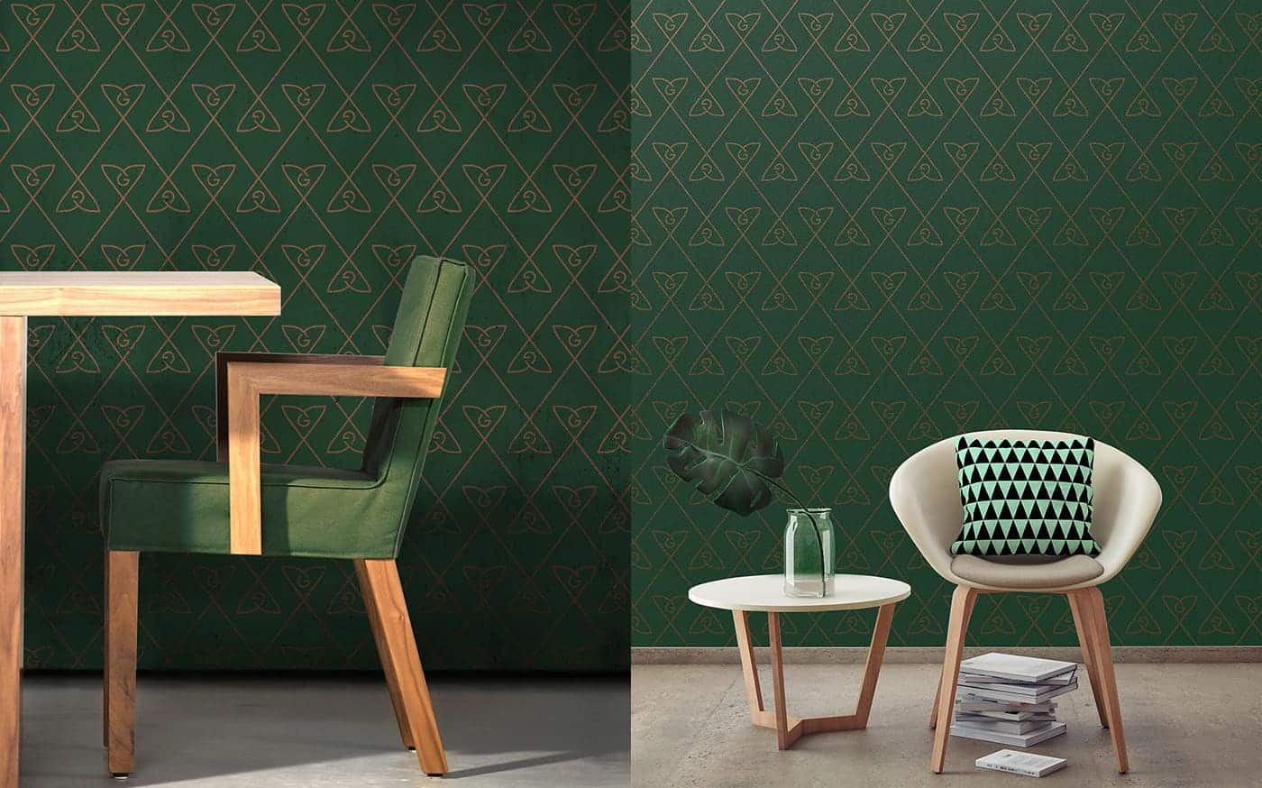
I’ve supplied the guideline with a number of brand implementation examples to show how all the elements can work together.
We've received an excellent feedback from Van Gundy and getting a lot of great feedback and attention from our behance portfolio visitors.
I want to thank everyone for appreciation, it inspires me to create more great projects with passion and care for details.
Love it
Thanks, Mariana!