Villa Calea

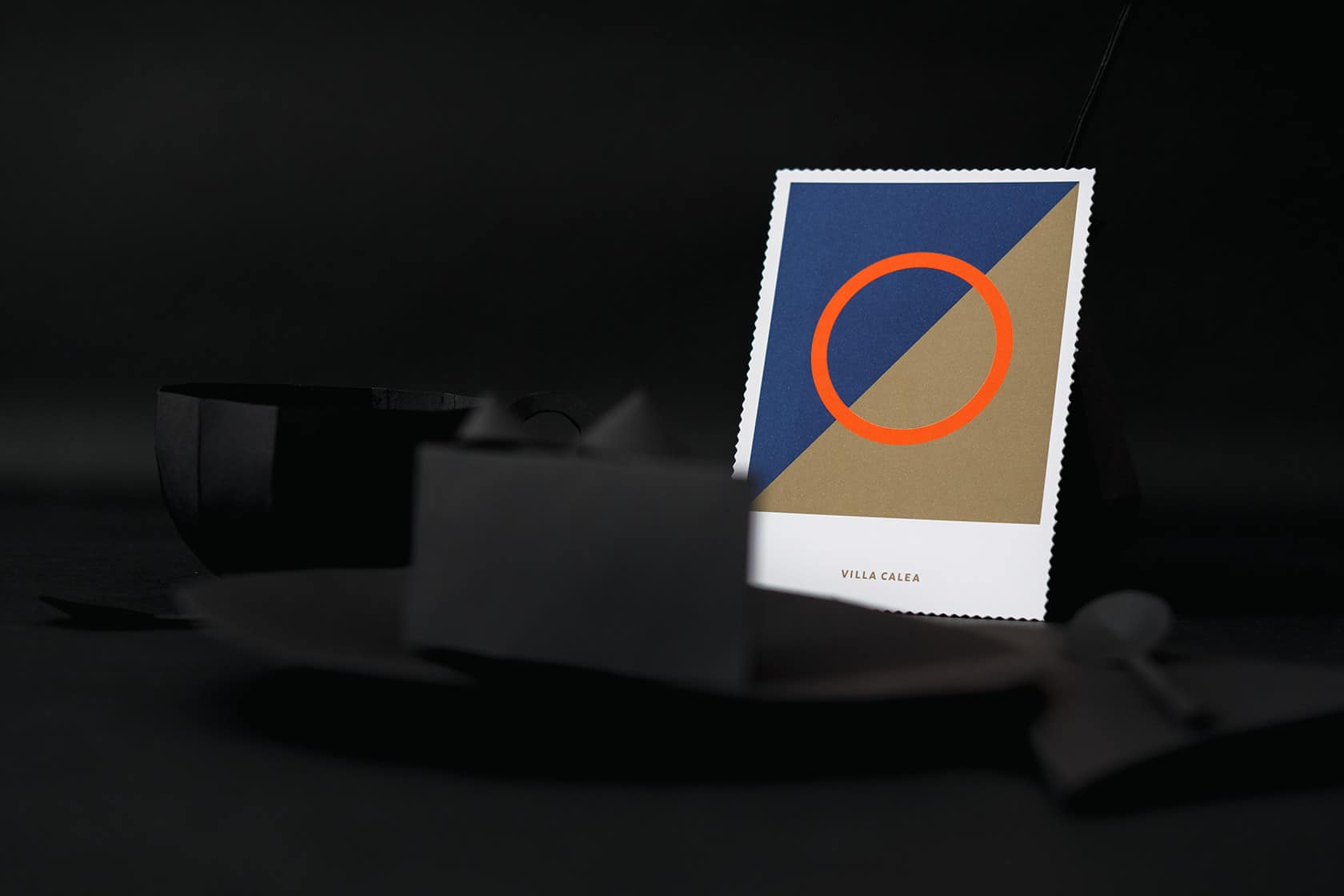
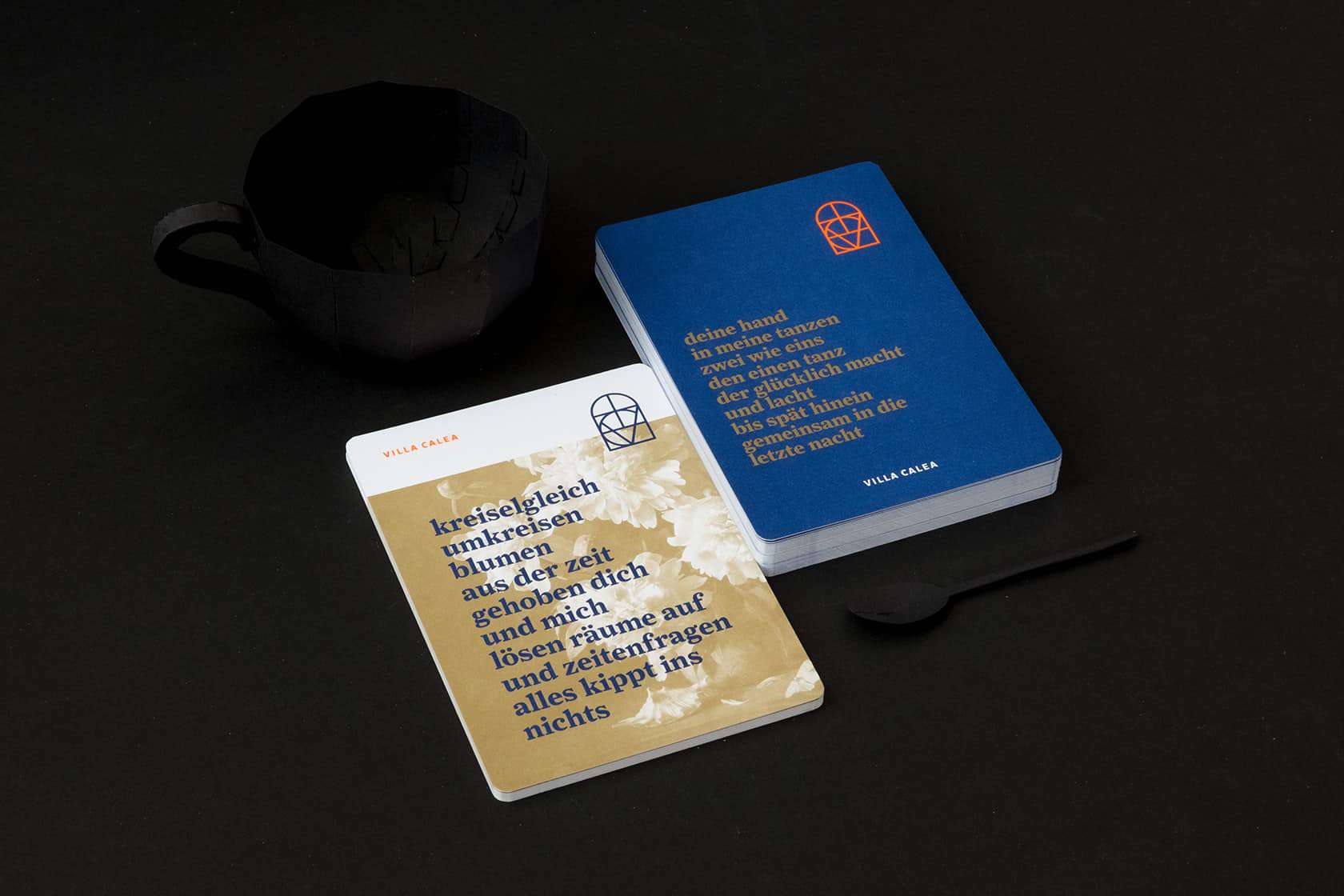
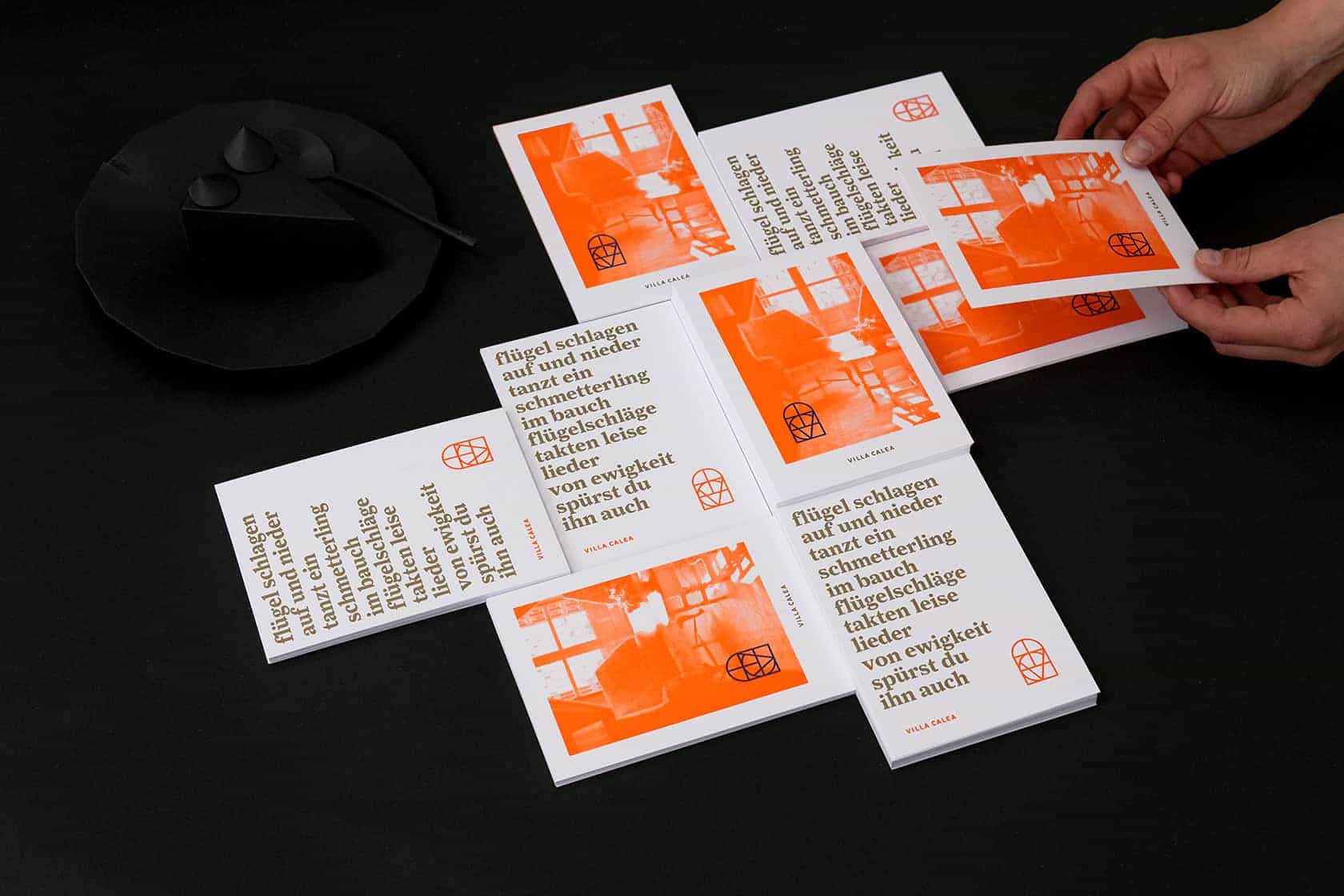
If you, in search of the perfect wedding location, buy an art-nouveau villa and convert it into an exclusive setting for your special events and wedding parties – then why not being daring enough about Corporate Design. Printed forms in Pantone Blue/Gold/Neon-Orange are out of the question? We don’t think so!
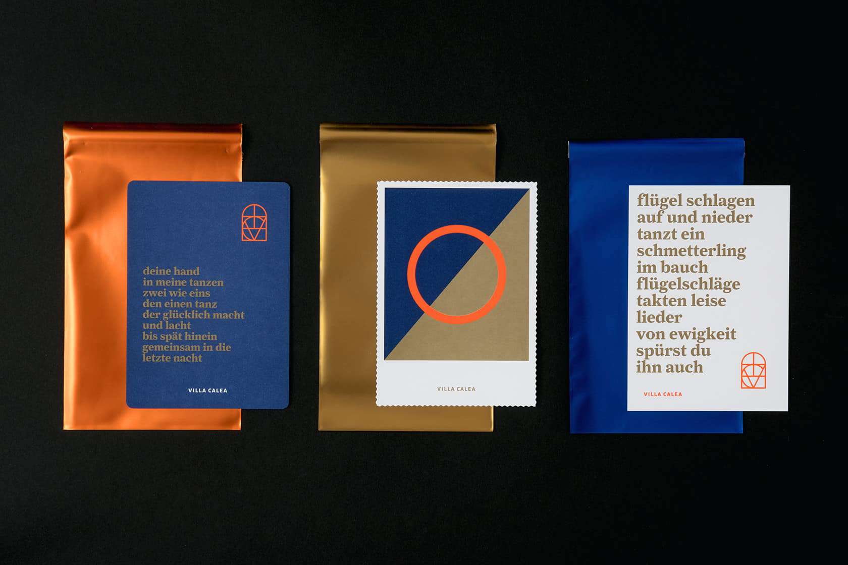
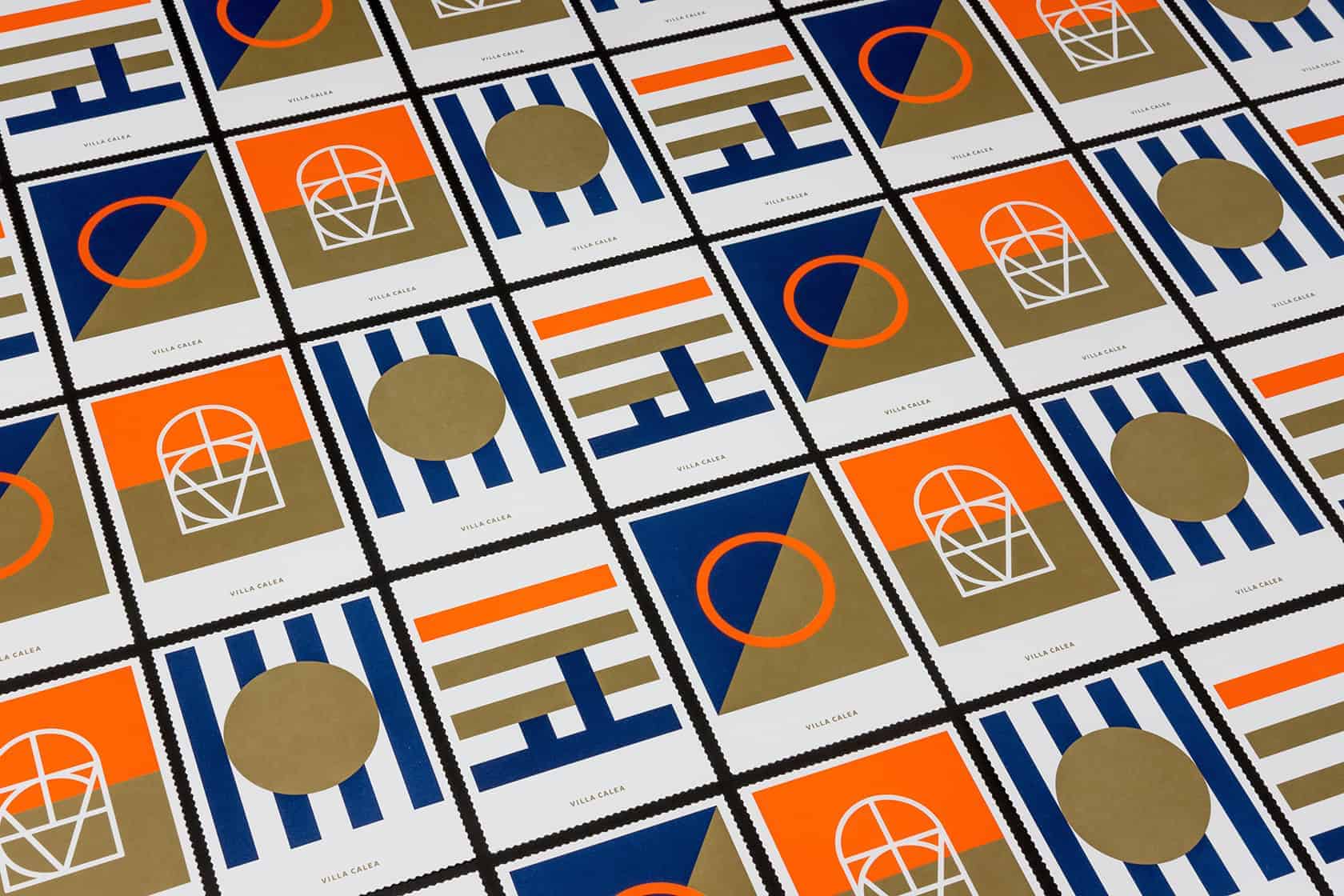
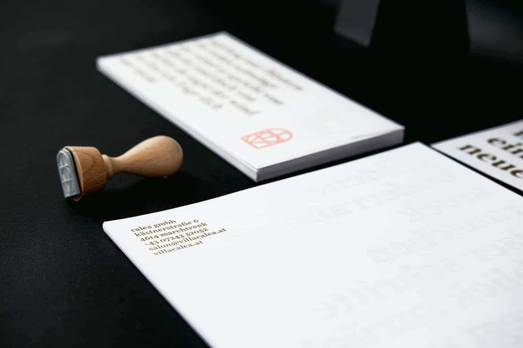
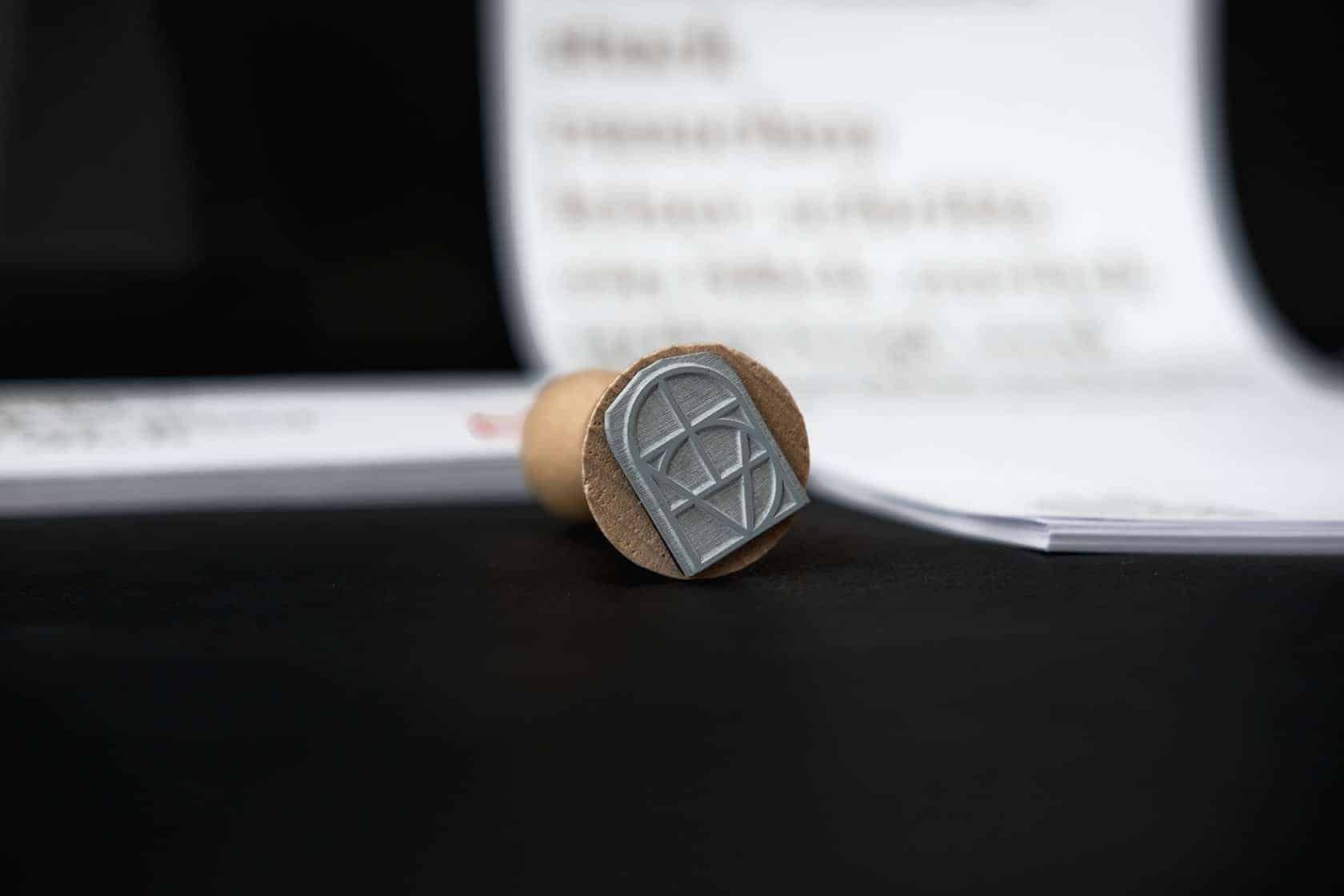
In the beginning we started a brainstorming in connection with our client. There is always a big focus on the identity of our clients, we learn a lot of that. After some sketches, we started with a first idea of colours and designs – we created a first mood. We decided to implement it with Pantone Blue/Gold and Neon-Orange. The Logo-Idea is based on a window in the villa. We wanted a art-nouveau style, so we created a frame that based on that window with all letters from the project's name in it. We would like to make it simple, concise and strong.
Our main focus was on a strong coloring, that works only with Pantone colours. The design followed on art-nouveau graphics and some characteristics of the villa.
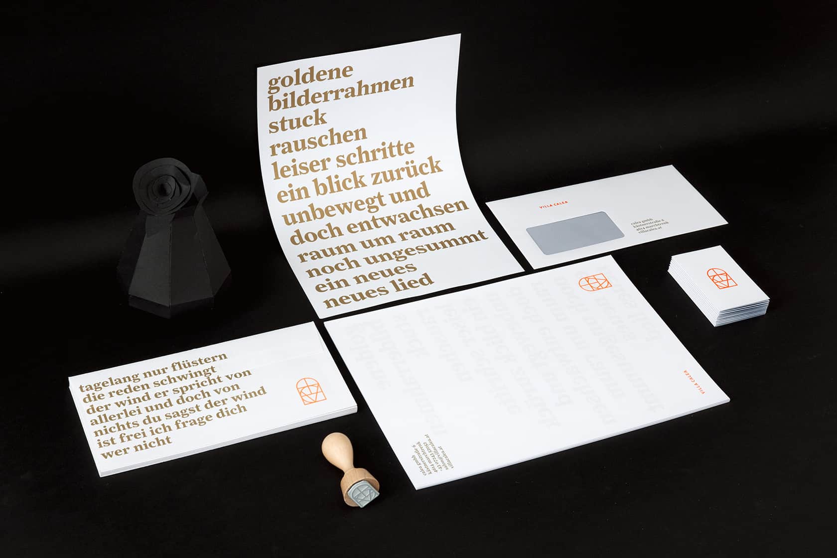
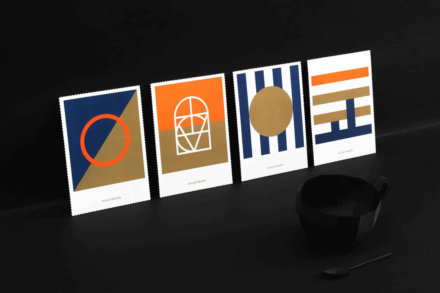
At first we do some sketches, many brainstormings and then we use our Adobe Creative Suite. The tools were easy, at first some analog sketches and after that we used Adobe Illustrator to transform the sketches into digital. All the rest is produced with Adobe InDesign.
The respond was great, all above Behance and some other Blogs. And yes we've learned a lot. We trust our first inspiration, that we never release. It was difficult, and we risk a lot with the coloring – but we trust in it.
Believe in colours!