Villa Figueira
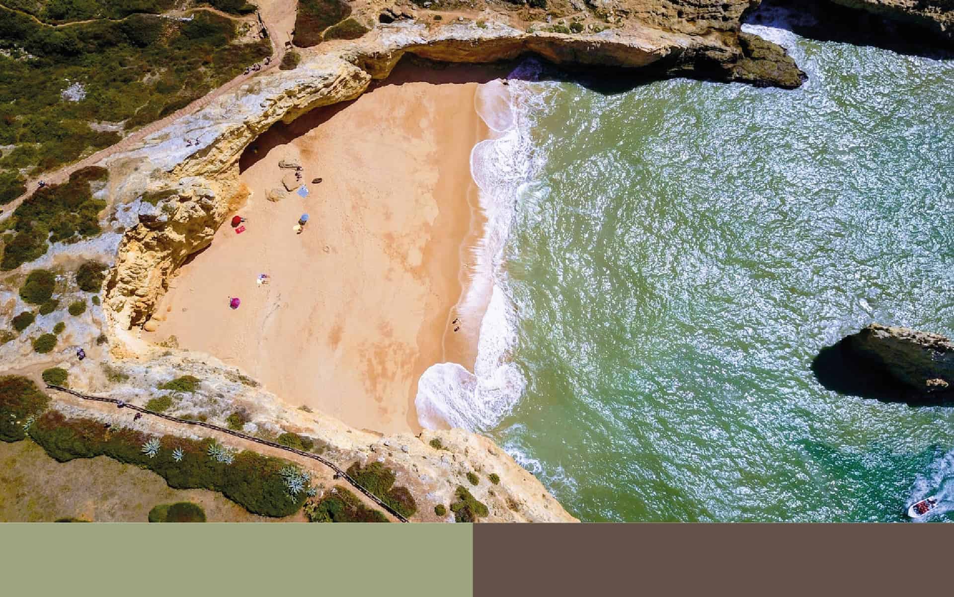
Villa Figueira is a holiday home in Portimão, Portugal. It's a familiar and cozy place with a view to the mountains and very close to the beach.
The brief was very simple and the objective is mostly about create something they can use in websites, social network, business cards and embroidery.
Algarve is the southernmost region of continental Portugal. Portimão and Villa Figueira are part of them.
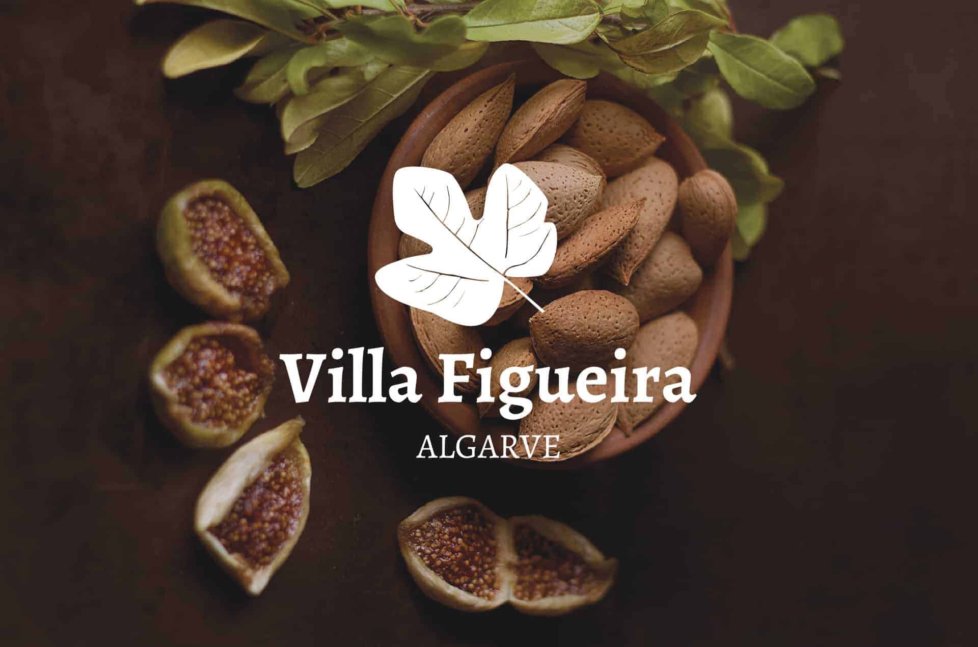
Production of food like fish, seafood, fruit, oranges, carob beans, figs and almonds are economically important in the region and become symbols and metaphors of this place.
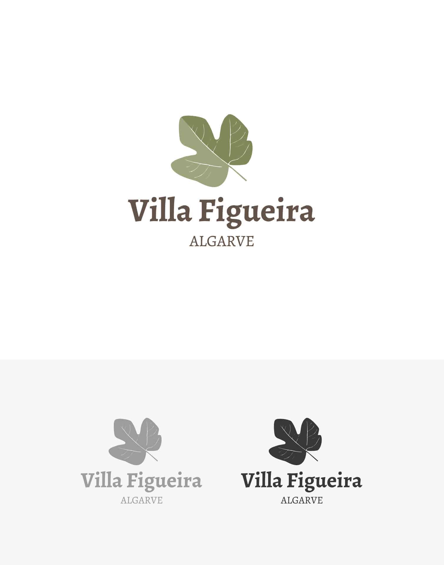
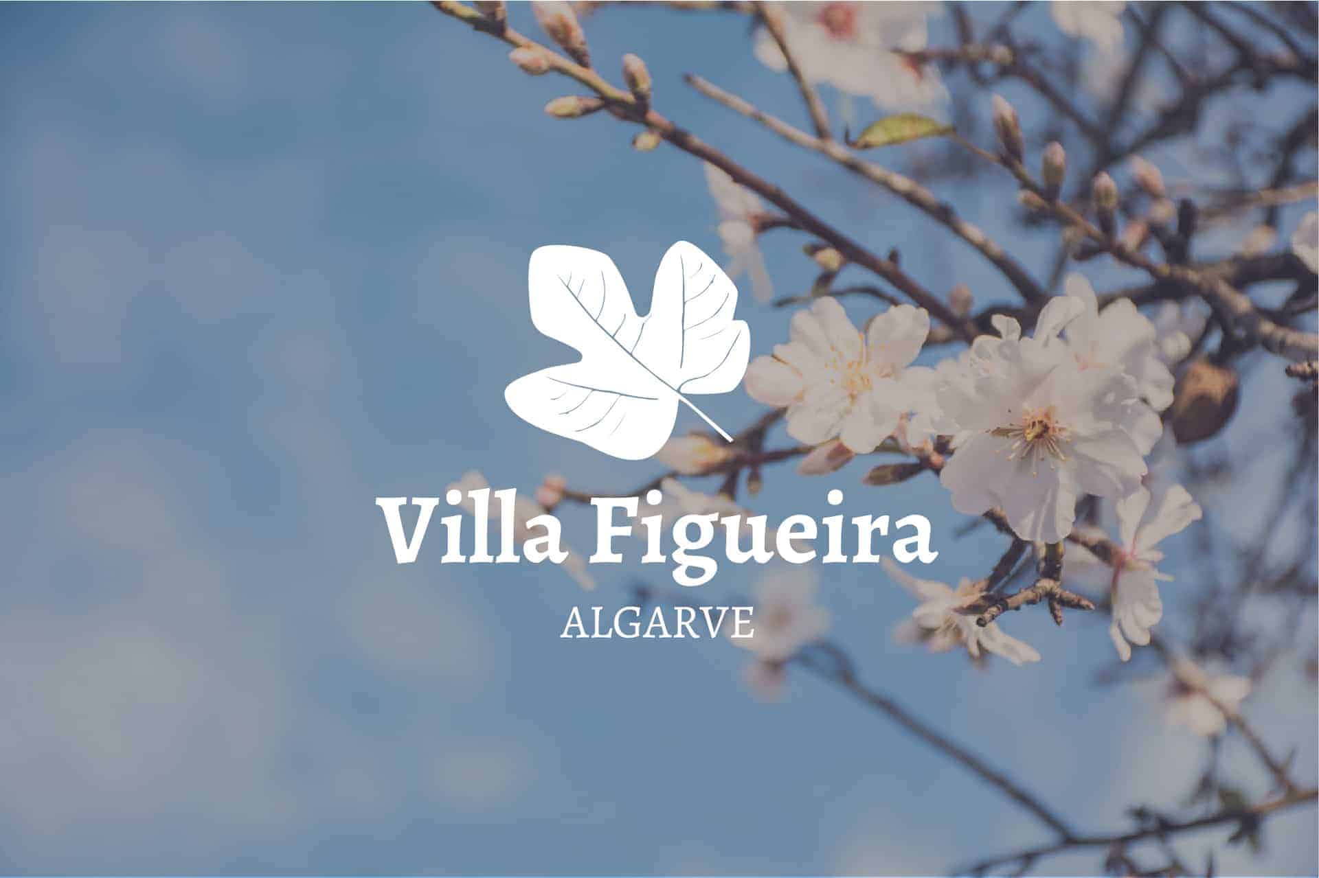
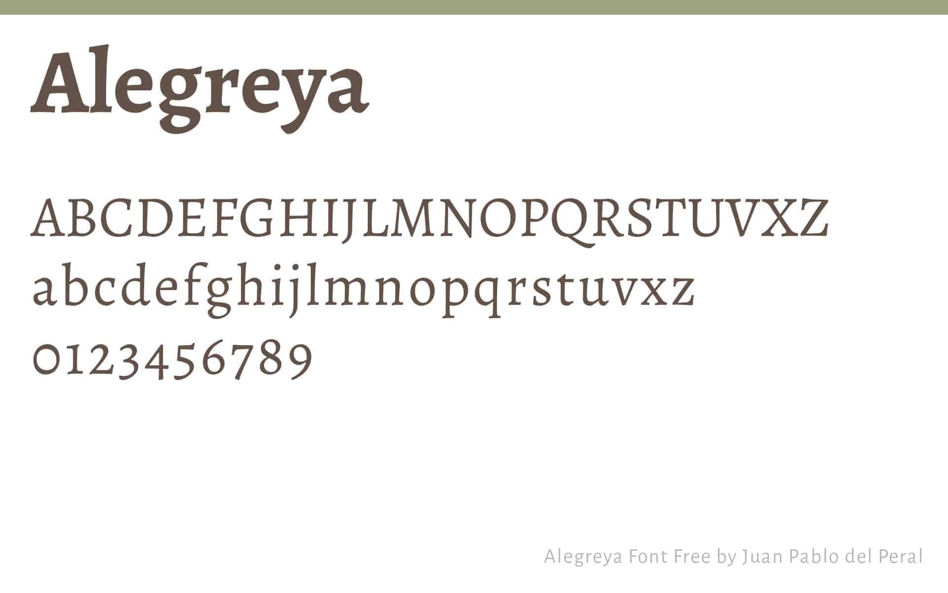
"Figueira" is the portuguese word for fig tree. So I decide to start with that and work around the nature and the tree. In the end the result is just one icon based on the leaf of a fig tree balanced with some serif typography (Alegreya). The colors are soft green and brown remembering the nature and the quiet village where it is placed.
I've made a sketch of the leaf on my notebook, after that I scanned it and vectorize it on Adobe Illustrator.
When the icon is ready I worked with typography, studied different types, colors and compositions until I'm sastifeid with the final design. While I'm working I like to go researching the work of great designers like Paul Rand, Paula Scher, Peter Saville, Stefan Sagmeister, Aaron Drapling, etc.
I sent three final options and they quickly choose this one. The project was really simple, they was very happy and project resulted very well. Right now everything is working, the logo was embroidered on towels and cushions, the business cards are printed and everything looks good.
I believe that the most important thing here was to create something that represented the house, the space, the village and at the same time reminded the Algarve.