Vineria 9

The older the better wine. However it doesn’t work for brand design of a business that sells wines on internet. This is the case of Vineria 9 and its website www.vineria9.com.br. The brand was former known as Coisas da Serra, the business has changed its name to Vineria 9 and reformulated strategic definitions. From this turnaround emerged the necessity to create a new brand identity.
During the branding project was chosen the Sage as archetype for the brand. The archetype shows the profound specialization and knowledge in the area, both shared among the customers.
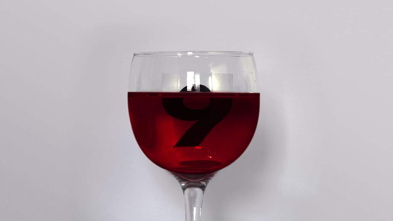
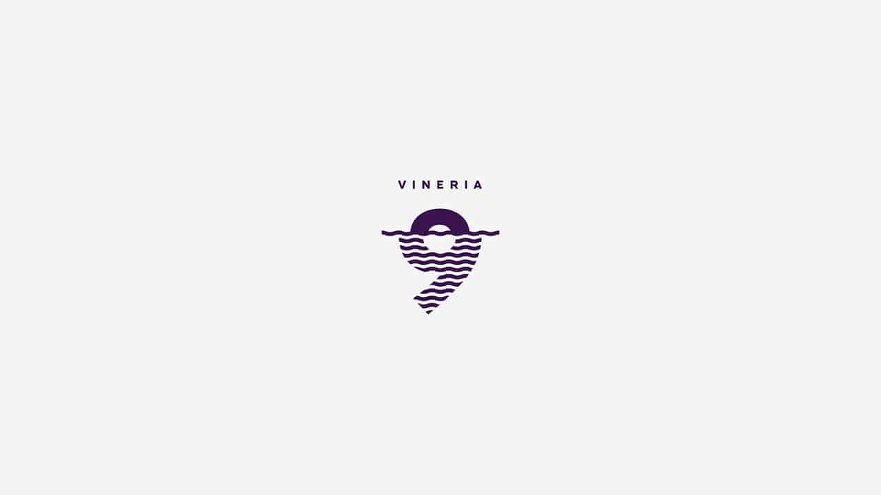
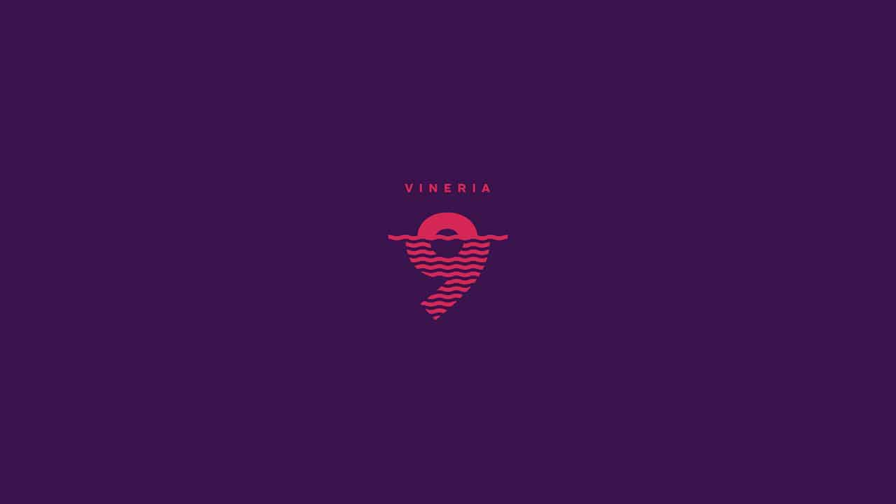
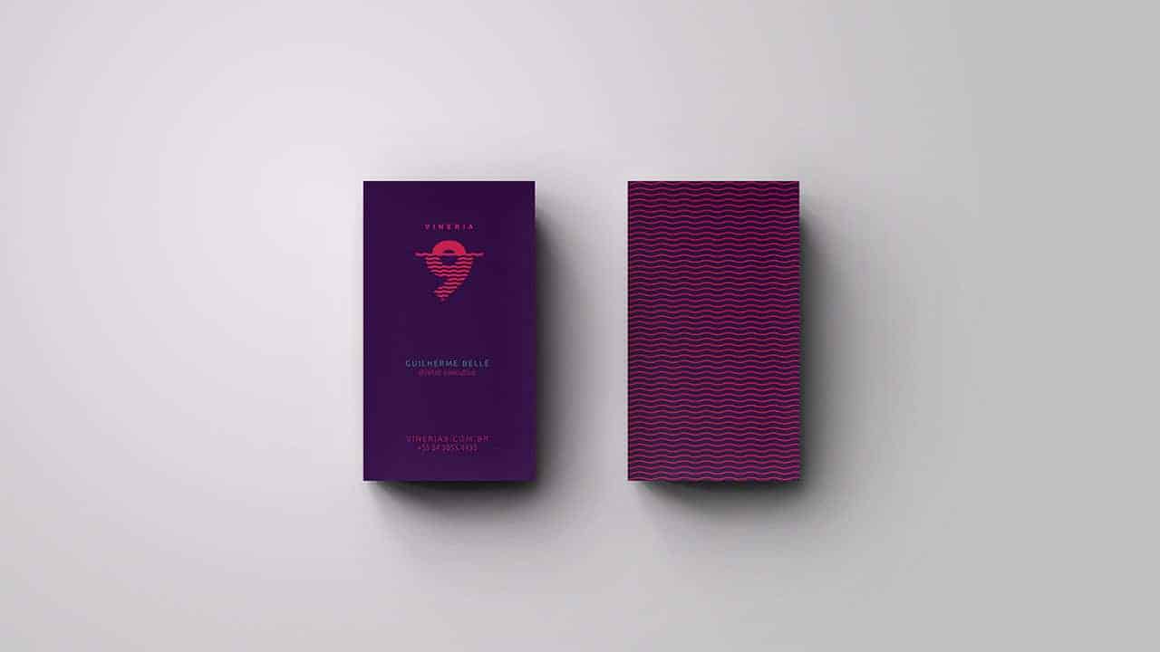
Inspired by concept “we see beyond the wine” was designed a brand identity where the number 9 is modified by the refraction from a glass of wine. The main colors were inspired by diversity on types of beverages.
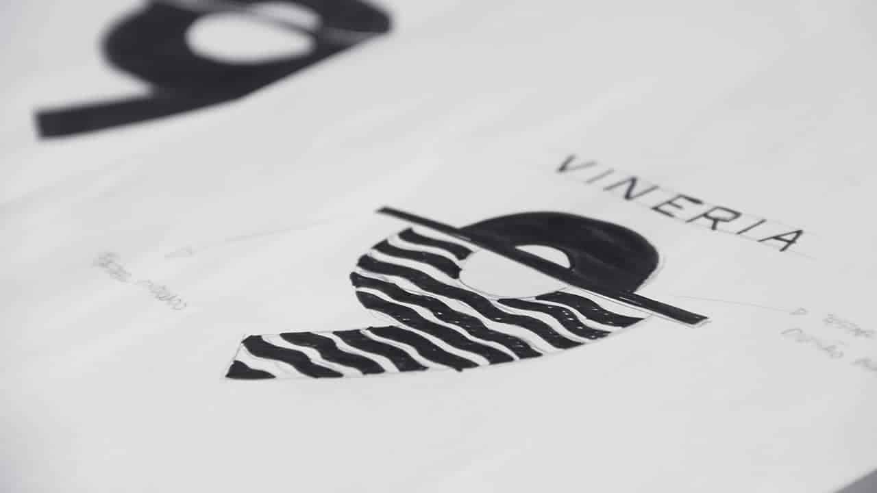
The initial design of the studio projects Gilnei Silva always happen manually so that we have greater personality. Always guided by branding tools.
Once set the goal to be followed, we move to traditional graphics programs such as Adobe Illustrator, Photoshop and Keynote.
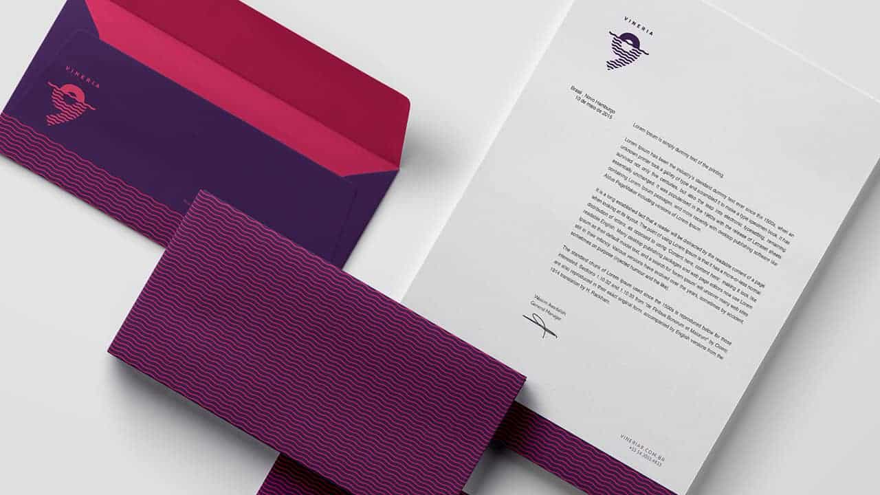
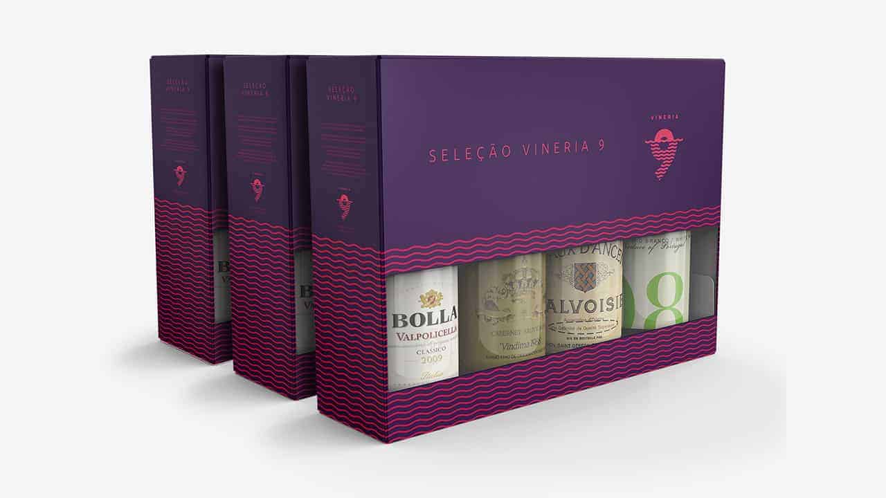
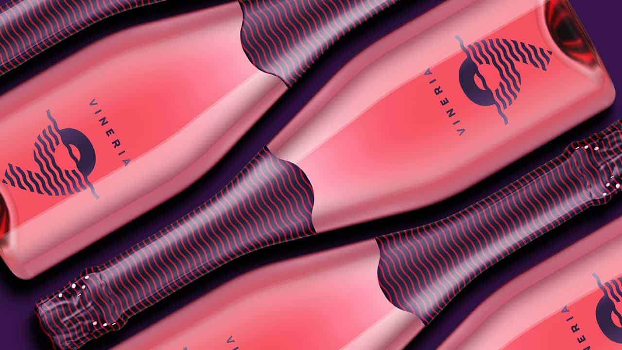
The outcome: clean design, contemporary, but with strong personality like you can see in this post, fanpage, website and every touchpoint brand.
The project was very well accepted by the Vineria 9 brand owners.
In social networks and local media realized if a large identification of consumers and drink lovers by identified with the brand.