Visit Blackpool / branding + print + animation

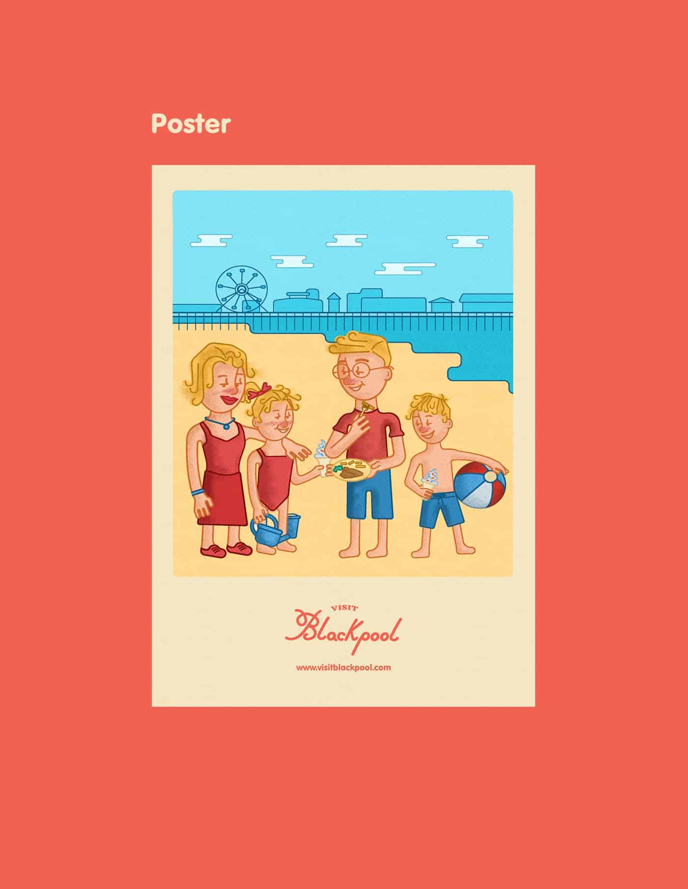
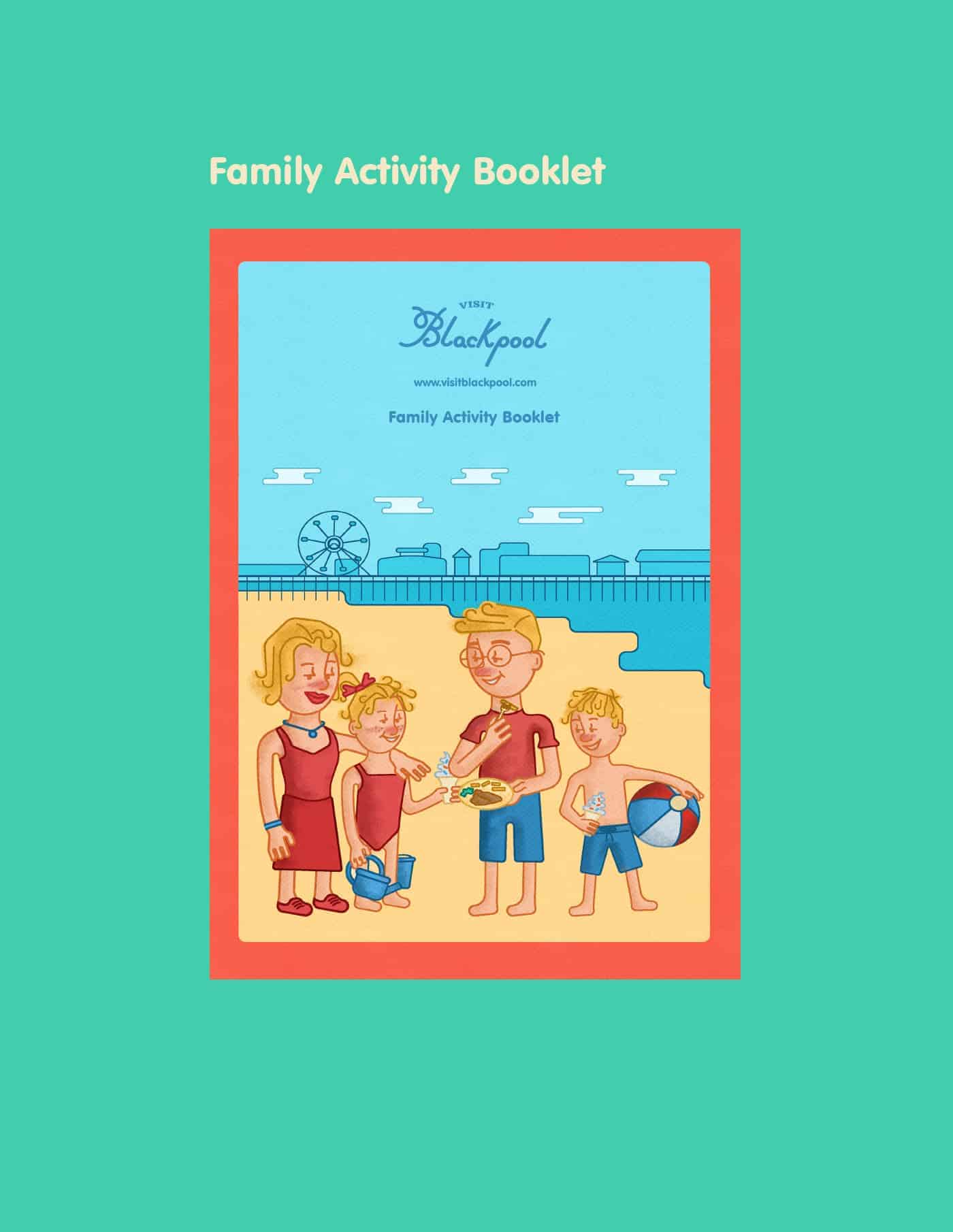
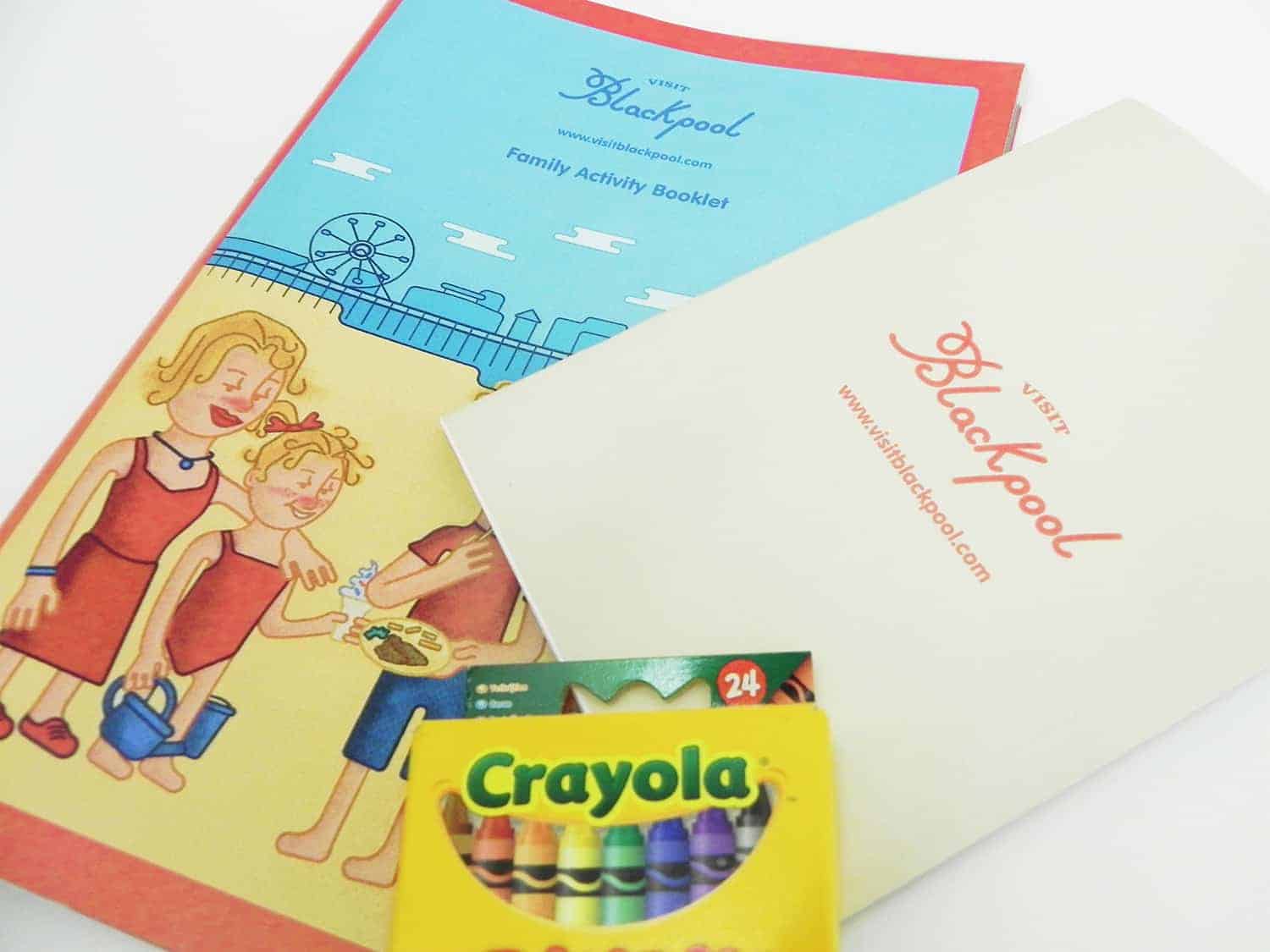
The task was to rebrand Blackpool and target a specific audience. I've created a rebrand which is modern, utilizing bright colours, but uses the persuasive technique of nostalgia to appeal to the parents of young famillies. A more child focussed brand, which features emphasis on children having fun.
See the full project with the animation at
www.behance.net/gallery/57303773/Visit-Blackpool-branding-print-animation
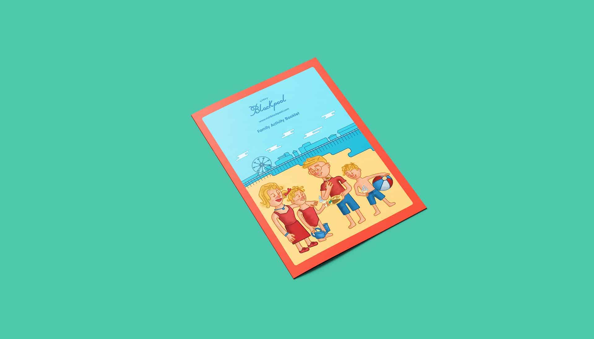
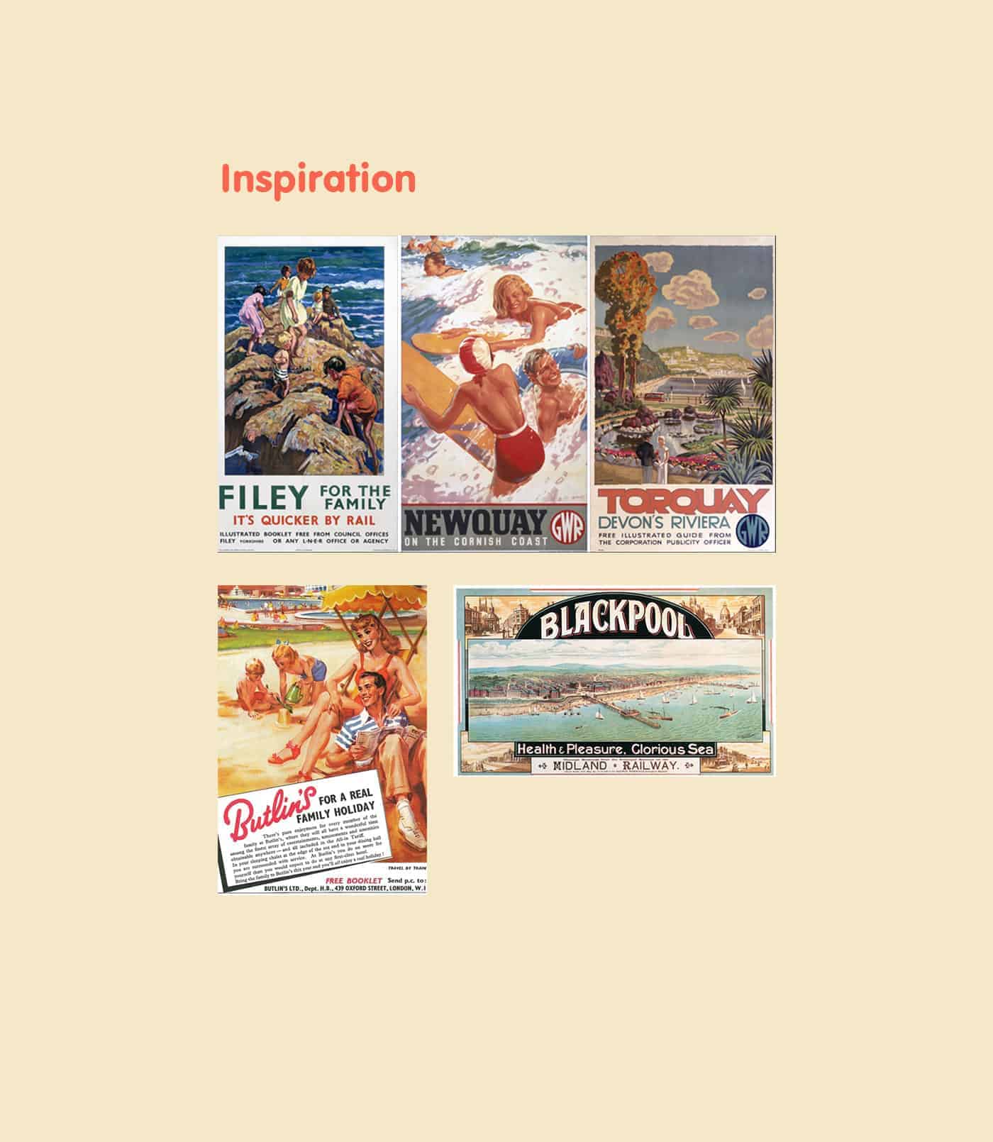
I researched coastal holiday resort advertisments from the 1950s, and was inspired by the colours and design itself. I wanted to create a similar feel but for modern audience, with a modern ilustration style, which is child friendly. I researched a range of children's illustrators, styles that I liked and could help me develop my own style specifically for this project.
![]()
Adobe Photoshop, Adobe InDesign, Adobe Ilustrator, and Adobe After Effecs were all used in this project.
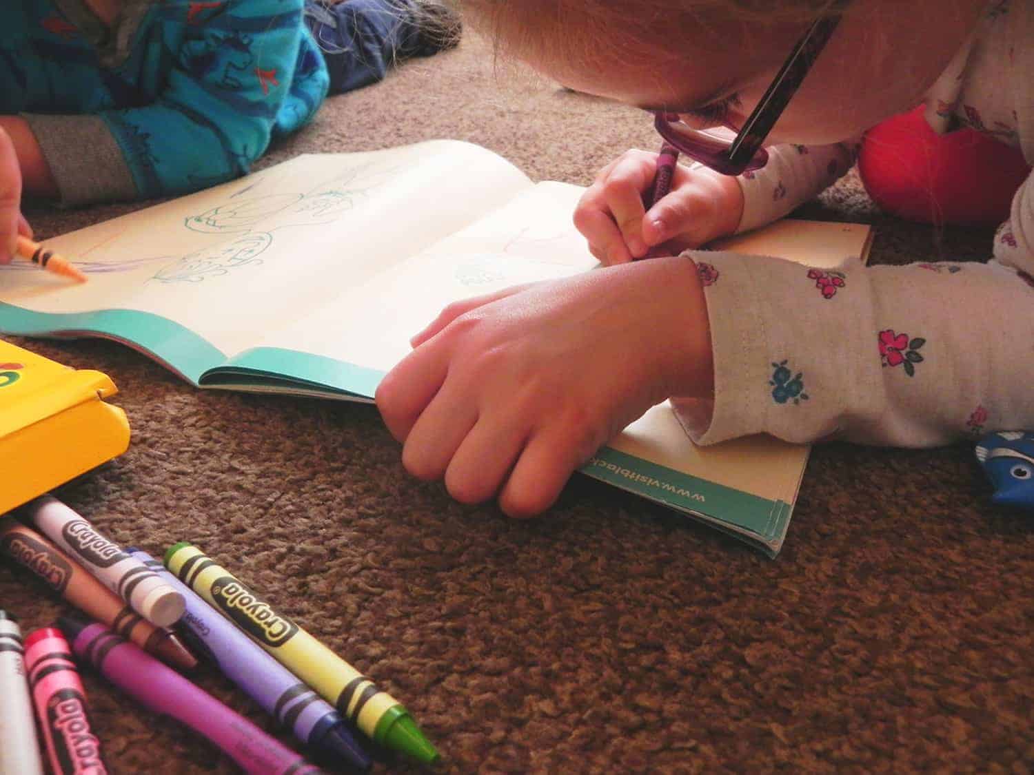
The process began with sketching, in my research and development sketchbook which we're required to do for college, This is an indepth look at the project from initial ideas to completion.
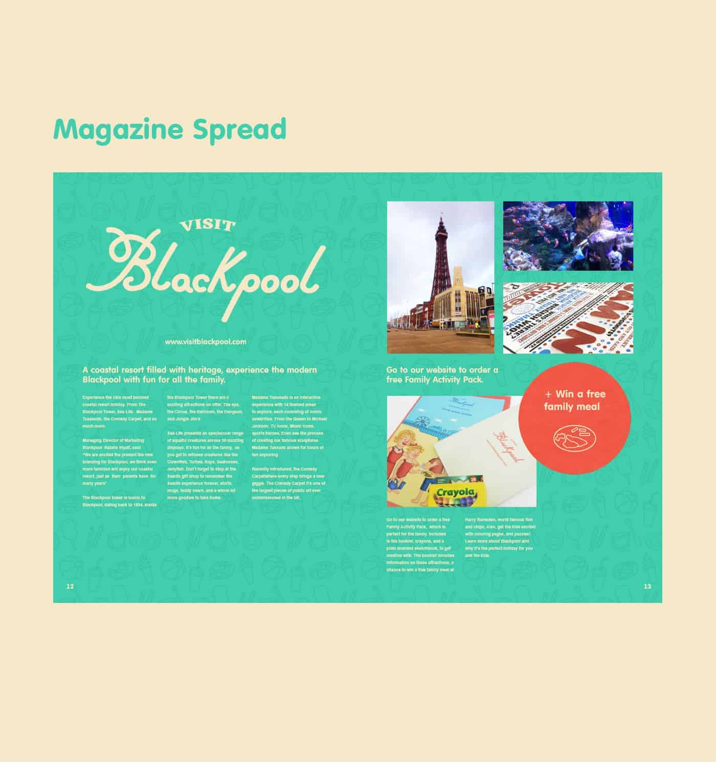
From this project I learnt how to use InDesign in a basic way, as this was the first time I've ever used the program. I found it awkward at first because it's different to Photoshop, but I've learnt InDesign is much more effective for actual print materials.
Have a look at more of my work at behance.net/michaelmorton
Also, I'm available for freelance work, let's work together!
Shoot me an email at [email protected]