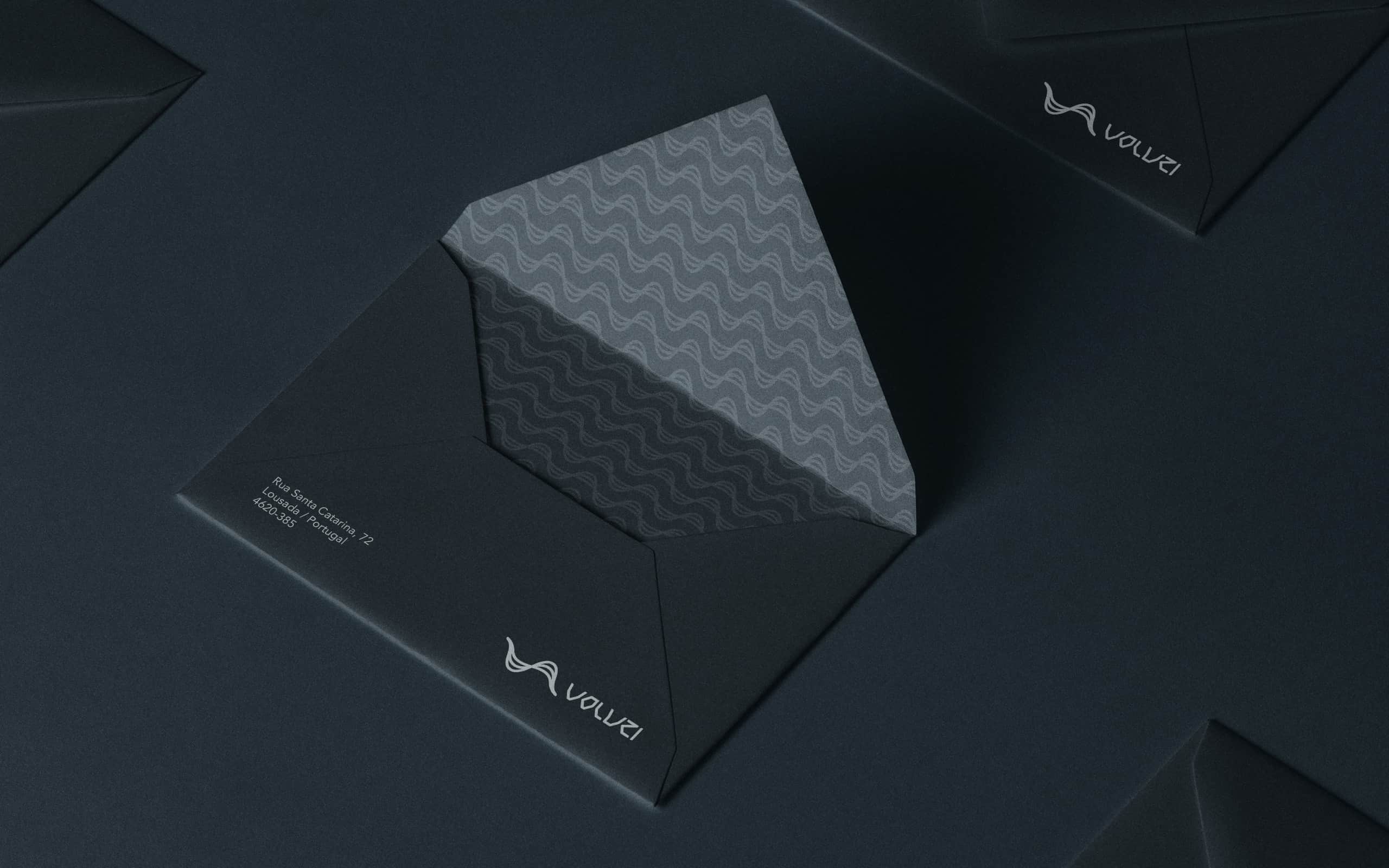
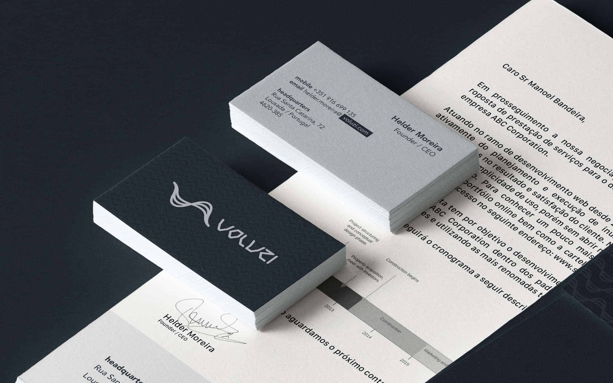
Voluzi Brand Identity
Voluzi is a company of information technology based on Lousada, Portugal. They are going through an expansion phase and needed a new brand that represents all of the company's expertise and versatility. The brand needed to deliver technology without limiting its reach, as the company offers a wide range of services aimed at the software development and hardware infrastructure market.

Seeking references for the creation of the Voluzi new brand identity, an IT company based in Portugal, I decided to fall back to the representative scale of information in digital media until the binary code.
The visual translation of the encoded information into a binary system can be visualized in the form of two pulses, one representing “1” and a second representing “0” in a two-dimensional graph.
This road leads us to the minimal representation of information in the current IT architecture since the definition of Boolean Algebra in 1854, then applied in electrical circuits in 1937, the bit.
We advance in the timeline until the appearance of optical fiber, the fastest way for transmission of information nowadays, that among others can uses a technique for transmission of digital data called ASK (Amplitude-shift keying).
In an ASK system, the binary symbol "1" is represented by the transmission of a carrier wave of fixed amplitude and fixed frequency for a bit duration of "T" seconds.

In this way the symbol was constructed by mergening the smallest unit of information of the digital systems, the bit, and the visual representation of its transmission through optical fiber, the fastest way used today.
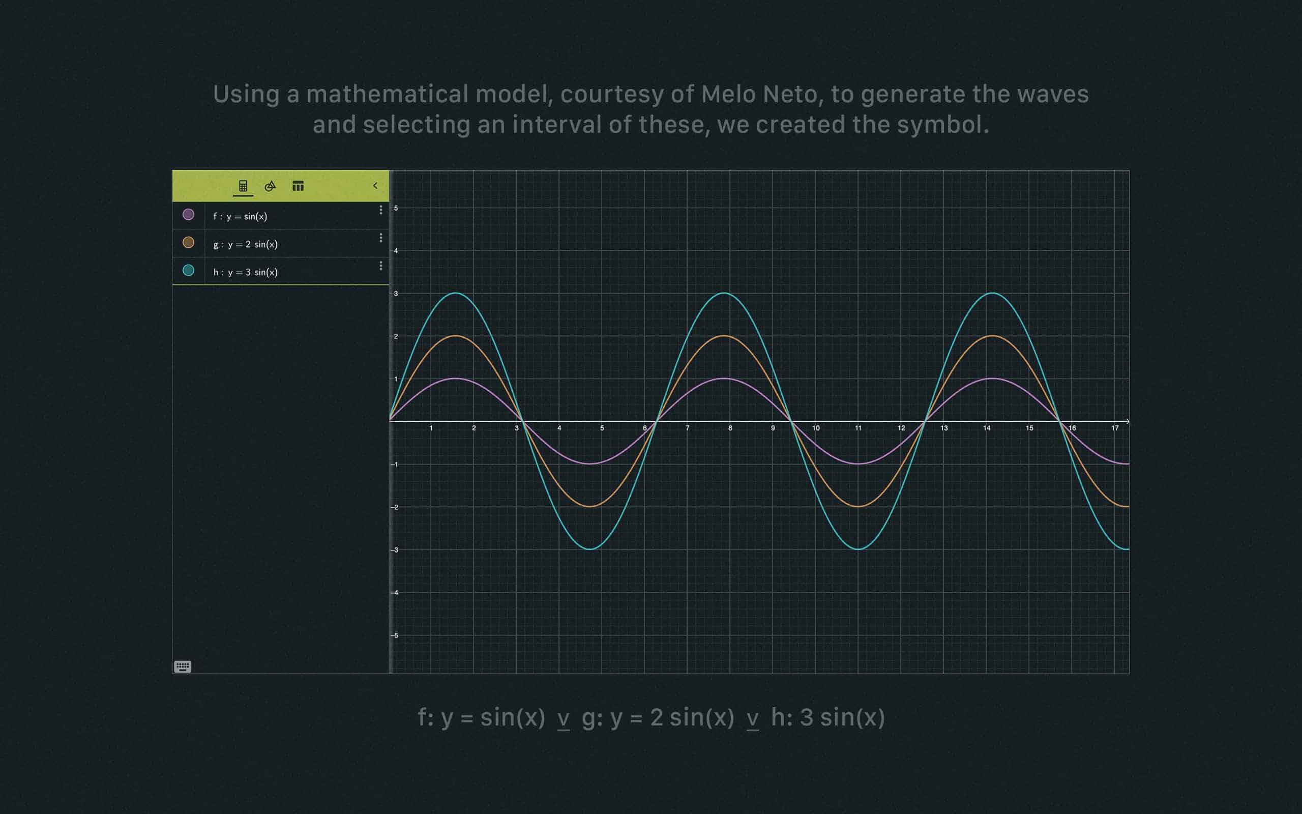
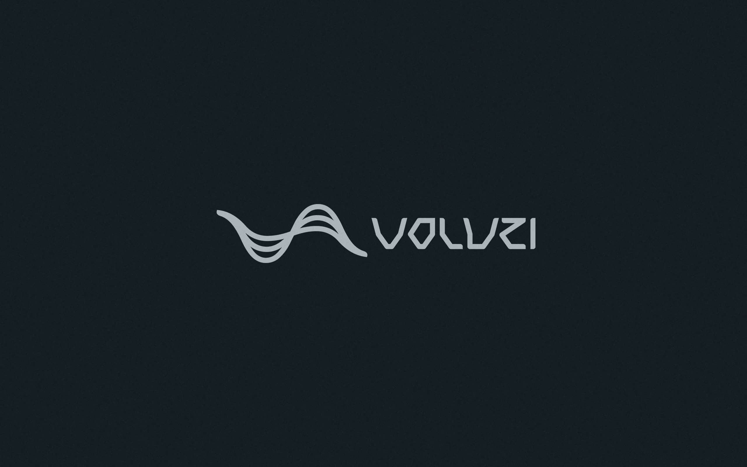
Using a mathematical model, courtesy of Melo Neto, to generate the waves and selecting an interval of these, we created the symbol. The unique typography was inspired by the visual representation of the transmission of information using binary code.
The symbol sketch was created in the Procreate App using an iPad and after that we import the file and refine it in Adobe Illustrator. All typography and stationery was already created directly in Illustrator.

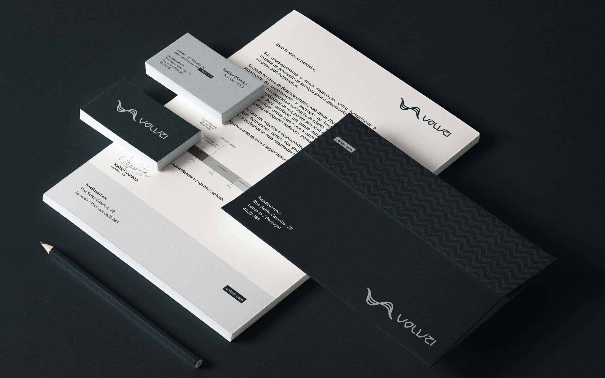
The client took an instant liking to the brand. The feedback was very positive. Was a good opportunity to exercise the capacity to create something minimalist, without many illustrations or many colors. We tried to create a modern and elegant identity, so let us know your opinion.