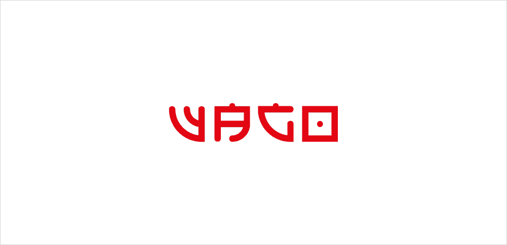
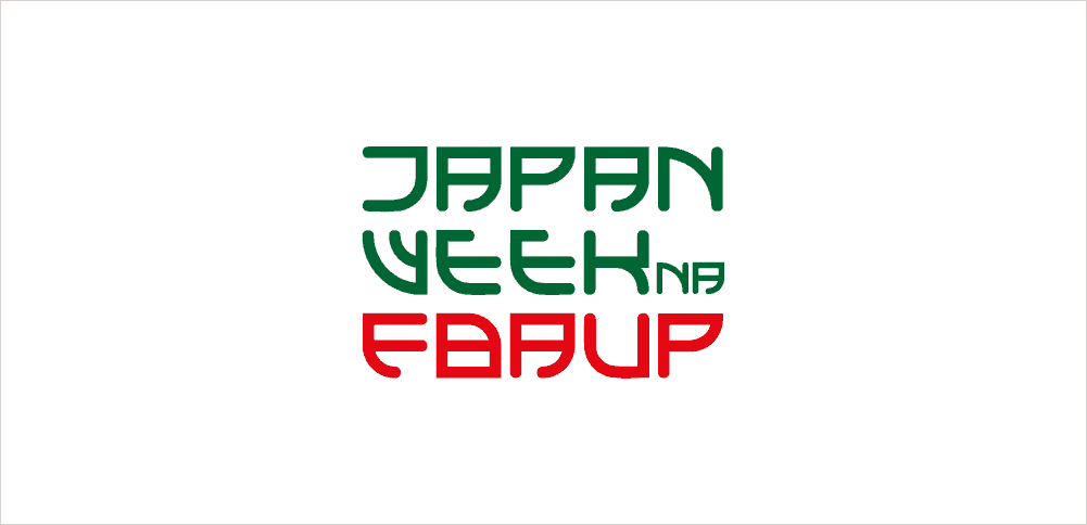
Wago

In 1860 Portugal and Japan signed a Treaty of Peace, Friendship and Trade. 150 years later the Faculty of Fine Arts of the University of Porto (FBAUP) honors the signing of this Treaty with the program "Wago: two cultures, two moments".
This project is the graphic identity of this program.
(winning proposal of a academic competition)
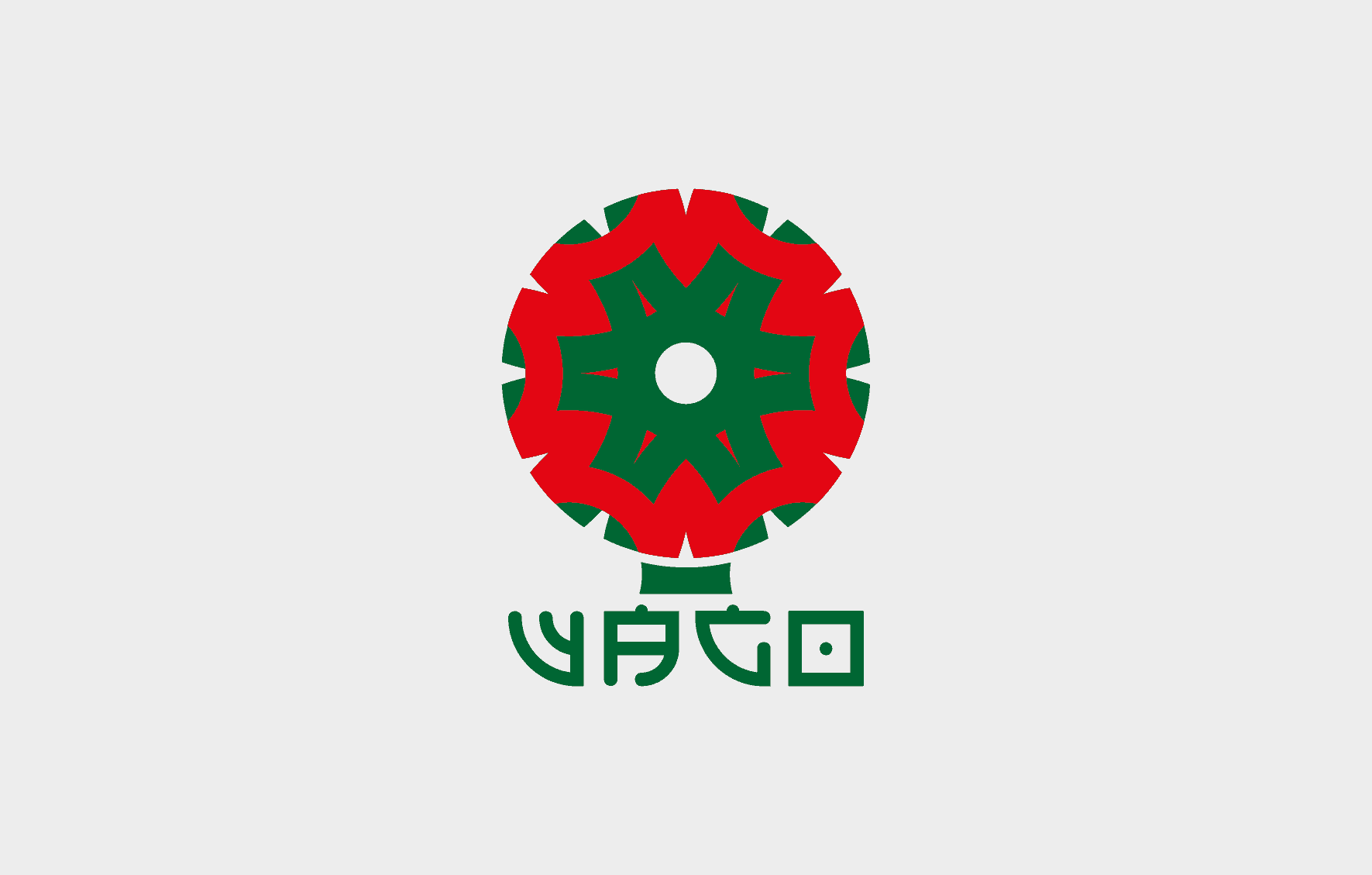
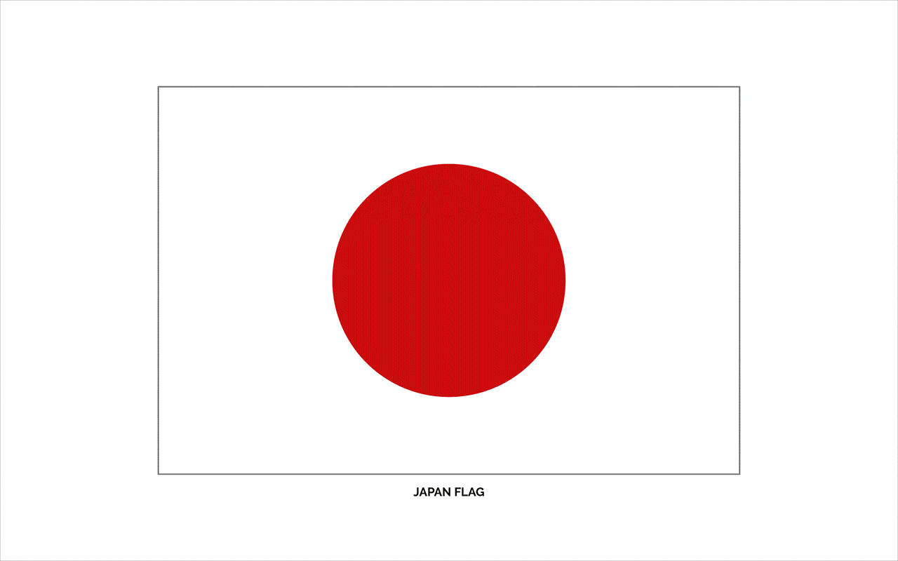
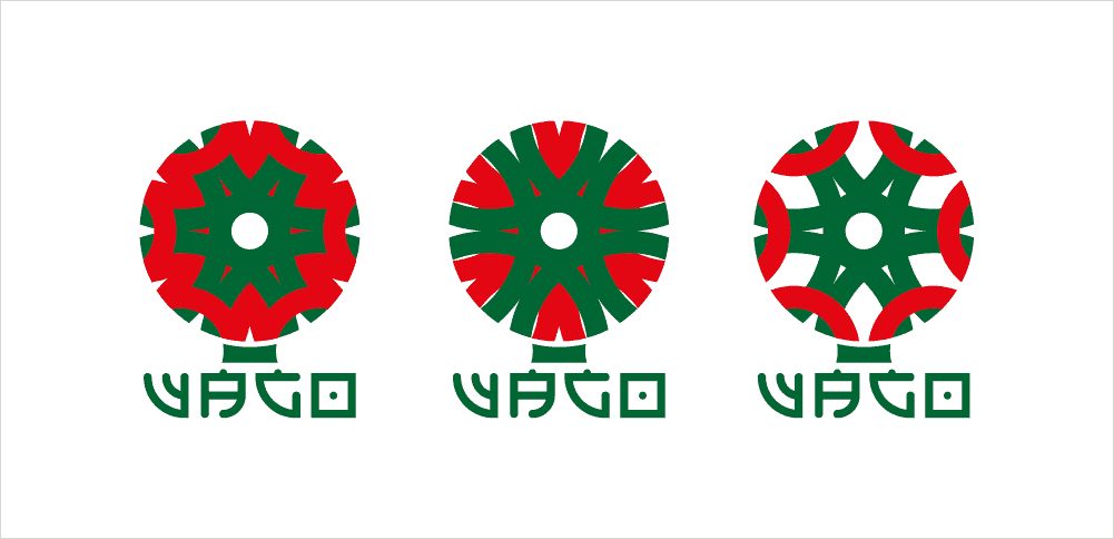
"Wago" is a Japanese word that means "harmonization", so I needed to create a logo of harmony, peace and unity. I remembered that this logo could be a plant, so I picked up the circle of the Japanese flag and built that plant. I created three variations of logo.
For typography the concept was to merge Latin characters with Japanese characters, and I used the circles too.
I choiced the colors red and green, because they are the colors of Japense and Portuguese flags.
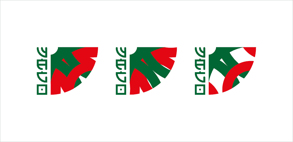
The events of the "Wago" program were about Printing Techniques, so for the banners and posters I used effects of Printing Techniques.
I built the logo and the typography with Adobe Illustrator and Adobe InDesign.
For banners I used the Adobe Photoshop.
The posters are not digital, I have not used any software. They were done in woodcut, engraving, xylol and serigraphy.
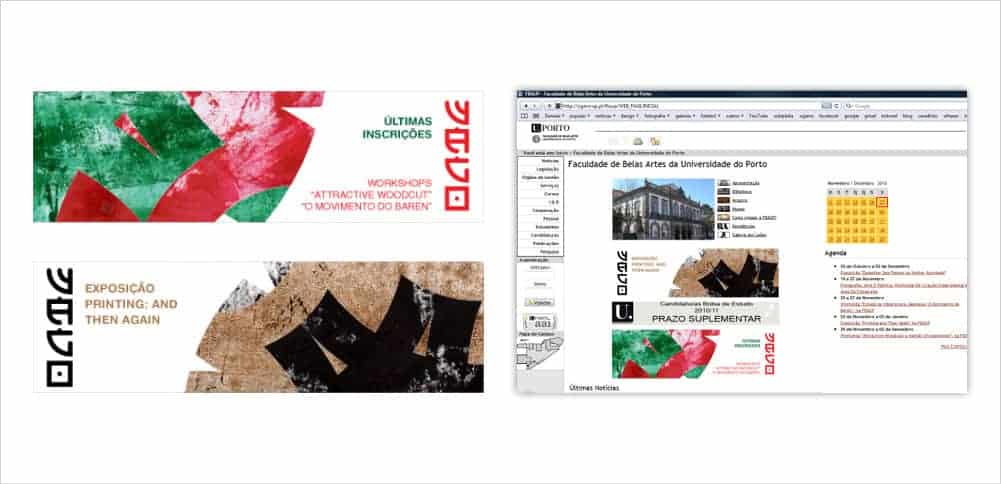
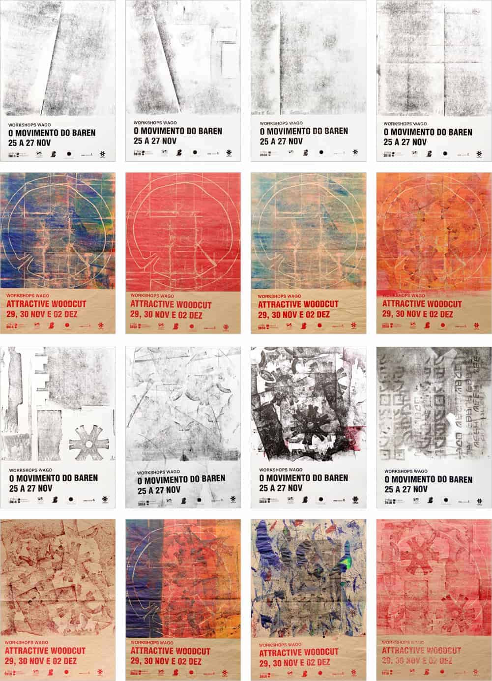
People liked so much this project, that they stole the posters from the walls of University.
At that time, I was a student and this was my first real design project. I learned that to do real projects is very diferent of academic projects... I learned a lot with this experience.
nothing