WANDERER MAGAZINE

This brief is an editorial design for Wanderer Magazine based on unconventional travel destinations and it targets authentic travellers. Our client requests a front cover and four inside spreads. This is a student project that uses Photoshop, InDesign, and Illustrator.
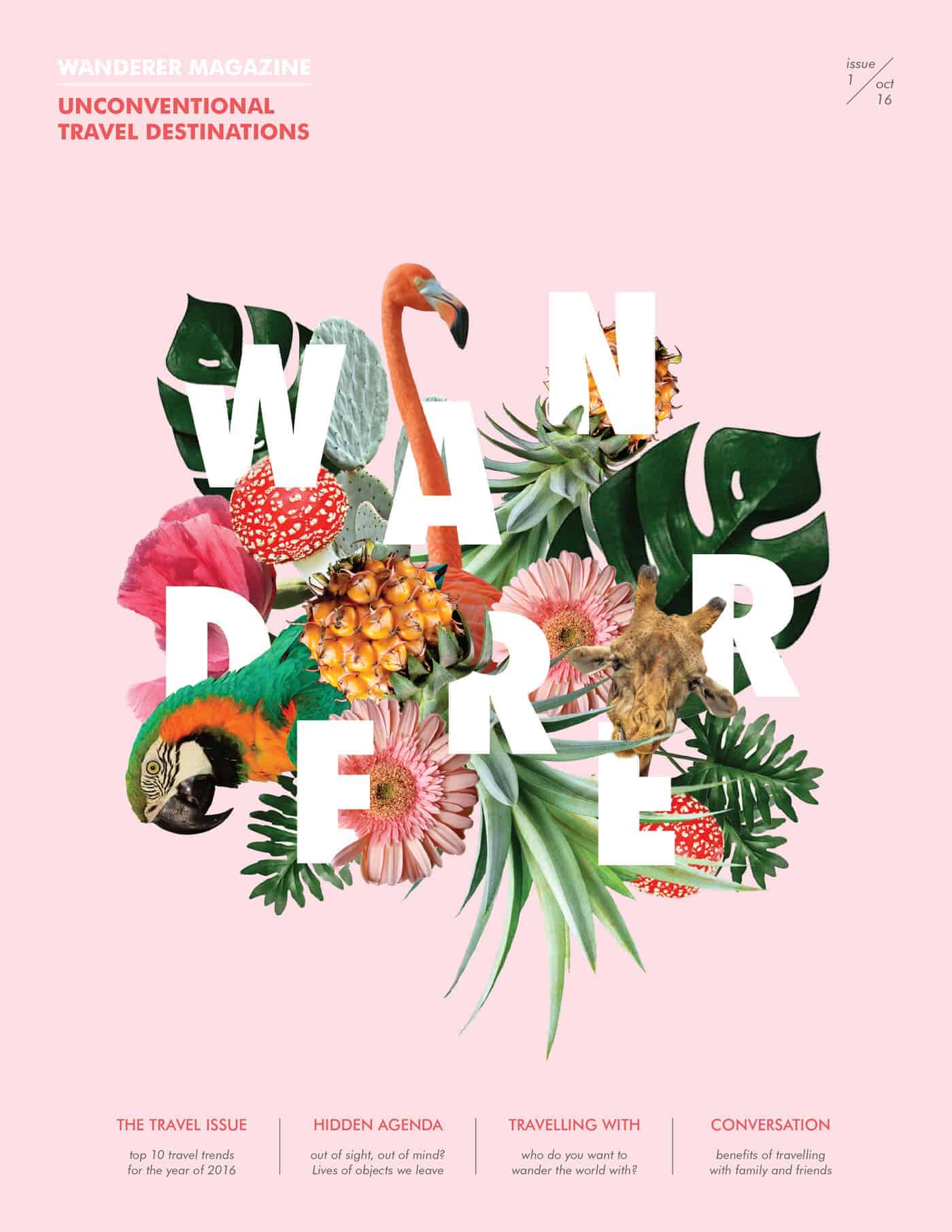
This special edition of the Wanderer Magazine features unconventional travel destinations so I chose to use a combination of exotic animals and plants as the focal point. Since there is one strong focal point already, I selected a pastel color as a soft background. This gives the design Hierarchy, Contrast, and Balance. For the spread, industrial is the main concept for the type package and image treatment. Using lines and color layers in the type package represents structure and hierarchy that reflect back to the article.
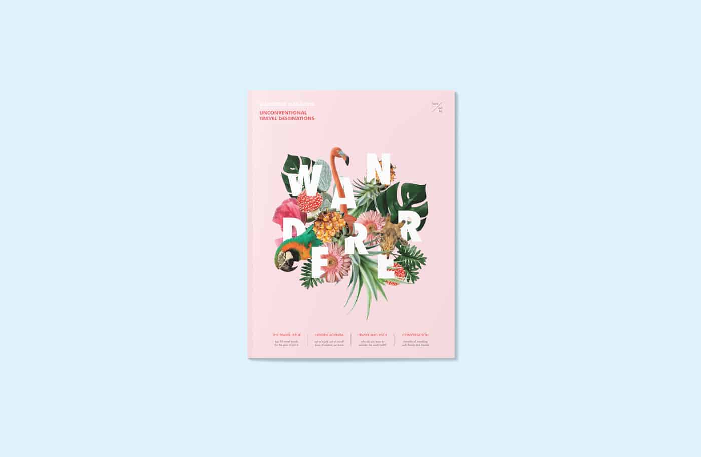
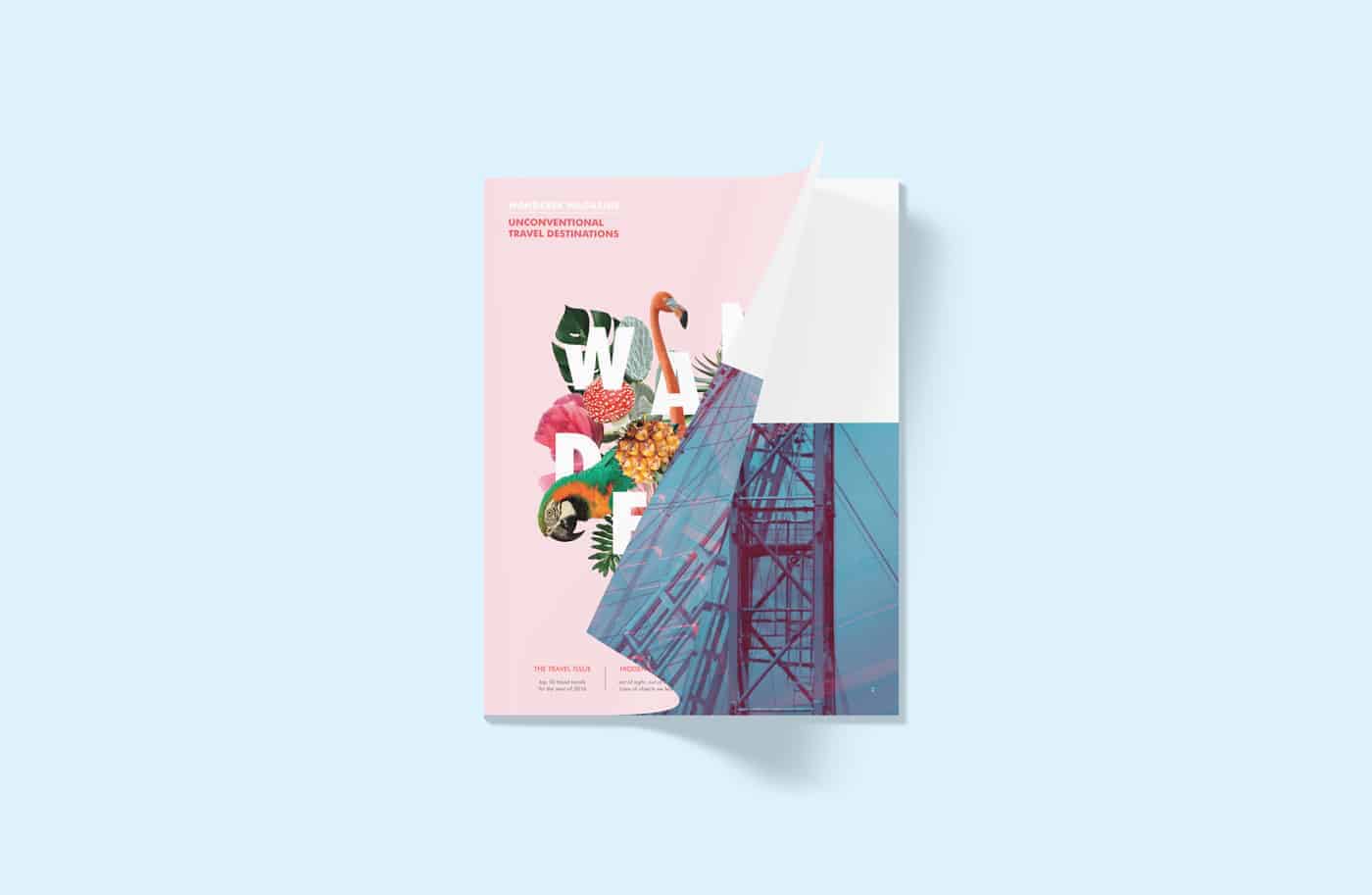
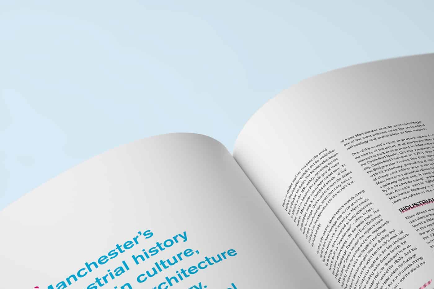
I use Photoshop, InDesign, and Illustrator. The collage on the front cover is created entirely in Photoshop. I collect different stock photos and use layer masks to create the collage. The double color exposure treatment of the images in the spread is also made in Photoshop. I use Illustrator to create the type package of "Shock City" as well as the additional graphic elements in the spread. Finally, the layout and typesetting are all created in InDesign.
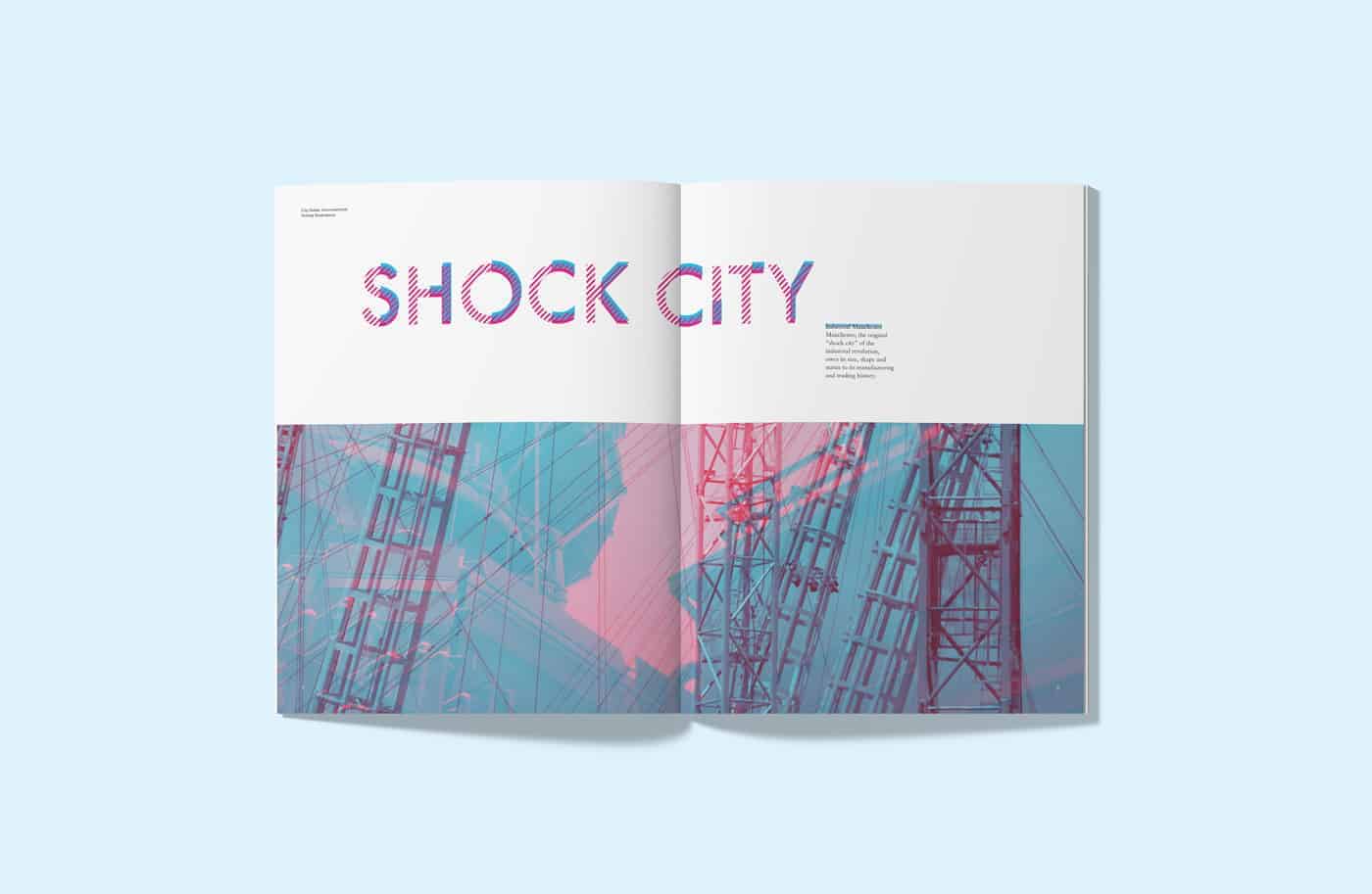
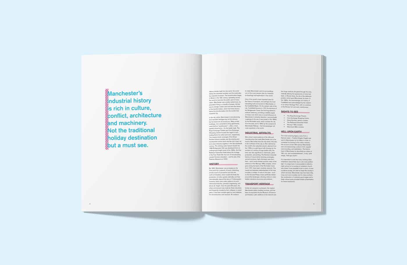
This project has received many positive feedbacks. Viewers like the combination of random animals and plants on the cover and has a very eye-catching effect. The type package is a popular one as well since it echoes with the image treatment and shows the industrial theme.
Don't be afraid to try something new or something that seems tangent to the content.
This is so gorgeous! Love the design + layout!