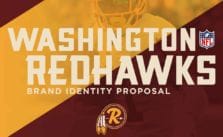
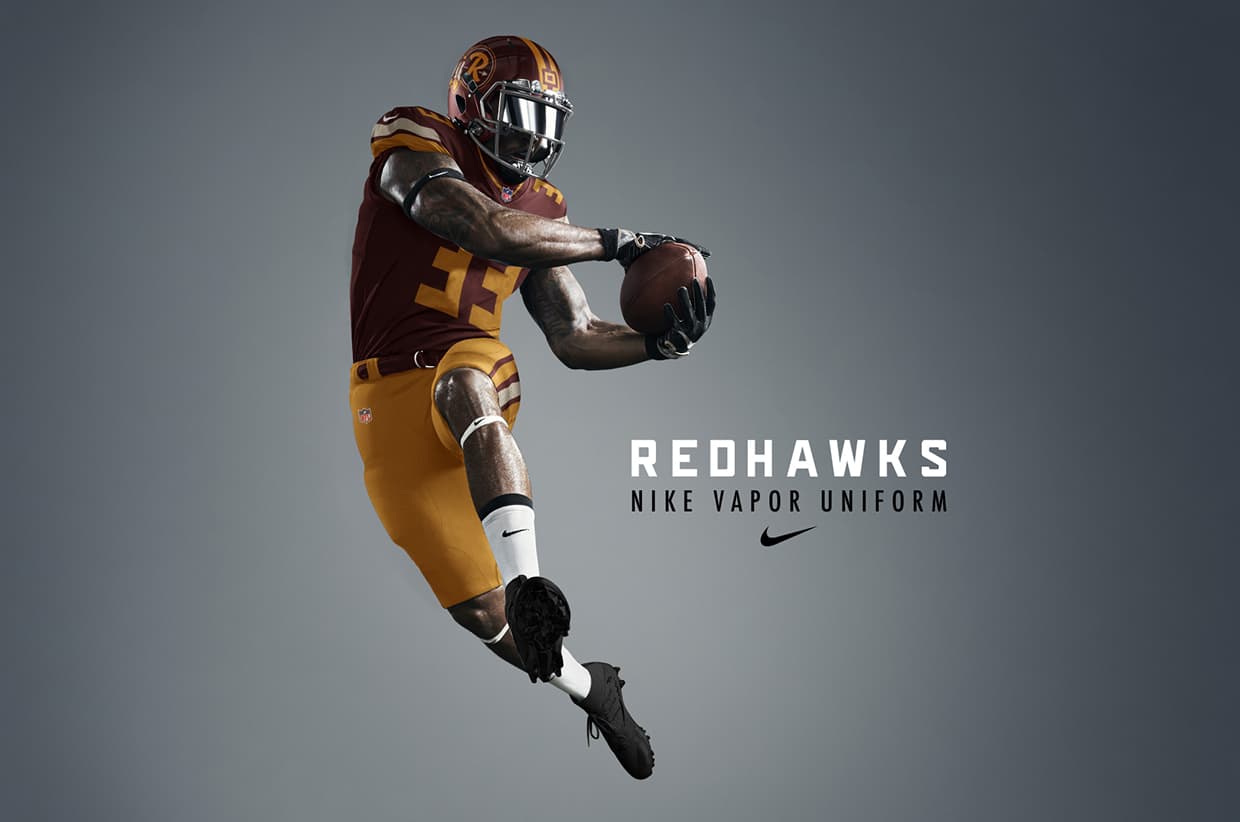
Washington Redhawks - Identity Proposal by Brandon Moore

This project is the new identity proposal for the Washington Redskins illustrated by Brandon Moore who wanted to do a name change proposal and show how the football team could have a name that is strong and proud. Read on and enjoy!
I've always had a high interest and respect for Native American culture and have been a life long NFL fan. As the rising issue of the team name gained media traction, I felt the need to do an identity proposal. it was also fueled by a trip to the Navajo reservation in Arizona where after spending a day there and seeing first hand their struggles and crumbling culture, the only thought i had was "how dare a white man from Washington DC call his sports team the Redskins". I wanted to find a way to steer the fans' love of the team towards a better, stronger moniker and identity.
- Brandon Moore
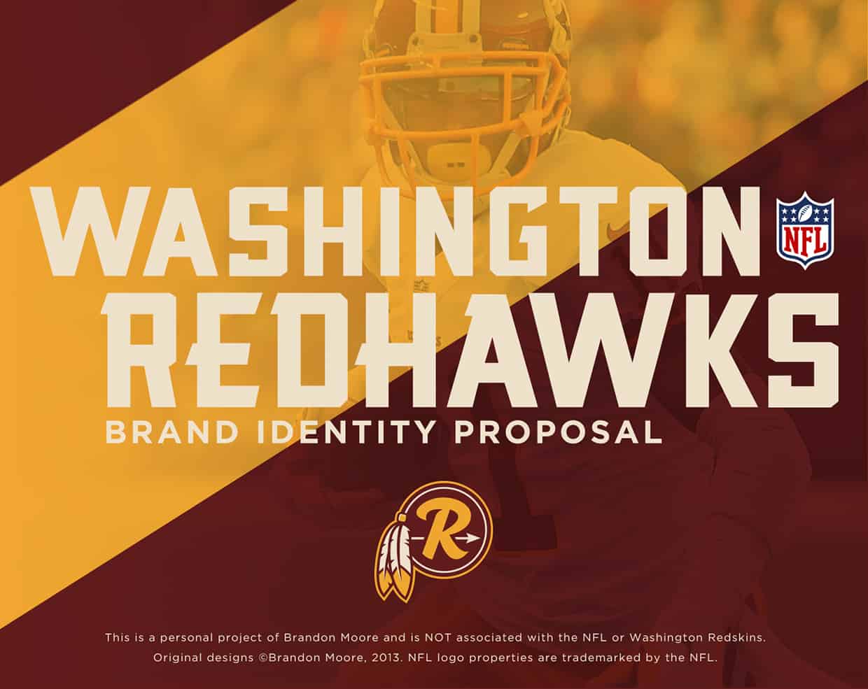
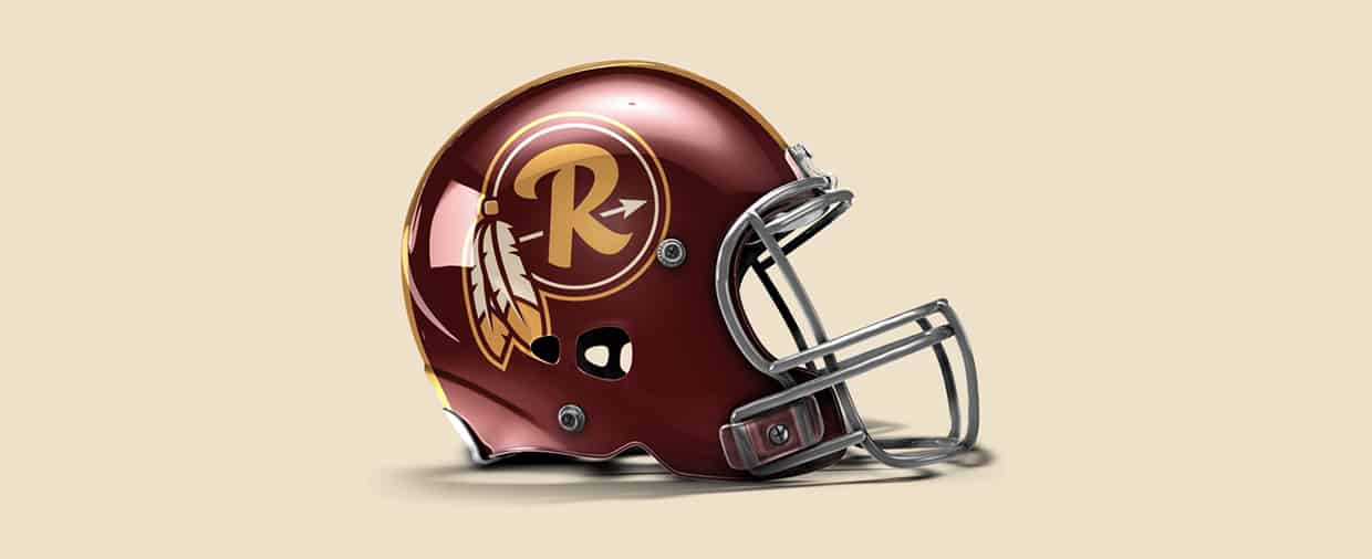
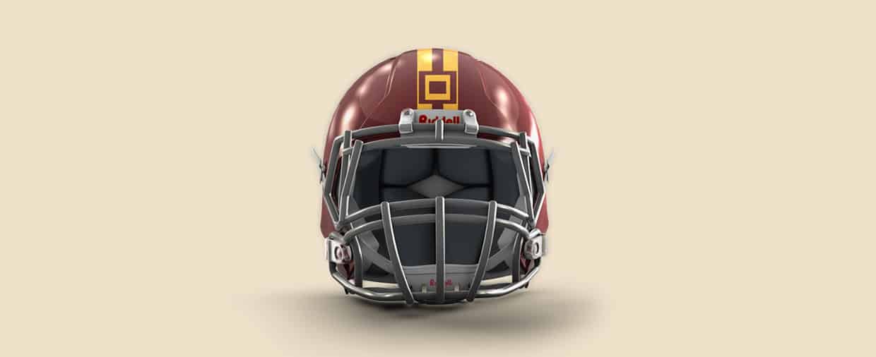
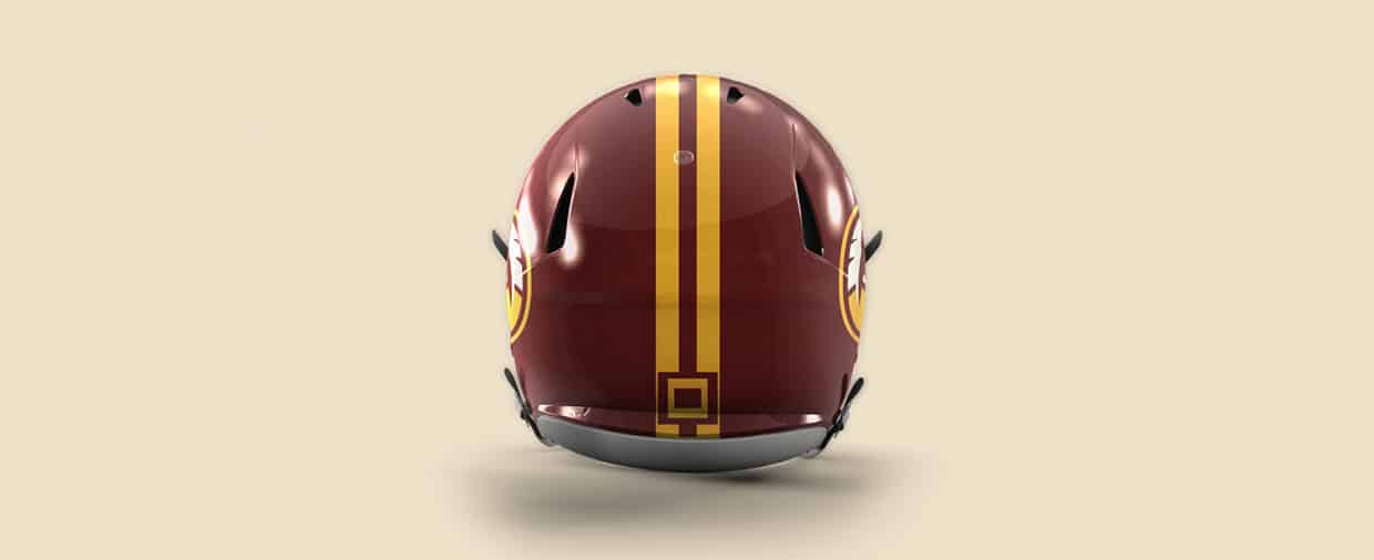
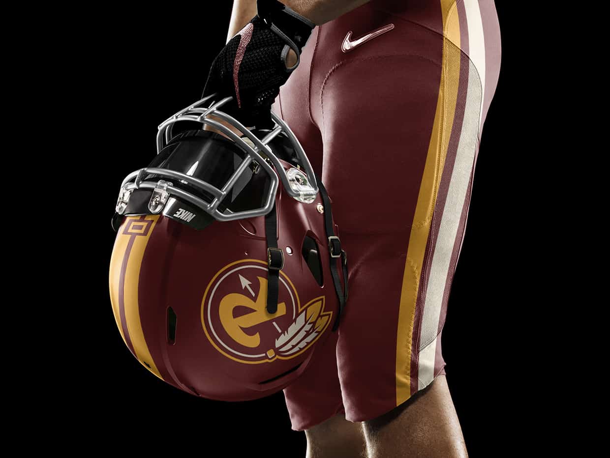
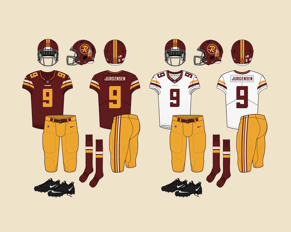
Once I settled on the Redhawks name, that was going to be such a big change i didn't want to do much more to the logos and uniforms. The primary logo was influenced largely by an old team logo that was worn on gold helmets. but the uniform presented an opportunity to do something special in the details. the stripe patterns are directly taken from wampum belts, a sort of peace offering, that symbolize respect and unity between 2 different cultures.
- Brandon Moore
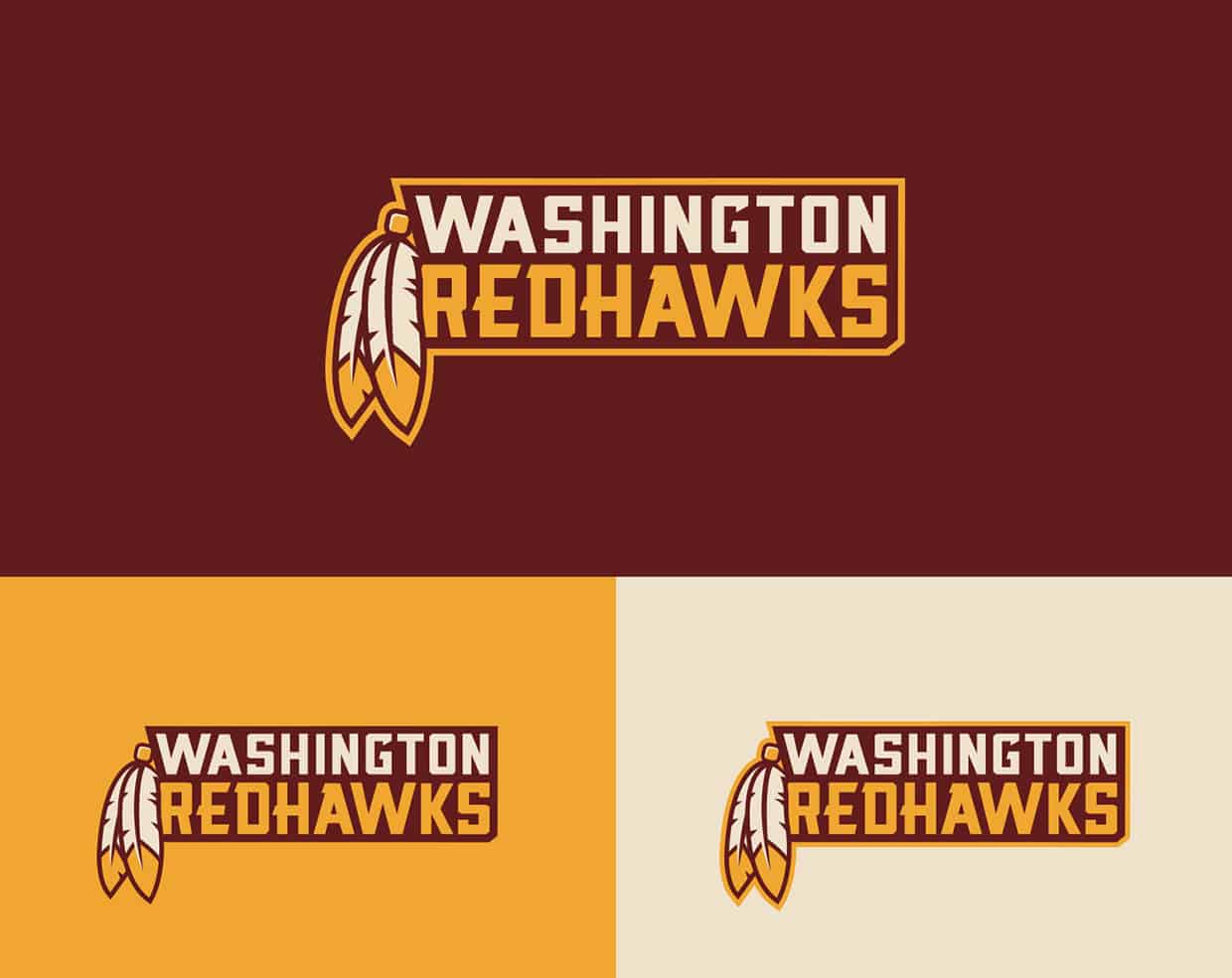
I used trusty sketchbook and pens, Photoshop, and Illustrator. I got the ideas mostly from the team history and Native American wampum belts. The biggest challenge was choosing the right name. i had considered Red Clouds, Redbirds, and Warriors but the Redhawks name felt the strongest of the group and was the only one i could see people screaming at games ("GO REDHAWKS!!"). I wasn't completely sure if it would work in a league where another team is named the Seahawks, but if 3 teams in baseball (Reds, Red Sox, and White Sox) can co-exist so closely together, then i concluded 2 NFL teams on the opposite ends of the US could as well.
- Brandon Moore
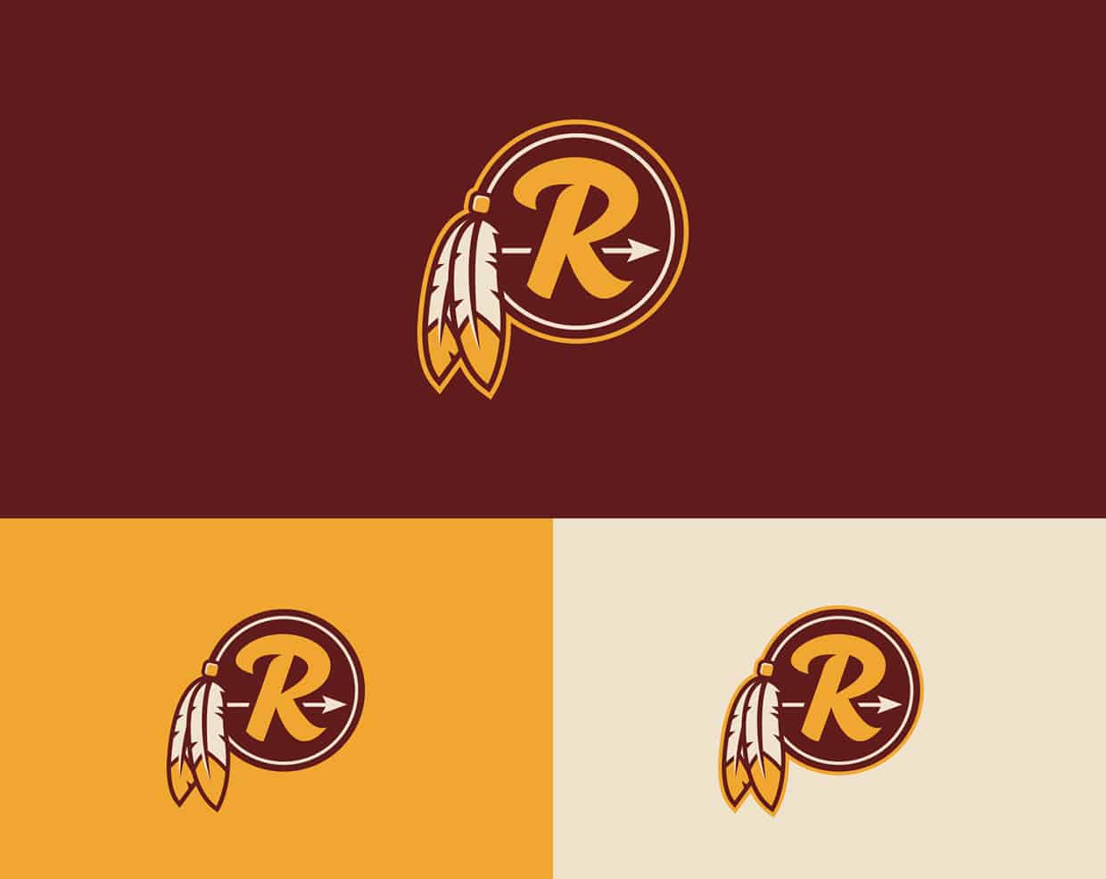
For the 2 logos there were many revisions. The primary was always based on an R inside of a circle, but there were at least 6 different versions i had concepted for that one. at one time i had a 3rd mark that was a W-R monogram based on Native hieroglyphics (the symbol for "river" looks very much like a W) but felt only 2 logos were needed for the identity.
- Brandon Moore
About Brandon Moore
Brandon Moore has been an artist his whole life and a graphic designer for 7 years, specializing in sports branding. He recently joined the Miami Dolphins creative team but still take on independent work. He is currently writing and illustrating a book called The Modern History of Football Uniform Design. You can see more of his works on his Behance profile.
Thanks for the great tips! I do have a question however that I think you could probably answer.
I was wondering, What is difference between Interaction design,
Visual Design, Web design, UX design, UI design, UI development?
I'm really confused about how they are differnet. Any insight would be greatly appreciated!