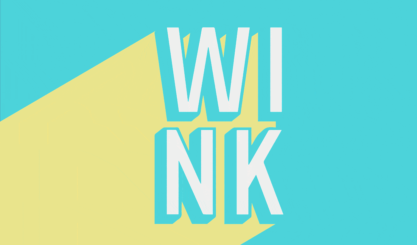
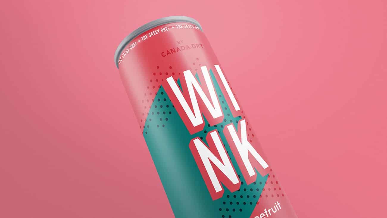
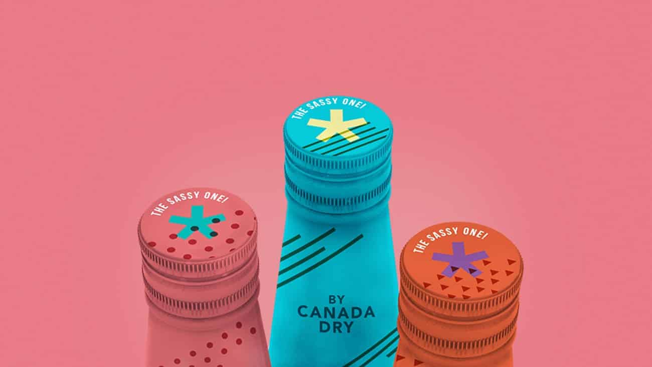
Wink

Laura de Miguel and her partner Alejandra Martínez made this graphic redesign of soda's Wink brand, from Canada Dry's family. It is been inspired in the 60's Pop Art flavour, when the brand was born. The geometric shapes and the powerful colors are references from that time. And also the superposition of forms, referring to the printing failures that occurred frequently at that time.
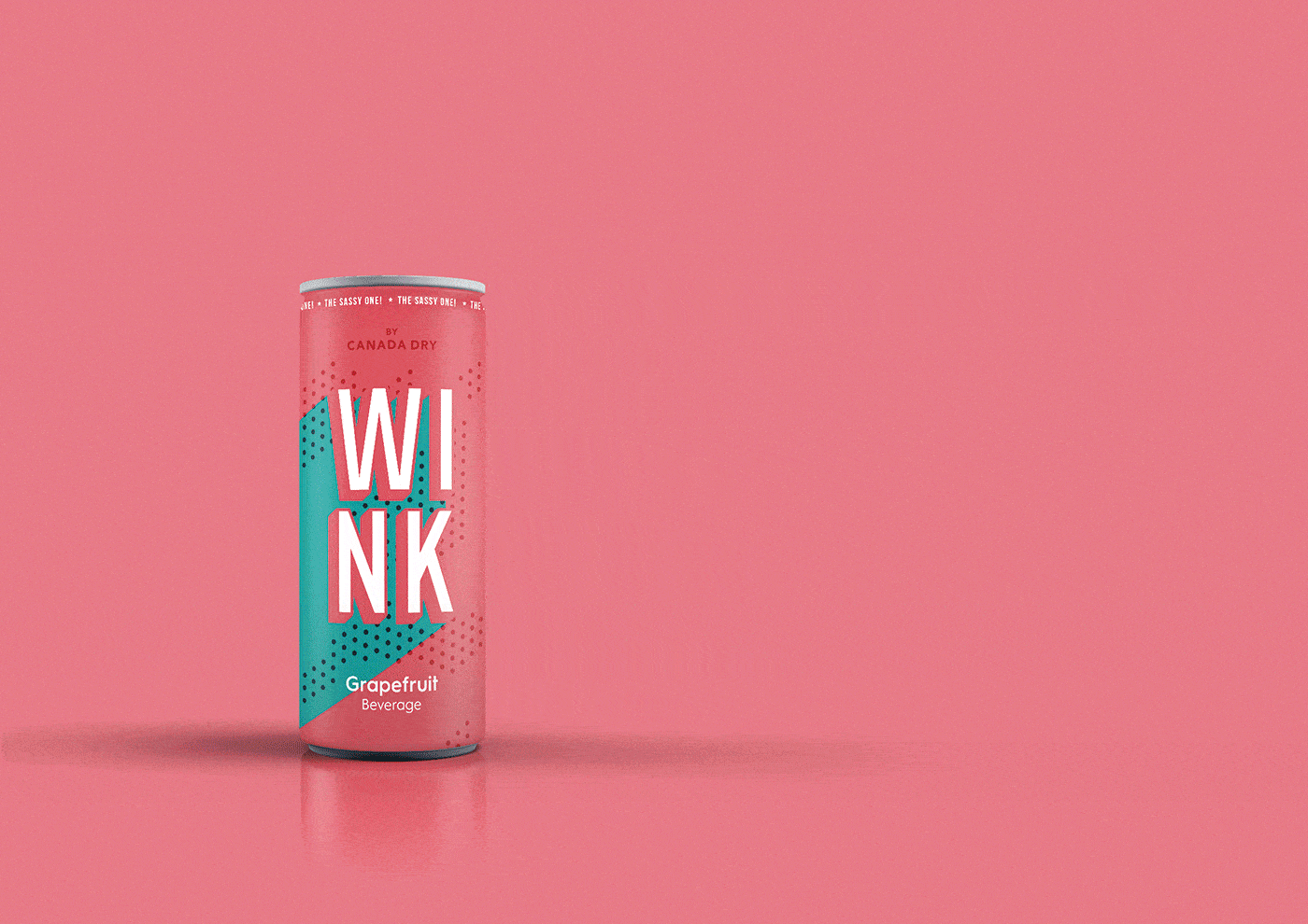
We made a research of Wink's brand origins. We inspired the redesign on the 60's, when the brand was born, because we thought was the best form to get into the market again as a refreshing start, bringing the Pop style back with a powerful brand that could compete with the actual competitors.
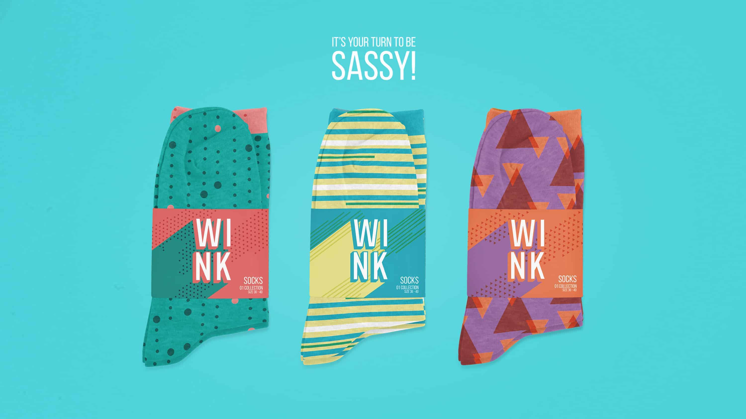
We love the pop art aesthetic, the way it uses the colors and shapes, and makes impact even in fashion designs, architecture or graphic. We do love the tendence of picking up the magic flavours of old times and traduce it to the new actual language.
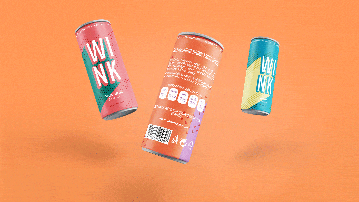
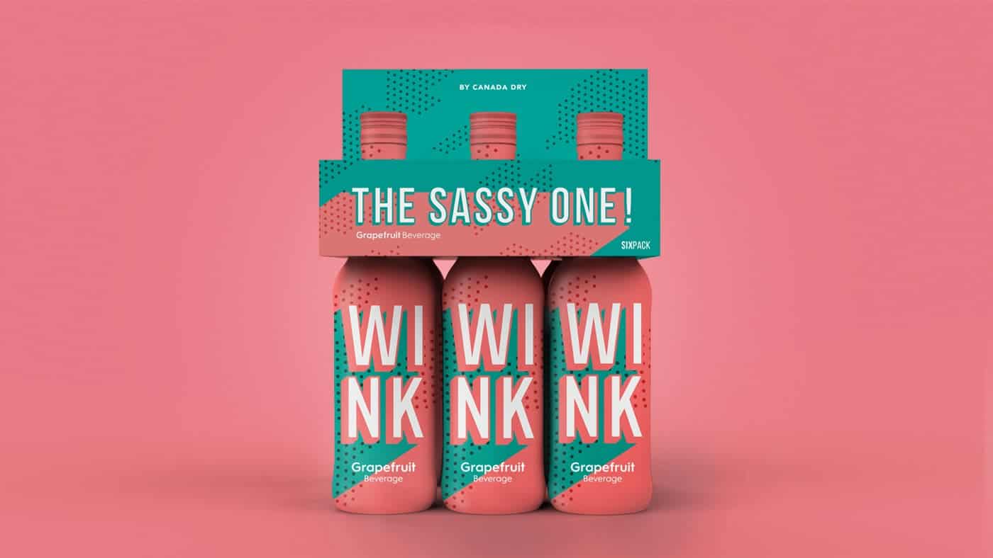
We started making sketches of different forms of layout with a pencil and different colors. As we knew what was making the highest impact, we started to try in the illustrator workspace. While we were working on the graphic, we designed a bottle and the sixpack in Solidworks to make the rendering for the mockup. Finally, we joined everything in photoshop to fit the graphic with the pack, and put the correct illumination and spotlight.

Surprisingly, as we published the work, people liked it so much. We had some doubts because it was so risky because of the powerful color combination and strong graphic. But, we really learned to do not fear of the colours power, and to play in abstract way with the shapes, so its arbitrary position had significate and make brighter the final result.
www.laurademiguel.com
www.amartinezgonzalez.com
I really really love the colors! If ever I saw this, I'd definitely buy this!
Thank you so much Bea! It would be amazing to make it real!