Wolly Valley

Wolly Valley is an Innovation Lab for digital banking solutions, kind of very small version of the Silicon Valley in central Europe. This logo is not for official use but intended as a visual for internal team members to motivate them and provide a vision of what to achieve.
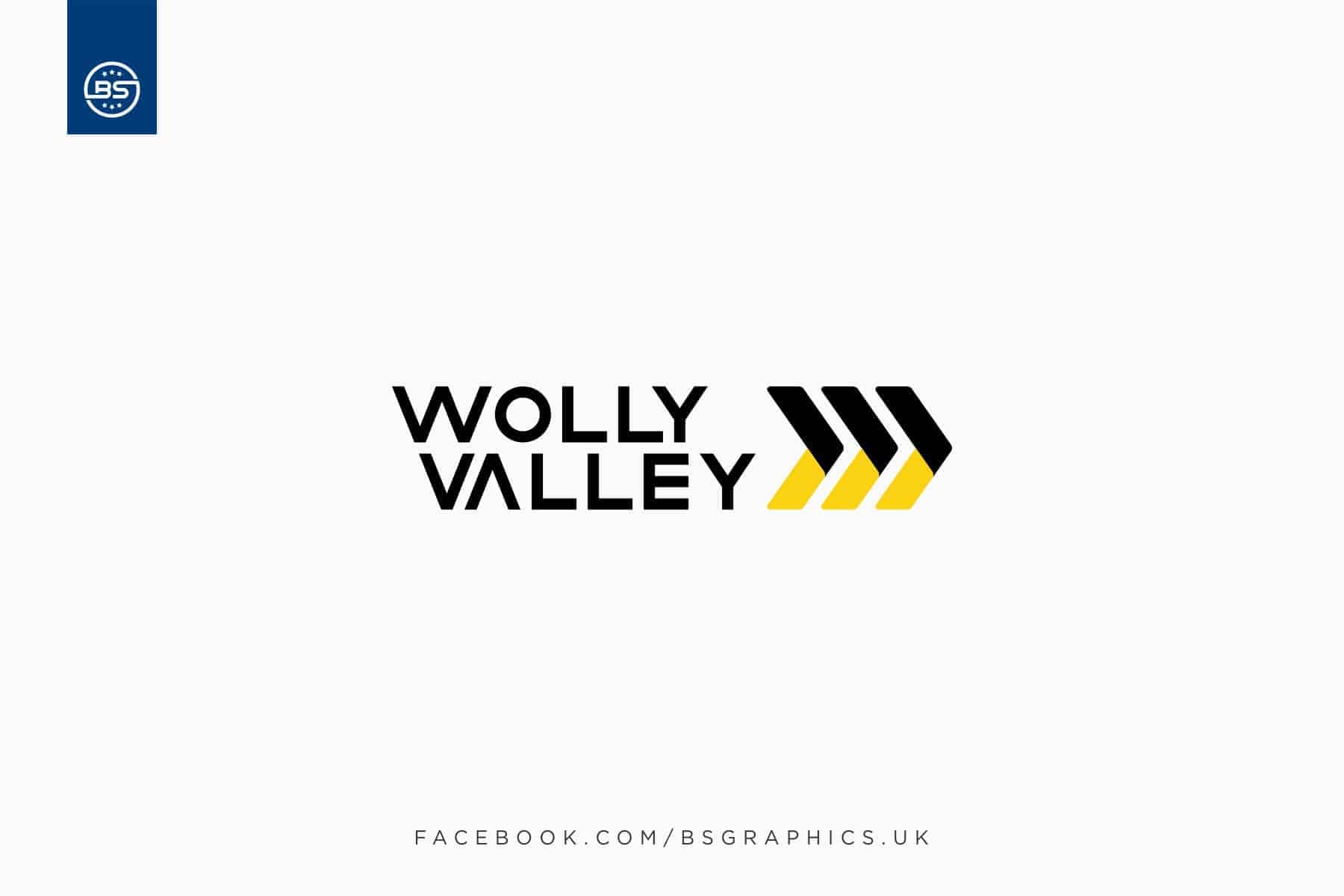
The concept behind the logo is pretty straight forward, simple and kind of minimalistic. The arrows represent the future, forwardness, continuous growth and solution towards the problems. W for Wolly and V for Valley are aligned in such a way that it looks pretty smooth from both sides of the logo.
I have used Adobe Illustrator and CorelDraw to come up with this end result. It took me around 3-4 days to draw and execute the end result. The purpose behind using the black and yellow color was to be bold and stand out.
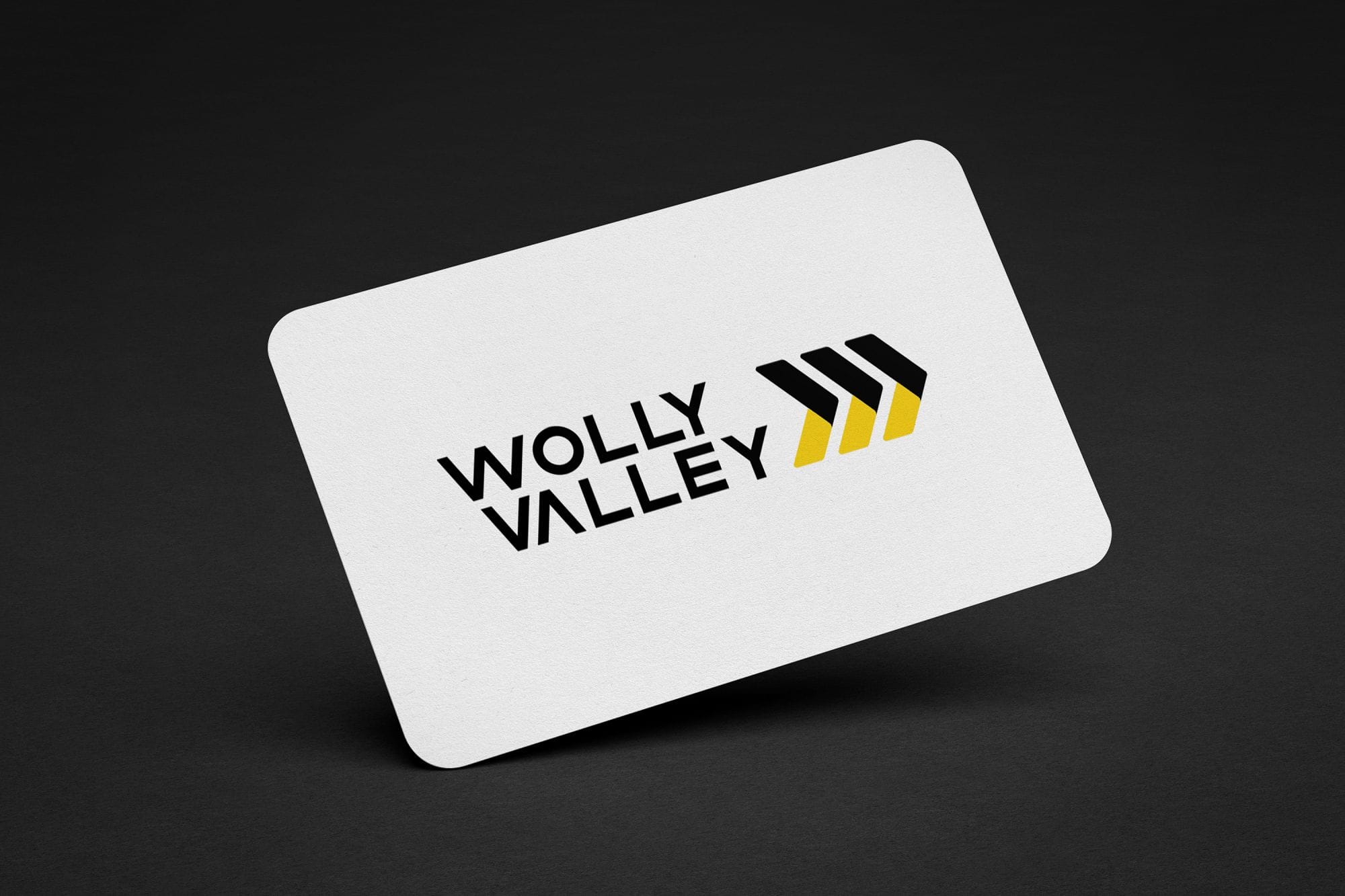
The response was awesome. Everyone liked it. Every project has its own dimensions, and learning is the key. During this project, I have come up with many ideas and I liked this one the most and convinced the client to go for it.