
WorkaJobs Logo by Bruno Bondesan

The WorkaJobs is a personal project that was born in 2011 as a simple collaboration between Bruno Bondesan and Flavio Muniz developer and partner, to share jobs in the communication area with the city of São Paulo. In this period there only a few websites and companies who do this, however all they needed a payment and for those without a job that is not good to pay money that did not have to seek employment.
Today we managed to turn it into a startup that shares oportunities for all the Brazilians in communication market, we offer to companies the main recruitment resource to facilitate and assist in time to seek candidates as dashboard to track the vacancy, online registration, panel for the management of candidates, posting on social networks, email alert and even a premium system with headhunter. For the candidate is no different have many benefits, and in the case of candidates all are free, at any time it needs to enter credit card or commit to payments.
-Bruno Bondesan
![]()
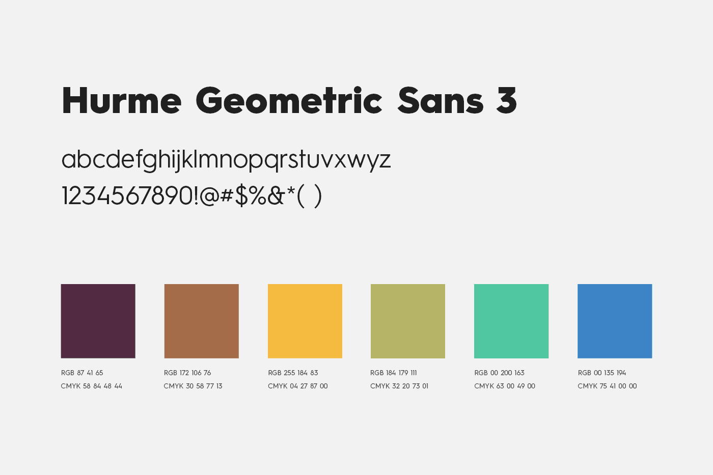
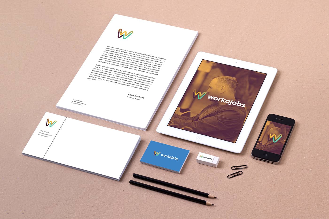
The logo design came quite from the colors, since the begin WorkaJobs worked with three main colors to distinguish what type of work the user were looking for, Full Time Jobs, Freelancers and Internships. Based on this principle we begin a study on a color palette where we had a spectrum of colors that would be combined beautiful and still not lose this color theory by category within these studies we have reached a very interesting triadic palette and harmony that I even like share (image name) that the principle of this triadic color palette is the same of the project with some tone adjustments.
-Bruno Bondesan
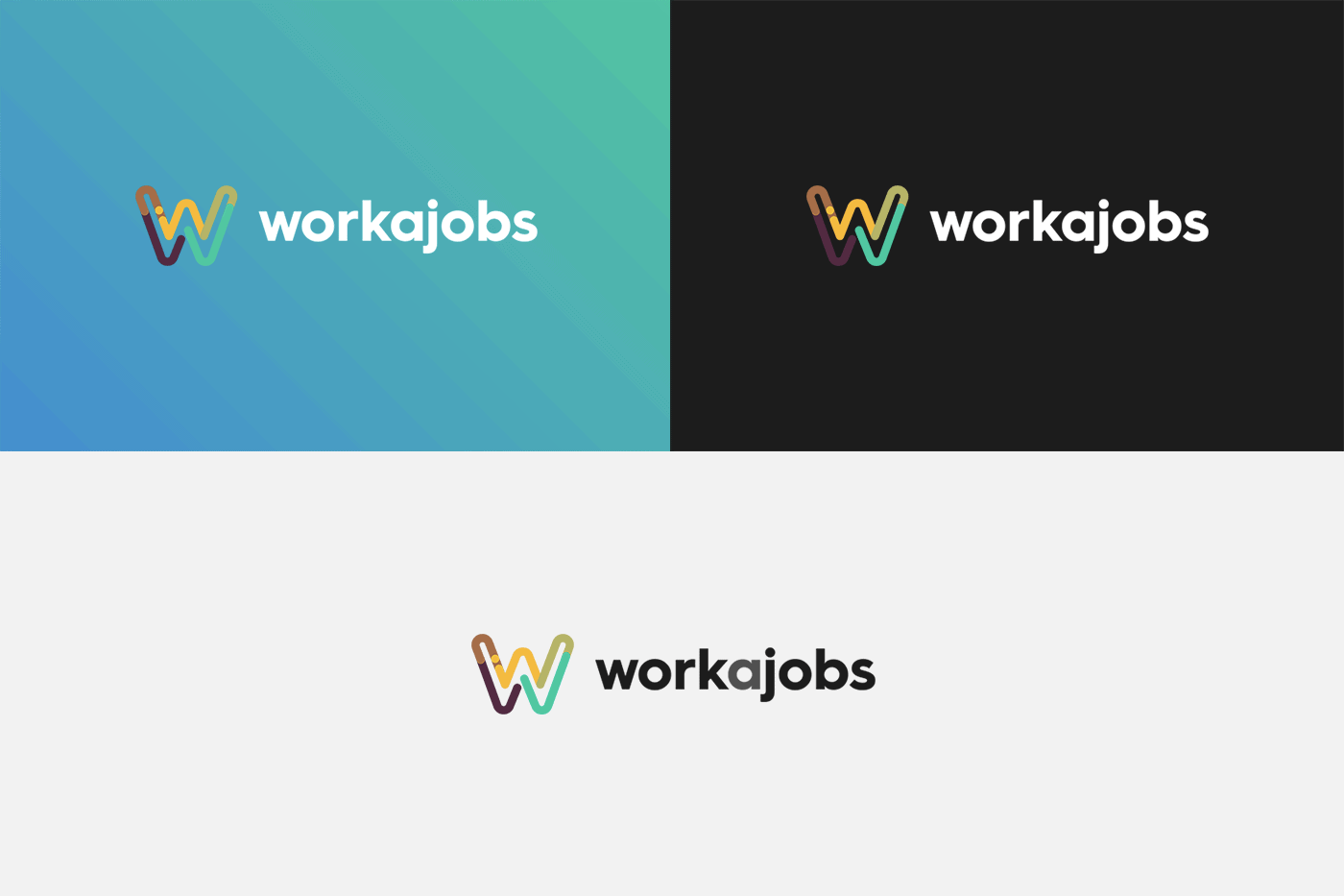
After the colors we start to think about shapes ways that we could work within the segment Job, Work, Recruit, but our color palette had taken such a large proportion and could get such a cool palette, why not work the letter W, one of the key visual elements from the beginning when it was just a collaborative, but with the colors of the new palette. So we need to construct another palette called intermediate colors that would be within this triadic spectrum but linking the main colors the secondary colors in the movement of the letter W of the logo. If I were set this project in a few words would be a great study of colors with simple shapes and a lot of passion involved. :)
-Bruno Bondesan
I was born in an environment where my father was not exactly an interior designer, but working with products and accessories for interiors, in a way much more handmade my father taught me a lot about colors, woodwork and many other things that were not much sense at the time but now as a designer and art director I see that make much difference I know and have that base of the hand made. I've always been a person who loved computer and games too, and at age 14 I discovered Photoshop and played a lot with him, at this same time my cousin started working in the area of communication agencies and introduced me to the world of art directors and product designer, I love with all this since childhood now knew I could work it out.
-Bruno Bondesan
I do not think I have a great inspiration behind this project, I think the studies were fundamental for him, but certainly one of the main inspirations for the application and the palette was this trend of gradient map and text in small caps, while creating some moodboards of references and possible applications we think the product and the purpose it had a very modern face and why not follow trends.
-Bruno Bondesan
My style, there’s one thing that will be very difficult for me to explain, I quite like to be always following the trends, not always apply them, but to understand how the market is behaving quite like daring color and different applications, for example the trend is rounded edges, why not try the same application with square edges? if google materials is cool flat, why not try it with gradient? I think it's more or less how I define my style, not run away from the trend, just like it always question the limit of them.
-Bruno Bondesan
I like to tell my friends and especially for those who are entering in design is, find a focus, find a thing that you like very much to do and don't be the kind of guy who wants to do everything but the one who understands everything what is happening and respect your limitations. I went through many threads to find out what I really wanted as a designer, I motion, print, online, advertising until I find out what I really wanted to be an interactive designer, that's what really got me the pleasure of doing. So I think my advice is, try everything do not have prejudgement about your job, try to learn all about to say you don't like that, and so go find what you really like.
-Bruno Bondesan
About Bruno Bondesan
Bruno Bondesan is a 24-year-old, Art Director and Interative Designer for 7 years. He has been through many companies and agency to find out what he really wanted as a designer, been into advertising agencies, e-commerces, full service agencies and digital intelligence companies. He have always been very attached to this web side and interactive of the internet, in love with interactivities, and in this area he thinks the passion is such an important element as studies and experience. Among his experiences he went through places where get work through different kind of customer - most of them in Brazil - like Land Rover and Jaguar Group, Lego, Samsung, Telefonica, VIVO, Dell, Microsoft, B2W Group, New Balance, Diesel, L'Oréal among some others. See more of his works on Behance.