ARI provides acquisitions and restructuring consulting services to organizations from different industries. They approached me to create their new visual identity. ARI is a young company, very flexible and agile so this determined the direction I took - clean, modern and vibrant look and feel.

![]()
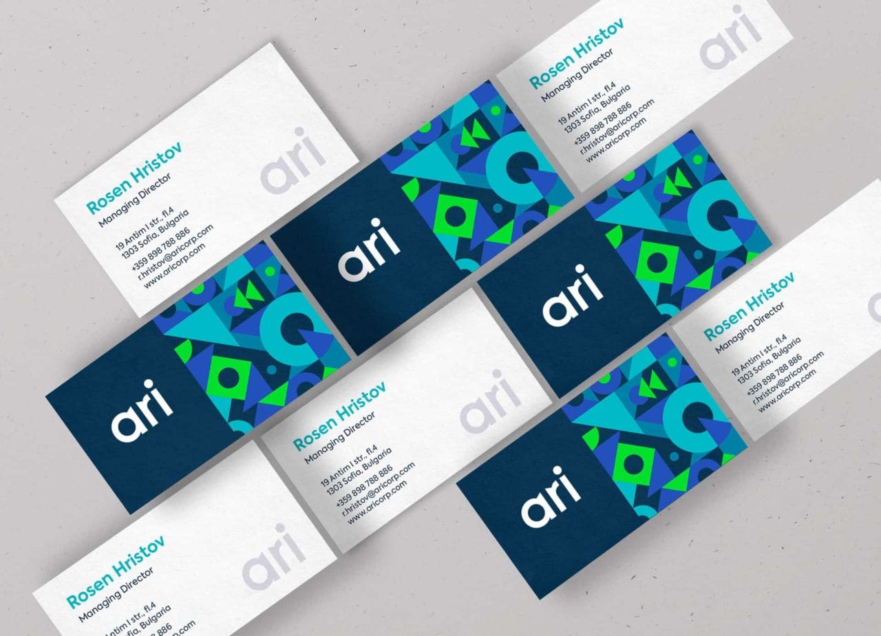
ARI is abbreviated from Acquisitions, Restructuring, Integrations, their three main activities. I decided to translate these activities into a geometric, modular and playful pattern that can be used as a secondary brand element. The pattern was paired with simple geometric typography and a bold colorful palette.
![]()

I started with paper and pencil. Once I cleared up the main idea and the grid of the pattern I used Adobe Illustrator to refine and finalize all basic elements. I used Adobe Photoshop for the mock-ups and retouching. Final print files for all the stationery were made in Adobe InDesign.

![]()


![]()
The new identity was accepted very well. I have received a lot of positive feedback on this project and people really love the pattern and how it communicates with the typography and the color palettes. Also I am pleased with the final result.