

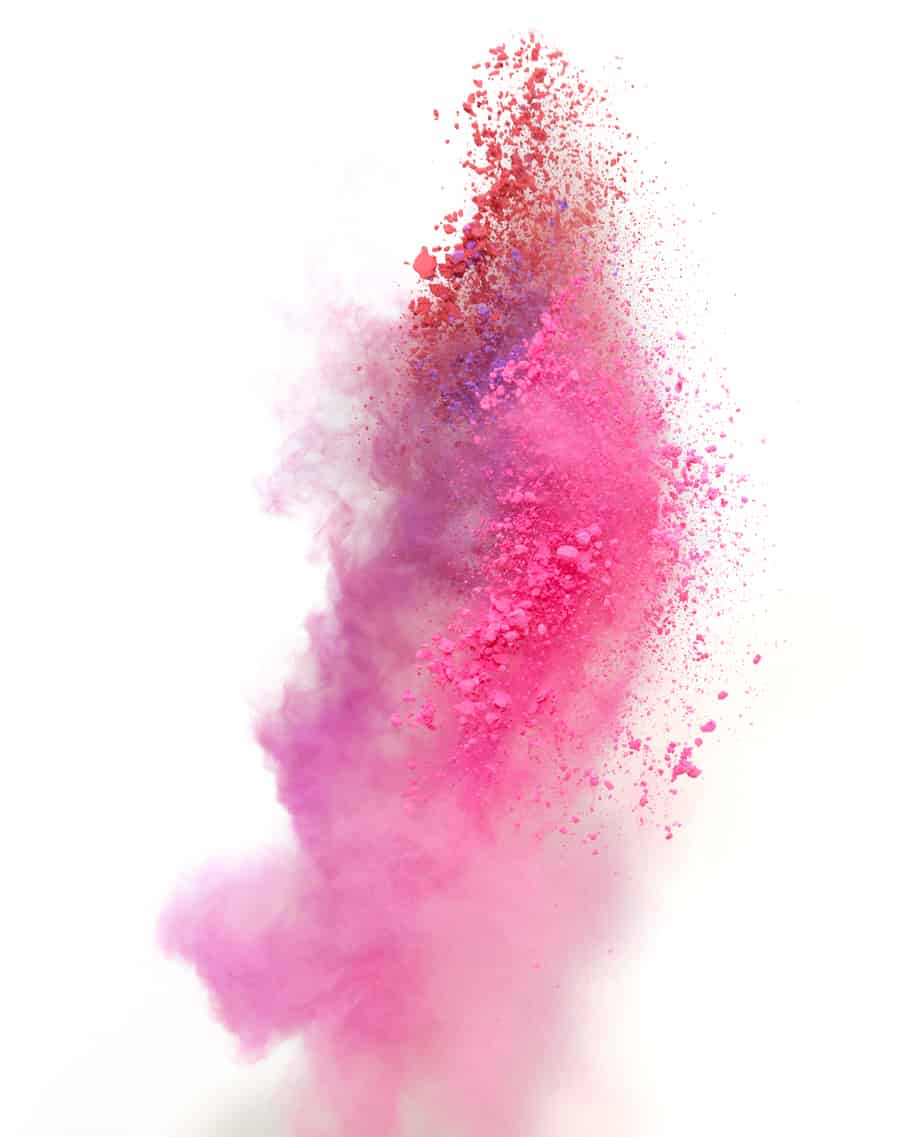
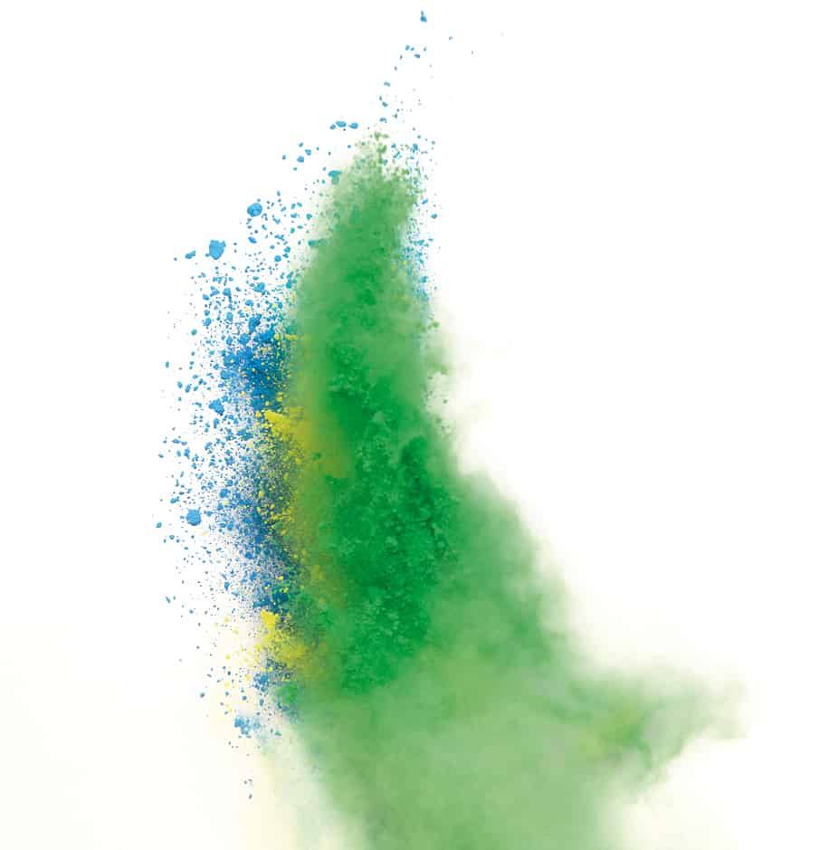
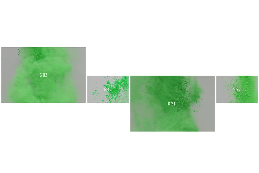
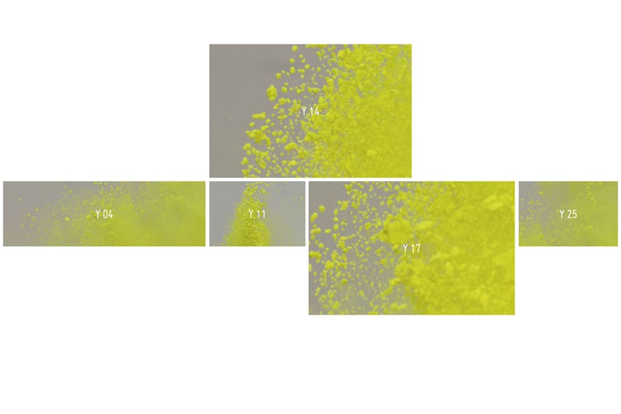
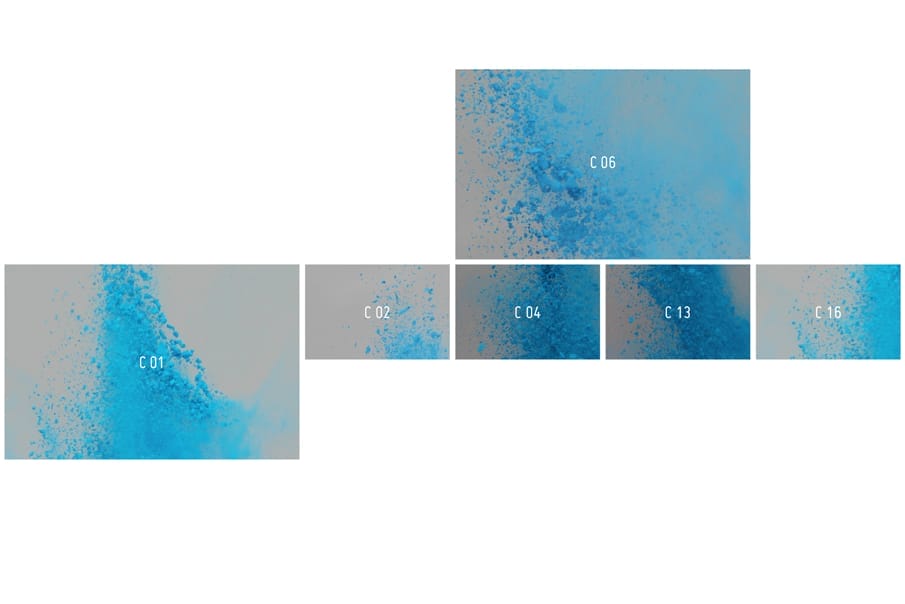
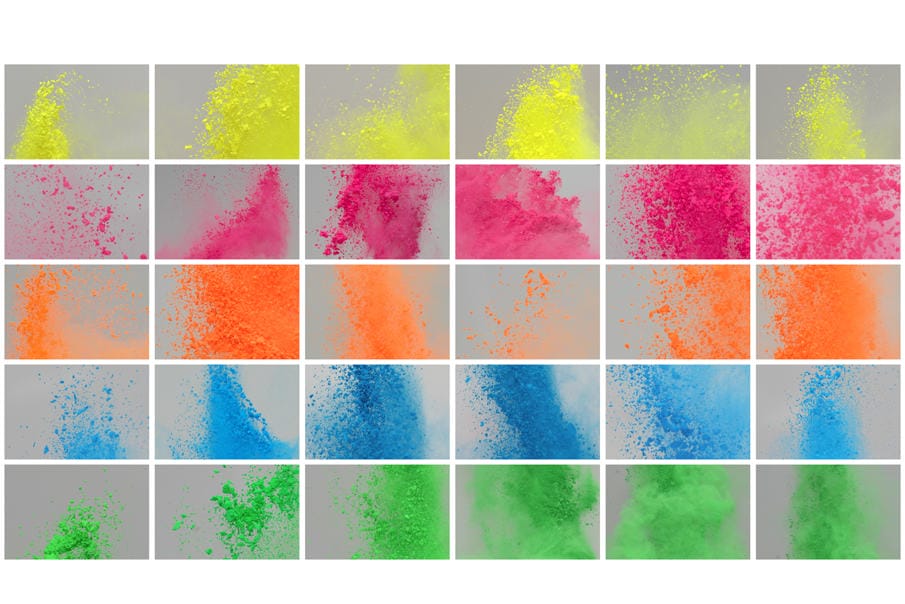
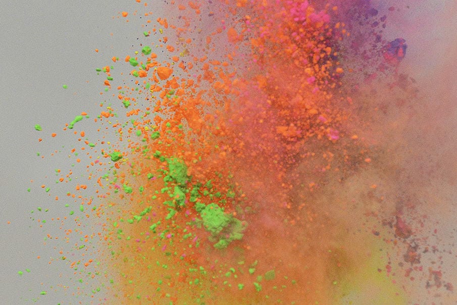
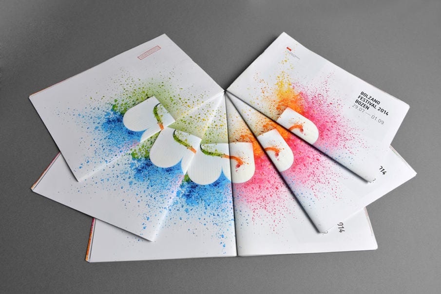
Every summer, the Bolzano Festival Bozen transforms the city of Bolzano into the beating heart of classical music. The best performers on the contemporary music scene and Europe’s most promising musicians are combustive ingredients for an intense concert series that has enlivened Bolzano every summer since 2004. Bolzano, thus becomes an important center of musical excellence and at the same time, a meeting place and point of interchange between the great maestri and the young talents. Coordinated by the Busoni Foundation and dedicated to Music and Youth, the festival unites many summer events devoted to classical music and has four different partners, chromatically identified by four different colors: cyan, magenta, orange and green. The logo has been developed by Gianluca Manzana, a graphic designer who curated two previous editions of the festival.
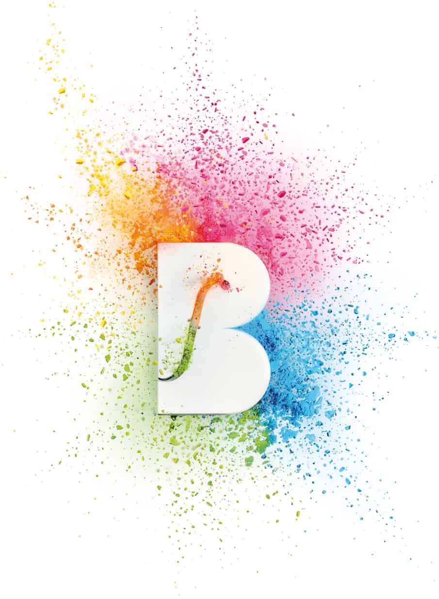
The client asked me for a powerful image for a young audience. The festival lasts more than a month and requires a lot of communication supports to promote its dense program. Therefore, I had to design a set of pictures that could work both for a powerful single poster and as a texture-system that identifies the different partners of the festival. In 2013, I designed a visual identity made of vector-graphic organic shapes. In 2014, I tried to explore the visual identity with a different approach: my strength is tactile design and photography: I love to work with materials and I often use photography as a graphic language.
-Davide Falzone
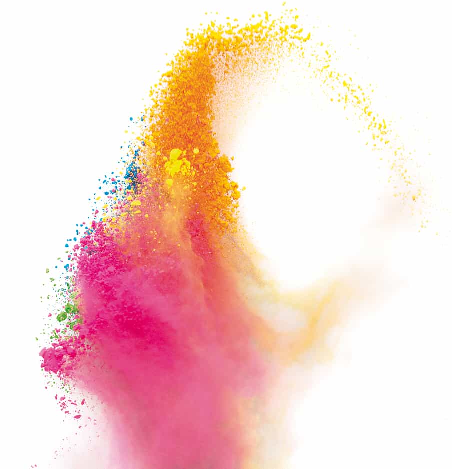
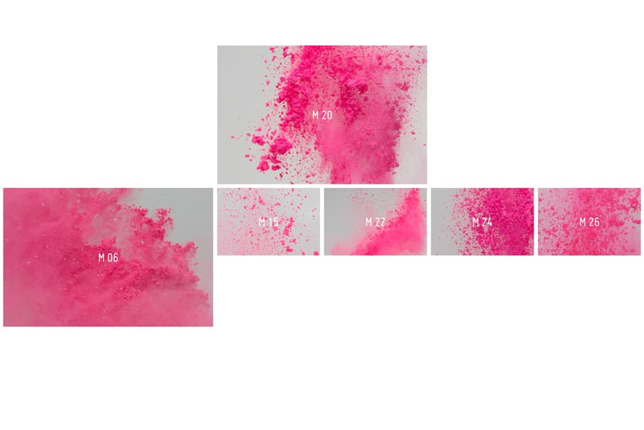
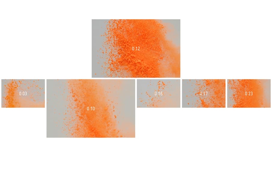
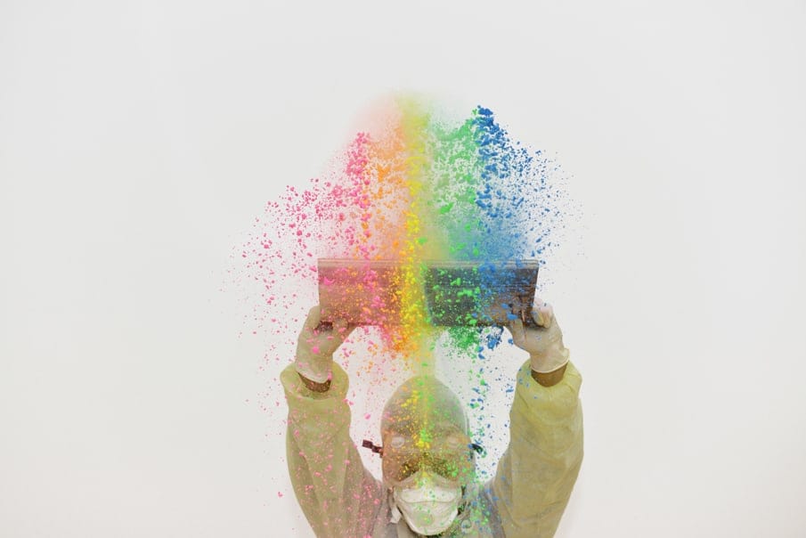
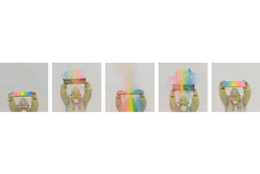
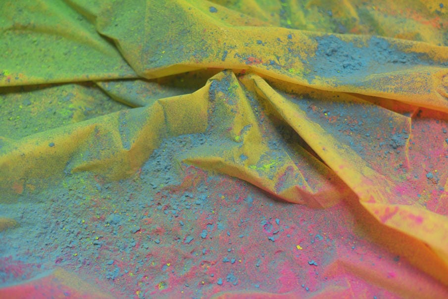
The main idea of the project was simple: the celebration of classical music becomes visually a celebration of colors, like a vibrant and shrill firework. I wanted to create abstract forms that looks like clouds and fireworks simultaneously, that could be soft and crisp at the same time. I bought a lot of holy powder packages made of natural ingredients from a Berlin-based producer and I took the pictures in studio together with Silva Rotelli, photographer and long time friend.
-Davide Falzone
Giulia Webber Debiasi helped us during the photo-shoot. When I find out a good idea for a client, I rarely buy pictures from on-line stocks. I need to give attention to all the details. I don’t need just “a” picture, I want “the” picture to express my idea at its best. I am designer and a photographer, that’s why I want to develop the main concept from scratch and make my ideas grow up physically. I love to get my hands dirty, while doing it.
-Davide Falzone
I don’t like following any visual trends. I think there is a widespread flattening in graphic language. It is important to dare to do something different. A designer is interested in visual research, he mixes and reinterprets visual languages from different fields, giving them a new life and a new meaning. It’s important not only to look at the work of our colleagues but especially to be curious and to be inspired by other fields, these interests enable experimenting new languages, external to graphic design. Painting, sculpture, crafts give best inspirations and avoid copying other designer’s work.
-Davide Falzone
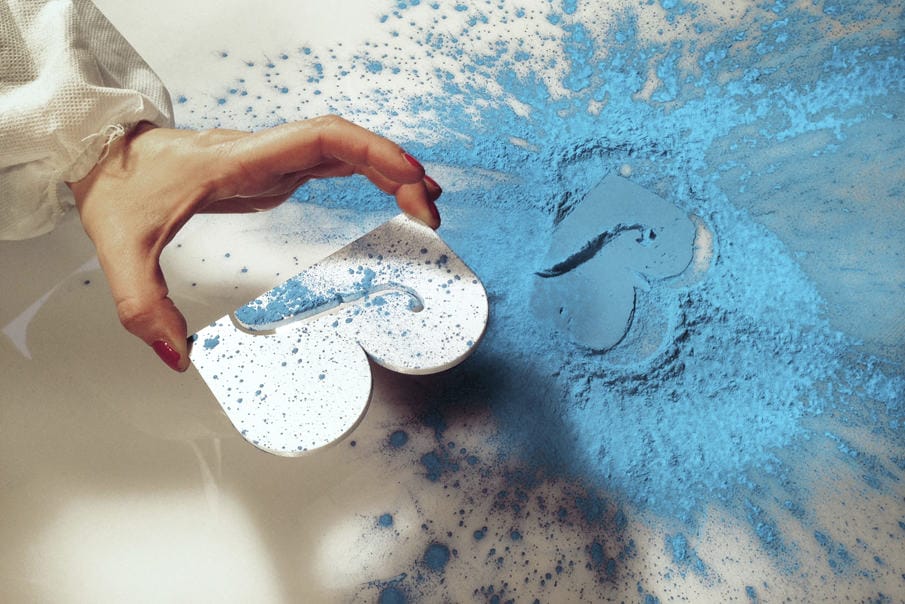
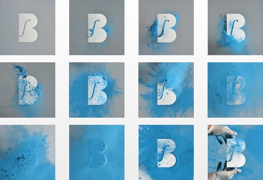
We had little time to take the pictures and it was the very first time we had to develop such a complex shooting. At first, we wanted a black blackground to bring out the colors of the dust but we couldn’t use it for all the communication products in terms of readability of the texts, that’s why we turned out for a white background. In order to create different shapes of colorful clouds, we did several experiments with the dust.
-Davide Falzone
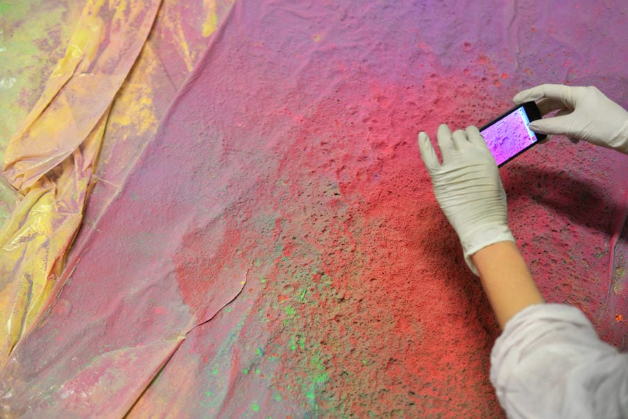
We blew firecrackers, we used compressed air pumps, balloons in different sizes and we launched the dust in the air with different tools.Once overcome the first difficulties, the shooting has become an amusing and colorful experience. We shot the photos for two days and two nights and there was dust everywhere!
-Davide Falzone
About Davide Falzone
Davide Falzone is a freelance art director and photographer specialized in tactile design. Beside working in visual identity and branding for culture, he is completing an underwater photographic project about mermaids. He focuses on the “cultural industry”, providing him a platform for experimental and challenging design concepts. After graduating at Politecnico in Milan, he worked in Berlin and Bolzano and is currently living in Bologna. In year 2014 his work was selected and published on ADI Design Index and is candidate for participation in the XXIV ADI Prize Compasso d’Oro. See more of his works on Behance or his website.