The first simple & intuitive service for securities trading in Russia. Even if you are just a beginner investor, "My Broker" will help you understand the basics of trading and proceed to a successful investment. In the application, you are always available to the selection of a personal portfolio, quotes and investment ideas, customization of news and analytics.


Nowadays brokerage services are poorly developed in Russia, so it is always a very difficult subject for people, it even looks dangerous, people are afraid to deal in stock exchange or to buy a stock, because they think they will lose lots of money. That is why I felt like making this application easy to use and understand. When I was making wireframes for this app I used heuristic method of thinking, I started to ask myself a lot of questions, how to make this process easy for myself first of all. I imagined all these complicated points in a real life - and it was like skeuomorphic but back to front, which I had to transform in the digital space. I imagined that i had a briefcase with documents (in the case my stock and my bond) so this briefcase became the main page of the application. BCS company helps people in deal in stocks exchange as well, gives recommendations and teaches them. Thus in the application you can see recommendations, if you open any document information. I threw away all superfluous visual details in diagrams and tried to make them intuitively understandable. It took me about couple months to make wireframes as apart from things which we were introducing into interface we introducted them inside of the company as well. For instance a signing of a contract without going to the office and a distant assistance of the personal adviser.


I used corporate colours BCS company, flat schemas and tried to get of all kind of elements, which could prevent the perception, but at the same time I took into consideration users experience of target group, that is why for instance I left explanations near menu-item, because the target group of BCS was not ready for intuitive understanding of the menu by using icons - that was seen from analytics of the company's website. All UI was made in Sketch, wireframes stage was made in AI, prototype I made in Flinto, we decided not to overload the application with animation, even micro animation because that could frighten the target group or confuse them. So I made it as easy as possible, but understandable for it.


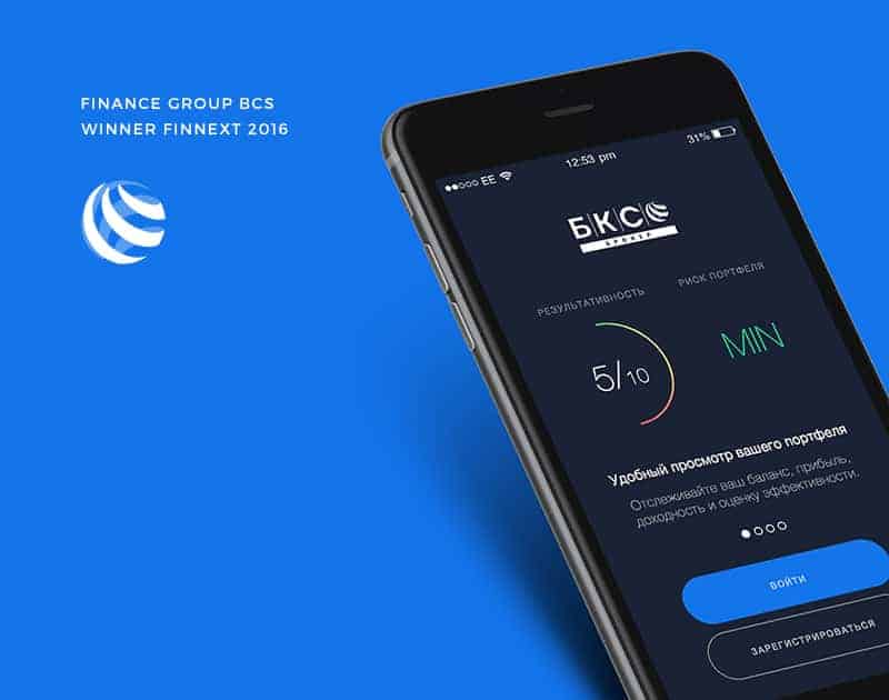
After we've launched the app, we got to top-10 app store russia category finance, we got an award as innovative application from FINNEXT 2016. In fact, in my opinion we managed to make a product which satisfies the demands of users. People start to be interested to deal in stock exchange and for them this process is not connected with something not for everybody. Now everybody can deal in stock exchange.