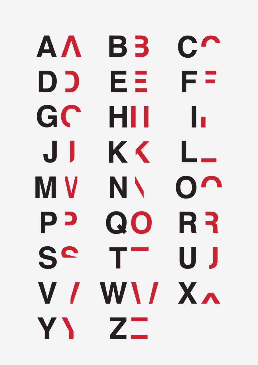
Ever wondered how people with Dyslexia read letters/words? A Dyslexic himself, Graphic Designer, Daniel Britton recreates the feeling of reading with Dyslexia with his new font.
I wanted to create a piece on Dyslexia as Dyslexia is for the most part greatly misunderstood and extremely miss communicated, even the government agencies that aim to create awareness at best create confusion and being a Dyslexic student I wanted to create a piece of artwork that would allow an understanding and a sense of empathy between non Dyslexics to Dyslexics.
I believe that once that Dyslexia is understood then as a nation we can create better learning conditions for Dyslexic students and let them excel in the same way that every other person can. Just think, there are around 8 Billion people living in the world right now with around 10% of the population being Dyslexic, so that gives you around 800,000,000 Dyslexic people on the planet, if we can increase our understanding and give the correct help to these people just think how many more Richard Bransons, Elon Musks or Boyan Slats we can produce.
-Daniel Britton
For most people the letters and numbers do not jump around on the page and the colours remain the same, it is simply a break down in communication between they eye and the brain, for most people you can see the information, you can see perfectly each and every letter form but there is something in your mind that is stopping or slowing the process of information and for most this is Dyslexia.
What this typeface does is break down the reading time of a non-dyslexic down to the speed of a dyslexic. I wanted to make non-Dyslexic people understand what it is like to read with the condition and to recreate the frustration and embarrassment of reading everyday text and then in turn to create a better understanding of the condition.
-Daniel Britton
In 2D the type is split into 2 and only one section of the type if revealed, just enough for you to eventually piece it together.
-Daniel Britton
Front View: 3D poster he created with a wood base and perspex top, both layers had two separate sections of screen-printed type on to create a single letter, the idea being that you had to move yourself into position to read the message as the further the screen rotated the more distorted the words become. In this case this was a 3D poster he created for a mock Dyslexic exhibition at university.
In its 3D form both sections of the type are there, one placed directly on top of the other which is perfectly legible from front on, but the moment you move to either side or you view the poster from above or below the type breaks to which you have to physically move yourself to read the text, it is exactly this that I wanted to get across, I need the viewer to have to work to read something so simple as a poster and it is this feeling of work, aggravation, effort, stress, embarrassment that recreates the feeling of reading with the condition.
-Daniel Britton
ABOUT DANIEL BRITTON
Daniel Britton is Graphic Designer from UK. He's currently kick-starting his Dyslexia awareness pack for school children. See more of his work at Behance or website. Learn more about his project, Dyslexia.
