Engenheiro de Montreal

The main role of the Montreal Engineer is to provide safety to the civil engineer who will participate in projects involving public works, specifically in the area of management. Through courses and workshops, the company provides training and technical support so that professionals can efficiently participate in public management processes without jeopardizing their careers, avoiding losses and delays within these areas.
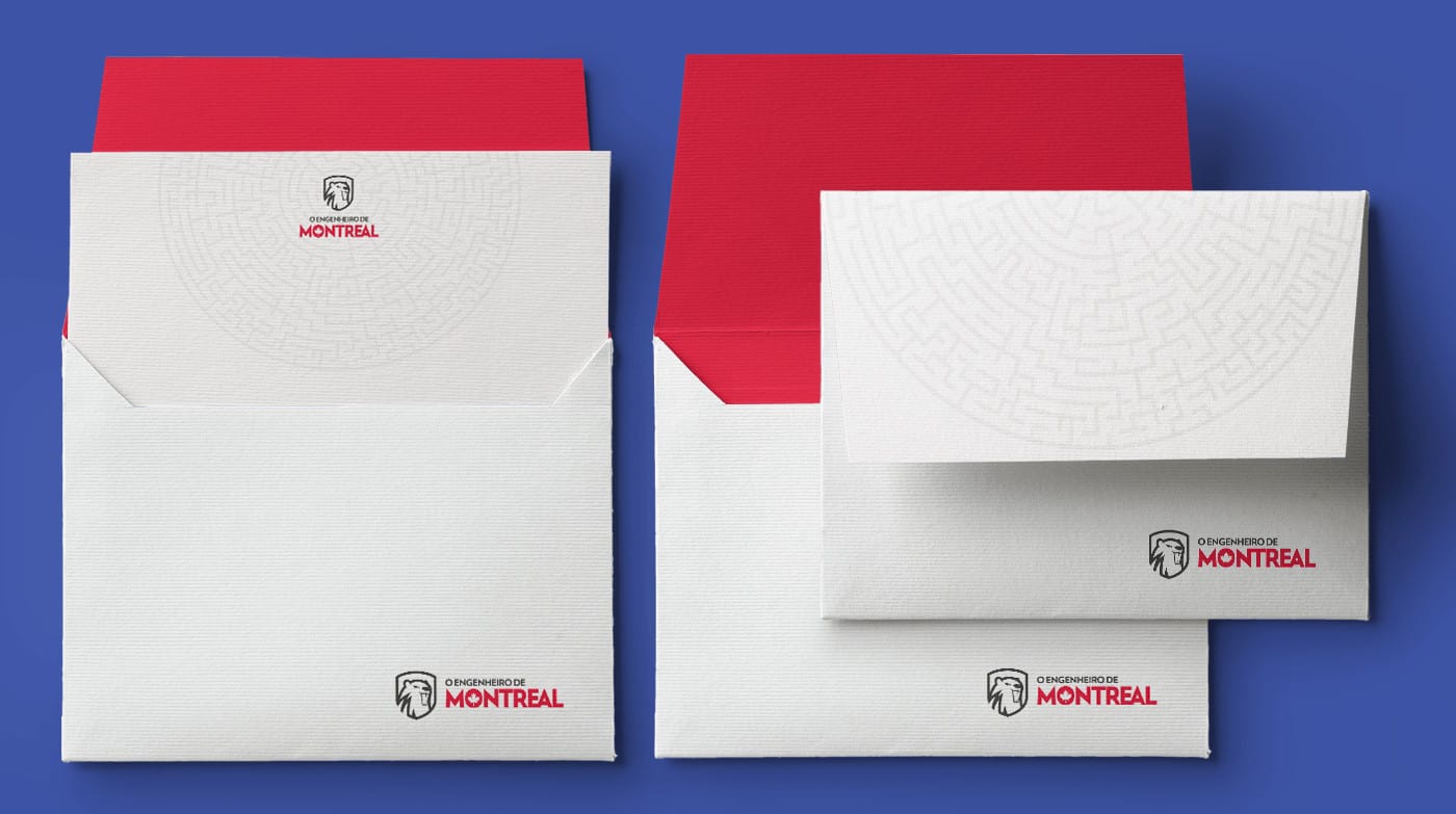
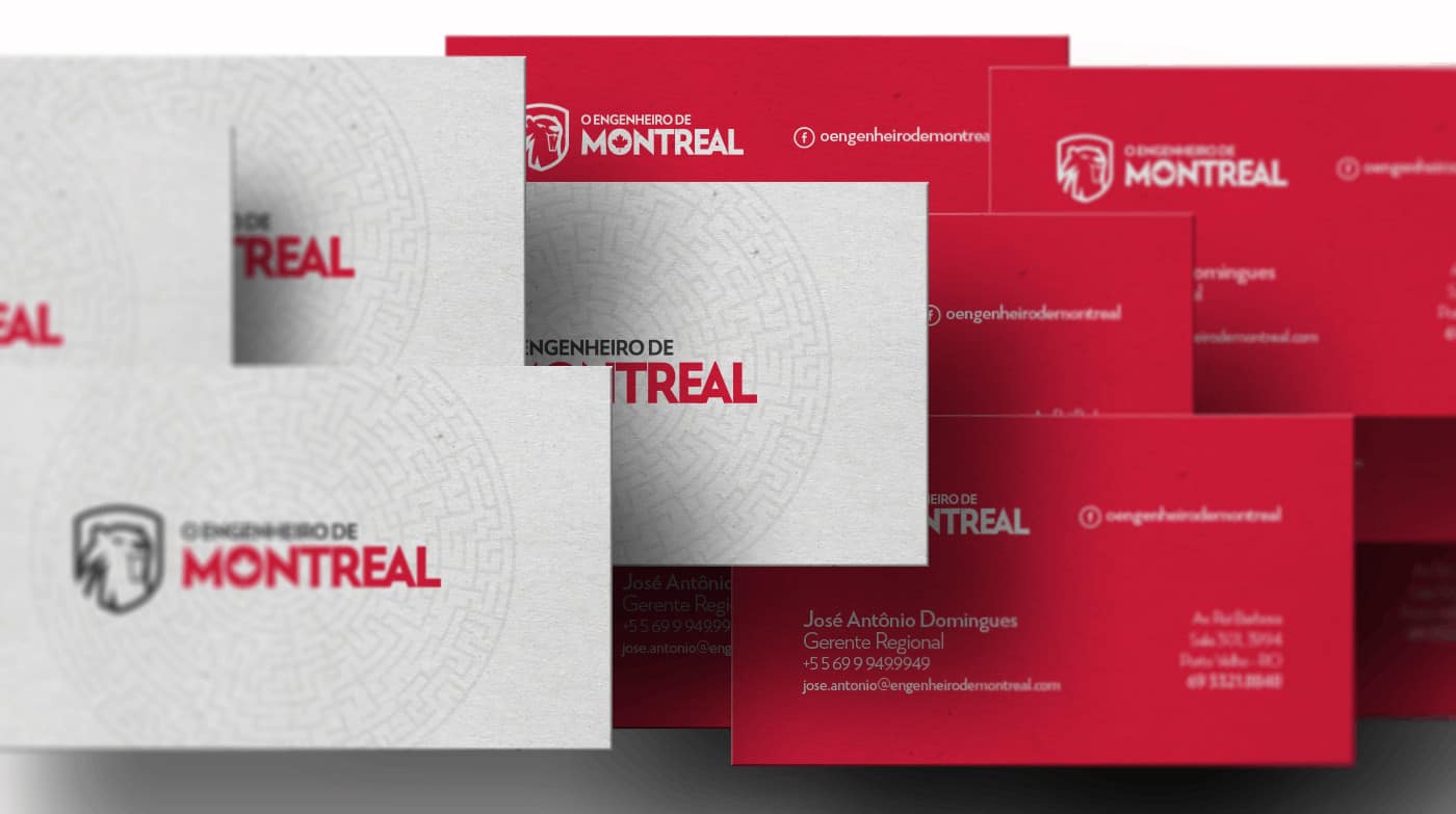
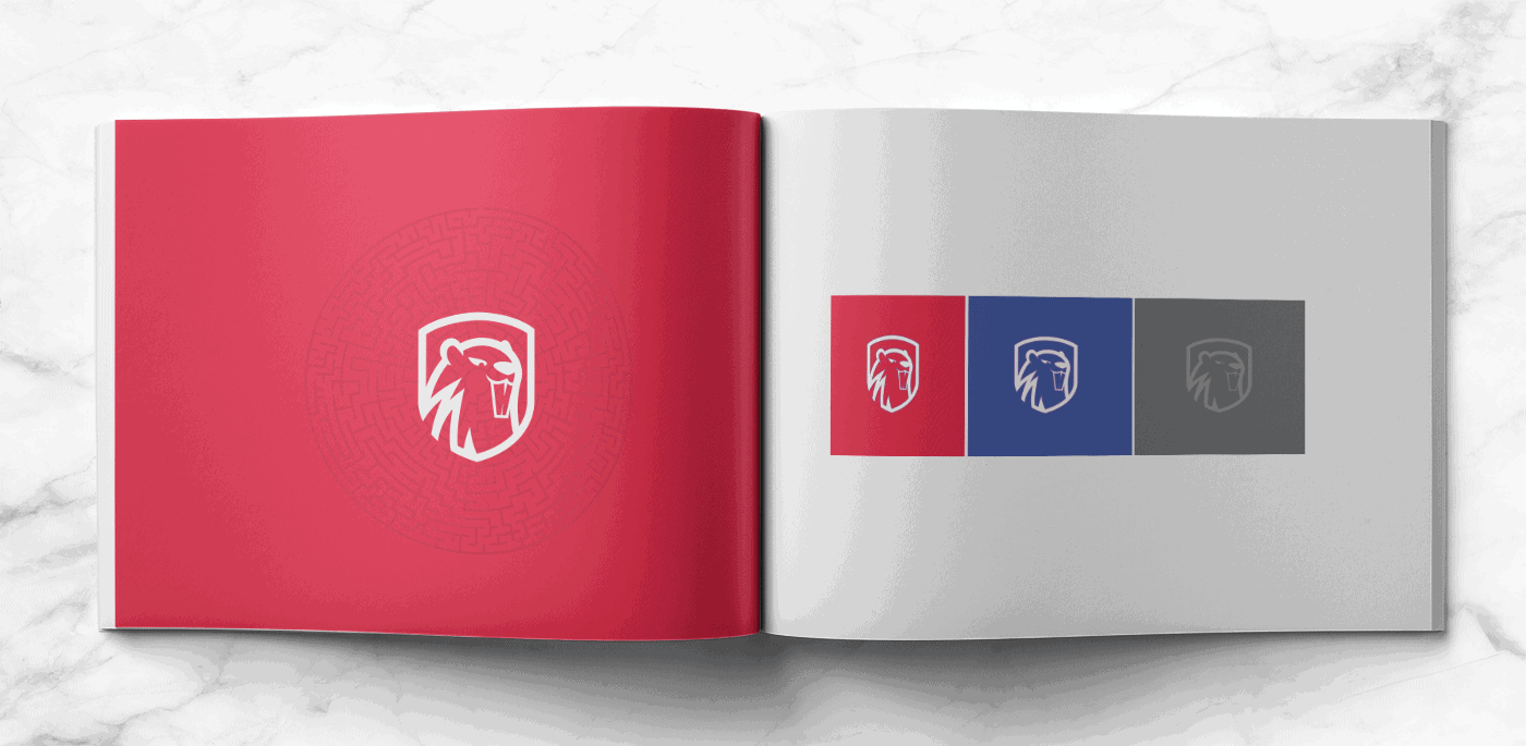
The brand needed to pass credibility, security and inspire quality. It is important that the symbol of the mark connects with its etymological origin, the beaver.
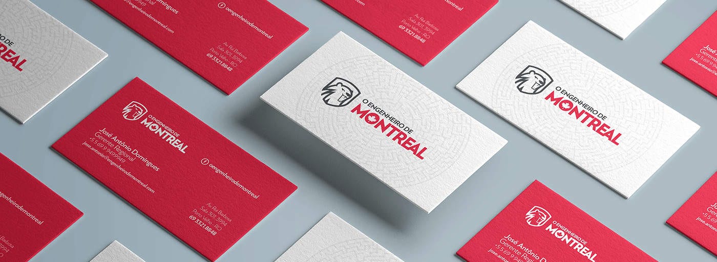
The idea was to implement the symbol and create a icon that emphasize the naming of the company. The Montreal Engineer is a company that is specialized in consulting and training for young engineers, public managers, mayors and other community leaders focused on public management and civil engineering. The name of the company is a tribute to the beaver, a North American species, notably known for his skills as a builder.

We used adobe illustrator to create the symbol and logo and adobe photoshop for creating the presentation. We used image references to get the mood of the beaver, then we outlined and vectorized it to the final result. It was important to give it a professional and serious look. We didn´t want to end up with a happy / childish mascot. We wanted a strong and powerful representation.
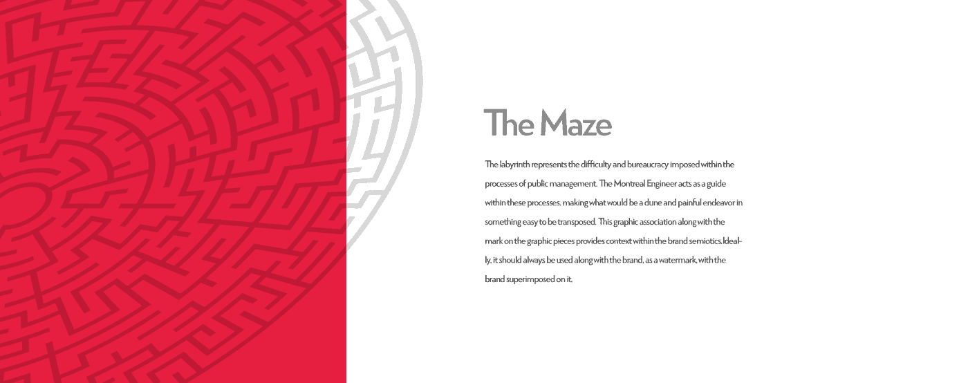
The client end up very satisfied with the results. He agreed on every aspect of the logo we created. He was also very fond of the colors and the symbol itself. The pattern also was a very high point of the identity because it sums up everything that the brand represents itself, giving a graphic representation of something that wasn´t easy to understand.