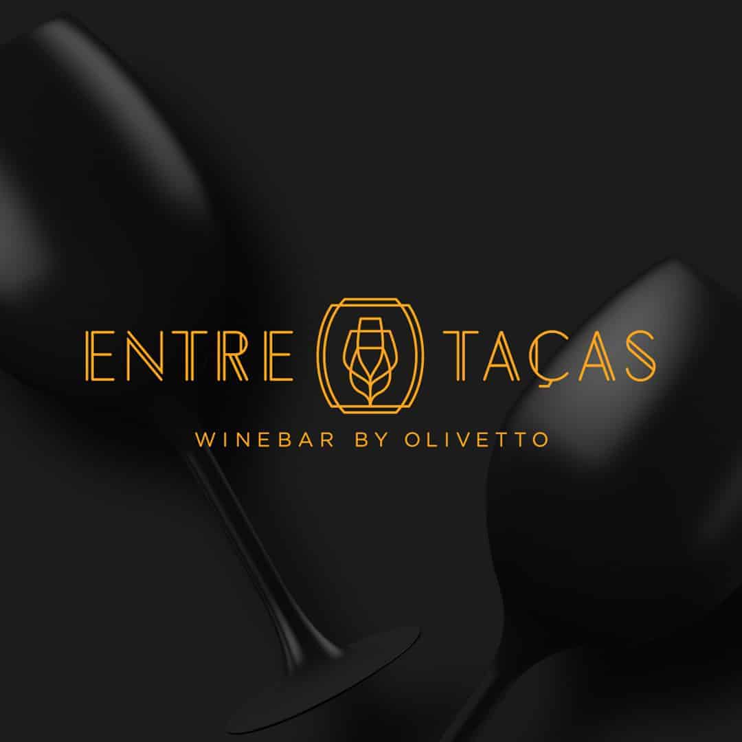
Entre Taças is the first WineBar situated in the city of Campinas, São Paulo, a place for celebrations, meetings and special moments for wine, personalized drinks and exquisite cuisine lovers. The establishment is part of the highly regarded Grupo Olivetto.
The word "among" (entre) is commonly used to define something that is seen, found or connected "in the middle" or "through" something. The challenge was to build up an icon that expresses the two meanings of the word. The first one, in a technical way, showing transparency among different types of aligned glasses and the second one in a playful way, representing the idea of a toast, a social gathering and celebration.
For the design of the brand I used Adobe Illustrator, and for the presentation, Photoshop.
I always start the project on paper. I believe that good ideas come to him. I spend a lot of time on paper and then I go to the computer for finishing. Still in Illustrator, I prepare the whole file and then I go to Photoshop, where I prepare the final presentation, which I will take to my website (www.sallesbrand.com.br) and also to my behance (www.behance.net) / sallesbrand).
The customer was surprised by the result, exceeding expectations. The reception of the brand by the public was also great, and very well accepted by wine lovers. The WineBar audience involves young people who know how to enjoy good drinks and unique appetizers.
See full project: https://www.behance.net/gallery/66316733/Entre-Tacas-WineBar
