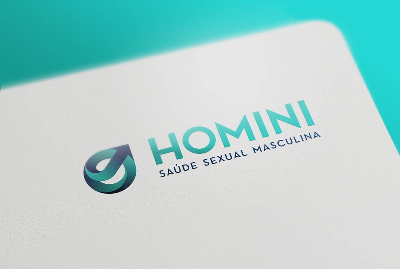
Homini

Homini is a medical clinic which takes care of men`s sexual health with private and personalized assistance, and full commitment. Our challenge was to create a strong brand, evidencing the focus of the company in a subtle way because, for most men, it is a delicate subject and requires total discretion.


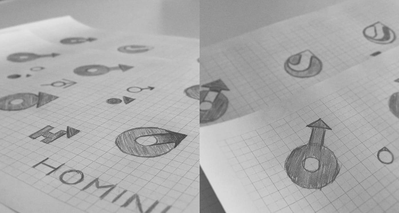
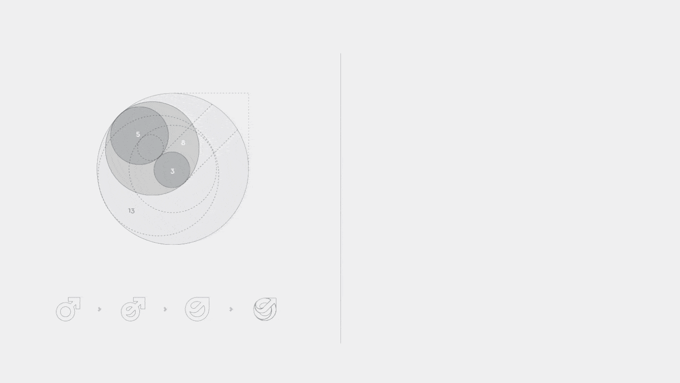
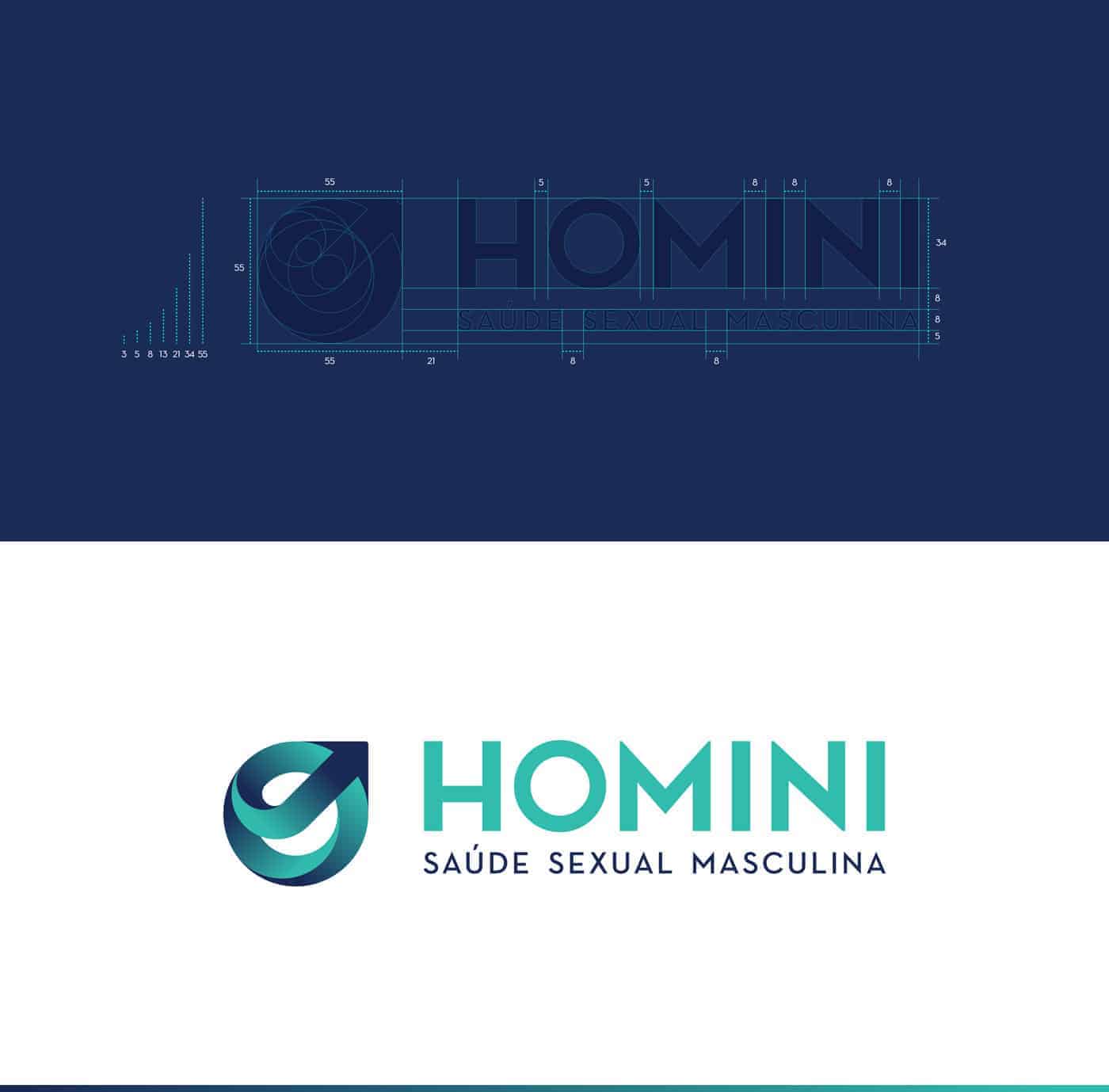
The idea was to use a symbol of Mars (male), but in a harmonious and aesthetically well-resolved way. I used the golden ratio for this work, and I followed the colors that refer to the health segment. The golden ratio is present in the creation of the symbol, in the diagram of the symbol and typology, and also in the width and height of the types.
For the design of the brand I used Adobe Illustrator, and for the presentation, Photoshop.
I always start the project on paper. I believe that good ideas come to him. I spend a lot of time on paper and then I go to the computer for finishing. Still in Illutrator, I prepare the whole file and then I go to Photohop, where I prepare the final presentation, which I will take to my website (www.sallesbrand.com.br) and also to my behance (www.behance.net) / sallesbrand).


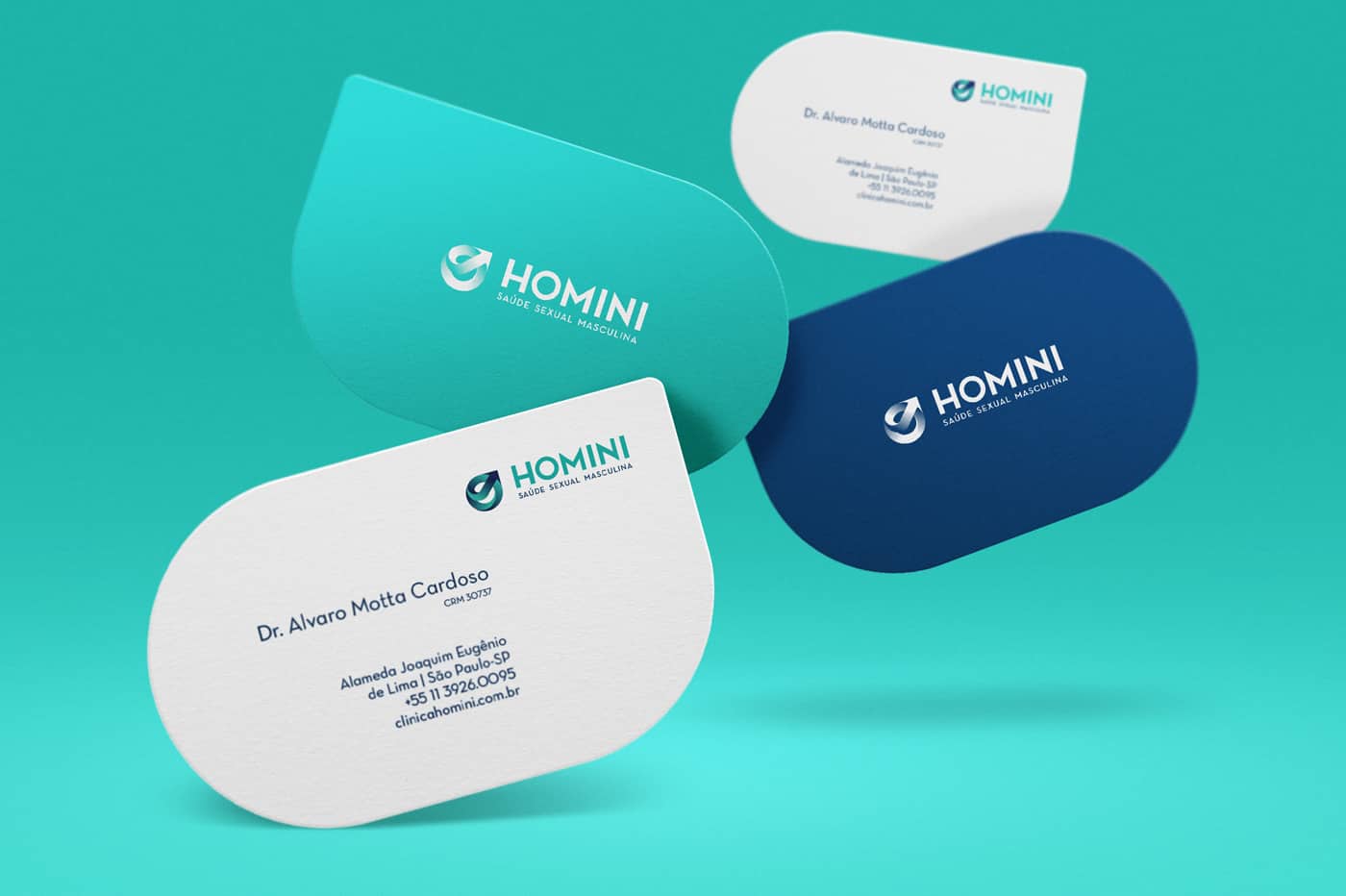
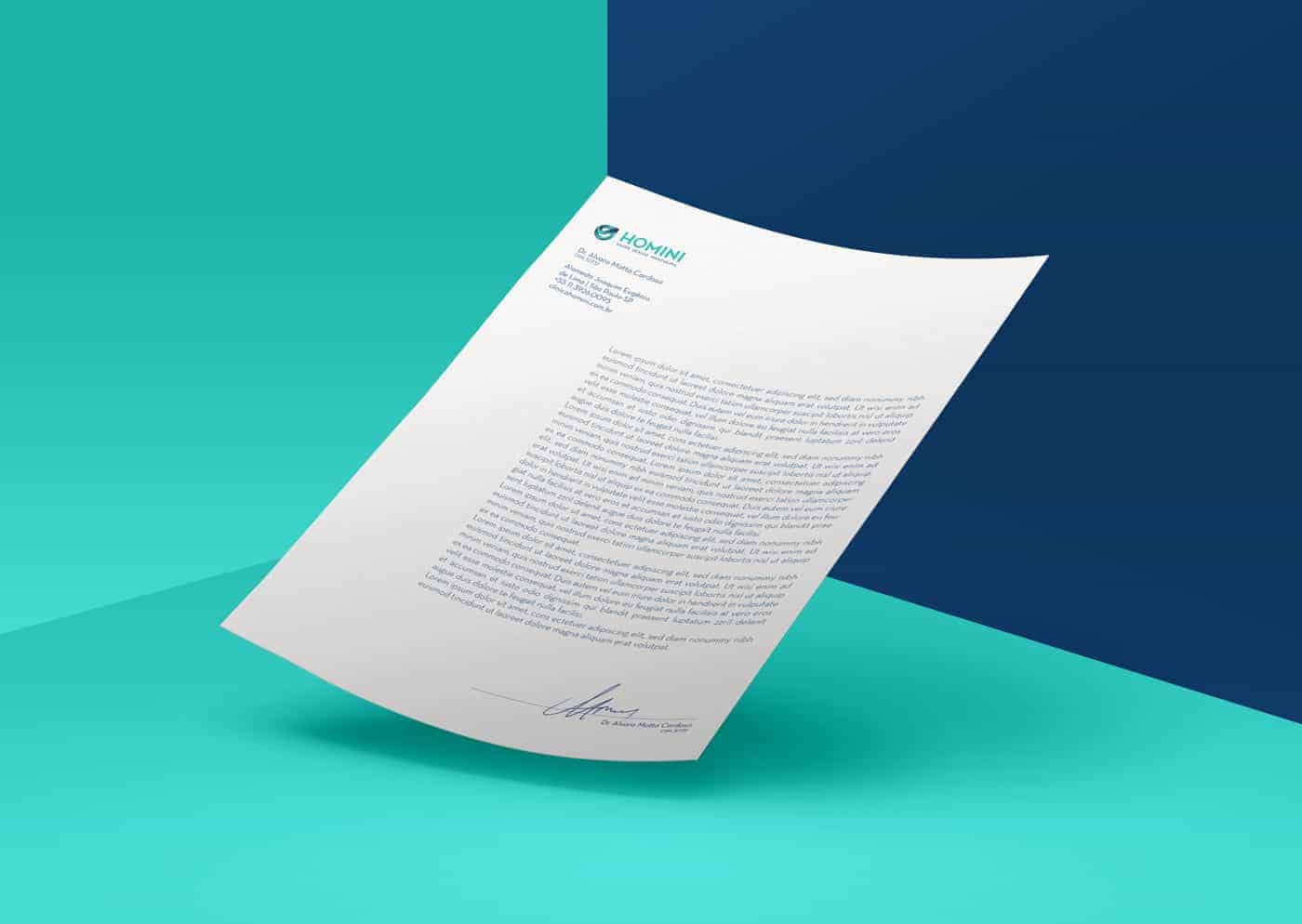
The response from the audience and the client was very positive, and the observation on the subject there is a more creative alternative to a problem that is proposed. Com o cliente, o projeto foi rapidamente aprovado. Em seguida começamos a pensar na derivação e peças de apoio: cartão de visita, uniformes, papelaria completa, etc.