


Impakt Podcast is a Cape Verde company based in USA whose focus is to promote the Cape Verdean urban music around the world through podcasts.
The challenge was to create a logo that would convey an image of power and strength, while being elegant and representing the identity of the company and its purpose.


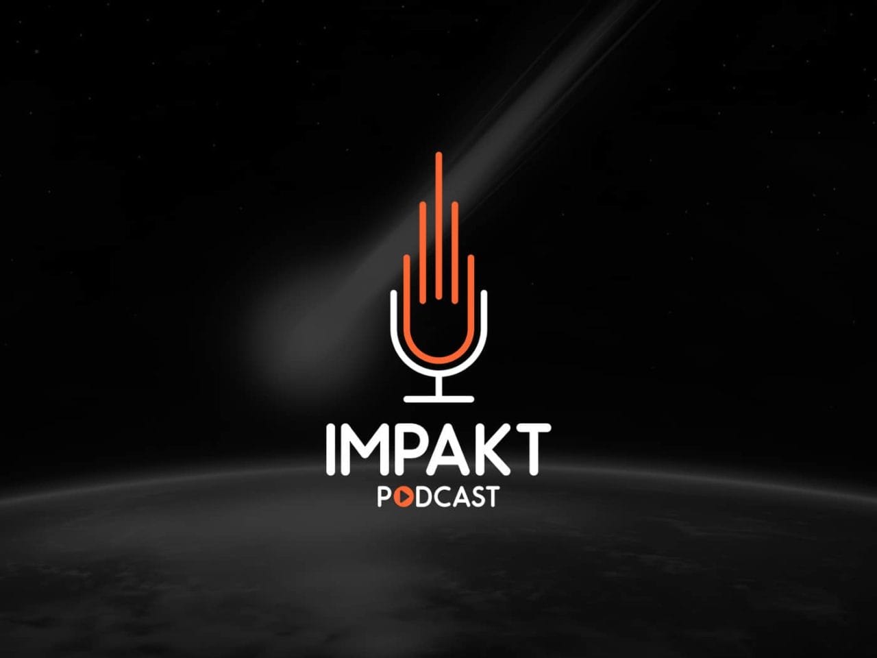
The logo is formed by a meteor to symbolize the idea of impact and at the bottom represents a base of a microphone that refers to the podcast.
The chosen color is the orange, warm color that stimulates the creativity and the optimism but also that makes reference to an explosion caused by an impact.


The project was conceived through several research that originated many proposals. From the concept of the brand and what was required, I presented a satisfactory final result created through Corel Draw and with the help of photoshop to make the presentation.


This project was very satisfactory, professionally and also personally, people loved the logo and the repercussion was very positive. I learned a lot about golden ratio, geometry and minimalism that will help me to develop better projects in the future.
