


Exploring typography is more some kind of personal productivity challenge for Matti Vandersee, it started when an Instagram app for Windows Phone came out. He first used the media to upload typographic inspirations he found in the streets of Costa Rica, but soon he realized there was this entire universe of outstanding graphic designers with passion for type and they all showed off their work and created those amazing feeds through filtering their posts through hashtags.
Since the time at the university I somehow had this inner voice yelling at me "Type is awesome and nobody sees it". All my colleagues used to approach the typographic elements as something that screwed up their illustration canvas, but I always saw type as an essential proper element that already represents the information that has to be communicated and through modification could express different moods. Guess I'm a type romantic.
-Matti Vandersee
Since I was taught to write the Alphabet, I got captured in reproducing the form of letters. Always got the worst grades but the teachers couldn't deny my clean handwriting. During my teenage time I got hooked up by graffiti and during the study typography caught my eye. But it was until 2012 when I was introduced to the work of Jessica Hische during a workshop at the International Design Festival in Costa Rica where she taught me that it's actually possible to make a living out of these nerdy interests.
-Matti Vandersee
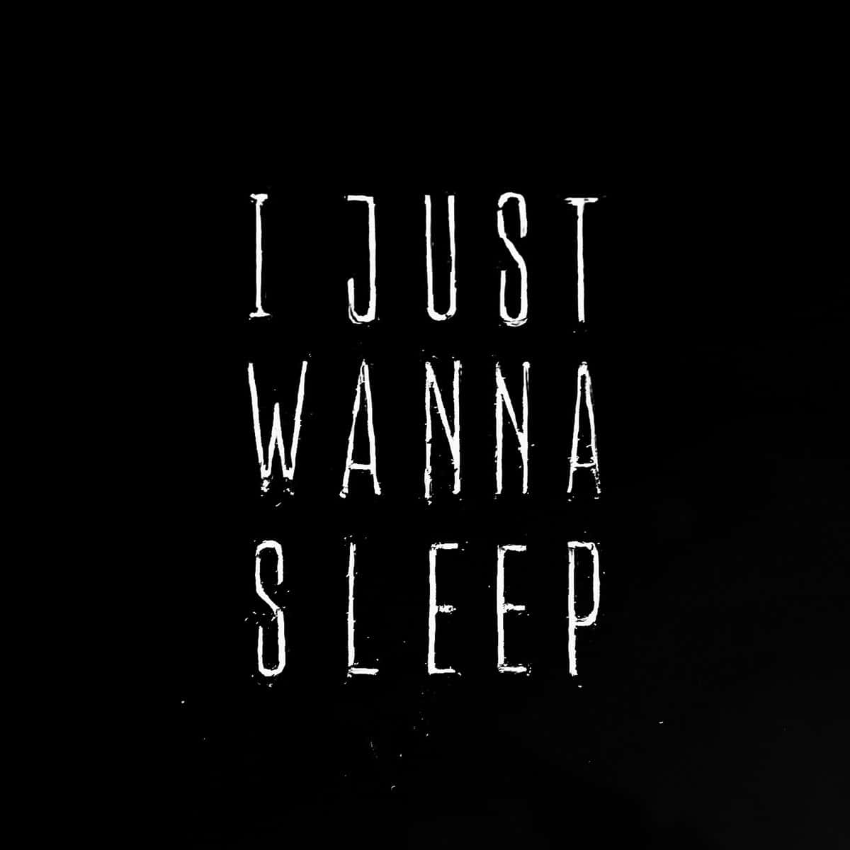
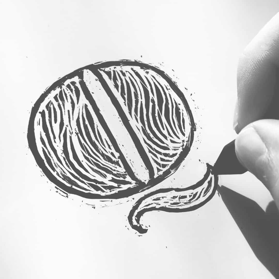
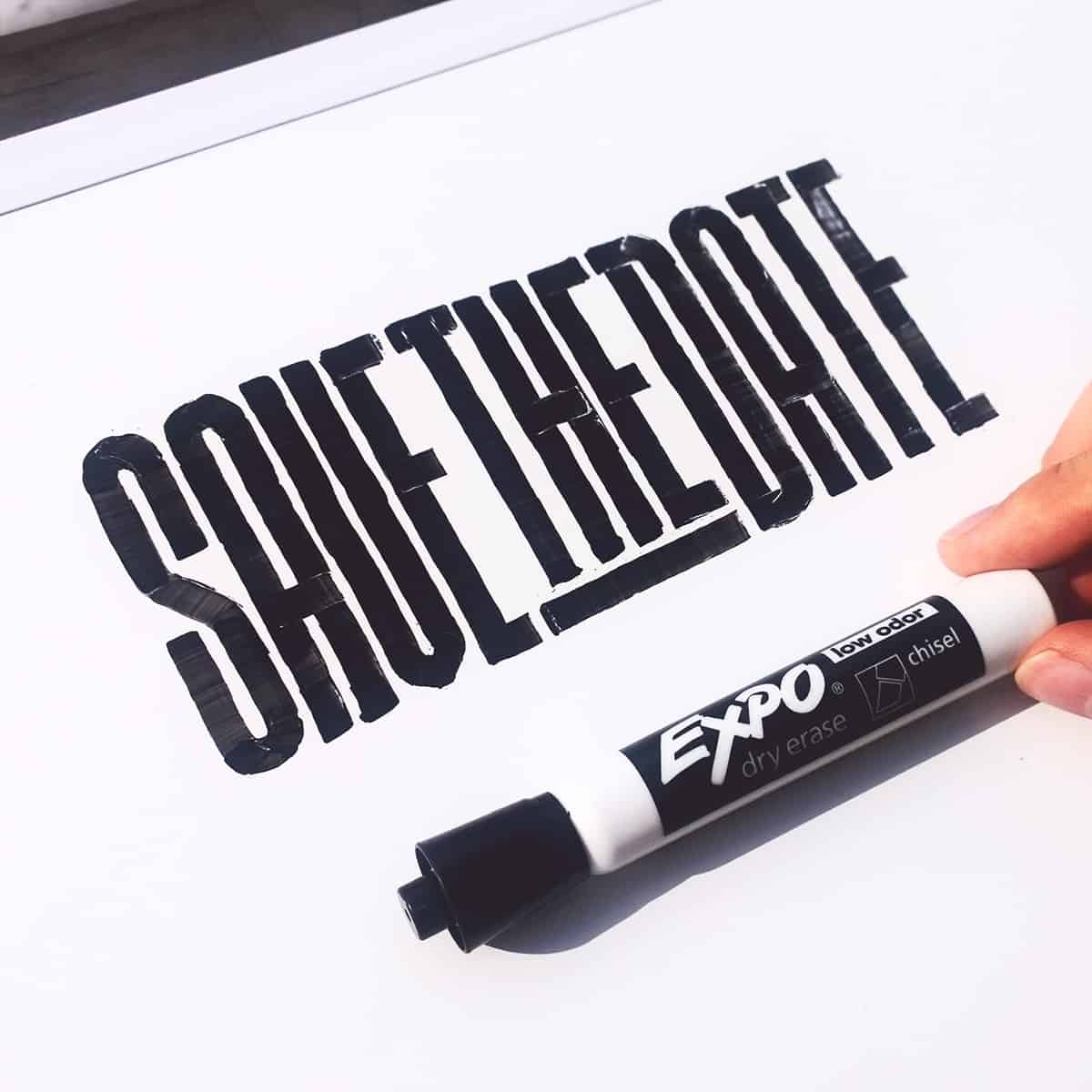
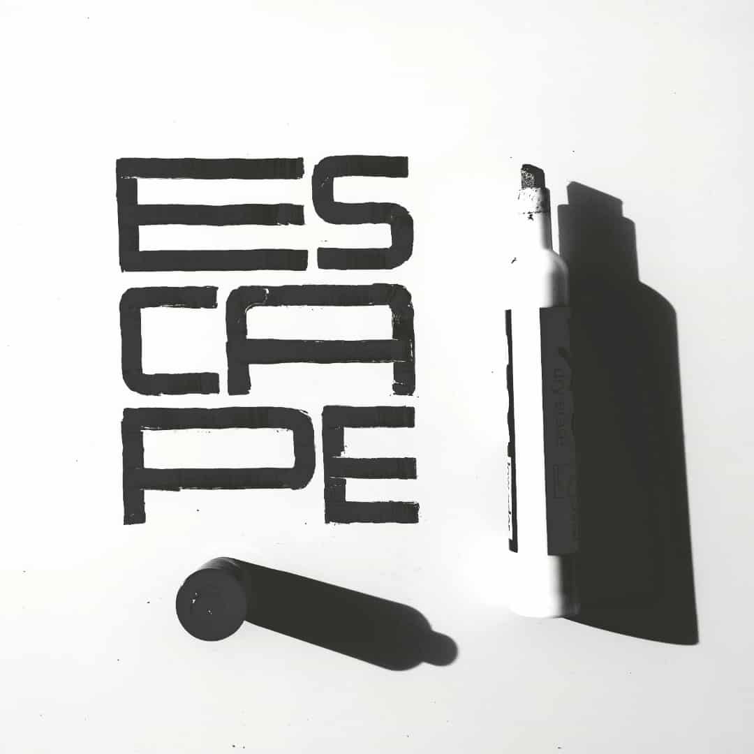
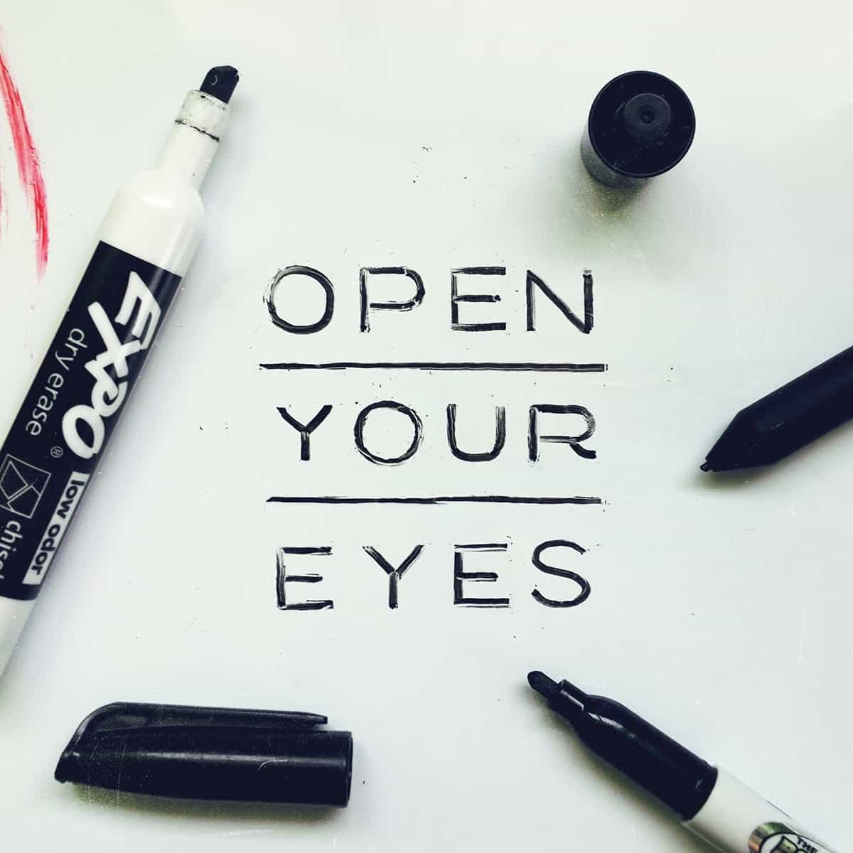
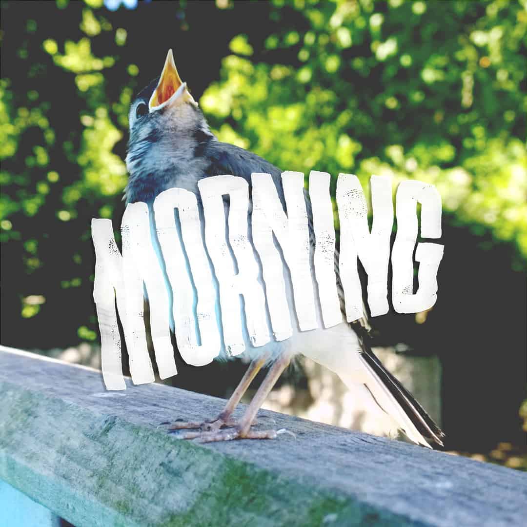
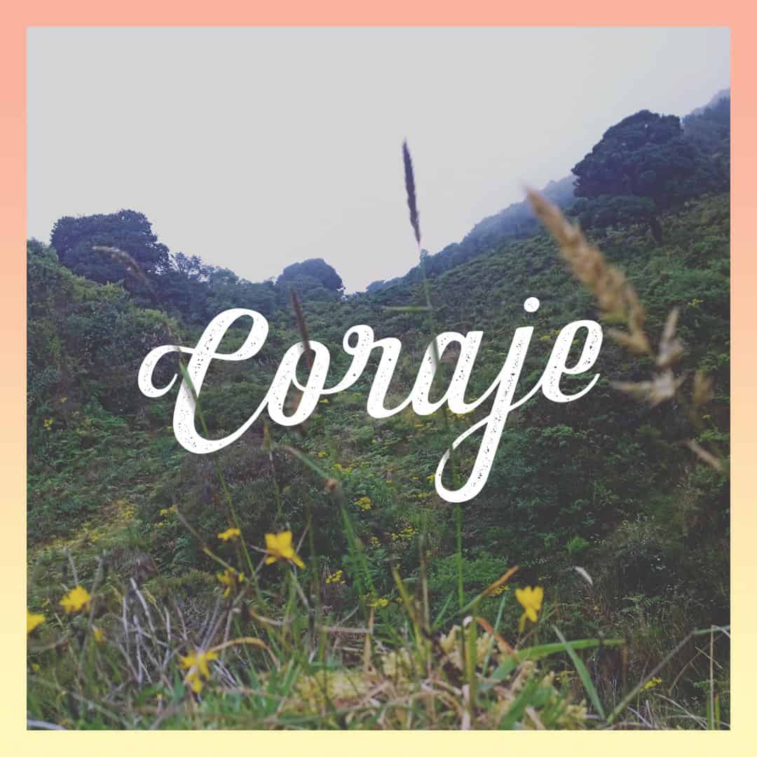
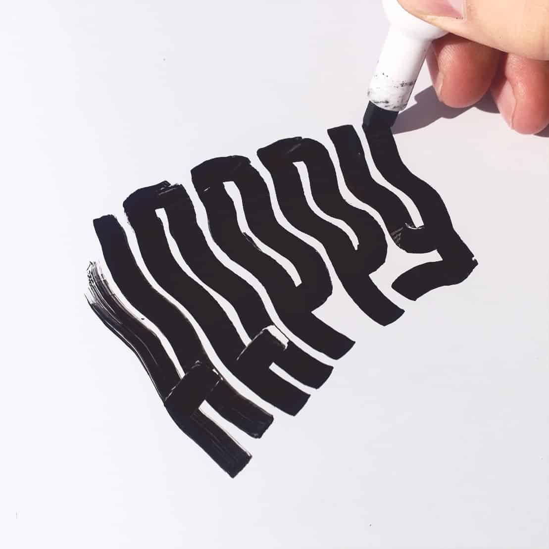
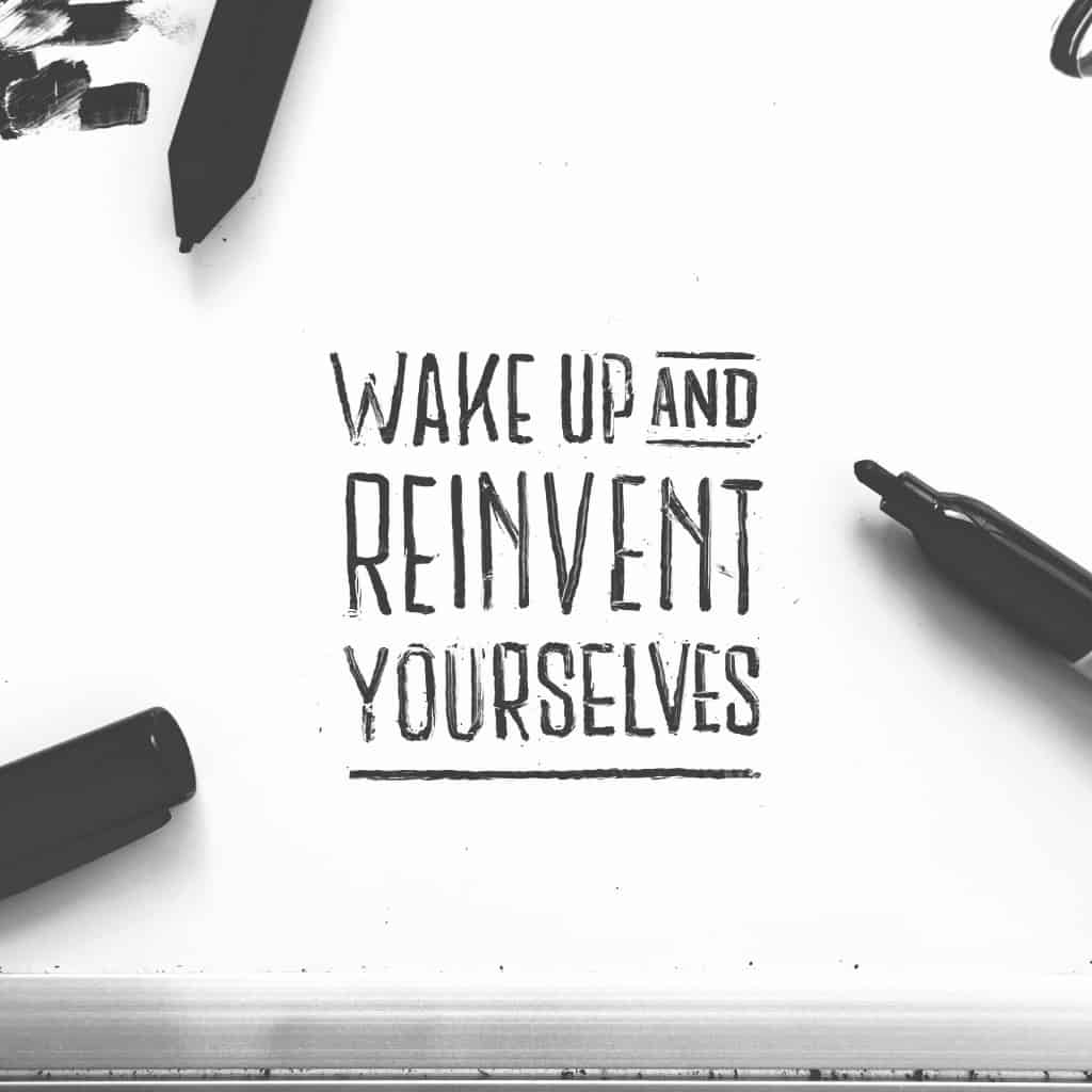
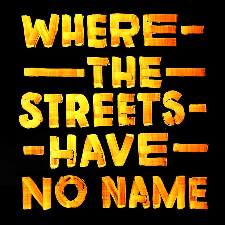
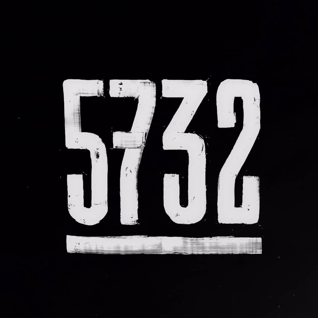
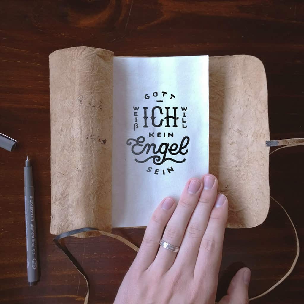
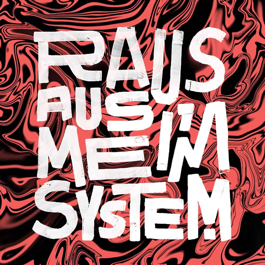
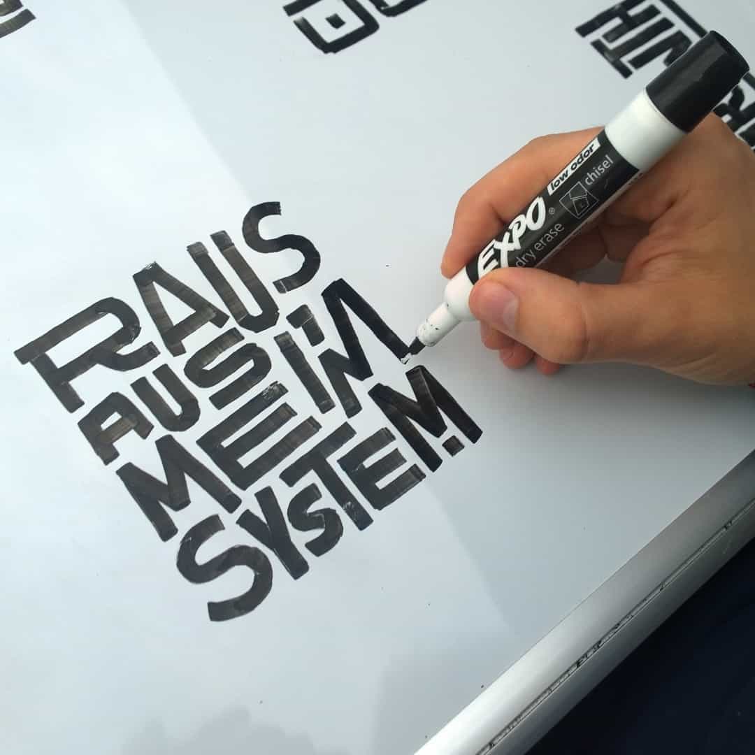
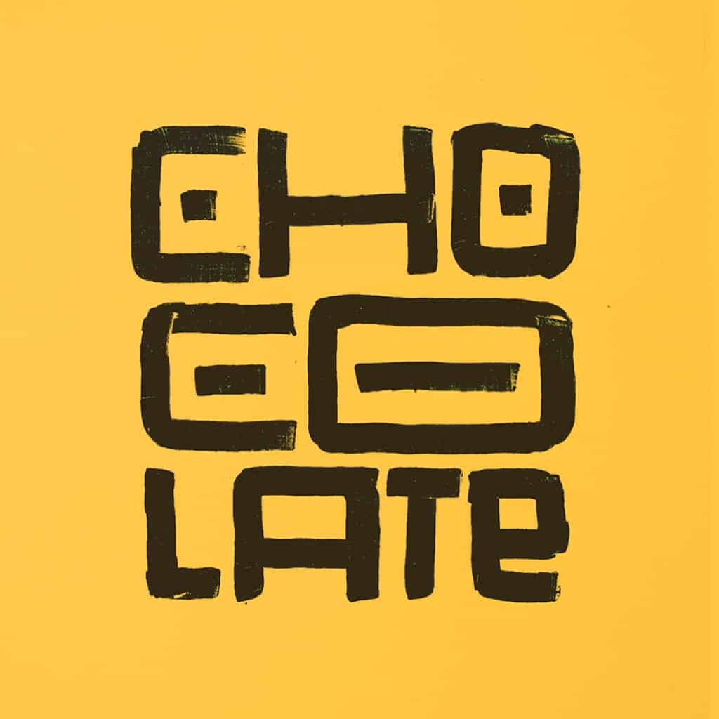
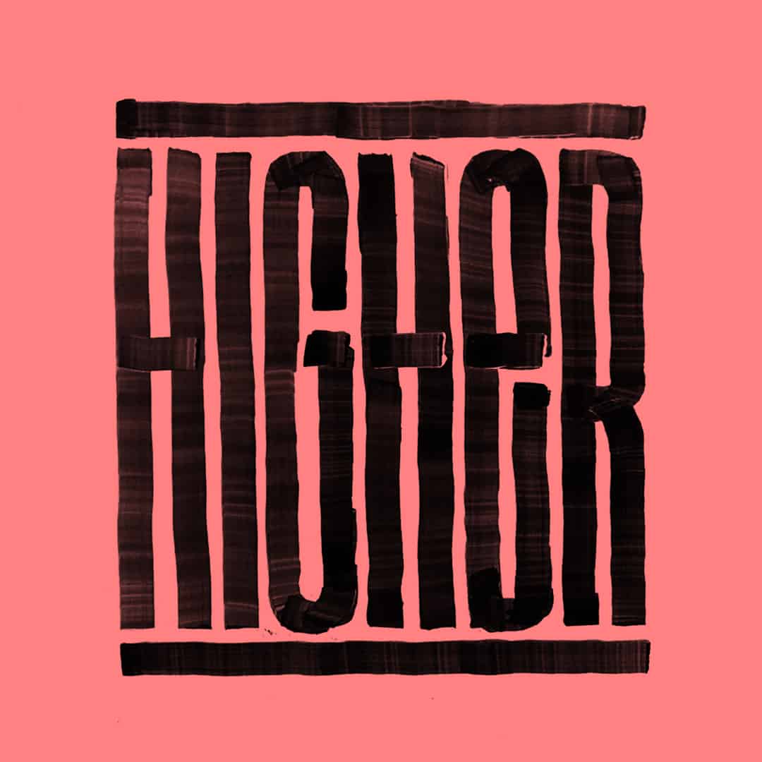
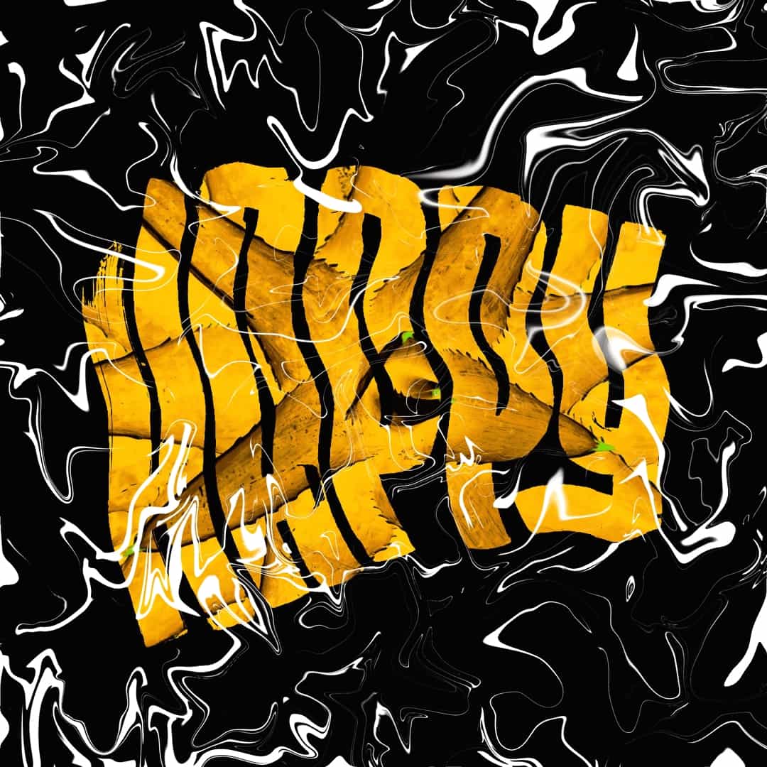
On my journey to create some kind of proper visual language I always try to explore different techniques. Turns out we had this writable whiteboard desk at the studio and one day I just started to play and realised the vast opportunities to create customised typefaces. See, there's nothing better to me about graphic creation then going directly to the canvas and just free yourself from rules that will only guide you through a labyrinth of already achieved knowledge and of course result in an predictable outcome. So in the end my mayor rule is: There are no rules. This is the love story of me finding beauty in creating with a whiteboard and use it to achieve my plan of daily productivity (my wife isn't quite always amused about this new relationship :/). My mayor inspirations are calligraphy, graffiti, lettering and typographic designers such as Seb Lester, Nils Shoeman, Jon Contino and Eike König.
-Matti Vandersee
I really dig the term of "Calligrafuturism" brought to life by the outstanding Pokras Lampas, but it's already his very own style. Perhaps "white dude with a whiteboard" or maybe "whiteboard vandalism".
-Matti Vandersee
Always follow your heart cause it's the only way to find yourself and become happy by doing what you really enjoy.
-Matti Vandersee
About Matti Vandersee
Matti Vandersee is a 27 year old German graphic designer with a Finnish first- and a belgian last name loving in Costa Rica. He left Germany at the age of 20 to follow his heart to Central America, because it told him that he was better of next to this amazing Costa Rican girl he got to know during high school. Turned out it didn't lie to me. Today she's his wife and they're about to celebrate 10 years of being a couple. Quite a story for a book, maybe a lettering book ;) So this is something that defines him as someone who always follows his heart to become as happy as possible. Matti studied graphic design during four years at veritas.cr and work for three years now at pupilaestudio.com one of the best graphic design studios in the region. (Any similarity between each brands is based on the university's recent rebranding, where they choose us as their mayor inspiration.) See more of his amazing works on Behance or his Instagram.