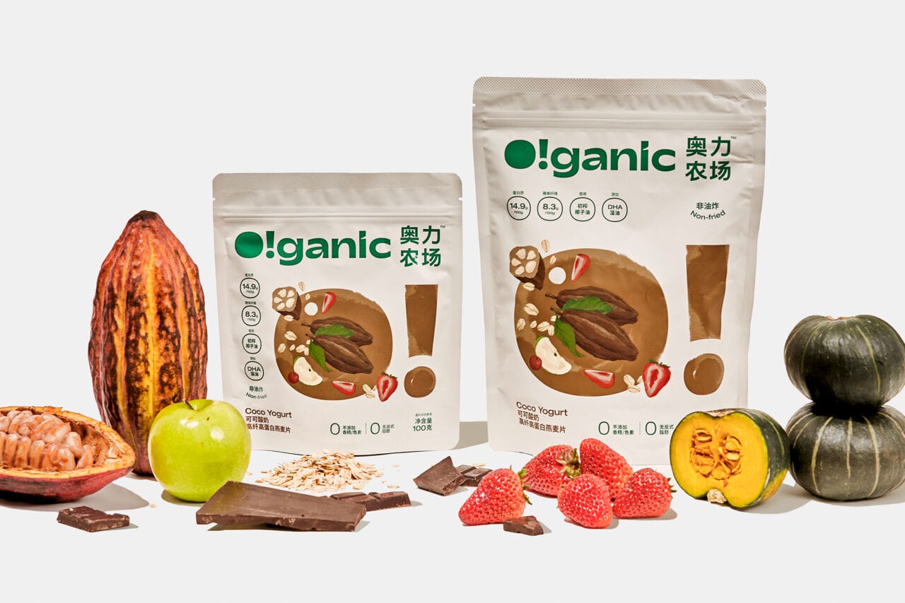
O!ganic奥力农场 is committed to providing high-quality high-fiber and high-protein oatmeal for chinese families, only choose natural organic raw materials and insist on no additives in production. We designed the logo, brand identity system, packaging identity and brand communication materials for the brand. The brand name O!ganic comes from Organic. We extracted and designed this honest and lovely O!, which has become the best symbol of the brand's personality. We used green, golden yellow and linen as brand colors, representing growth, harvest and natural. In the packaging, we presented O! in an extra-large size, together with natural watercolor illustrations, creating a natural, sincere, simple and interesting brand identity.
We used green, golden yellow and linen as brand colors, representing growth, harvest and natural.
We use Adobe Illustrator CC and Photoshop CC, also we created illustrations using watercolor pens and paper.
Customers and consumers really like our design and believe that this work well describes the natural, organic and healthy concept of the brand and product.
