Ornate Logotype

I was approached by guys who sell original designer watches with a proposal to make a logo for them.
I immediately agreed because I had never made a logo for a company that deals with watches. It became interesting to me that I can offer them something that will look expensive, clean and beautiful. Easy to perceive and stay in your head. I came to the next decision that I want to share with you!
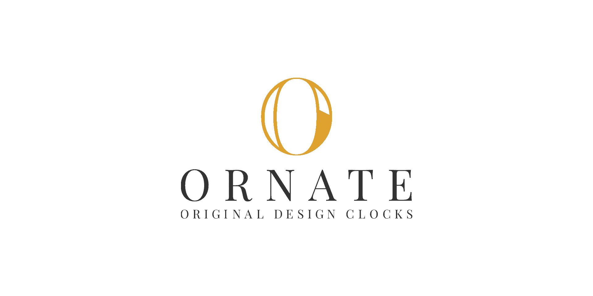
I came up with the idea to make the logo of the company that sells watches, the letter O - symbolizing the frame of the watch, why is it stretched? because the original ;) The font use - "serif" was chosen to emphasize the the company's vibe and so that it is in line with the overall branding. I did some kerning so the font looks readable and noticeable even from a distance.
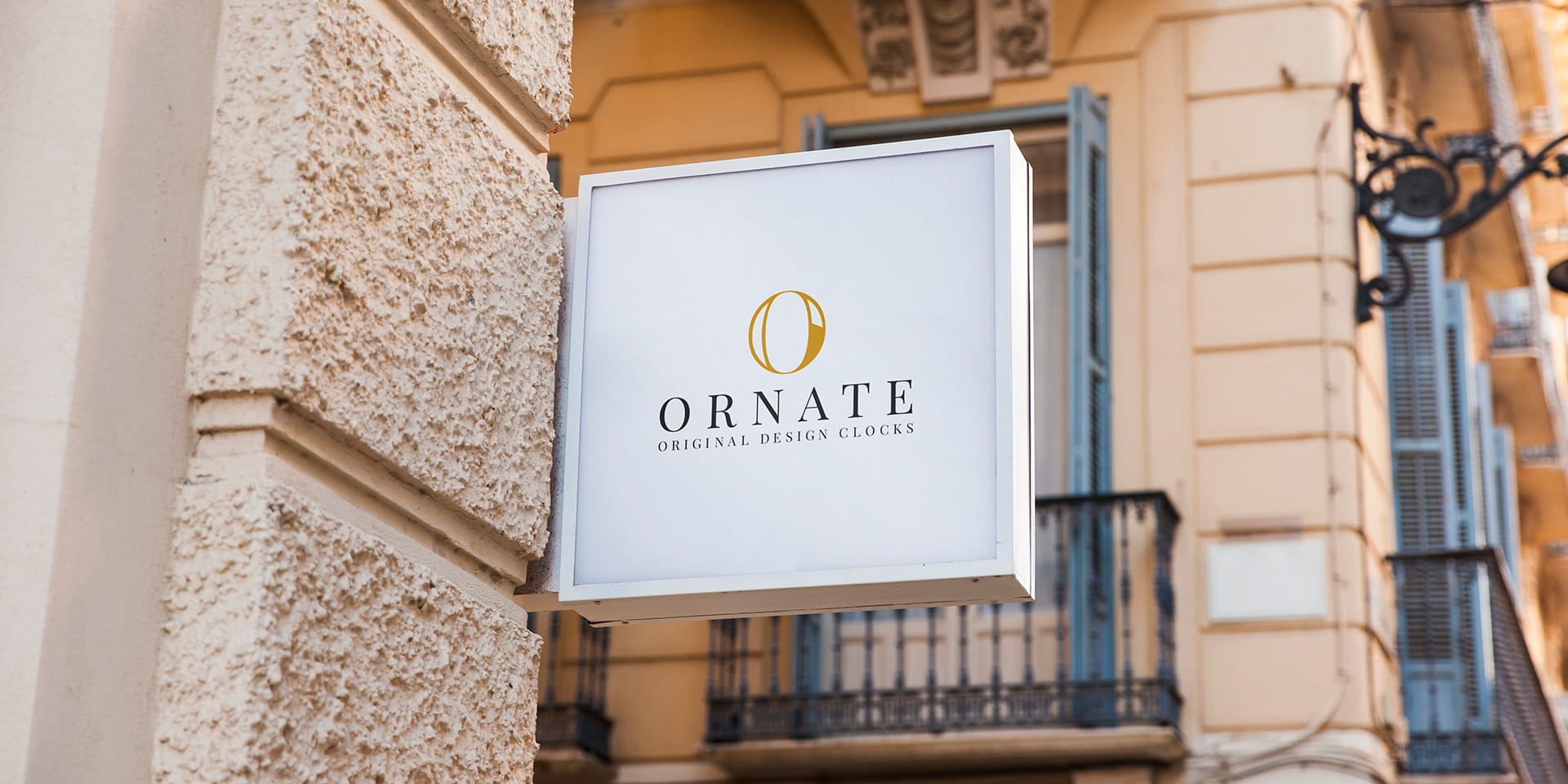
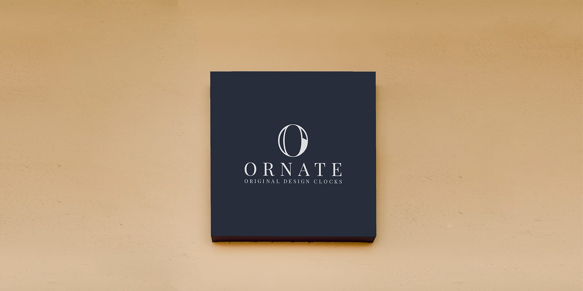
In this work, I used only the illustrator, maybe somewhere at the time of preparing the mockups, I interacted with Photoshop, but I try to do vector graphics only in the illustrator and advise everyone, because in the future you may encounter a lot of trouble at the printing stage.

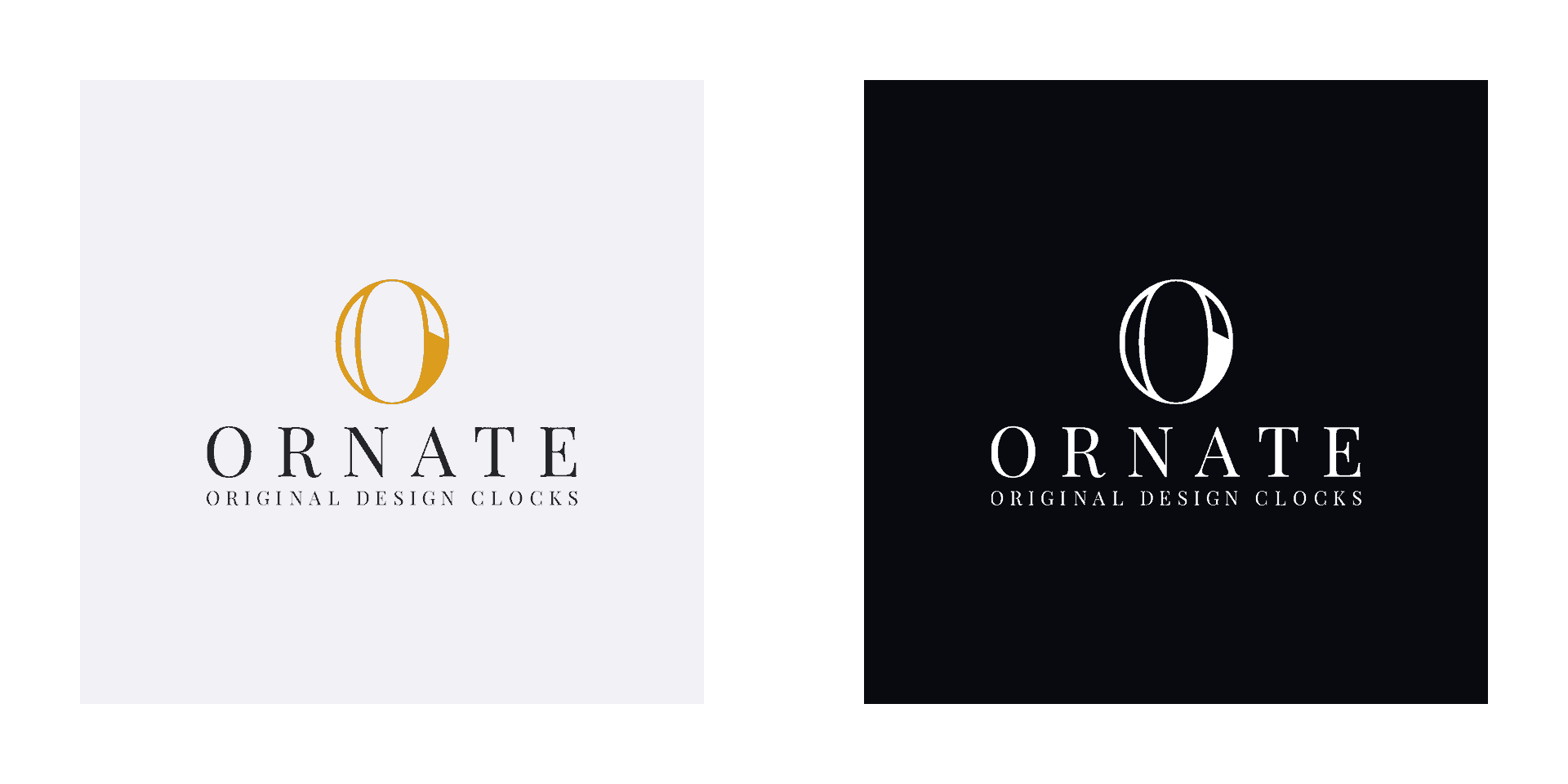
The customer was satisfied, the colors picked up perfectly.
Just now we are starting to make a website which I soon think will also share with you!
Did I learn something new? No, I just confirmed that I like to create only the best for people!
Believe in yourself
---
https://www.behance.net/b_ratiev